Making the ReCommerce experience for OLX users more usable: A UX case study
Overview
OLX, a C2C (consumer to consumer) online exchange marketplace, came into existence in the year 2006 as a Craigslist alternative for the world outside of the United States. It had filled a big gap in the world of flea market consumers. People could now buy and sell used products, ranging from electronics to second-hand furniture, online.
In India, about 99% of its listings come from used mobile and electronics, used home and household goods, and used cars & bikes.
Context
A little Backstory
My fixation with second-hand products began quite early on during my childhood. Being the youngest, hand-me-downs had been a part of my life, be it the clothes or the gadgets that my siblings wanted to replace with the new ones in the market, or the books they no longer needed. For me, my home was the thrift store that kept getting refilled automatically every time my siblings decided to upgrade to something new.
My personal experience
OLX has proved to be a useful platform as I was able to sell off my old stuff and buy some second-hand stuff when I had moved back to the city. But sadly, usefulness/utility is not the only factor that influences a user’s experience. If it was so, no useful services would have had to see the end of the day. (You can check out some of the apps that failed despite being useful, due to their poor UX here.)
My hypothesis
Any deal (buying/selling)that couldn’t get through during my experience with the app, was somewhere the consequence of the way, the whole experience was designed and not that of the buyer or the seller.
Strategy
Problem statement
Through my secondary research and usability testing(that I would be elaborating on further down the case study), I learned that many users were facing problems navigating through the important features that they wanted to use or the functions that they wished were more forgiving.
Goal
I had two main motives for this case study:
- Identify the pain points in OLX’s current android app
- Have a solid UX case study in my brand new portfolio
Process
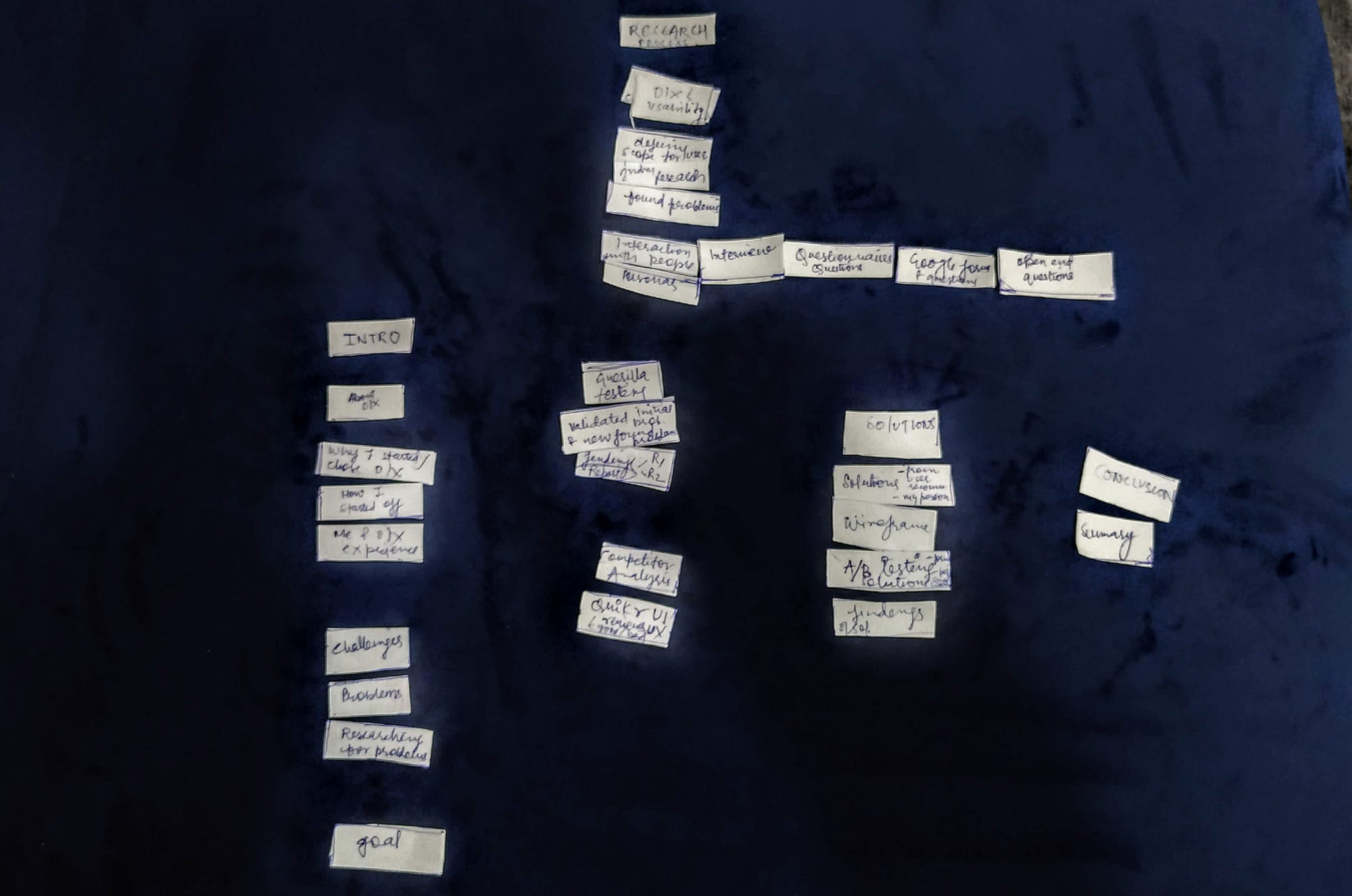
My process for the case study began with the purpose of me wanting to have a comprehensive UX case study in my portfolio. The first thing I did was find an app that I was a frequent user of. Once I decided it was OLX, it was then that the actual process started. Following are the steps involved in my process:
a. Stating the hypothesis and determining the strategy
b. Accumulating the data through secondary research to identify problem areas
c. Formulating questions based on former, for primary research
d. Examining the findings based on their criticality and carrying out usability testing based on that
f. Preparing the usability testing report
g. Lastly, sharing my insights and solutions followed by my thoughts on the experience
Challenges
Since it was my first case study, I had a hard time organizing the information architecture of the case study I had at hand, mainly because I was trying to do all the sorting in my head. I, later on, resolved it by jotting down every idea and content on a separate piece of paper and organizing them into a meaningful whole.
Secondly, scope of the research kept expanding and I didn’t know where to stop. To overcome it I prioritized my finding based on how critical impact they had on the experience.
Thirdly, the pandemic made me narrow down the sample size and diversity of users that I wanted to interact with for my research.
Ideas in my head, in the beginning, were like

Classifying everything into meaningful categories
Secondary Research
I set out to do some secondary research online to
- identify the problem areas, and
- to define the scope for further research.
At first, I’ll take you through every step that I took to arrive at my final findings.
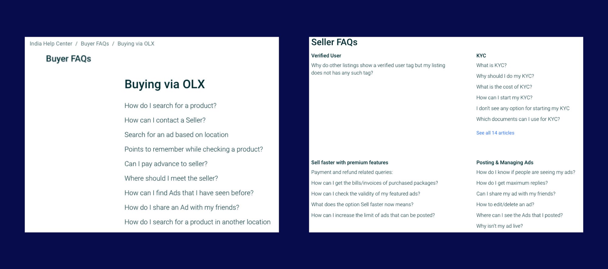
1. Finding my answers in Frequently Asked Questions
I strongly believe that FAQs give you a window to look into users’ frequent frustrations on the platform.
2. Reviewing the reviews
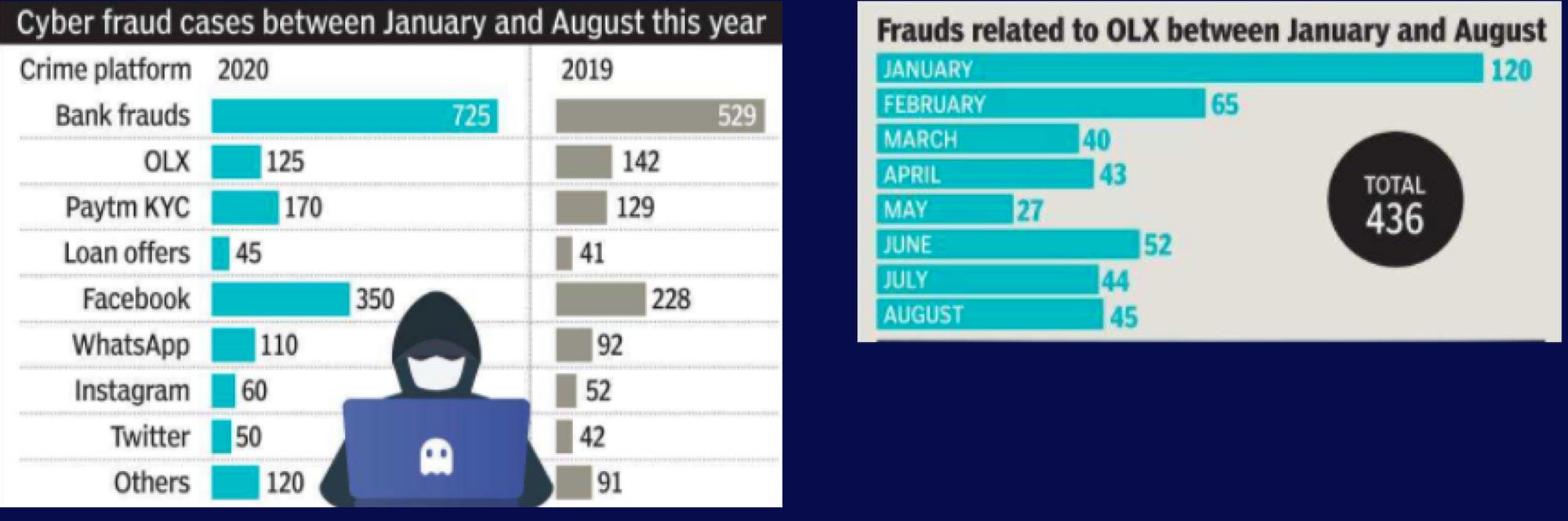
In reviews, the users frequently complained about filtering function, notifications settings, increase in frauds, and their ads getting rejected without any obvious reasons. Some of the users also shared their views on the UI of the app.


3. Surfing the internet
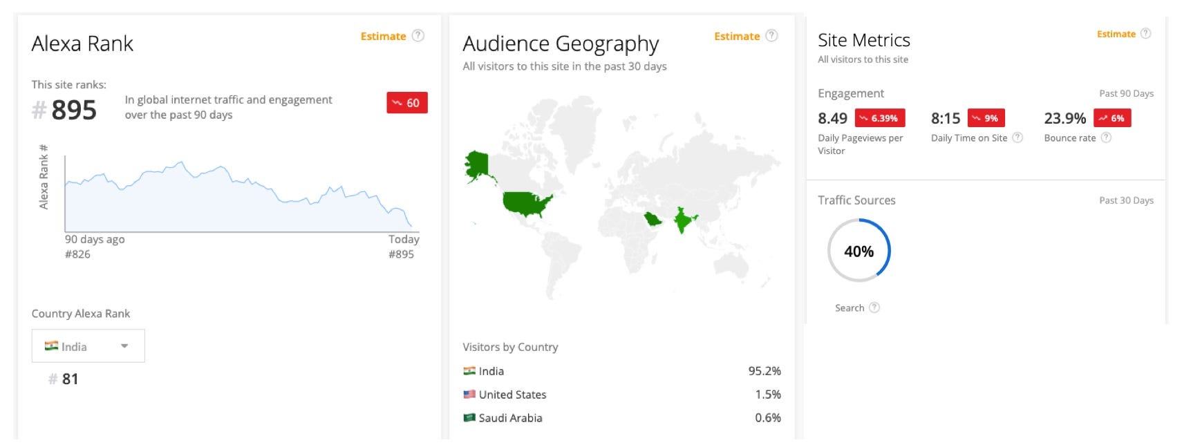
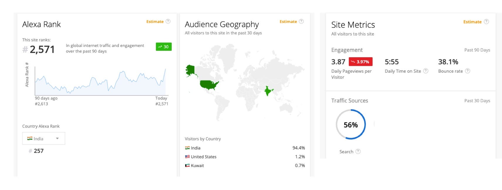
According to Alexa, OLX’s rank within India is 81 (2021) and globally the site’s rank is 895, which is 69 places down from where it was 90 days ago. Engagement metrics, which take into account the daily pageviews per visitor, daily time on site, and bounce rate, saw a downtrend in the past 90 days. Further, I discovered that OLX India’s site also has some visitors from the United States as well, although the percentage may not have been notable enough, it was a fun fact to be aware of.
4. Alexa! Find me my competitors!
The site that shares the majority of visitors and search-keywords with OLX is Quikr. The rest of the competitors are 99acres, magicbricks, cardekho, and Flipkart.
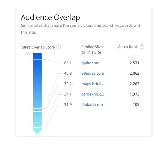
In contrast to OLX, Quikr’s global rank has been witnessing an upward trend. Its global rank as of March 2021 is 2571, which is 41 places up from where it was 90 days ago.
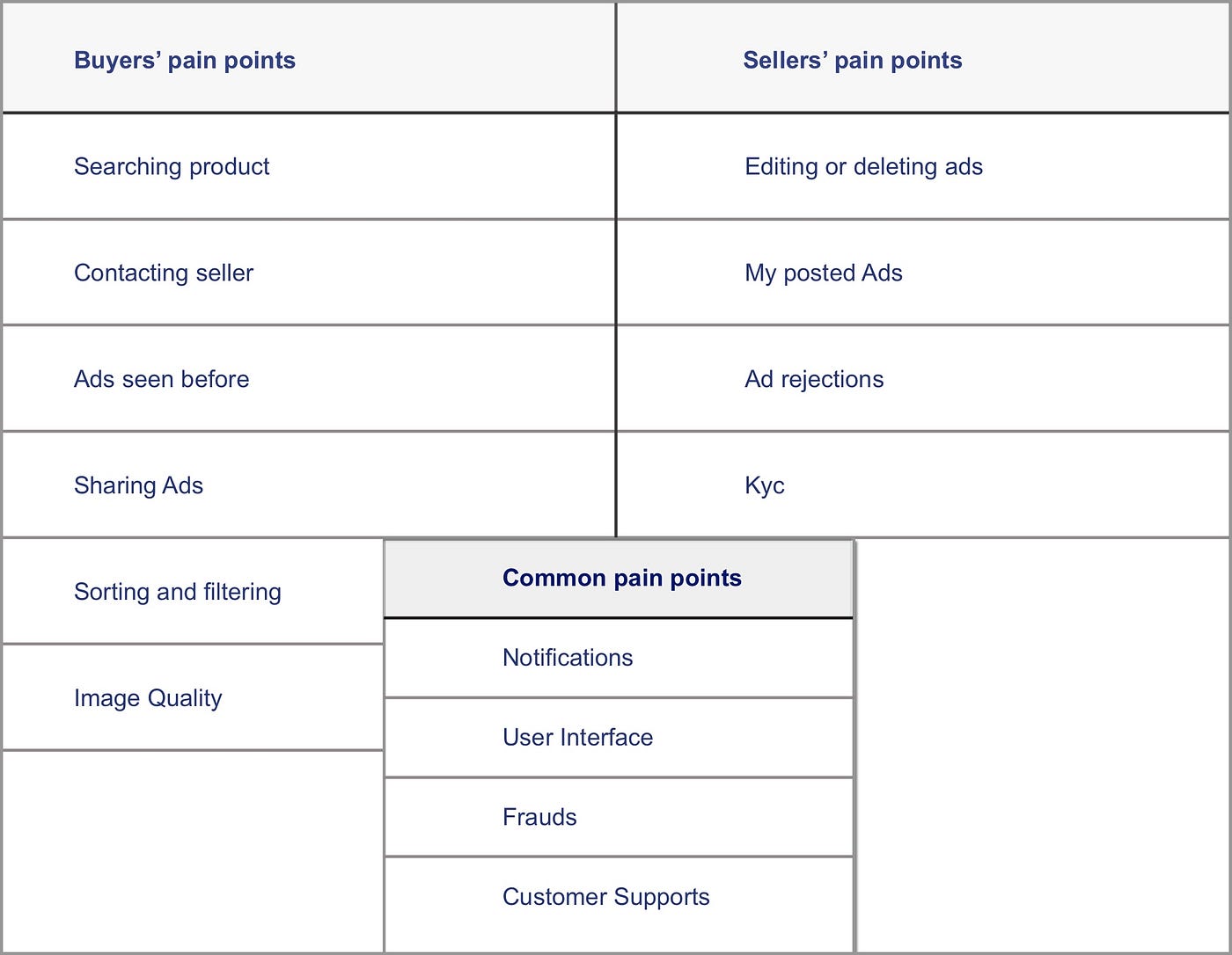
Problem Identification
After having assembled all the pain points I classified them into three categories: Buyer’s, Seller’s, and Common to both pain points.
Primary research
- Firstly, I started with User Survey via Google Forms to understand user motivation and behavior
- Furthermore, I did guerrilla testing to observe how users interacted with the app in real-time
Before jumping right into my survey findings it would be ideal for me to introduce you to Dhruv Singh who represents one of the sample users of OLX and also my focus group. I am well aware of the fact that OLX has a very diverse user base out there and I would have loved to include as much diversity in my research as possible if the resources at hand and the conditions outside had permitted me to.
User persona

User Survey findings
User demographics
75% of the focus group was in its 20s and 30s, 87.5% of them were working-folks, only 25 % were rural users, 37.5% were female and the rest were male.
User behaviour
Money turned out to be one of the prime motivations in both the cases of selling and buying. Everyone who took part in the survey shopped for pre-owned items on OLX and had the app on their phone. 37.5% however, also liked exploring flea markets offline.
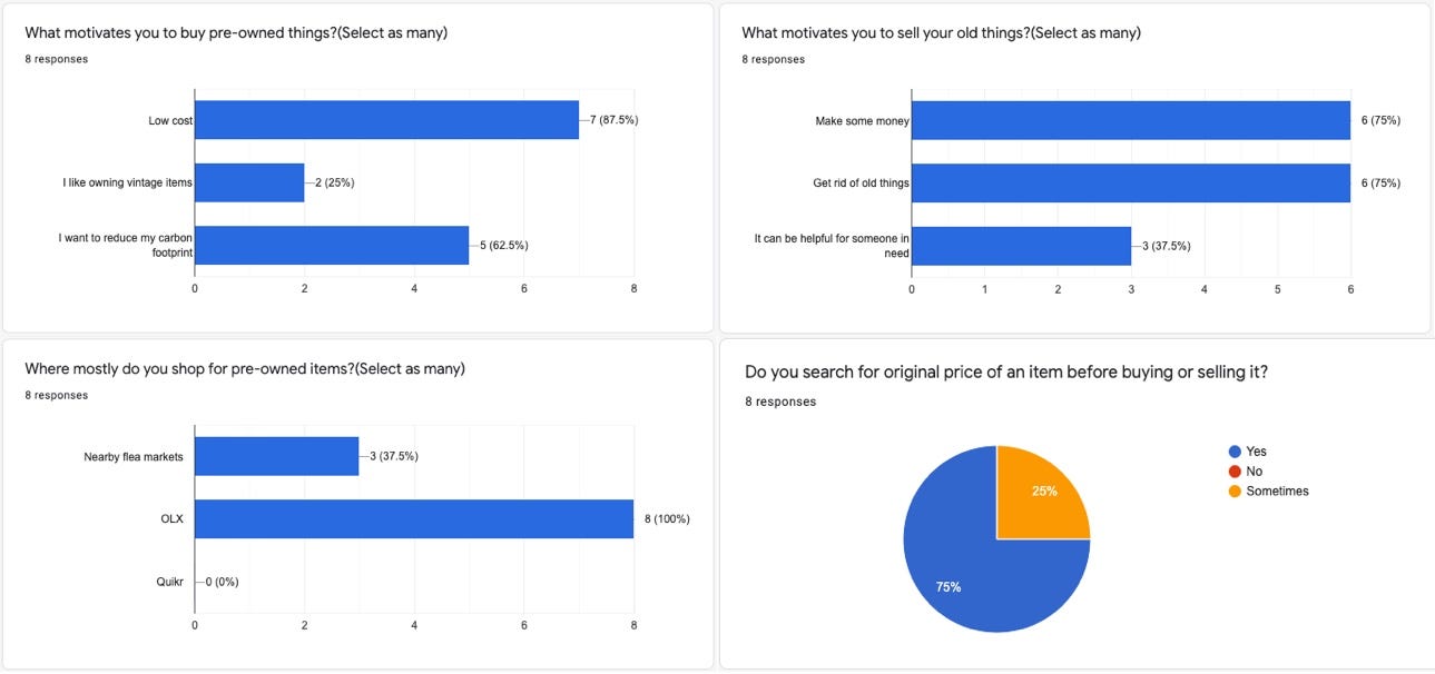
OLX specific
Furniture was the most searched for item among the surveyees. Everyone had used OLX as a seller and 75% had used it as a buyer and 25% had only window-shopped on the platform.
App features specific
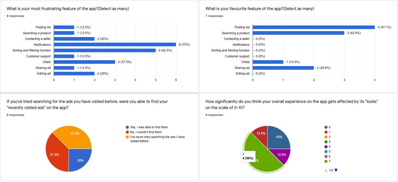
The notification was the most frustrating feature of the app according to the survey and 62.5% of the users found the sort and filter function also frustrating. Whereas the favorite feature of 57.1% of the users was Posting ads. On asking about the influence of looks of the app on their overall experience, 50% believed the level of influence was a 7 on a scale of 0–10.
Rate OLX
I made the users rate the looks and usability of the app on a scale of 1–10 separately. On usability, it scored a 7 from 50% of the users and a 6 for looks from 50%.

Which one looks better? OLX or Quikr?
In this part of the survey, I had put screenshots of both OLX and Quikr’s homepages next to each other and asked the users which one was easy on eyes and 62.5% voted for Quikr, 25% for OLX, and 12.5 % liked none.
(Here’s the link to the google form that everybody took part in.)
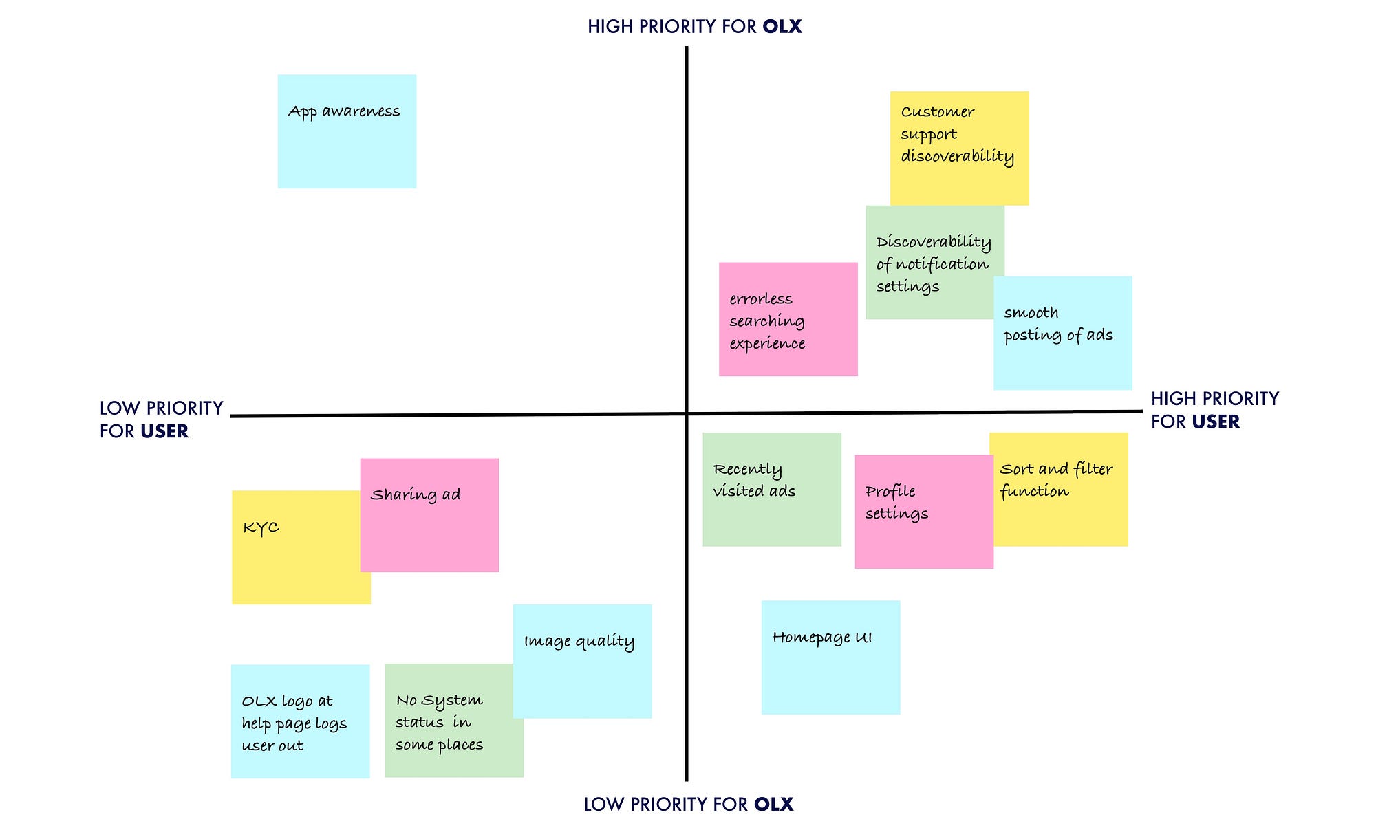
Prioritizing issues
After having all the issues at hand I narrowed down the issues based on the criticality of their impact on the app and the user.
Guerrilla usability testing
Features being tested:
1. Notification settings
2. Customer support
3. Post Ads
4. Search a product
Scenario 1: You have just moved into a new city and are living in a rented place. You wish to buy some furniture for the house.
Task :
Find yourself a three seater sofa on OLX.
User flow: Home>Location>Search>Budget>sort by distance and so on.
User comments: “umm…they could put an option for choosing the distance radius…like withing this much km”
Observation 1: The sequence of steps that the user followed matched mostly with the visual placing of content on the interface.
Observation 2: The user wished to control the distance radius and struggled to find something with similar functionality for a moment, finally sorting the results based on distance.
Observation 3: User didn’t bother to choose the category on the home page and chose to jump right into the search bar. On the search results page after doing some sorting and filtering, the user tried choosing a category but was warned that her filters will get reset by doing so.
Scenario 2: You found a fair deal on OLX and have offered a fair price as well through the chat function. You wish to hear back from the seller and do not want to miss the deal.
Task: Turn the notifications on for the chat.
User flow I: Home>Profile>Settings>Notifications and then the user looked lost.
User flow II: User went back, looked for it in the chats section. Couldn’t find it there as well.
User comments: “Not sure if I’ll get notified when he replies.”
Observation: The user expected the notification settings to be at a familiar place like it is on other apps.
Scenario 3: Your ad has gotten rejected for reasons you don’t understand or your account has been suspended for unknown reasons and you wish to reach out to customer support.
Task: Find the right course of action or the helpline number.
User flow I: Home>Account>Help and support>General queries and then lost.
User flow II: Home>Account>Help and support>Trust and safety and then lost again.
User comments: No comments.
Observation 1: The user struggled with finding the customer support helpline.
Observation 2: An already frustrated user will not have the patience to look for customer support beyond 3–4 clicks.
Scenario 4: You have been working from home for the last 6 months as your office hasn’t opened back yet, you have been paying rent for no logical reason and wish to move back home and save some money. All the furniture you own needs to be discarded before you go.
Task: Post an ad of your revolving chair on OLX.
User flow: Home>Sell>Category>Details>Upload photo>Price>Location> Profile details review>Post
Observation: Posting ad was the smoothest experience of all for the user, and it validated the survey finding stating Posting ad as the most favorite feature of the app.
Insights and solutions
A) Error-prevention delayed is Error-prevention denied.
Select Category function needs the slate to be clean for it to work, then why let the user scribble over it in the first place? If a user decides to Select the category not on the home page but instead on the search results page the option easily goes unnoticed, unlike the Budget option. Selecting category after the filters gives the user a warning pop-up and there’s not a lot that the user can do here.
The text size, weight, placement, on the screen real estate, of an option has to catch the user’s attention if it is that important in the hierarchy.
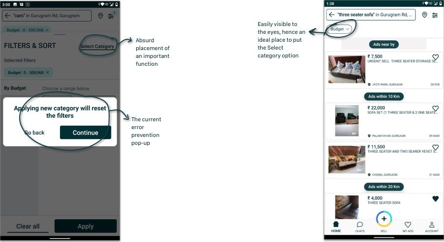
Solution: Replace the Budget button at the left top corner with Select Category. If the user still goes for the filter option first she can be asked there and then, to choose a category first as the current experience is less forgiving.
B) Incoming Message!
The notification function is very crucial to not miss out on the deals that have almost gotten through and it appeared a lot of users had already faced this issue. To find a solution to it I searched how texting apps deal with it.
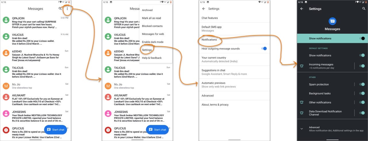
Solution: The notification setting could be placed at the top right corner of chats which eventually takes the user to his phone’s notification setting’s category.
C) Be empathetic to the user.
The potential user of a helpline number is a frustrated or helpless user and the system doesn’t do a lot to lessen the user’s ordeal. The customer support helpline is unsearchable for the users and the hunt for it unbearable. I took it upon myself to find the helpline number and I struggled to understand the reason why the number was kept nested and in a not-so-apparent place.
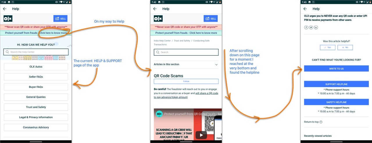
Wait! The experience doesn’t end here. Users don’t see a number right away after finding the helpline option, so she clicks the big blue call-to-action button. And oops!
To keep the number visible and to keep yourself on the same page user is supposed to press and hold it, but still, she can’t copy it to the clipboard.
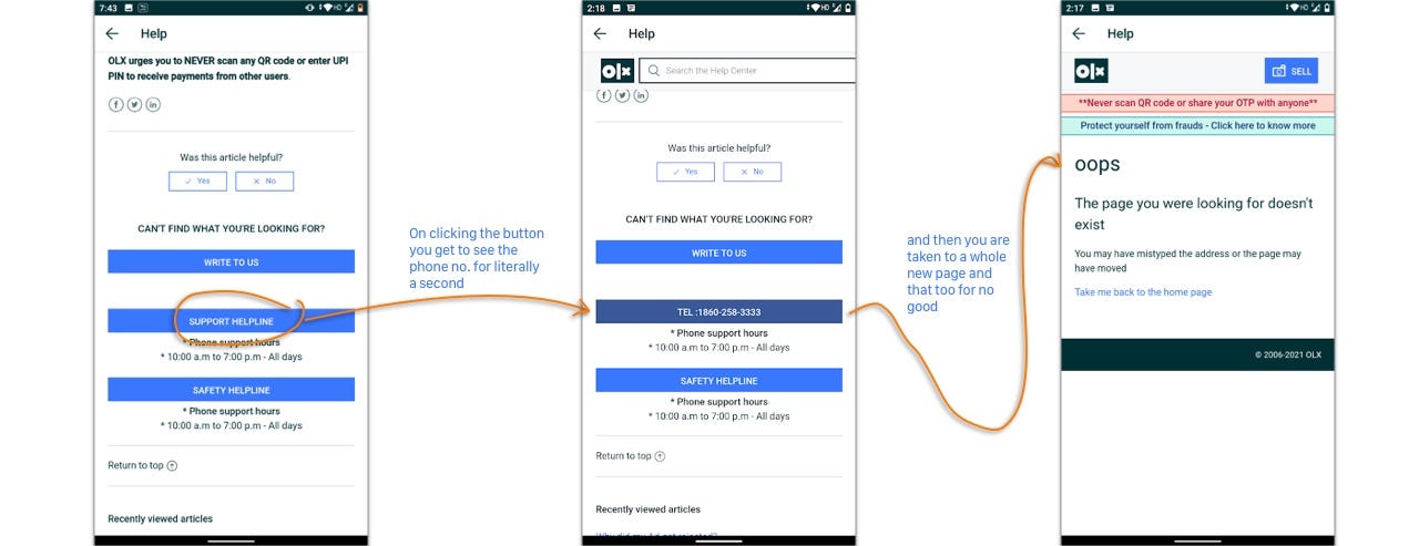
Solution: OLX could bring the helpline number into a little more accessible place with the least number of clicks possible.
Also, provide the user with a chatbox once the user is on the Help page. Every user would love to have an ear curious and ready to hear her problems out.
Reflections on my experience in this case study
This was my first case study in the field of User Experience and I was excited to start the project. The most favorite part of carrying out this case study for me was the process of narrowing down the features to be tested, from a long list of issues, found from secondary research to a very specific list that I used for my Guerilla Testing. The experience of looking at things falling into place one by one from a very messy start had a different level of satisfaction to it.
P.S. I was very eager to redesign the app, but it felt like I was writing a thesis on OLX and I didn’t want the readers to miss the important process behind every little decision that I had made by adding another whole process of designing here. So, I have left the redesign for the next post.
Till then, leave a clap if you liked the case study or anything in particular about it. To give me feedback or any suggestions on what I could improve upon or what you liked in my process, leave a comment below. I would love to hear back. You are also free to share it with someone who you think would be interested in it.