New design is now; accessibility and ADHD
Why are sites so boring? For web design, app design and graphics: clean and simple styles aren’t good enough anymore.
Style choices come down to what works first and what looks good second. Visual media drives information around the clock: it could not be a better time to be an artist turned graphic designer because both art and design are communication.
A creative’s work in many visual formats (anything from painting to web design) are to capture attention and make the message easy to digest. In print and web, bright colors and bold choices are ideal when done well because they grab interest and help reading time, too.
As a professional I know which choices to make in design but it’s not as complicated as some might think. Design thought can be as simple as “Does it work and do we want to look at it?” Modern approaches to design have been clean and simple to make using a website or reading a book easy, but only for some people.
Accessibility
Styles with lots of white space and clean text aren’t good enough anymore, for any enjoyable or optional experience.
As someone with ADHD and a digital native, I need to be stimulated with color and imagery. If your website or app isn’t exciting enough my brain says “this isn’t rewarding” and I lose focus. If I have to read “normal-sized” text on top of that, you no longer have my attention at all.
Learn more about ADHD here.
I usually turn up the magnification on my browser to combat this, but that’s one more step your users have to take to view your content. Business emails are especially guilty of this because the default text, in my experience using Gmail, is tiny compared to body text on the web.
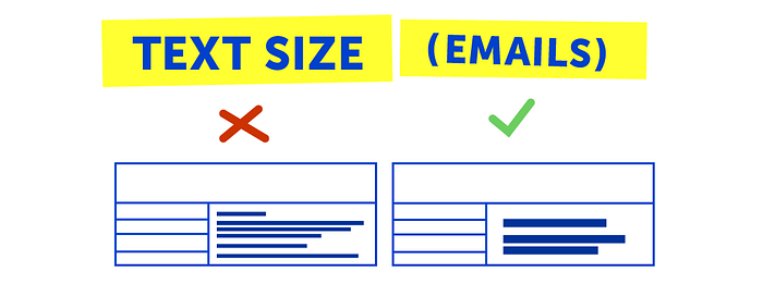
The new standard is larger text and lots of color for current web and mobile design.
Michal Malewicz points out these trends as Neubrutalism in his article “Neubrutalism is taking over the web”.
Following the guidelines he sets, accessibility is a top priority while rising above the bounds of sleek, harmonious design to bring bold and bright style to an otherwise un-energetic sphere.
I feel ahead of the trend a bit, because I’ve been craving this ease of use, trying to weave it into my work. When I was doing project-based work for my graphic design Bachelor’s, I had professors tell me time and time again that the industry standard for text is smaller than I prefer, just big enough for people to read. They were right in a lot of ways, but trends change.
I’ve seen Adobe using a bright, bold and geometric approach in motion design recently, and I am in love with similar styles from Adobe Max 2021.
Neubrutalism or Neobrutalism in architecture is a style of exact, rigid structures which break the molds for what they should look like. Under that definition plenty of new and bright design fits the movement, but the larger amount of Neobrutalist works that I found when searching social media channels are dark or edgy responses to overly simplistic and shiny examples of modern architecture.
I plan on experimenting with designs that follow Gumroad’s lead, but I probably won’t be calling it New/Neo Brutalism.


