Never Run Out of Essentials Again! UX Case Study on Commodity Subscriptions

This was an assignement for 10K Designers Cohort 5
Humans have a bad sense of foresight due to which they are bound to make errors when planning ahead, I learnt this through the interviews I conducted and as you will also learn later in the case study. When preparing shopping lists for daily essentials such as groceries, medicine, and snacks, people often end up with excess ingredients and no recipe to use them, or run out of snacks at the worst times, like when the midnight cravings hit.

While instant doorstep delivery is a convenient service available at all times, relying on it may not always be ideal in situations where immediate remedies are needed. For instance, when you oversleep and need to pack a sandwich for your commute but realize you forgot to order bread, or in serious situations such as requiring urgent medical supplies for a health condition. Despite the convenience of tech innovations, it’s important to have contingency plans in place for such scenarios.
We plan and prepare for such unforeseen or unplanned (the irony XD) situations, but being humans we are tend to making errors like forgetting to buy the ingredients or not restocking our supply of snacks.
The Problem
People often forget to buy essential items and don’t realize it until they check on them when they need them immediately. Also for commodities which are bought frequently by the user they need to repeat the whole flow of ordering and checkout again, and for daily essentials which require timely and periodic restocking people need to be vigilante about when they run out which may not always be possible due to busy schedules.
A simple subscription feature which can be used to set the frequency of delivery over a time span can be used by people to deliver their products automatically after a period of time, which they usually buy repetitively (eg — groceries, medicines, other essentials, etc). This addresses all the frustrations and pain points mentioned above.
The Design Process
Project Goal: To design a subscription feature for stores on Dukaan’s platform which makes it easier for customers to place orders which are placed frequently by automating the whole ordering and checkout flow.
What is Dukaan?
Dukaan is a Bangalore-based start-up that empowers merchants to establish an online store and sell products digitally without requiring coding expertise. Merchants can add inventory manually and start selling to customers after setting up their store. Dukaan also supports grocery merchants by providing automatic cataloging of inventory pictures to create a digital store.
Understanding the users

To widen my perspective of looking at this problem of recurring purchases and to develop the solution with real user frustrations and problems rather than assumed ones,I reached out to my friends and family to conduct in-depth interviews which were semi-structured to understand more about consumer behavior from a designer’s perspective.
Research Goals:
- Gauge the consumer attitude towards purchasing commodities onlin🛒
- Learn about past grocery-buying experiences from online platforms or stores ⌚
- Understand purchase repeat patterns 🔁
- Testing my assumptions 📝
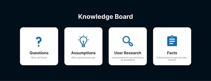
Key Insights from the interviews:
- People who work jobs or are students often choose to order their daily necessities online instead of going to the stores because they value convenience over price. House caretakers, on the other hand, typically prefer going to local stores and selecting the highest quality products themselves.
- When people have busy schedules, they often forget to buy essential items until they have run out of them.
- People usually place their orders for daily commodities (snacks, toiletries, groceries, etc) on the weekends when they are at home and free from work. They place the order in the afternoons as they are usually available at that time to collect the deliveries.
- People usually don’t bother trying out other options like a different brand or seller until they’ve had a negative experience with a product they’ve purchased.
- Snacks are a common item that people run out of, often realizing this when they get late-night cravings and find none left. (I, too, face this problem frequently.) To prevent surplus waste, people tend to underestimate their expected usage.
After user research I conducted secondary research by reading articles online and case studies of other E-commerce platforms. These insights were then translated into a list of principles which would help me to implement an user centric solution.
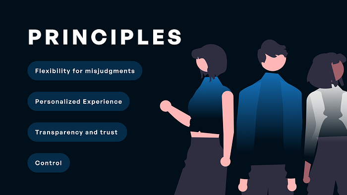
Keeping reading to find out how these principles were implemented in the final solution
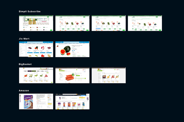
Competitor Analysis
I researched other platforms that offer subscription services for daily essentials and groceries, focusing on mainly the following two aspects:
- Subscription scheduling
- Checkout process
Wireframes
I prefer wireframing on paper as I am able to sketch out my ideas faster.
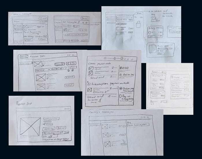
Early Ideation

After generating three distinct user flows and developing the initial designs, I conducted a design critique with Dawar Mir, Head of Product Design at Dukaan. During the call, I presented my design process and the resulting designs for feedback. Dawar’s input was crucial in guiding my design decisions and refining the user experience. Using his insights, I was able to iterate and refine the design until arriving at the final solution. This approach to design critiques is a fundamental part of my design process, leveraging the expertise of colleagues to optimize design decisions and enhance the user experience.
Version 1:
So after sketching out my screens on paper I went ahead with making lo-fi wireframes to place the various design elements into a standard grid used for desktop.
I used Dukaan’s already existing design system and designed the first versions of my screens or V.1 In V.1 the touchpoints to subscribe to a product where clubbed together with the product card in the items list.
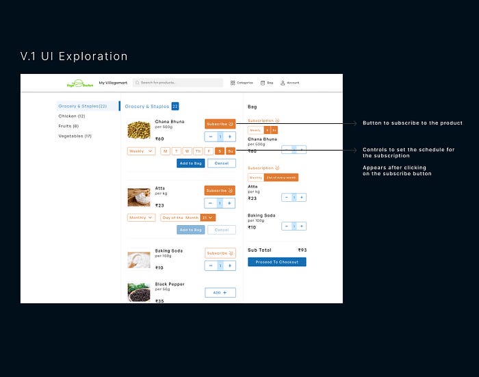
Feedback:
This approach would have resulted in a cluttered item list navigation with multiple buttons and dropdowns when users subscribed to many products, negatively impacting the user experience. As a result, this version was discarded and subsequently redesigned to address this issue.
Version 2:
In this version,
- The user interface allows for the creation of a subscription through a dedicated “Create Subscription” button.
- The user is prompted to set a schedule for the subscription.
- The system restricts the selection of items that are eligible for subscription based on vendor-defined criteria. These eligible items are the only ones presented as selectable options in the user interface. Non-eligible items are presented as non-selectable in the list, providing clear visual feedback to the user.
- This approach to design optimizes the subscription creation process by streamlining the user’s decision-making and reducing the potential for errors.
Feedback:
- The placement of the “Create subscription” button at the top and center of the page made it the primary call to action, causing confusion for users who only intended to make a one-time purchase. This resulted in a hierarchy discrepancy.
- While disabling non-eligible items in the list streamlined the user’s decision-making, it also resulted in increased cognitive load when users had to scroll longer to locate desired items. This issue can negatively impact the user experience by increasing frustration and reducing efficiency.
- To address this issue I thought about different design solutions such as filtering, sorting, or pagination to enhance the usability of the list and improve the user experience.
- Additionally, the use of bright orange colors to distinguish subscription-related features was too prominent and cluttered the screen, diverting users’ attention from other buttons and features.
I worked on these feedbacks by Dawar Mir and designed the final solution.
The Final Designs
Creating A Subscription
- A separate page for all the products that could be subscribed solves for a cluttered items list and also makes discovery easier.
- The “Set Schedule” card at the top of the page takes in the users subscription frequency and then the user can add products from the items list to the bag as a subscription with the set schedule.
- When the schedule is changed, a new subscription is automatically created in the bag when a product is added with the new schedule.
- Users can create multiple subscription plans in a single order and from the same store.
- The Frequently purchased section recommends subscriptions on items with past reorders (recognition rather than recall).
- Subscriptions are grouped together in subtle blue containers to provide visual distinction from the other items in the bag.
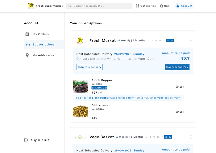
Checkout flow

- Detailed breakdown of the grand total is given including the sub totals of each plan.
- The bill also provides a feedback highlighting the amount saved through the subscription discounts. This type of feedback can help to incite a sense of joy and satisfaction in the user, which can encourage them to continue using the product and even recommend it to others.
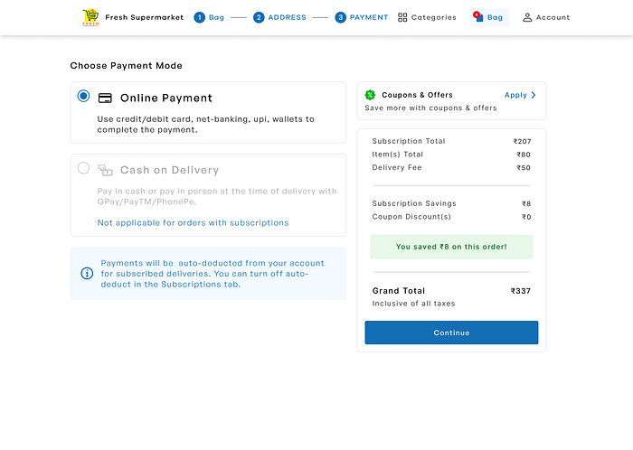
- An info card to communicate to the user where and how they can turn off auto-deduct and switch to manual payments for scheduled deliveries. Incorporating informational cues in the user interface is crucial to establish transparency and build trust with the user. These cues serve as ethical design principles that empower the user to make informed decisions and take control of their digital experience.
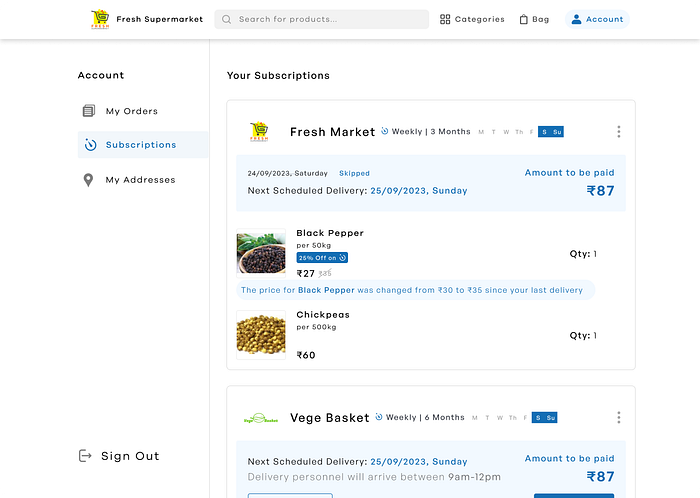
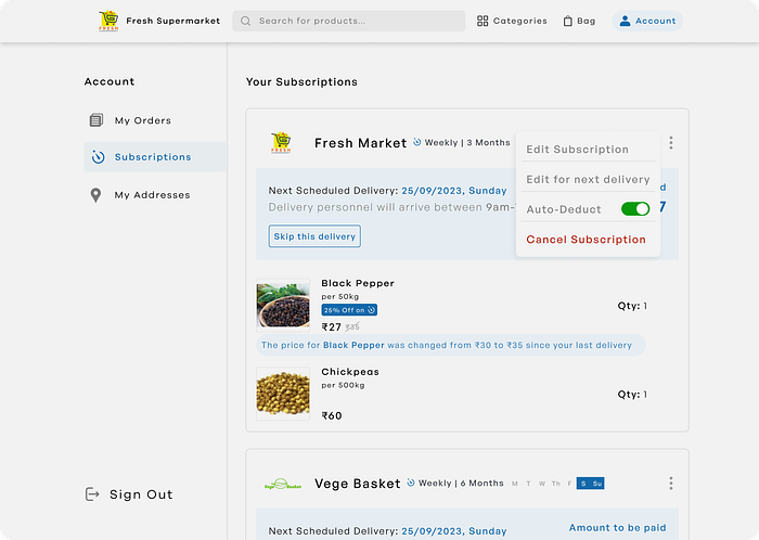
Active Subscriptions
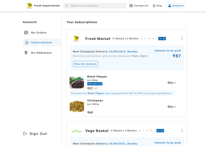
- Through the Subscriptions page in the profile tab users can view their current active plans and perform other actions.
- FMCG and grocery products are very susceptible to price changes. It is highly likely that users will often forget the prices of the products after they have subscribed to them, so any such changes in prices by the vendor will go unnoticed by the user. These fluctuations in prices are highlighted with the product card so that user remains informed. Color coding has been used to draw attention to the price change.
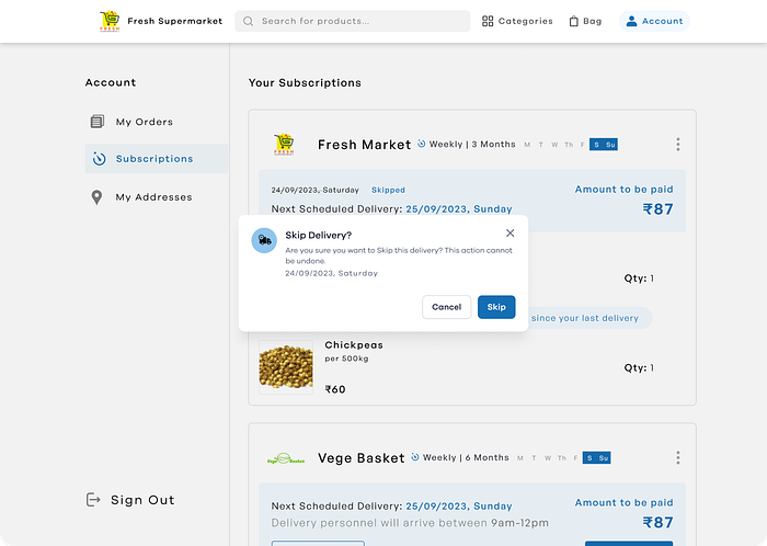
By taking such an user-centric approach to design and emphasizing the importance of clear and transparent pricing information, it is possible to create a positive user experience that builds trust and encourages continued engagement with the product. - There might be instances when the user is not available to collect a scheduled delivery or they might have surplus of commodities and might not need a restocking, for such instances they can skip the next scheduled delivery. Its important to consider human error when designing a product and providing that flexibility for misjudgments so users can correct their mistakes
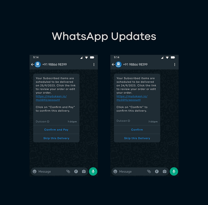
WhatsApp Updates
Key Takeaways
- Recognition-based recommendations improve the user experience by reducing cognitive load.
- Highlighting savings in the bill creates a sense of satisfaction, increasing user engagement and encouraging recommendations.
- Providing clear and transparent information establishes trust with the user.
- Focusing on user-centric design principles builds trust and encourages continued engagement with the product.
Scope for the future
I am aware that my solution isn’t perfect and still has to address some important edge cases and also take into various business considerations to cater to the stakeholders as well. This is the best of what I could come up with the insights and resources I had access to. Since it isn’t perfect it means that there’s scope to work on it more and that’s something that excites me. With the right feedback and guidance I would be glad to make improvements on this project to address all facets of this problem statement.

