“Never-ending tales of lines & outlines”

When I started my design career I felt line is just a distraction that I should avoid in my designs. but as my career progressed I learned, Lines and the use of Outlines/Borders are making my design look more stable. It adds a magical balance. and there’s infinite use for them.
👉 By writing this post I will share my observations and whatever I have learned through all these years. If I am wrong anywhere then do correct me.
I am a Product Designer so I will not tell everything from A to Z about lines & Outlines but whatever I learned about them and how I see them.
Why lines and the use of outlines should be an eternal part of the designs?
I have divided this reading into two parts:
a). Lines
b). Outlines/Borders
A). Lines

The line is a visual element in design that is used to separate, organize, or emphasize content and draw attention, and so forth.
Lines are also called interchangeably strokes in Graphic Design terms.

A line can add Energy, Emotions, and Movement.
Different Types of lines -
- Solid
- Dotted
- Dashed
Generally, Lines can be - Horizontal, Vertical, Diagonal, Curved, Thick, or Thin.
Some Psychological responses:
i). Curved lines (suggest comfort and ease)
ii). Horizontal lines (suggest distance and calm)
iii). Vertical lines (suggest height and strength)
iv). Jagged lines (suggest turmoil and anxiety)

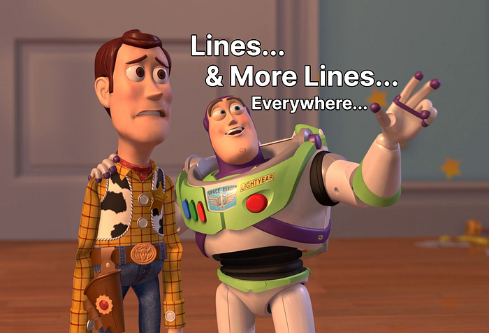
Pretty boring at this point, Right? Let’s jump into some practical examples.

A). Lines in UI
Example 1: Context Menus
A context menu is a menu that contains commands specific to the object that the cursor.
These are also sometimes called “right-click menus” or “right mouse menus”
Observe how each function/feature is divided from the rest of them by using a line. Every feature is grouped together.
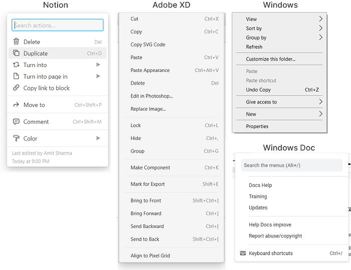
Let’s break Notion Menu
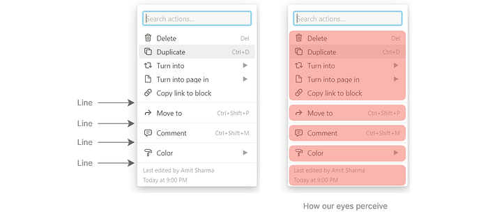
A line is helping our eyes to see the features like groups. The second screenshot shows how our eyes perceive this design. For our eyes scanning becomes very easy.
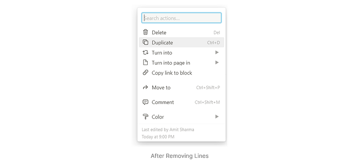
Observe the above image. Yes, the Top sections look grouped or one set of features. But after that, the whole hierarchy looks different to the eyes.
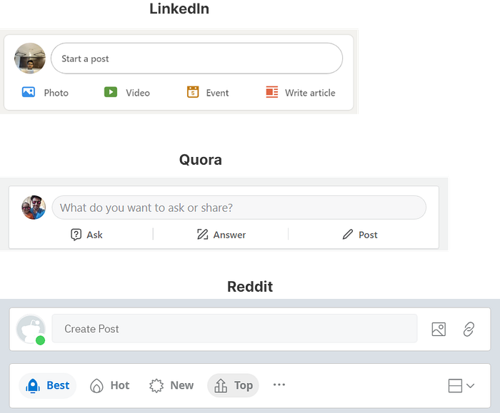
Example 2: Profile Menus
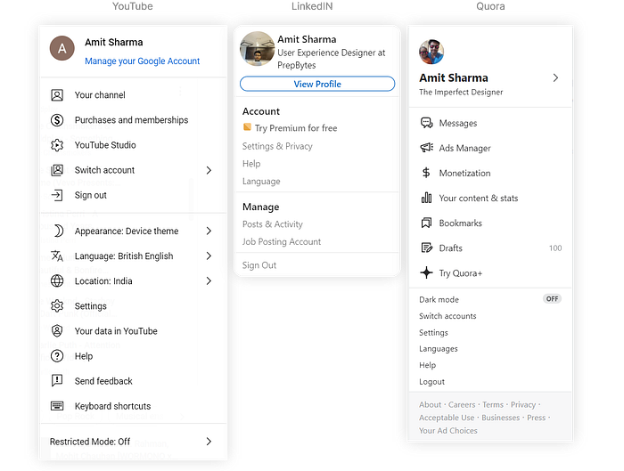
See the below example of the Pinterest Profile Popup. No use of lines, But they have grouped the content very well.
Example 3: Post UI design
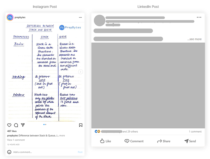
Notice in both screenshots at the end of the section that there is a line to separate comments, like and etc actions from the rest of the content.
→ Lines in Graphic Design & in general design.
The most common uses in layout design are Underlines, header and footer separators, and horizontal line design, but that’s not it. There are a plethora of things you can do with lines.
Example 1: Poster, Logo, Resume, Logos, Infographics, Geometric patterns, & Etc
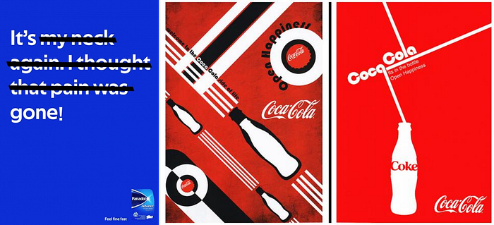
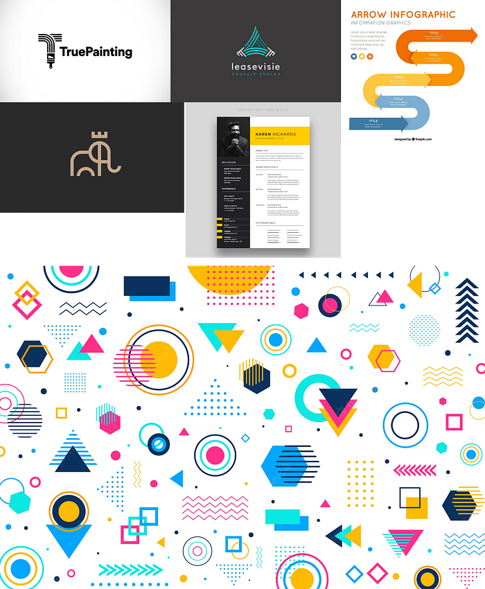
Observe how lines are being used in these references and it can create a huge impact in your designs, be it in UI design, Graphic Design, and design in general. You won’t always see lines in designs but also in real life too. Just observe.
Summary About Lines:
- A-line can help in Breaking sections.
- it adds a visual balance to the designs.
- It helps in Organizing content.
- By using lines, it creates a hierarchy, it emphasizes the content from each other.
A line is a beautiful visual element to make your design look nicer. There is n number of designs be it Graphic, UI, or any kind of design, where lines are being used. Observe and get obsessed with them. There are no rules, Just explore.
B). Outlines
“A line or set of lines enclosing or indicating the shape of an object in a sketch or diagram.”

I will talk about two things here,
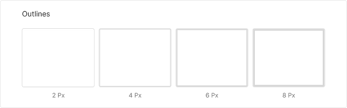
- Outline: It only includes the exterior information. You will see in the image below that it is making the boundary of the objects. You won’t find too many details here.
2. Contour Lines: It contains details like form, weight & mass, not just outlines where you will only see a boundary around the objects.
Watch this simple and short video to understand the difference.
https://www.youtube.com/watch?v=MZfeMZshnYo
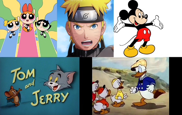
Alright now, Look at this picture →
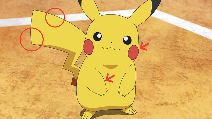
What designers see:
- Observe the outline around the character illustration.
- Disney and many companies, and plenty of artists use this pattern where they would add these contour lines to their characters to create a sense of shape. and the character should not merge with the background.
This outline is called Contour Lines.
A line is drawn on a topographic map to indicate ground elevation or depression.
I have divided the image into two parts. The first one has contour lines and the second part is without them. I have erased some of the details.
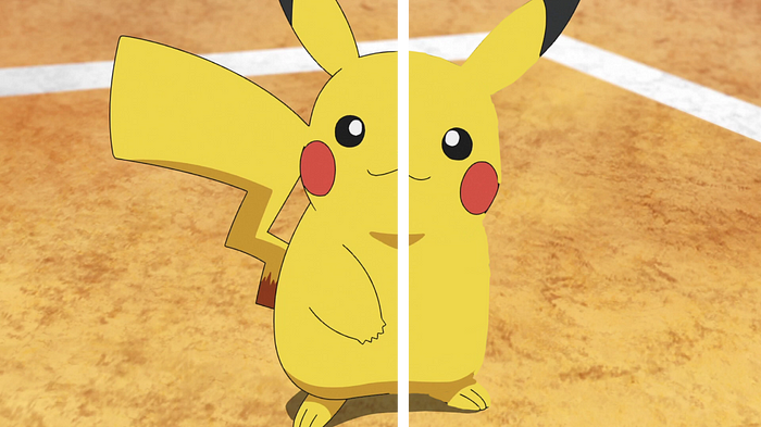
Notice how on the second side of the image, a sense of shape is lost. It looks incomplete. It’s merging with the background.
Observe these famous characters. Notice the contour lines.
How this Contour lines principle is changing the UI game totally?
Let’s dig deep into some used cases to understand:
Example: UI Designs
Observe the lines around the shapes. It’s the outline that is creating a sense of shape & how the outline is separating it from the rest of the background.
This is the random principle of modern UI designs. Whenever you are creating a shape you can add an outline.
Interestingly, YouTube’s Explore section cards have no outlines.
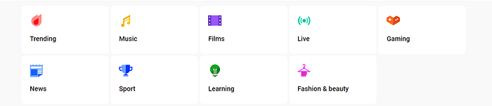
Now, Let’s add an outline around the cards to see the difference.

Things changed right? Observe how our eyes are perceiving the boxes.
Not saying that this is the wrong method or approach used by YouTube.
Let’s again recall the contour lines principle.
A line is drawn on a topographic map to indicate ground elevation or depression.
So here in UI design whenever you create a shape, to separate it from the rest of the background we can add an outline.
I mean just yourself how beautifully these tech giants have used outlines in their design system. and mind you not just with Light background.
Like Quora Navbar in dark mode.

Just like creating a component with shadow can increase its visibility and our eyes can scan it easily. Likewise, when creating a shadow, as a good practice you can try adding an outline to it.
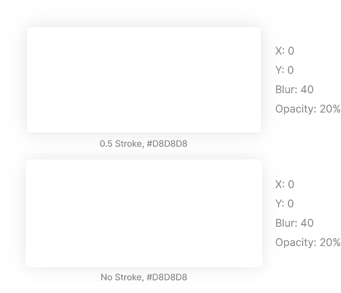
Observe this exporting window of Canva:
Just read this excellent insight from Google.
Material Design conducted 36 interviews with fifteen low-vision participants to better understand how shadows and outlines impact an individual’s ability to identify and interact with a component.
Research findings included:
- Shadows and outlines are just one of many attributes of an element that impacts a user’s ability to identify it. Other attributes that affect the ability to identify an element include font characteristics, elevation, color, layout among surrounding elements, and context of use.
- Using shadows and outlines increases the ease and speed of finding a component when scanning pages.
- Using a shadow or stroke outline around a component improves one’s ability to determine whether or not it can be interacted with.
Google conducted interviews which clearly shows the importance of outline.
Let’s wrap this post quickly before you guys fall sleep
Summary:
1. An Outline can help our eyes to scan better.
2. It helps in separating the shape from the background
3. It creates an identity.
4. It gives a sense of shape to the component.
Conclusion:
In almost every modern design system you will find this principle. Surely not a founder of this principle. But yeah by writing this post I expect people to get amazed with design in general. it’s lovely.
I am not Nostradamus
I have seen people go crazy about colors, typography, hierarchy, etc things. what I feel is a line & outline are equally a very integral part of the design.
I am not saying that you add an outline in every shape or component you build. There’s no law. Feel free to use it or don’t. I am a designer who gets very obsessed with design.
I say this to every designer who is a beginner,
“Just fall in love with the design, be obsessed, Observe things, Explore things, Fail, Fail often. Because by failing you will be learning.”
Thank you so much for investing your time.
Note: Correct me if I am wrong anywhere.
Footnotes(Some of these excellent websites literally can teach you all about lines and outlines. Do check these out)

