The Art and Science of Color Theory: Neutral Colors

Neutral colors palette includes black, white, gray, tans, and browns. Usually they’re combined with brighter accent colors, but can be also used on their own to come up with very cool designs. Being their nature a neutral one, they’re very affected by the colors around them.
Black

Introductions are not necessary here: Black is the strongest of the neutral colors and, just like all colors, has two faces: one positive, the other negative. Black color psychology can be associated with evil, death or mistery. In many Western countries it is often associated with mourning. In some others it is a symbol of rebellion, or Halloween and occult.
It is widely used for typography thanks to its neutrality, but also in more elegant and professional designs. Depending on the colors it is combined with, can be traditional or modern.

White

It is at the opposite end of the spectrum from black. But it can work well with (almost) any other color.
White color theory is associated with purity, cleanliness. In many western cultures it is worn by brides on their wedding day. It is worn by specialist in the healthcare industry such as doctors or nurses. Angels are also represented with this color.
On the other hand, in the Eastern part, white is associated with mourning and death, just the opposite of black we might say.
In design, white is often considered a neutral backdrop to give other colors a larger voice. Its versatility conveys minimalism and simplicity.

Gray

Here’s our third fellow neutral color: Gray. It can be considered a sad color, and a perfect replacement of white, if used in its light form, and for black, if used in its dark form.
More conservative than black, it can also be considered a modern color. In many cultures it is a representation of mourning, but also widely used to give corporates more professionalism.

Brown

Brown, reminiscent of the earth, wood, and stone, embodies a natural warmth and neutrality.
It evokes associations of dependability, reliability, and a rooted connection to the natural world. At times, it’s labeled as unexciting.
In design, brown is commonly used as a background color. It helps bring a feeling of warmth and wholesomeness to designs.

Beige and Tan

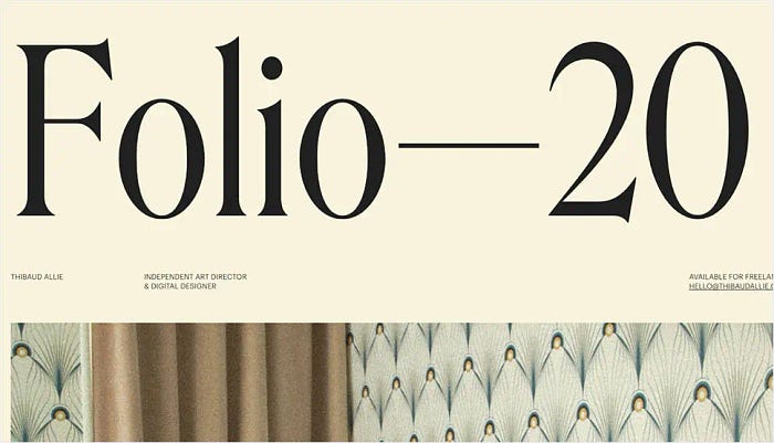
Beige holds a unique position in the color spectrum, capable of adopting either cool or warm tones depending on its surrounding palette. It encompasses the warmth of brown and the crispness of white, offering versatility in its visual appeal.
Like brown, it’s sometimes perceived as understated. In many cases, beige is considered a conservative choice, often reserved for background applications. Additionally, it carries connotations of piety.
In design, beige commonly serves as a background, frequently integrated with textures resembling paper. Its chameleon-like quality means it seamlessly integrates with surrounding colors, subtly influencing the overall impression of a design, particularly when paired with other nuanced hues.

Cream and Ivory

Ivory and cream, exuding sophistication, blend the warmth of brown with the crispness of white. These subdued hues carry an air of refinement, often resonating with echoes of the past.
Ivory, in particular, exudes a serene quality, emanating the purity akin to white with a subtle warmth.
In the realm of design, ivory introduces an element of elegance and tranquility to a website. When paired with earthy tones like peach or brown, it infuses an organic essence. Additionally, it serves as an effective tool to gently illuminate darker shades, avoiding the starkness that white might bring.

As we conclude our exploration of color theory, we’ve uncovered the essence of hues, harmonies, and their profound impact on design. Now, armed with this foundation, let’s embark on a new chapter, delving into the core principles of visual design. From layout to typography, we’ll unravel the fundamentals that bring designs to life.
Join us in this exciting journey, where creativity and technique converge in the art of visual storytelling!


