Case study: your pocket bank kit
🌥 Backdrop…
The banking sector has historically been a monopoly, with the world’s biggest
institutions maintaining a relatively unchallenged hegemony. Many of the market leaders, including the likes of JPMorgan Chase and HSBC, have roots going back more than 150 years, and market capitalization is measured in hundreds of billions of dollars.
Online banking has become a familiar part of our daily lives. No longer do people need to go to the bank to tend their banking activities or have to call the telephone number of the bank to do telephone banking. However, these methods of banking still exist.
Traditional brick-and-mortar banks introduced customers to digital channels
without really pressing home their advantages. Although mobile banking
has been available for the best part of a decade, the apps offered by high
street banks have been hampered by poor functionality and security
concerns.
With the rise of acceptance of NeoBank internationally, I picked up this subject to learn and present my interpretation of the banking systems eccentric to the everyday user in India, for India. Most of us here have more than one bank account, and, any two bank accounts are not the same however could be similar. As a professional, I have had my experiences working with financial institutions and banks (investment banks, corporate banks) before my UX case study on NeoBanks, so I think having a background helped!
🥅 The Goal…
To design a NeoBanking app for India that provides end-to-end banking and financial service to customers with multiple bank accounts, simplifying banking and is a single destination for all banking operations and more.
🎯 The Scope…
To create a banking system fundamentally different from traditional banks,
providing, linking of multiple bank accounts, hassle-free account creation,
seamless payments, smart reporting, user-friendly interface and
more under a single mobile app.
🚠 High-Level Objectives
- To create a type of direct bank that is 100% digital and
reaches users on mobile apps. - To digitally reinvent the practices and processes associated
with traditional banking. - To create a userfriendly banking user interface to improve
the experience of both parties. - To host a safe financial environment.
Later, while creating a strategy, you will see how these high-level objectives got translated to a meticulous user-centric winning formula.
🪂 The Case Study journey

🔬Research
📈 Market Research / Secondary Research
People’s trust in Banks decreasing? 😎 → 😮🕶🤏🏼
The results of a YouGov (a British international Internet-based market research and data analytics firm) survey conducted in 2017 tells the story of individual's trust in their banks.
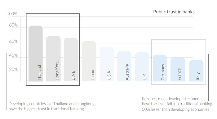
Just 37% of the individuals in Italy, and 27% in France stated they trust their bank.
27% of people in Japan think banks act in the best interests of their customers
People in emerging markets and developing countries like Thailand, the banks have managed to hold the trust of individuals with a percentage close to 90.
Thus, In recent years, the approach to financial regulation has opened the sector up to the greater competition. This has allowed neobanks, which are institutions without physical branches where customers organize their finances entirely via digital channels, to thrive. Neo Banks are reinventing the practices and processes associated with traditional banking.
🥇 So, what is a Neobank?
A Bank That Is 100% Digital And Reaches Customers On Mobile Apps And Personal Computer Platforms Only.
(They don’t have their own bank license but use partners to offer bank-licensed services. Apps that facilitate the administration of accounts and credit cards are typical neobanks they rely on customers having an account with an underlying bank with a corresponding bank license but offer a user-friendly interface. The extent to which customers are aware of the underlying bank relationship day to day may vary.)
Examples: Yolt (ING’s launch in the UK retail banking market), Lunarway, Webank (Tencent, the company behind China’s most popular social l media platform WeChat), Moven.
🥈 What about Challenger Banks then?
A modern form of banks to challenge NeoBanks, but owned by traditional banks.
(Challenger banks are similar to NeoBanks. They are a modernized form of a traditional bank, which functions without physical offices or branches. Have their own bank license, hence, have the right to offer banking service.)
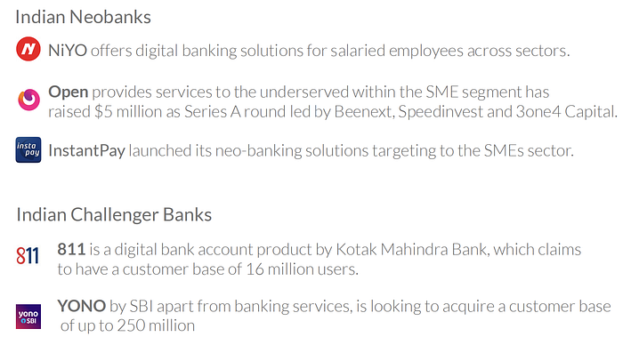
Example: Kotak 811, YONO SBI, Yolt
📊 Statistics for Neobanks and Challenger banks
The research study by HTF Marketing Report provides forecasts for Neo and Challenger Bank investments till 2022.
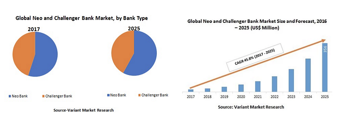
Forecast, by Players, Types, and Applications)
The rate of return expected for money invested on NeoBanks is to grow more than 12 times from its beginning balance to its ending balance.
Continental Breakup of VC Funding, 2019

🎶 Ching-Ching, Bling-Bling! 💵 💶 💷 💴

Neo Banks & Challenger Banks In India 🇮🇳
With open banking emerging in India, fintech, and banks collaborating at various wavelengths, and the RBI focusing on digitalization and financial inclusion, neo banks have started to make their presence felt.
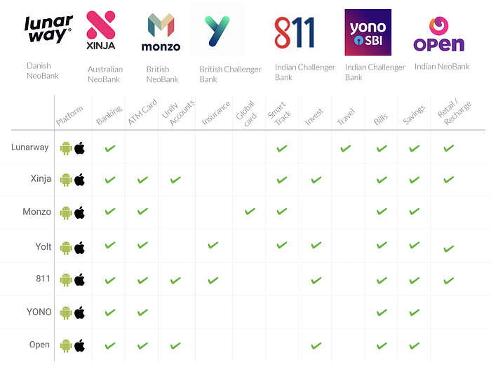
🤼♂️ Competition Benchmarking
Taken into account both Indian🇮🇳 (Kotak 811, Open, Yono SBI)and overseas (Lunarway 🇩🇰, Xinja 🇦🇺, Monzo 🇬🇧, Yolt🇬🇧) neobanks and challenger banks.
👥 Stakeholder Analysis
Created using ‘Miro’, a mind mapping for a user and his dependence on a bank.

👤 User Persona Exploration
The target audience for my research was mainly people between ages of 24–40 with jobs, businesses, and even entrepreneurs. For all these users have a different financial pattern and also this age range dominated the digital financial footprint.
During my research, I managed to interview 7 individuals from different backgrounds and from different tier of cities as well. Apart from the 7 individuals, I managed to speak to a few more on their financial handlings but off-record, however, this exercise added useful insights while creating personas.
🎙 User Interviews
Blurring the names of the interview participants, as promised.
Participant #1 (Salaried, Manager)
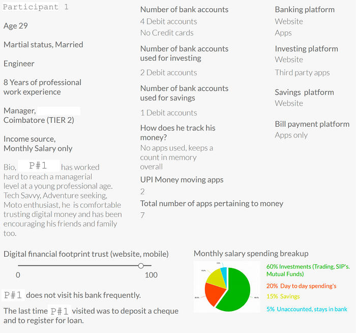
Participant #2 (Salaried, Consultant)
Participant #3 (Salaried, Analyst)

Participant #4 (Artist, Entrepreneur)

Participant #5 (Salaried, Stock Markets)

Participant #6 (Salaried, Specialist)
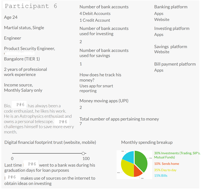
Participant #7 (Businessman)
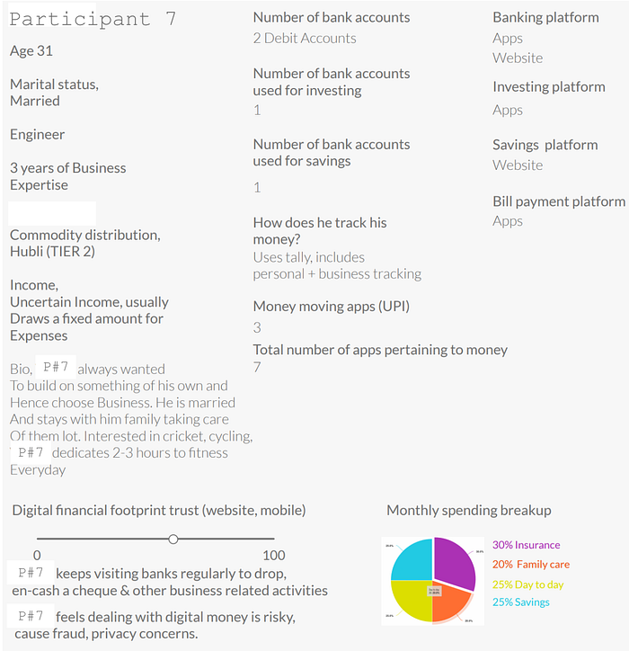
Some quantified data from the interviews. I agree 7 is a small number and a small sample set cannot represent the entire age range of 24–40. However, the insights gained were interesting.

Along with these interviews, I have had conversations with a few people I meet every day. Asking them about their experiences with banks, applications, investment, and money tracking. This helped dilute the inclination of the 7 users whom I interviewed.
🌏 The Banking Ecosystem, from the eyes of the user…
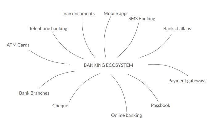
A user through his/her bank account is linked with his/ her financial data which is kept safe under the assurance of the bank. The banking industry has evolved from being paper-based to becoming paperless.
It is also a known fact that until recent times banking with its policies was only an option for the affluent. Times have changed and so has banking, becoming more appealable to any commoner and very recently to the underprivileged.
And thus, attracting both Businesses and Personal banking, the banking ecosystem today is not only bound to websites, apps on laptops or mobiles but still exist in the physical form being the branch office itself. Adding to that, checkbooks, passbooks, challans, acknowledgments, ATM receipts, certain onboarding procedures, and more still exist on a paper form. An active user, who uses bank accounts frequently with time only develops more such data in physical or digital forms. Hence, leaving the banking ecosystem with loose ends.
The challenge here is to understand the processes involved in the physical ecosystem and to create seamless experiences between the digital and physical world and between different software.

🎭 Current User Journeys, based on the interviews
The 7 participants were given 6 different scenarios with each scenario, the views and opinions of the users for each task were made a note and were gauged based on averages for each task. So, the most common thing-to-do were broken down into tasks and sub-tasks. Any extra or different point of view by the participant was later grouped respectively with the most inclined task.


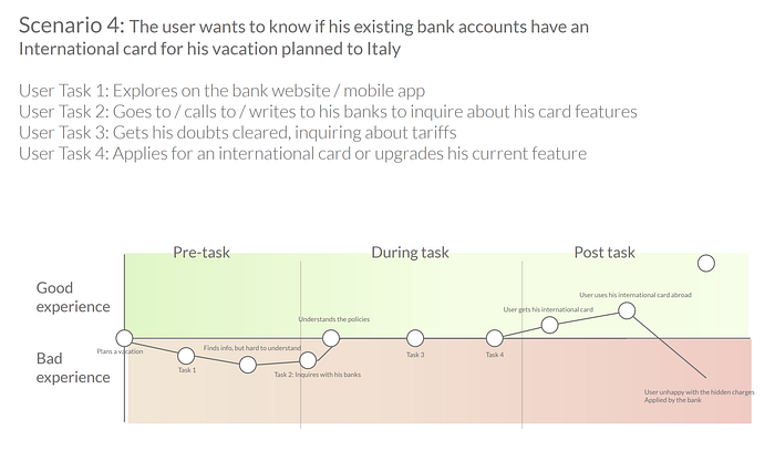

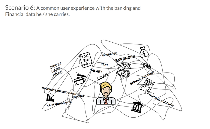

That completes the research part of this study, however, this is just a selection of the best available information from my research scrapbook. For detailed research on the previous sections, I have maintained a document that I am sharing here. Feel free to visit Secondary Research.doc
😕 Some common pain-points
- Lack of transparency between banking Policies and norms, awareness of bank account features. Vocabulary used is not simple.

- Lack of user interest and time to learn or get used to banking on applications or visiting physical banks. Banking pictures a complex image for most users. Technology shyness.
- Multiple bank account creates multiple Banking credentials, thus, is challenging to the user memory. Users go to multiple destinations For various financial operations be it A bank, branch, app, website.
- It takes 7 septs on a website and 8 minutes On average to block bank offer calls which bug the user several times a day. People from India, do you get annoying advertisement calls from your banks when you’re in the middle of something important?
💡 Strategy
After the research, it was time I revisited my objectives with this study. This was for me, a very exciting phase of this study as I got a chance to reflect on my research findings. The perspective gained, things changed, objectives were reinforced — for good!
- Keep banking simple, vocabulary simpler, accessibility simplest! 🚨
- Help user take a pulse of his/her existing loans, assets, investments, liabilities. Provide insights so the user gets more confident and makes a proper judgment.
- Track the user’s everyday expenses, including the smallest of all the expenses. Categorize them into groups and give a visual representation of the same.
- Users having 1 or more bank accounts should be able to access, transfer, receive, encash a cheque, track status, know more about their accounts and offers — all under one application. This looks overwhelming, but the sign-up process must be seamless and easy.
- Users must be able to create their goals and saving to achieve the goals should be encouraged by the application. The user will be able to give access to his created goals to whomsoever he wishes to, be it a friend, parents, children, wife, sibling, mentor. The goals will have a social touch, wherein the looped people will be able to react, comment, and advise on goals.
- Payments. Paying bills. Splitting bills.
- Learning must be promoted. Socialize goals.

📻 Storyboarding
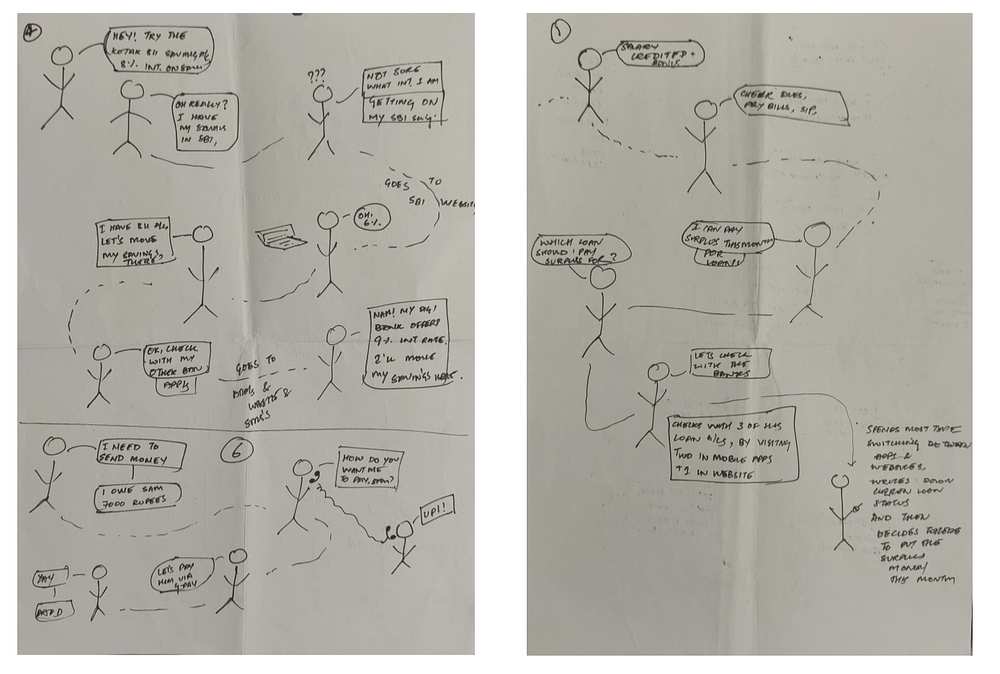
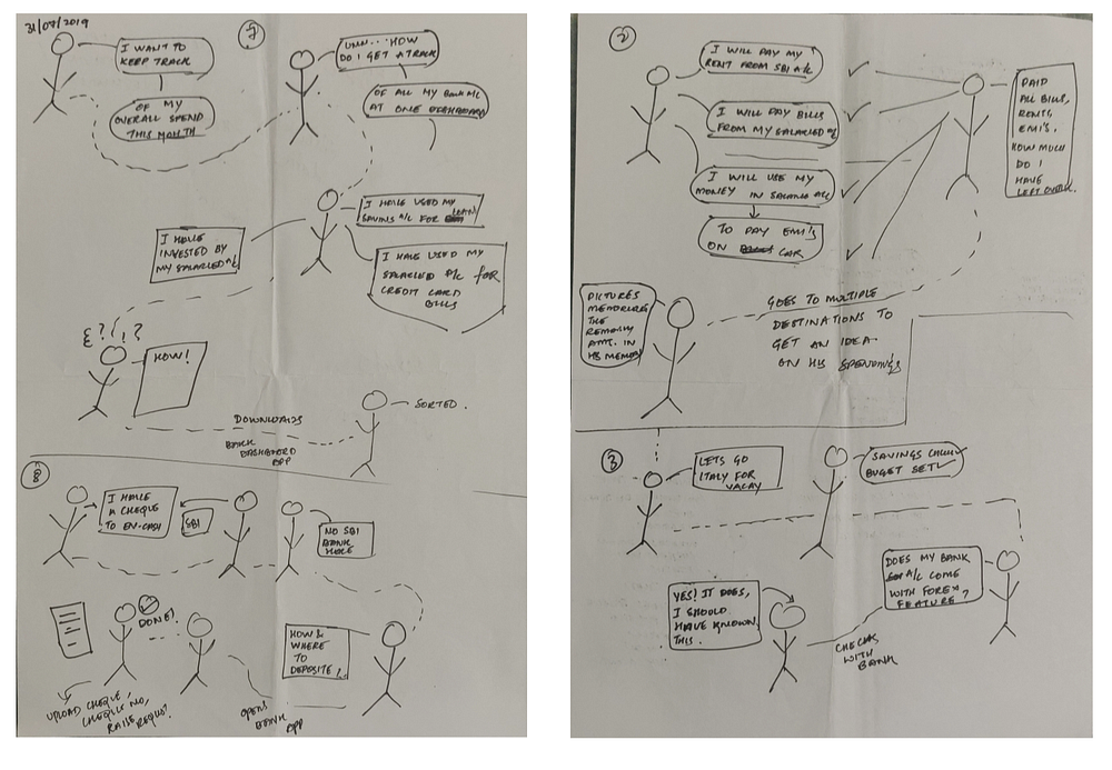
I know adding images causes like the ones below hampers readability, these are just scenarios that I will mention in each of the captions.
Picture 1 (left), Picture 2 (right)
Picture 3 (left), Picture 4 (right)
🤔 ‘How Might We’ statements
- How might we help the user sort their banking portfolio because he /
she is prone to have their financial data in different forms? - How might we reinvent the practices and processes with traditional
banking? - How might we make users aware of their bank account features
because the majority of users are unaware of the same. - How might we unify & provide access to the user's multiple Bank
accounts which are linked with loans, EMI’s, savings, Investments, etc.
because the current user has different destinations to perform
respective tasks. - How might we provide a timeline to users towards the fulfillment of
his/her financial goals? - How might we create access to basic banking i.e. live interest rates,
FD & RD plans, cheque encashment, passbook, request checkbook,
etc. - How might we make tracking of expenses effortless and smart?
- How might we host a safe financial environment for the users?
- How might we create a dashboard for the user to make aware
the user of his/her banking goals? Dashboard of Loans,
SIP’s, Savings, etc. - How might we educate the user on finance, savings, investments, tax filings, etc.,
🎨 Proposed touch-points
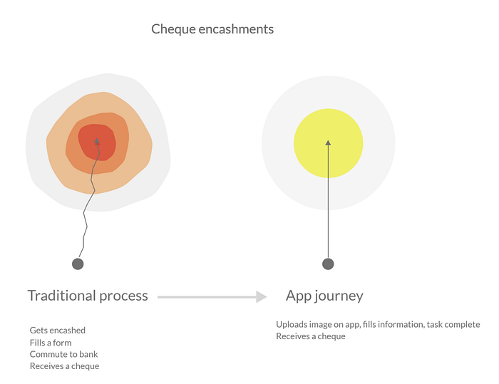
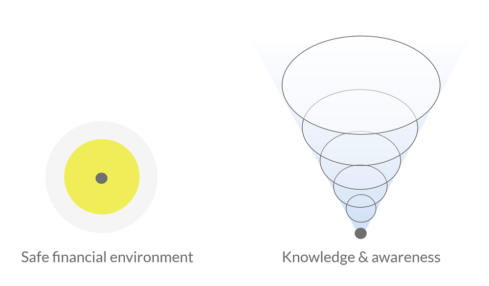
Iterations of the proposed solutions for the pain points, journeys, stories told above. Here, I have tried to illustrate with abstract elements where I introduce a solution to its problem.
Digital Cheque Encashments, translating traditional experience to digital-only.
Getting more aware of your bank and bank accounts, awareness about bank account features. Below is a scenario where a user wants to know the best rate of interest for his to park lumpsum amount.

Overall experience about banking, this summarises most of the pain-points, meeting its solution. A clean, on-point, seamless banking application...

Moral objectives of the proposed application. Learning, education, accreditation the learning, keeping the way the app deals with security transparent and open and modest. The user’s trust is important, hence, not hiding anything under the carpet.
🏗 Information Architecture
As an iterative process, the scope of the application was measured with the information architecture shown below. The application, had to perform four distinct and important functionalities i.e., Linking of accounts (all that a bank app can do, this too should), User Goal Settings, Quick Money Transfers, Moral and Community aspects of financial education. These helped me define the primary navigations of the application and connect the secondary navigations to primary navigations and lesser important routes.

👨🏻💻 Design
Phew, finally! After all the juggle and struggle I was relieved to reach the Design stage of this product. Oh wait, this is the first time I called the product a product :)
Designing, for me, means freedom and responsibility. After all the thinking phases, I was hoping I could create something reasonable.
🥁 Bankkit — I named my product before I dived into the design. Why Bankkit? Cause there are two ways you can look at this, and both of them convinced me.
- Bankkit — A banking kit, Bank-kit 😅
- Bankkit — referring to Nike’s famous advert lines ‘Just Do It’. Just Bank it 😅😅
As a practice, I started off with creating paper wireframes.
✍🏼 Paper Wireframes
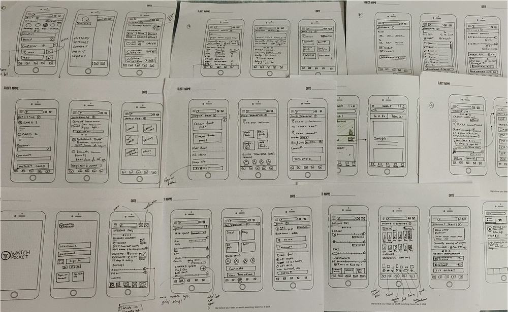

Grey-scale wireframes next!
💻 Greyscale Wireframes
📌 Usecase 1: Sign-up and Onboarding
At the outset, the proposed sign-up process. A seamless, transparent, and simple onboarding. Here, the user, i.e. Vivian:

- Screen 1: Opens the application.
- Screen 2: Registers his email for sign-up.
- Screen 3: Validates his mobile number with OTP.
- Screen 4: The app fetches a list of bank accounts associated with the number. Both debit and credit.

- Screen 4: Vivian now decides and selects the bank accounts he wants to link with the application.
Both credit and debit. Selected accounts: HDFC, ICICI, AXIS, SBI, and SBI Credit. Vivian excludes CITI bank.
By a long press on the tiles, the user should be able to prioritize the order of bank accounts. Say, HDFC Bank which is his salaried account and the most used account gets the first priority.
- Screen 5: After selecting the bank accounts, Vivian gets to choose what would he like to see on his banking dashboard from the selected accounts.
For example, on the screen below:
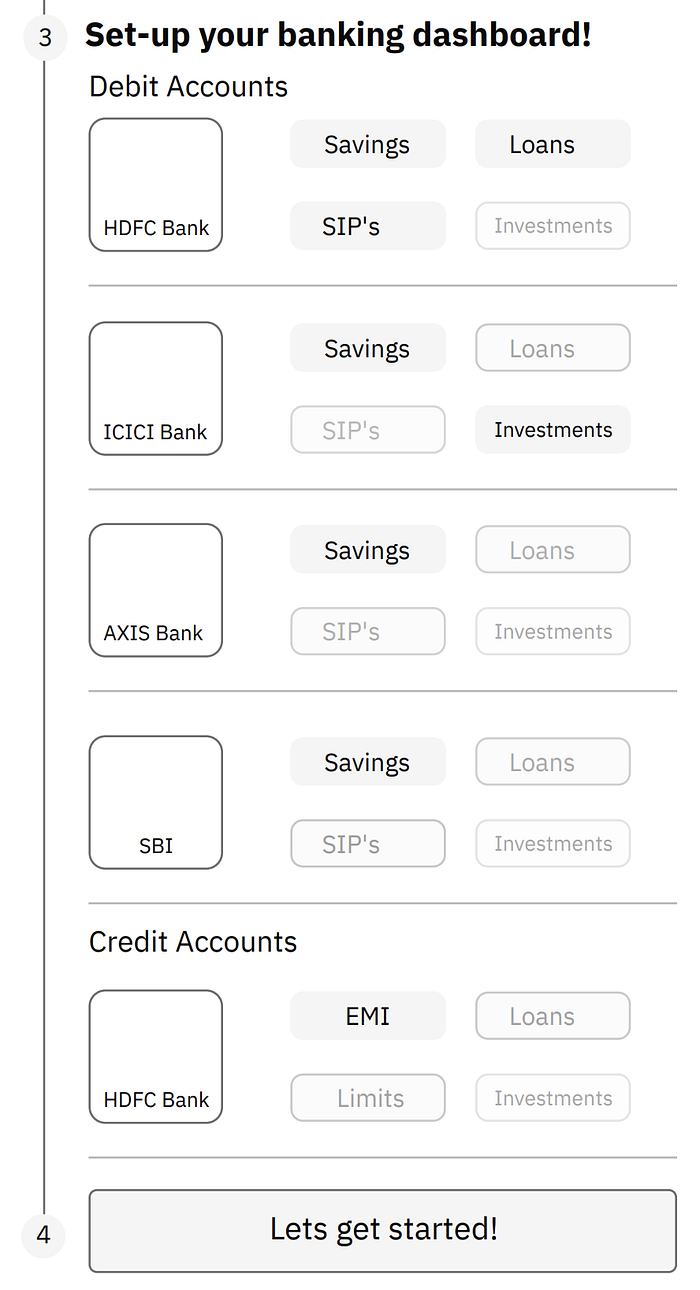
For HDFC Debit Account, Vivian selects savings, loans, and SIPs. Excludes and excludes investment.
Similarly, for ICICI Debit Account, Vivian selects savings and investments but excludes SIPs and Loans.
Likewise, for AXIS and SBI Debit accounts, Vivian only selects Savings. And only EMI’s for his SBI Credit card.
This sets up his dashboard.
- Screen 6: The HOME screen. Based on the priority selected, the accounts will be reflected in the shape of cards, with their balance shown upfront along with other highlights of the account.

For example, in the first account i.e. HDFC bank, the current balance is INR 40,000. Along with the balance, the interest rate being applied i.e. 4.92% is also being shown. Both, dynamic. Towards the left corner of the card, some icons are being shown:

🌎 The Globe Icon: Indicating it's an international account.
📈 The Line Graph Icon: Indicating there are investments associated with this (HDFC) account.
The short-text ‘LN’: Indicates the active loans in the account.
🐖 The Piggy-Bank Icon: Indicates saving instruments like Fixed Deposit and Recurring Deposit being associated with HDFC bank.
Along with it, the card credentials, expiry date, and registered name for the account holder are also shown.
📌 Usecase 2: Navigating from the Home screen to the detailed page of the application. Also, navigating to the Expenses and Transaction sections of the application.

- Screen 1 here is the Home screen, which is explained in the previous use case.
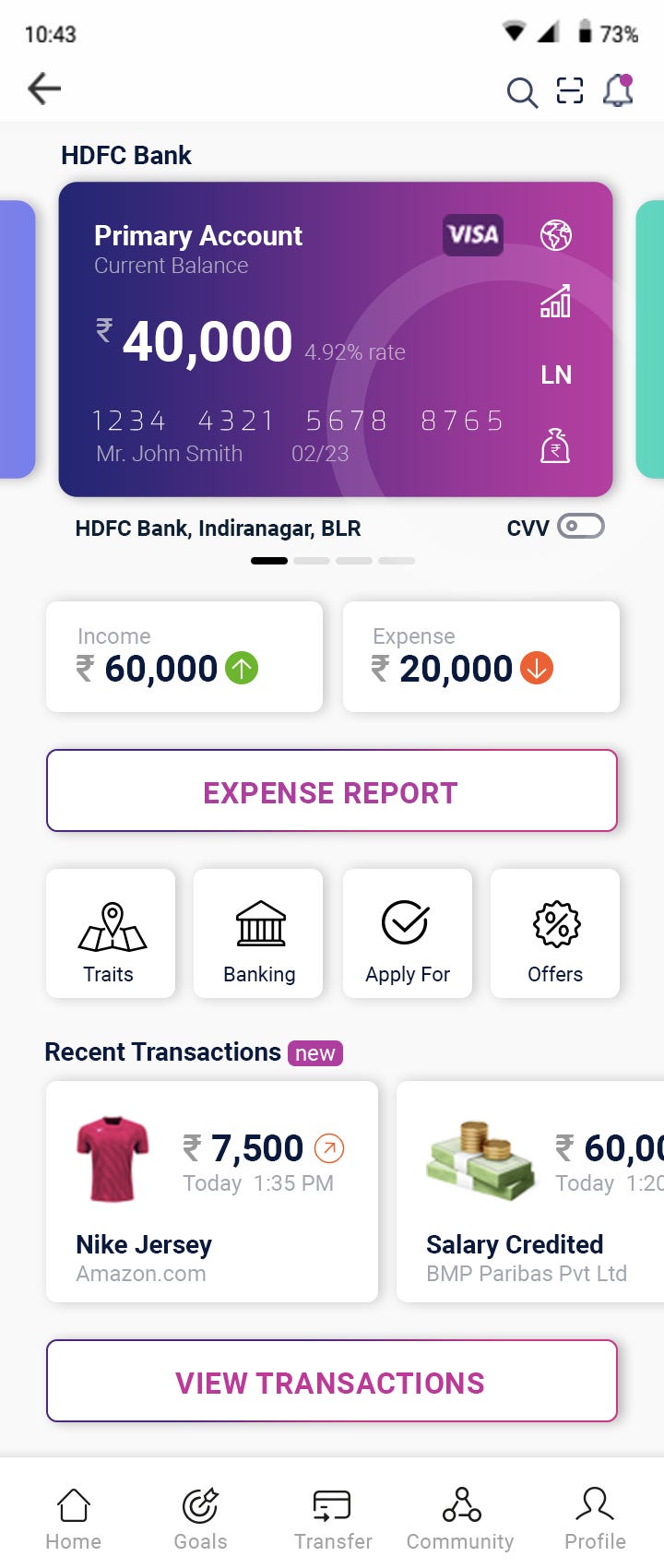
- Screen 2: This is the detailed page of a particular bank account. Vivian, our user here has selected HDFC Bank from the Home screen, which directs him to the detailed page of the HDFC account. An important feature here is, on swiping left or right, the application switches from one bank account to another. Making accessibility easy and fun.
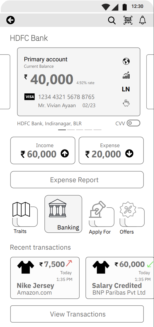
The CVV is kept hidden, for security reasons with the help of a toggle button. Interacting with the toggle should ask for a password or fingerprint validation of the user, and, only then display the CVV.
The first section of the detailed page, the income versus expense tile. Gives an overall credit versus debit numeric overview. Followed is an action button, called, ‘Expense Report’. The expense report is in continuation o the credit versus expense tile.
Below the Income vs Expense, section is the crucial ‘banking’ section, where the most becoming navigations of a banking app are defined.
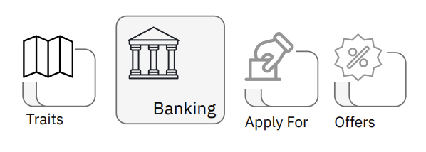
Traits: Account information, features, characteristics, limits, free transactions, transfer limits, international rates, etc., fall under the umbrella of traits.
Banking: Passbook, e-statements, cheque encashments, cheque encashment status, hotlisting a card, blocking bank offer calls, etc., are grouped under banking.
Apply for: Loans, Internation cards, EMIs, Passbook, Chequebook, Debit Card, Priority cards, etc., fall under the ‘Apply for’ category.
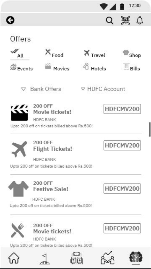
Offers: For business reasons and user’s interest, dedicated navigation for offers related to the bank account, card, and internet banking are clubbed together, categorized based on the nature of the application, and then shown in form of a filtered list with active filters.
Below these four crucial navigations, the dashboard button should take Vivian to a visual representation of the banking goals and personal goals.
Finally, the last section on the Detailed page (screen 2) is about the most recent transactions.
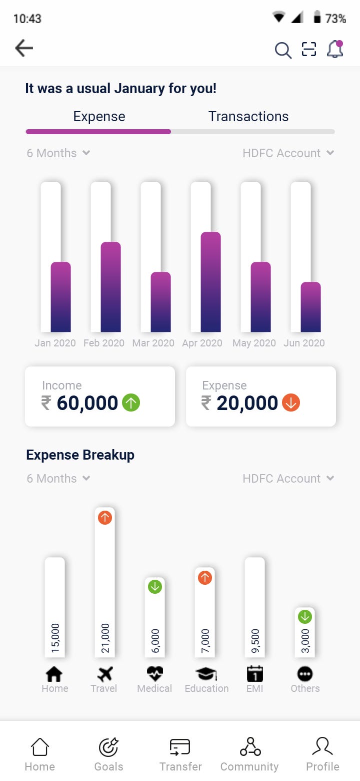
- Screen 3: On clicking the ‘Expense Report’ button, Vivian is navigated to the expense page, which is divided into two halves.
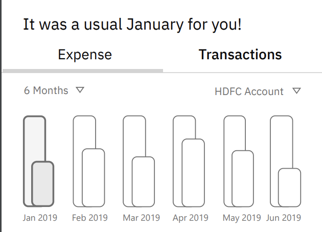
The first half is for the ‘monthly credit v monthly expense’ bar graph, live comparison. With filters to change the period range from 1 month to desired months. By default, it measures the past 6 months. Another filter here is the account filter, Vivian can include and exclude linked accounts and watch them in the same dashboard.

The second half of the screen is dedicated to ‘monthly’ expenses only. By default, it shows the categorized spending of the current month. But on the selection of a particular bar graph from the first half of the screen, the user should be able to see expenses based on the selected month. The categories in the second half are kept on-point and minimal. The expense categories include household, travel, health/fitness, food, saved/invested sum, and cash withdrawals.

- Screen 4: On clicking the ‘Transactions’ tab from screen 3 and the ‘View Transactions’ button from screen 2, the user is navigated to a list of recent transactions with the same filters, i.e., account and period. Here, the user gets to download his statement or passbook.
📌 Usecase 3: The Banking Dashboard and User Goals

- Screen 1: Again, this is the detailed page of the bank account (HDFC). On clicking the ‘Dashboard’.
- Screen 2: Vivian is now navigated to the ‘Dashboard’ screen which comprises two tabs they are:
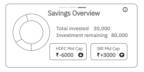
- Banking Goals, which consist of an overview of Loans, Savings (FD’s, RD’s, and more), Investments. Each type separated by cards, and each card having 3 carousels.
The first carousel is the graphical representation/information design.

The second carousel is more to the table (row and column) with quantified numbers.

The third carousel is again the summary with both, numbers and micro charts.
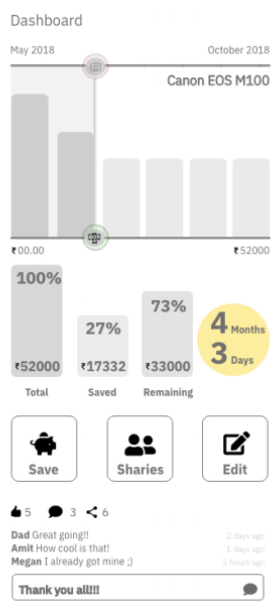
2. The User Goals, Personal Goals Tab, Create Goals. Here, our user, Vivian, can create a personal goal, set a timeline, and start saving for the particular goal. The goals can be anything, a Europe trip you’ve been planning for or that cool camera which you’ve been thinking of saving for.

The highlighted part is a goal created by the user. These are shown with cards and carousels withing cards.
The first carousel: The first card here, the user has created a goal to buy a camera. The micro-chart here shows the progress of the goal and a timeline, and where is the goal in today’s gauge. Along with the remaining period, it also shows the monthly saving contributed towards saving for buying a camera. The icons below, i.e. the like, comment, and share icons are the social part of these goals. The user can add, remove people from a particular goal.
The second carousel: The second goal, i.e., the Europe trip, the social side of this goal is shown where the user is able to see, like, delete, reply to comments and reactions.
- Screen 4: On clicking the cards, the user is navigated to a much detailed screen of the goal.
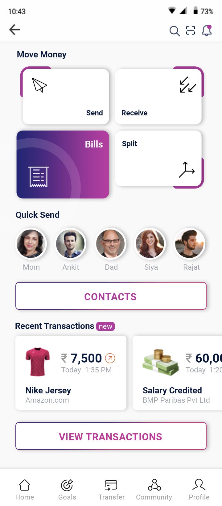
📌 Usecase 4: Money Transfers, Bills, Splitting of bills


📌 Usecase 5: Core Banking

Screen 2: Traits: Account information, features, characteristics, limits, free transactions, transfer limits, international rates, etc., fall under the umbrella of traits.

Screen 3: Banking: Passbook, e-statements, cheque encashments, cheque encashment status, hotlisting a card, blocking bank offer calls, etc., are grouped under banking.

Apply for: Loans, Internation cards, EMIs, Passbook, Chequebook, Debit Card, Priority cards, etc., fall under the ‘Apply for’ category.
Screen 4: Offers: For business reasons and user’s interest, dedicated navigation for offers related to the bank account, card, and internet banking are clubbed together, categorized based on the nature of the application, and then shown in form of a filtered list with active filters.
🧭 Bottom Navigation Bar

🧑🏻🎨 Visual Design
🎩 Brand Statement
Bankkit is a NeoBank that provides banking & financial services to
customers with multiple bank accounts in an entangled financial
environment. Helping them sort their bank account & traits/features that
comes with it, which in turn will aim at creating a single destination/platform for all banking operations.
🦾 Application Characteristics

🏁 Conclusions and Learnings
This case study was performed some time ago but uploaded on Medium only in April 2021. Although, most of the data still is relevant and the statistics showed cover up to the year 2025 in predictive cases.
For me, this case study was intense and challenging. Although I downloaded the NeoBank application of different countries, I was unable to sign-up or login. Nor was I allowed to take a tour of the application, as the banks had a strong regulatory commitment to the respective financial regulatory authorities of their jurisdiction.
Since I couldn’t refer or get inspired by their ideas, I only got a chance to skim through their websites, articles, and videos about them. This made the case study exciting as I got a chance to start from scratch and this helped me add up to my knowledge of a typical Indian bank user, the Indian banking regulations, Global banking scenario, and a lot more exploration towards the future of banking with a pulse of current trends within the banking sector. Although I had experience working with financial institutes, FinTechs, and more as my full-time job, this case study not only gave a chance for me to explore an entirely new topic but also handed me an open opportunity to exercise and practice my user experience skill-sets.
At the outset of the interviews that were conducted, I was quite skeptical as to whether the participants would be comfortable sharing their money handling and financial details, however, as I proceeded, I found that the participants are more than happy to answer the ‘right’ questions. The first rounds of interviews made me revisit my scrapbooks and pushed me to improvise.
Well, in the end, what is user experience without a user! 🤜🏼🤛🏼

Be there a chance to connect, I would be happy to get in touch! 🤝
Radhakrishna Aekbote, UX Design | UX Research | Product | Mentor

