Navigation bar with Jetpack Compose

Hello there, hope you’re doing well!
In the Android world, Jetpack Compose has emerged as a powerful toolkit for building beautiful and dynamic user interfaces. One key component that plays a crucial role in navigation and user experience is the bottom bar.
The bottom bar serves as a hub for essential app navigation elements, providing easy access to important features and enhancing usability. So let’s learn how we can develop that!
Implementation
I am using Material Design 3, so I will add the following line of code in the build.gradle (module:app):
implementation("androidx.compose.material3:material3:1.0.0-alpha12")
implementation("androidx.compose.material3:material3-window-size-class:1.0.0-alpha12")
You may encounter compatibility issues with certain library versions. To check the compatibility version of Kotlin and Compose, click here.
I am currently using the following configurations:
compose_ui_version = '1.1.1'
org.jetbrains.kotlin.android = '1.6.21'
compileSdk = 32
targetSdk = 32
kotlinCompilerExtensionVersion = '1.2.0-beta03'
Bottom Bar Icon
The first thing I am going to do is create a sealed class for all the icons in the bar:
sealed class BottomNavItem(
    var title: String,
    var icon: Int
) {
    object Home :
        BottomNavItem(
            "Home",
            R.drawable.baseline_home_24
        )

    object List :
        BottomNavItem(
            "List",
            R.drawable.baseline_list_24
        )

    object Analytics :
        BottomNavItem(
            "Analytics",
            R.drawable.baseline_access_time_24
        )

    object Profile :
        BottomNavItem(
            "Profile",
            R.drawable.baseline_person_24
        )
}
Let’s create a file responsible for our bottom bar:
fun BottomNavigation() {

}
Now, I am going to create a function and call the Compose function with NavigationBarItem to create our icon:
@Composable
fun RowScope.AddItem(
    screen: BottomNavItem
) {
    NavigationBarItem(
        selected = ,
        onClick = { /*TODO*/ }
    ) {

    }
}
You can click here to see all the parameter that you can pass for the NavigationBarItem.
I am going to set the parameters by passing what is in the item:
@Composable
fun RowScope.AddItem(
screen: BottomNavItem
) {
NavigationBarItem(
// Text that shows bellow the icon
label = {
Text(text = screen.title)
},
// The icon resource
icon = {
Icon(
painterResource(id = screen.icon),
contentDescription = screen.title
)
},
// Display if the icon it is select or not
selected = true,
// Always show the label bellow the icon or not
alwaysShowLabel = true,
// Click listener for the icon
onClick = { /*TODO*/ },
// Control all the colors of the icon
colors = NavigationBarItemDefaults.colors()
)
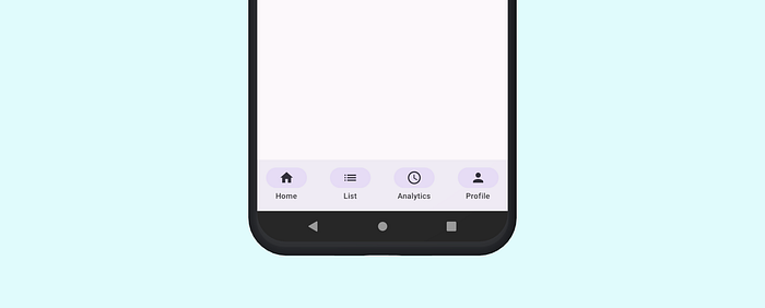
}Bottom Bar
We need to create a list of items to populate the bottom navigation bar:
val items = listOf(
    BottomNavItem.Home,
    BottomNavItem.List,
    BottomNavItem.Analytics,
    BottomNavItem.Profile
)
Now, let’s call the function responsible for creating the entire bottom bar. The NavigationBar():
NavigationBar {
    items.forEach { item ->
        AddItem(
            screen = item
        )
    }
}
My whole class looks like this:
@Composable
fun BottomNavigation() {

    val items = listOf(
        BottomNavItem.Home,
        BottomNavItem.List,
        BottomNavItem.Analytics,
        BottomNavItem.Profile
    )

    NavigationBar {
        items.forEach { item ->
            AddItem(
                screen = item
            )
        }
    }
}

@Composable
fun RowScope.AddItem(
    screen: BottomNavItem
) {
    NavigationBarItem(
        // Text that shows bellow the icon
        label = {
            Text(text = screen.title)
        },

        // The icon resource
        icon = {
            Icon(
                painterResource(id = screen.icon),
                contentDescription = screen.title
            )
        },

        // Display if the icon it is select or not
        selected = true,

        // Always show the label bellow the icon or not
        alwaysShowLabel = true,

        // Click listener for the icon
        onClick = { /*TODO*/ },

        // Control all the colors of the icon
        colors = NavigationBarItemDefaults.colors()
    )
}
Displaying a bar
In the main activity, let’s call the file to display our bottom bar:
class MainActivity : ComponentActivity() {

    @SuppressLint("UnusedMaterial3ScaffoldPaddingParameter")
    @OptIn(ExperimentalMaterial3Api::class)
    override fun onCreate(savedInstanceState: Bundle?) {
        super.onCreate(savedInstanceState)
        setContent {
            NavigationBarTheme {
                Scaffold(
                    bottomBar = {
                        BottomNavigation()
                    },
                ) {}
            }
        }
    }
}
You can customize your bottom bar however you want, but pay attention to following the best-practices of Material Design.
Conclusion
The Navigation component can be a great ally when developing a navigation bar. With the combination of Material Design 3 and Jetpack Compose, developers can easily create a bottom bar.
Happy coding ❤


