Navigate to the top: Essential strategies for creating intuitive navigation
Designing for user success: Tips and techniques for crafting intuitive navigation

Navigation is an essential element of user experience design, and it plays a crucial role in determining the success of a website or app. When navigation is intuitive and seamless, it helps users to find the information they need and complete their tasks quickly and easily. On the other hand, poor navigation can lead to frustration and abandonment, causing users to leave the site or app and seek out alternatives.
In this article, we will explore the importance of intuitive navigation and provide tips and strategies for creating it. By following best practices for navigation design, you can improve user satisfaction and increase the chances of success for your website or app.
The importance of intuitive navigation
Intuitive navigation is critical to the success of a website or app. It helps users to find what they are looking for quickly and easily, and it guides them through the user journey in a logical and seamless manner. When navigation is intuitive, it reduces frustration and improves user satisfaction, increasing the chances that users will return to the site or app in the future.
On the other hand, poor navigation can lead to frustration and abandonment. If users cannot find what they are looking for or if they get lost in the navigation, they are likely to leave the site or app and seek out alternatives. This can result in lost customers and revenue, as well as a negative reputation for the site or app.
To avoid these issues, it is important to prioritize intuitive navigation in your design process. This means considering the needs and goals of your users, and organizing content and navigation elements in a way that is logical and easy to understand.
Best practices for creating intuitive navigation
So, how do you create intuitive navigation that meets the needs of your users and helps your website or app succeed? Here are a few best practices to keep in mind:
- Use clear and consistent labels for navigation items. Avoid using jargon or ambiguous terms that might confuse users. Instead, use straightforward and descriptive language that clearly communicates the content or functionality of the page.
- Organize content in a logical and intuitive manner. Group related items together and use clear headings and subheadings to help users find what they are looking for.
- Use visual design elements to guide users through the navigation process. For example, you can use color, icons, and white space to differentiate between different sections and draw attention to important links.
- Test your navigation with users to ensure that it is intuitive and easy to use. This can help you to identify any issues or confusion and make necessary adjustments.
By following these best practices, you can create navigation that is clear, consistent, and easy to use, improving the overall user experience of your website or app.
Case studies
To better understand the concepts discussed in this article, let’s take a look at a few real-world examples of websites or apps with successful intuitive navigation.
There are several reasons why websites might choose to use top navigation:
- Visibility: Top navigation is highly visible and easy for users to see, making it a convenient and effective way to access different sections of the site.
- Consistency: Because top navigation is present on every page of the site, it helps to create a sense of consistency and familiarity for users. This can make it easier for users to navigate and find the information they need.
- Ease of use: Top navigation is easy for users to use, as they can simply click on the link they want to access. This is especially important on mobile devices, where users may have limited screen space and may not want to scroll down the page to access navigation links.
- Branding: Top navigation can also be used as a branding opportunity, as it provides a prominent location to display a logo or other branding elements.
Example 1: Netflix

Netflix, like many other websites, uses top navigation to help users find and access the content they are interested in. The navigation links are typically located at the top of the page, above the main content area, and are visible on every page of the site.
Here are a few key navigation features that help Netflix improve the user experience on its website:
- Clear and descriptive labels: Netflix uses clear and descriptive labels for its navigation links, such as “Home,” “TV Shows,” and “Movies.” This helps users to easily understand the content or functionality that each link represents.
- Consistency: Netflix uses a consistent navigation design across its website, with the navigation links always located at the top of the page. This helps to create a sense of familiarity for users and makes it easy for them to find their way around the site.
- Personalization: Netflix uses personalized recommendations to help users discover new content that they may be interested in. These recommendations are based on the user’s viewing history and are displayed prominently on the homepage and within the navigation menu.
- Search functionality: Netflix also includes a search bar in its top navigation, which allows users to search for specific content by title or keyword. This can be especially helpful for users who are looking for a specific movie or TV show and want to quickly find it on the site.
These navigation features help to improve the user experience by making it easier for users to find and access the content they are interested in on Netflix’s website.
Analysis of how these elements meet the needs of the target audience:
- User goals and tasks: Netflix’s navigation elements are organized in a way that helps users to easily find and access the content they are interested in. The main categories, such as “TV Shows” and “Movies,” are clearly labeled and organized in a logical manner, making it easy for users to find what they are looking for. Additionally, the personalized recommendations feature helps users to discover new content that they may be interested in based on their viewing history.
- User familiarity: The navigation elements of Netflix are familiar and easy for users to understand, as they use clear and descriptive labels and a consistent design across the site. This helps users to easily navigate and find the content they are looking for.
- User preferences: Netflix’s navigation elements align with the preferences and expectations of many users, as the site offers a wide variety of content and the navigation is organized in a logical and intuitive manner. Additionally, the personalized recommendations feature helps users to discover new content that they may be interested in, which can be especially appealing to users who enjoy discovering new shows and movies.
- User feedback: Netflix has received positive feedback from users about its navigation elements, with many praising the clear and intuitive design and the personalized recommendations feature. This indicates that the navigation elements are meeting the needs of the target audience.
Netflix’s navigation elements are well-suited to the needs and preferences of the target audience, as they are clear, intuitive, and personalized. This helps to improve the user experience and drive success for the site.
Example 2: Amazon
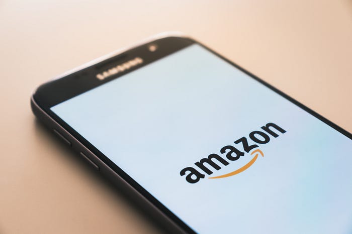
- Filtering and sorting options: Amazon provides a variety of filtering and sorting options to help users narrow down and refine their search results. These options include categories, price ranges, and customer ratings, and they can be accessed from the navigation menu or within the search results page.
- Customer service links: Amazon includes links to its customer service resources in the navigation menu, including a “Help & Customer Service” link and a “Contact Us” link. This makes it easy for users to get assistance with their orders or any other issues they may be experiencing.
- Account and cart links: Amazon includes links to the user’s account and shopping cart in the top right corner of the navigation menu. This allows users to easily access their account information or view the items in their cart.
- Mobile optimization: Amazon’s navigation is optimized for mobile devices, with a responsive design that adjusts to fit the screen size of the device. This makes it easy for users to navigate the site on their phone or tablet.
These navigation features help to improve the user experience by making it easier for users to find and access the products they are interested in on Amazon’s website.
Analysis of how these elements meet the needs of the target audience:
- Filtering and sorting options: These features help users to narrow down and refine their search results, making it easier for them to find the products they are interested in. This aligns with the users’ goals and tasks of finding and purchasing products on the site.
- Customer service links: The inclusion of customer service links in the navigation menu meets the needs of users who may have questions or issues related to their orders or other aspects of their experience on the site. By providing easy access to these resources, Amazon helps to improve the user experience and build trust with its customers.
- Account and cart links: The links to the user’s account and shopping cart meet the needs of users who want to easily access their account information or view the items in their cart. These links are prominently placed in the top right corner of the navigation menu, making them easy to find.
- Mobile optimization: The responsive design of Amazon’s navigation is well-suited to the needs of users who access the site on mobile devices. It ensures that the navigation is easy to use and provides a consistent experience across devices, which can improve the overall user experience.
These navigation features help to meet the needs of the target audience for Amazon by providing users with a variety of options and resources to help them find and purchase the products they are interested in.
By analyzing these case studies, we can see how effective navigation can enhance the user experience and drive success for a website or app.
Conclusion
Intuitive navigation is a crucial element of user experience design, and it plays a key role in the success of a website or app. By following best practices for navigation design, such as using clear and consistent labels, organizing content in a logical and intuitive manner, and using visual design elements to guide users, you can create navigation that is easy to use and enhances the overall user experience.
In addition to these best practices, it is important to consider the needs and goals of your users in the design process. By designing with empathy and understanding, you can create navigation that meets the needs of your users and helps them to achieve their objectives.
To learn more about UX designs see my article on Call To Action Buttons:

