How I name Design Tokens and Components
A brief, but hopefully effective, walk through my process of creating names for my components and all three levels of Design Tokens.
Naming conventions help us to onboard new team members, share an update with a developer, or maintain a consistent interface. In fact, I could have just said: “by using a naming convention we are able to understand what we wrote even after 2 weeks”.
With all the different approaches, methodologies, technologies, conventions, and theories, it is difficult to choose and stick to a single strategy since there is always a new one claiming to be the best.
Next, I will show you what I have been using for the last couple of years.
I choose BEM for Components
Let’s discuss how to name components using BEM (Block, Element, Modifier). BEM is easy to memorize, broadly adopted, flexible and scalable.
A Block is a standalone container, a wrapper.
An Element is a unit semantically tied to a block.
A Modifier is an addition/override that can be applied to either Blocks or Elements.
We identify an Element with the prefix “__“ (two underscores).
We identify a Modifier with the prefix “--“ (two dashes).
We make a compound name, in any of the three above, by adding single dashes. For example, main-navigation or contextual-drawer-area.
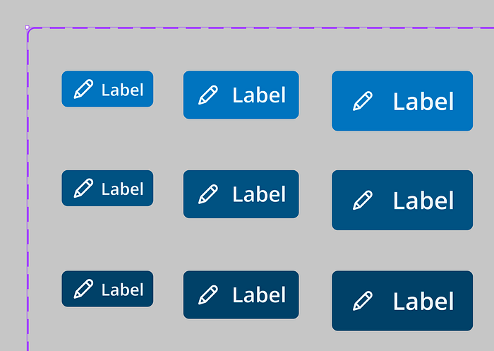
A “button” Block can have the Modifier “--primary”, E.g.

The main Block we call the “header”. It is an organism (atomic design) and a Block (BEM), and in this case, it contains other Blocks (molecules) and Elements (atoms) inside it. As you can see, although for the Atomic Design methodology an organism has molecules and a molecule has atoms, the BEM Blocks can contain other Blocks.
Let’s explore how could we name A, B, and C.
Header
A
- logo (block)
- logo__hawkeye-logo (element) or maybe logo__img (element)
While reproducing a simple Figma logo in HTML, I may need to have more than just one HTML element called “logo”. That is why you see here a block and an element.
<a href="" class="logo">
  <img src="logo.svg" class="logo__hawkeye-logo" alt="hawkeye brand logo" />
</a>
It is up to your taste and contextual evaluation of how abstract you want to name your classes. If on the one hand “logo__hawkeye-logo” helps you understand, perhaps in the midst of 5 other logos, “who’s who”, on the other hand, “logo__img” is a box that tomorrow may receive another brand image than hawkeye and semantics would remain intact.
B
- user (block)
- user__picture (element)
- user__name (element)
- user__icon (element)
C
- objects-bar (block)
- objects-bar__item (element)
- objects-bar__title (element)
- objects-bar__subtitle (element)
- objects-bar__item--selected (modifier)
- objects-bar__item--add (modifier)
If for some reason we needed the logo (A) in blue on one of the pages/screens, then a Modifier could be applied to the logo__hawkeye-logo resulting in logo__hawkeye-logo — inverted.
In Figma, here’s how I name them:
Example: Button
- Name your variants group of “button”.
2. If you create an instance of your button and inspect it, you will see something like this:
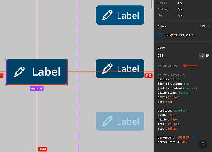
3. That is your block. Now, since you still want to keep your layer's name short and Designers friendly, instead, we will append extra information to the individual button variants.
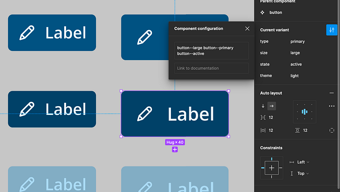
4. So I am adding 3 modifiers to my button.
Here’s how it will look in HTML:
<button class="button button--large button--primary button--active">and CSS:
.button{
}
.button--large{
}
.button--primary{
}
.button--active{
}
and in inspect:

The developer is now able to see the different modifiers being applied to the button block.
Note: In sorting my modifiers for HTML, I looked at my buttons and started from the most generic to the most specific modifier. There are 24+ large, 15 primary, and 12 active buttons.
I choose References, Systems, and Components for Design Tokens.
As also described in this other article, I like to create my Design Tokens in 3 levels and keep them as agnostic as possible. I also use a “.” (dot) instead of a “-” (dash) to structure Design Tokens’ names since I use the Figma Tokens plugin - which requires this naming convention - that enables me to use my Design Tokens while designing in Figma (meaning I click on a “design token” and it links with a Figma element, resizing, coloring, moving, etc., according to the token’s attributes). So instead of color-primary, I would type color.primary.
Reference Tokens
My reference colors aren’t called “blue” or “yellow”. Instead, I call them “quantum” or “numb”. I want them to act as empty boxes where I can put any value and the semantics will still hold. It’s a conscious trade-off between being consistent with the other reference tokens like “font-size.10" (which can have a value of 16px) vs human-friendly (aka you-know-what’s inside-when-it’s-called-yellow) as described in this other article.
I created a spreadsheet that I use to select, from left to right, all required values for my reference tokens.
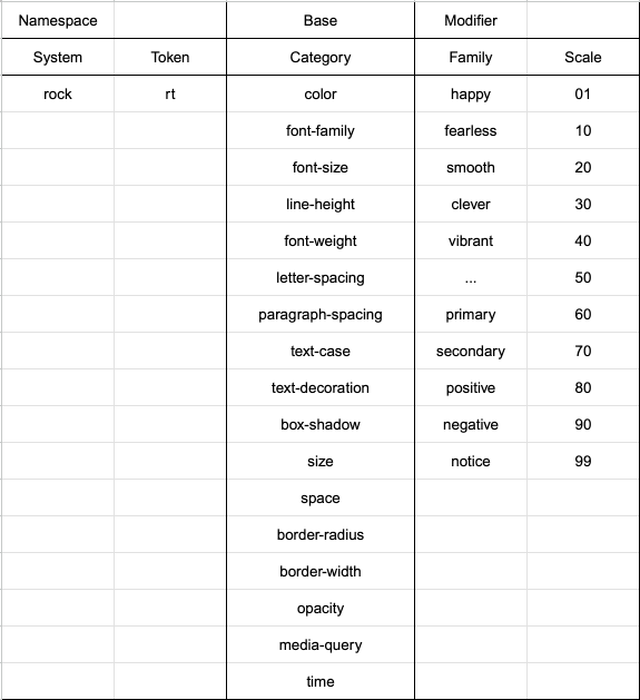
Ex: rk.rt.font-size.80
Note that the columns are not mandatory and we should keep only the indispensable in the names. We scroll through the columns like in a checklist and activate the ones that are justified.
System Tokens
Well, agnosticism steps out, and semantics steps in. Time for decisions.
With that in mind, I will need more than variable steps/scale of 00 to 99.
I want to decide, for example, that my font-size.medium will get the value from rk.rt.font-size.80.
“medium” is descriptive enough such as “large” or “2x.small”.
The result can be something very simple like:
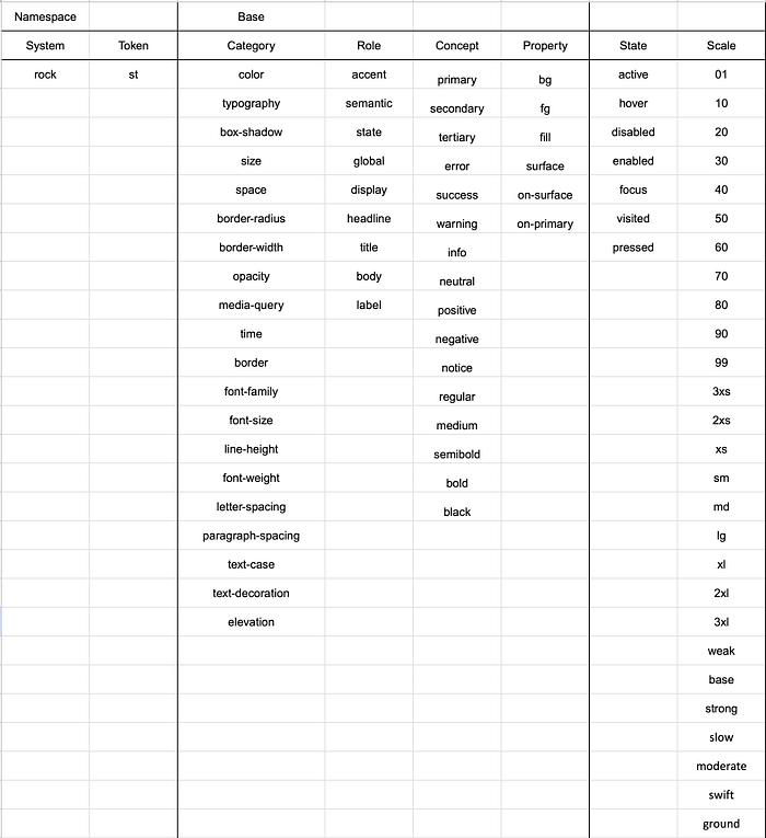
rk.st.typography.body
or something a bit more complex such as:
rk.st.color.semantic.success.bg.hover
Component Tokens
We need to add an important layer in component tokens: The components themselves.
This is what it might look like:
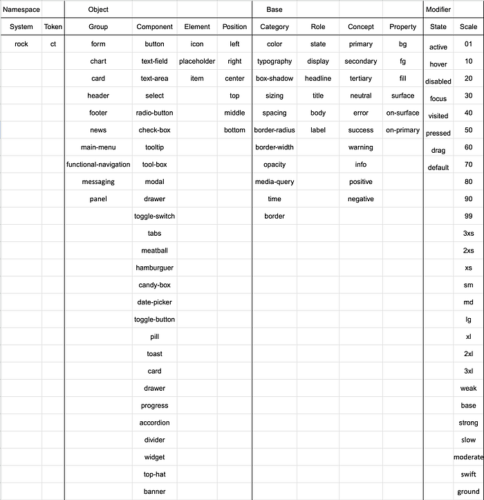
Note: A great article from Nathan Curtis inspired me to tweak and refine my terminology.
Conclusion
Like every other bit in my systems, these templates are constantly evolving/changing. What works and makes sense for me, may not make sense for you and that’s ok!
The focus of this article is on the importance of having a method and a rationale behind the creation of any name.
A rationale of simple explanation and easy understanding.

