UX Case Study- Beachside Café App
Project Overview:

The product:
The Beachside Café app is a mobile ordering app that allows users to place mobile pickup or dine-in orders. Their pickup time can be ASAP or they can schedule it 24 hours ahead. The target users are people who go to the beach and have busy schedules.
Project duration:
October 2022 to December 2022
The problem:
Busy people need ways to quickly and easily place mobile orders to optimize their time at the beach.
The goal:
Many different types of users will be able to use the Beachside Café app to quickly and easily place mobile orders to optimize their time.
My role:
Product designer and UX researcher
Responsibilities:
- User research
- Wireframing
- Creating high-fidelity mockups
- Prototyping
Competitive Audit
Link to competitive audit PDF: https://drive.google.com/file/d/1JhTPrKrHWZwMyqce6d9KriaLOo9L2Z2g/view?usp=sharing
After completing the competitive audit for two direct and two indirect competitors, the following opportunities were found:
- Clean UI for easy learning curve and easy user flow
- Clear, appropriately sized text
- Images and descriptions of all menu items
- A “user’s favorites” option
- Ability to see menu without starting an order
Understanding the User
User Research Summary:
For this study, I used sample user bios provided by the Google UX Design Course. From these bios, I chose 3 users to “interview.” I studied their bios and created answers I believed they would give to my interview questions based on the information provided. The questions asked users about experiences with mobile food orders including their positive experiences and common challenges. I also asked about their experiences with getting food at the beach and what features would be helpful on a mobile food ordering application for a beachside café.
Going into the interviews, I expected to hear a lot about simplicity of design for usability and readability purposes. Personally, this is something that matters a lot to me, and I expected the same from others. This assumption was accurate, but the “interviews” and deeper thought process definitely added more depth to the assumption. People have busy lives and want to optimize their time, whether that is during work hours or free time.
Pain Points:
1. Complicated UI with inappropriate color contrast
Users indicated issues with a busy UI that can make it take longer to figure out what steps to take. Some users with visual impairments found inappropriate color contrast inhibited readability.
2. Too many words
Users complained about having to read too many words when trying to complete a task quickly and easily.
3. Not enough icons
Users felt icons alongside calls to action would be helpful for language barriers, visual impairments, or simply identifying a call to action quickly and easily.
4. Inability to edit orders
Users would like an option to edit their orders for a certain amount of time after placing it instead of completely canceling an order if a mistake is made.
Going forward:
- Create a simple UI with clear calls to action and navigation with appropriate color contrast
- Minimize the amount of words
- Provide icons as visual guides for calls to action
- Provide the option to edit an order for a certain amount of time after order is placed
Persona:
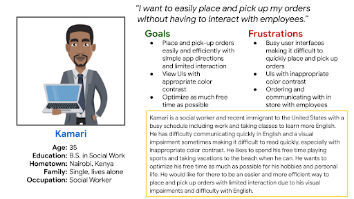
Kamari is a busy social worker and recent immigrant to the United States who needs clear calls to action and instructions when placing a mobile order because he doesn’t want to waste time ordering or asking questions in-person due to his visual impairment and struggle with English.
User Journey Map:
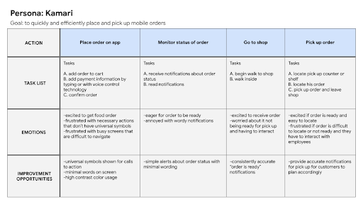
Mapping Kamari’s user journey revealed how helpful it would be to have simple UIs with noticeable calls to action, use of universal symbols, and high contrast colors to make mobile ordering quick and
efficient.
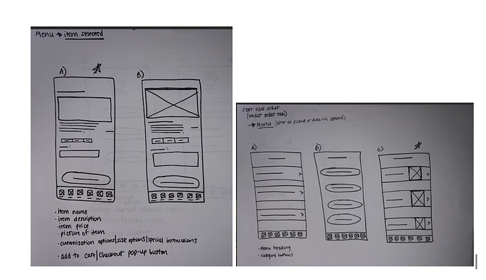
Starting the Design
Keeping the persona of Kamari in mind, I aimed to create designs that had simple user interfaces with obvious calls to action. I wanted my users with busy schedules to easily access everything necessary to complete the main user flow of placing a pickup order.
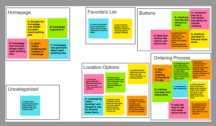
Usability Study- Round 1
I conducted each usability study with five people I personally know. Both were moderated by me as I watched their click paths, recorded the sessions, and took notes on pen and paper.
Round 1 Findings:
1. Users need ways to speed up the ordering process.
2. When tapping the “back” button, users need to be taken to the screen where their next step can be done.
3. Obvious buttons are necessary for steps of the ordering process to be accessible by all users.
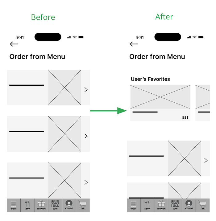
Below is an example of an iteration made after the first round of usability studies. I provided users with a “user’s favorites” option to make the ordering process quicker for returning customers.
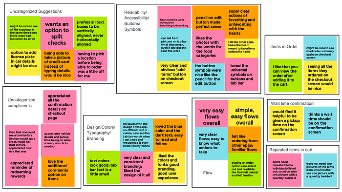
Usability Study- Round 2 with High-Fidelity Prototype
Round 2 Findings:
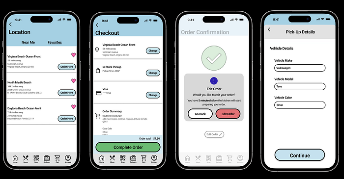
1. Users need to see their location details, type of order details, payment details, and items ordered all together before confirming.
2. Users need to be given a wait time on their confirmation screen.
3. Identical items should be listed once with a quantity beside them.
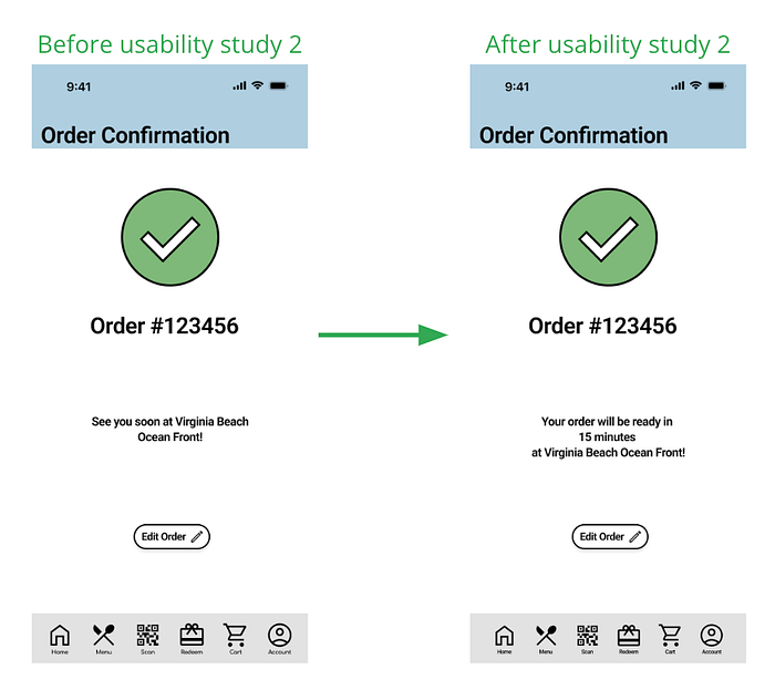
Users can clearly see how long until their order will be ready so they can plan accordingly and optimize their time.
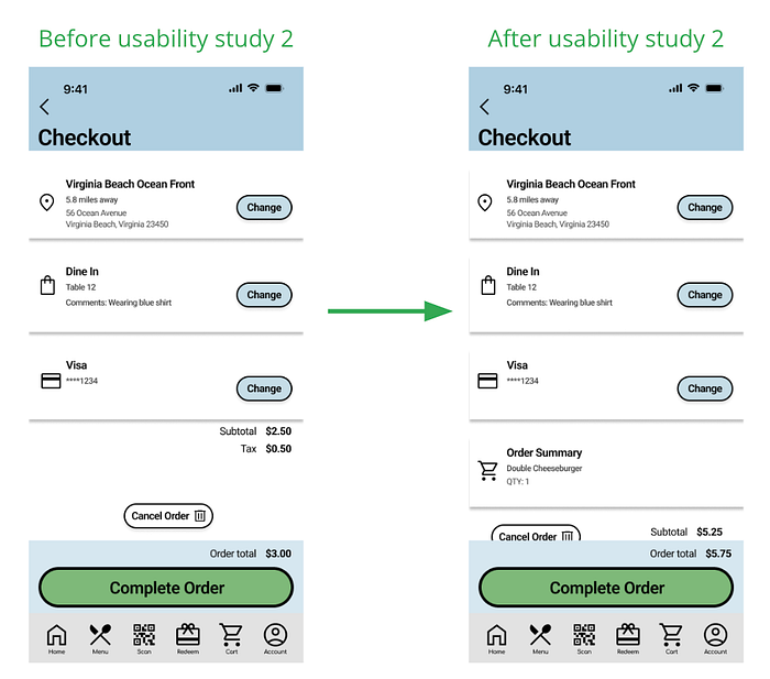
Users can see everything about their order in one place before fully completing their order.
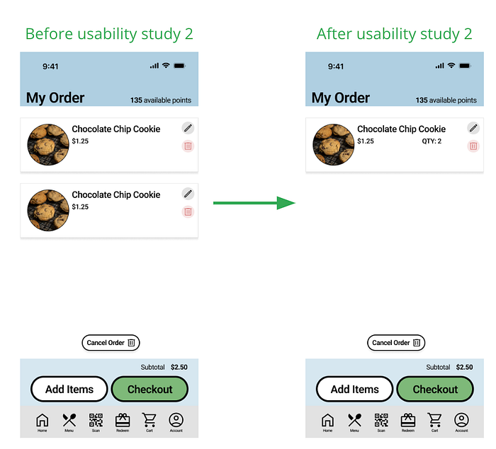
Users can quickly and easily view what they ordered in a more consolidated way with this simple UI.
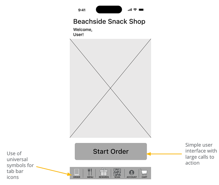
Key High-Fidelity Mockups

Accessibility Considerations
- All text and background color combinations were tested using the plug-in Contrast to meet WCAG standards of level AAA or AA contrast.
- Many of the interfaces and calls to action included icons with universal understanding, such as a pencil for editing, a trash can for deleting, or an addition symbol for adding something new.
- User interfaces were clean and simple with big and obvious calls to action.
Takeaways and Next Steps
Impact:
Those who participated in my usability study all gave a positive view of my app overall. This product was designed with users at the forefront of my mind, and therefore provides an enjoyable user experience and displays inclusive design.
What I learned:
During this project, the most important thing I learned is to design with empathy while putting myself in my users’ shoes. By keeping them in mind, I can design while seeing and understanding what each unique user can bring to the experience of placing a mobile order.
Next Steps:
1. Conduct a third round of usability testing to gather more insights.
2. Iterate based on insights from third round of usability testing.
3. Include updated insights and iterations in case study.
And that’s a wrap! Thank you for looking through my first case study.
Please contact me if you want to see the full prototype, are interested in my work, or want to talk about potential internship or career opportunities in product design.
I am currently working through the 6th out of the 7 Google UX Design Certificate courses and would be more than happy to show what else I am working on.
