My favorite 5 mobile apps based on their UX design
I’ve become much closer to my phone since the beginning of quarantine, unfortunately. I’ve tried several digital detoxes to try to get some space, but I just keep on coming back. And like most people who are addicted to their phone, my favorite apps are what keep me updated, informed, connected, entertained, and sometimes they even kelp keep me zen.
I started looking a lot more closely at the apps I use on a regular basis and started trying to see them from the standpoint of a first-time user. Of course, seeing something as a beginner when you are already an expert is a borderline impossible thing to do. But as much as I could, I started using my go-to mobile apps as if I was coming in with fresh eyes to get a better handle on the UX and usability of them.
I focused mainly on the overall look & feel, ease of use, how quickly I could see the purpose of the app, and the enjoyability of what I was working with. These were my top 5 favorites to interact with, and what I thought were incredibly straightforward to use.
1. Lemonade

Never in my life did I think I would have fun working with an insurance app. In my previous work at an insurance company, we aimed to make our apps as pleasant as they possibly could be within the constraints of the company’s branding. I thought those were the best an insurance app could get.
I was wrong. With Lemonade, the content is clear and easily understand (a true feat given insurance jargon’s complexity). It walks the user through a simple process to understand what kind of coverage they are getting & how the amount of coverage increases the premium they will pay. It is actually kind of fun to see the numbers change as you change the coverage limits.
On top of that, they attach a friendly face to the “person” assisting you as you sign up, and the content used makes the person seem friendly, upbeat, and excited. And visually, the pop of hot pink and use of custom illustration give the app some personality. It’s just…cute. I love it. A+, 10/10 for all things usability & desirability.
2. Headspace

Anyone who knows me knows that I am a Headspace evangelist. Headspace introduced me to meditation at a very difficult time in my life, and I clung on to every word that came out of Andy Puddicombe’s mouth. So, it is a little hard to look at the app completely objectively, but I will try.
This app is beautiful (I’m off to a very objective start). Custom illustrations and videos contribute to a sense of peace, with gentle smiling suns and warm colors spread throughout the mobile app. There isn’t a sharp corner in sight, there is plenty of white space, and the blissed-out little blobs make this little corner of my phone feel like it’s time for rest and rejuvenation.
Outside of how visually appealing it is, it just works. The bottom navigation has expanded over the years to include session around sleep, movement, and focus, as well as a home page dedicated to what you might specifically be interested in exploring. You see your most recent meditations/workouts first, then more popular ones. The layout makes sense, makes you feel like you’re a part of this community, and doesn’t exert any effort to find what you are looking for. I’m a Headspace superfan (Headspace — shameless plug to hire/sponsor me☺️)
3. Duolingo

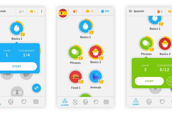
Duolingo has been around for a while now, and I feel like it just keeps getting cuter. It seems like it has been leaning in even more to being aimed toward children, especially with the introduction of its new literacy learning section.
Admittedly, I think the older versions were actually simpler and easier to use. But similar to Headspace, its fun use of color, illustration, and interesting interactions/microinteractions make it thoroughly enjoyable to use as well as highly functional.
The onboarding process kicks off by getting basic information (what you want to learn, why you want to learn it, how much you already know, etc.) and leads straight into the lessons. It clearly depicts what level you are at for the languages you are learning in the app, as well as what else you can do in the app in the bottom nav. It is cute, fun, makes learning some of a language entertaining and easily accessible. I’m a fan, even if it is it bordering on too cutesy for me.
4. Shazam

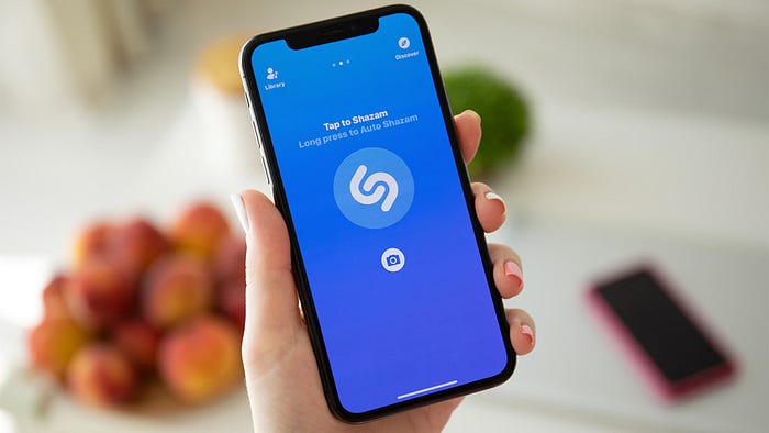
Listen, I know that Shazam allows you to do a lot more than just figure out what song is playing. I get that it can let you listen to the song, give you recommendations based on past “shazams”, link you to Apple music and all that.
It’s just that I don’t care.
This app is so simple, so useful, so clean, so satisfying. You pull it open, tap a button, and figure out what song is playing. The creators must know that is all people care about, which is why that put that huge button front and center the second the app opens. Functionally & visually, it’s just perfect.
5. Opentable

The simple red (smart, stimulate the appetite) against lots of white space helps the color pop and guide the user to where they need to go in the app. I wouldn’t say anything here is visually stunning — the food images from each restaurant are meant to stand on their own, so OpenTable didn’t really waste time on cute illustrations or fancy graphics.
In terms of usability…I have found and made dinner reservations within about 15 seconds using OpenTable. I won’t go into the exact step-by-step, but they make user entry as minimal as possible and get you hooked up to a reservation so simply and easily you cannot believe people used to wait on hold to talk to someone at the restaurant.
I’d love to hear about some of your favorite apps that you use regularly, too! Obviously I have a thing for fun illustrations and more engaging processes, but let me know if you agree/disagree with any of my choices.
