My Design System Journey: Building The Plane While Flying
Challenges I faced in Design Systems with Cross-Functional Teams

I assumed building a design system would be straightforward. Even if it proved challenging, I believed that breaking it down into smaller components, following the principles of atomic design, would make it manageable. However, the reality turned out to be much more complicated. Beyond the design and consistency aspects, there were organizational dynamics and collaboration challenges to navigate, not to mention the detailed work involved in crafting a comprehensive Figma file.
Our Design System Framework
My vision was simple; I planned to start step by step, and we could scale the design system from there. And it goes like this:
- Style Guide: Defining our visual language is crucial to building the design system, colors, typography, spacing, layout, elevations, etc. This was the first—step for our design system. A style guide contains information about, and examples of, how things should be done consistently across the product; it tells design direction, visuals, and interaction design standards.
- Pattern Library: Pattern libraries include UI elements, like forms and buttons, what they’re for, and when to use them. Every pattern library has been usability tested, and the design has been iterated. So, the designs that make it into the library are the team’s best work in that area. We were using the atomic design approach, where you can start with the smallest elements of the component and then scale up.
- Component Library: Take things to the next level and are UI patterns plus code. There’s a substantial cost savings at this point because not only do designers get a head start on design, but developers don’t need to rewrite code that a colleague has already done. And just as UX designs have been tested for usability, code has been reviewed and improved. So, the code that makes it into the library is tight and fast.
- Documentation: It is necessary to set rules and standardize the use of the design elements, as well as when, where, and how they should be used.

Better Curate than Create
Why build a whole design system from scratch when we can adapt an existing one? It’s often better to curate than create. Luckily, the dev team was already transitioning to a web library, and even luckier, we found a Figma file for that library. This discovery should streamline our process, but now, a new conflict arises.
We faced a conflict within the design team regarding our approach to utilizing the UI Kit. It was like the conflict you face when solving a puzzle with a friend: you want to start from the edges, while your friend prefers connecting similar pieces to form larger shapes.
Some suggested using it as a reference and adopting only the necessary components, considering the kit contains numerous components we may never use. They proposed building our own Figma file to create a more focused and customizable pattern library. Others advocated for direct edits to the UI Kit, leveraging its existing components and style guide. While this approach may seem faster, it could lead to complications when establishing our own visual language. Additionally, accessing components from the library within Figma may become difficult due to the multitude of styles, potentially increasing our workload and time consumed for rapid prototyping. This may also lead to inconsistency throughout the team when designing. Furthermore, the UI Kit was outdated, not utilizing the full potential of Figma, including new features like Autolayout or local variables, which posed another challenge.
It seemed logical to initiate the development of our own file, intended to serve as our central library. By doing so, we could easily access it whenever necessary, facilitating monitoring and ensuring consistency. Moreover, it would enhance accountability for the design team responsible for building components throughout the process.
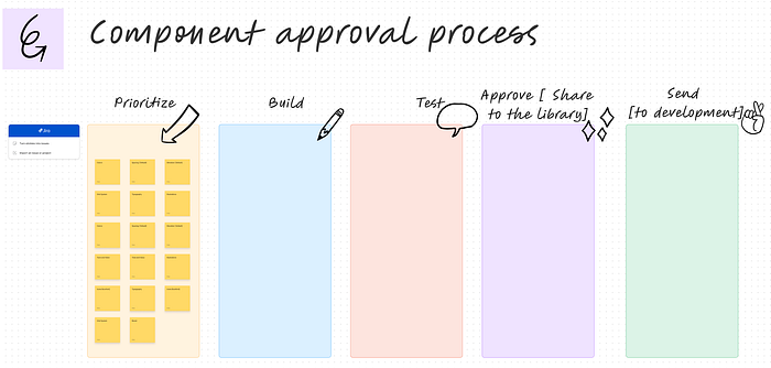
We outlined the workflow, detailing how each component would be managed. Our workflow consisted of (prioritization, building, testing, approval, and shipping to development). This entailed prioritizing components based on their frequency of use or highest value, followed by the building phase. Each component underwent usability testing for approval before being shipped to development for implementation. Having a dedicated frontend team to work on the design system was a significant advantage for us.
Riding the Rollercoaster of the Design Process
We don’t have the luxury of a dedicated team for the design system, so it’s an ongoing task alongside our everyday jobs. The plan is straightforward: whenever we build a prototype and customize a component from the large library, we ship the customized component to our pattern library. We then have a weekly call to discuss the shipped components, provide feedback, make adjustments, conduct usability and accessibility testing, and generalize the components for future use.
We call this approach “building the plane while flying,” and it’s convenient for the whole team as it helps us progress. However, we’ve faced some challenges:
- Collaboration with devs: As we don’t have a dedicated dev team to work solely on the design system, we’re involved in meetings to align on component approval, maintain consistency, and test each component upon delivery
- Colors: There are too many color values on the platform, and they’re not assigned as variables, making it difficult to edit. Developers need to collect all color values and assign them to variables for easier editing.
- Existing components: Within the platform, numerous components lack consistency due to the absence of design guidelines in the past, and it’s our responsibility to rectify this issue. Therefore, we tasked the development team with mapping out these components and replacing them as new ones are created along the way. “A considerable effort is required beyond their daily tasks, but it’s needed to be done, as it’s a one-time task” — here’s where we add the POs to the loop.
- Smart Components: Designing components, especially blocks, presents limitations. We create “smart components” with all possible features, and the development team shows/hides features as needed. While this approach is beneficial, it’s challenging to implement and requires more time due to the need to consider all possible scenarios for each component.
Those were just the main points of the challenges we encountered; there are many more complexities involved. Nonetheless, it felt like a rollercoaster ride, and we had to establish a plan and its structure to make progress and accomplish tasks. This involved creating our initial version of the design system to achieve an MVP.
A Never-Ending Task
Creating a design system turned out to be a distinctive journey, quite unlike my previous experiences in other companies. While I’ve had success with design systems before, each organization presents its own set of challenges and opportunities. This time around, we faced unanticipated obstacles that required us to adapt our approach. Rather than sticking to a rigid playbook, we embraced the fluidity of the process, tailoring our methods to suit the unique dynamics of our team and organizational structure. It’s all about working with what we have and finding creative solutions to overcome any challenges that arise along the way.

