Muted colors for 2021
Let’s get ready for subtle, simple designs with lots of muted, natural colors that make it easy to keep looking and scrolling for hours.

In 2021, I believe that bold and more vibrant colors are not going to disappear, but I also believe that will be more focus on muted colors.
This year we spent a lot of time looking at the screen, it was the year of online lessons and the year of socially distanced celebrations. From this, however, we learned that some colors are more comfortable to look at than others. In 2021, those comfortable, easy-on-the-eyes colors will be trending.
Let’s get ready for subtle, simple designs with lots of cool, natural colors that make it easy to keep looking and scrolling for hours.
But let’s proceed by grade.
What are muted colors exactly?
Muted colors refer to all colors that have low saturation (or chrome). These are subtle colors that are not bright or have been subdued, dulled, or grayed. The opposite of a soft color is a bright, vivid, saturated color. Compare the colors that you see in the sky on a cloudy day to the colors you see on a bright and sunny day. The tones of color found on a cloudy day are typically less bright, duller, and more muted compared to those of a sunny day.
Color Saturation refers to the brightness/intensity of a hue. Highly saturated colors are vibrant and radiant, while low saturated colors are dull.
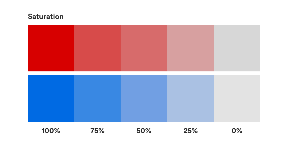
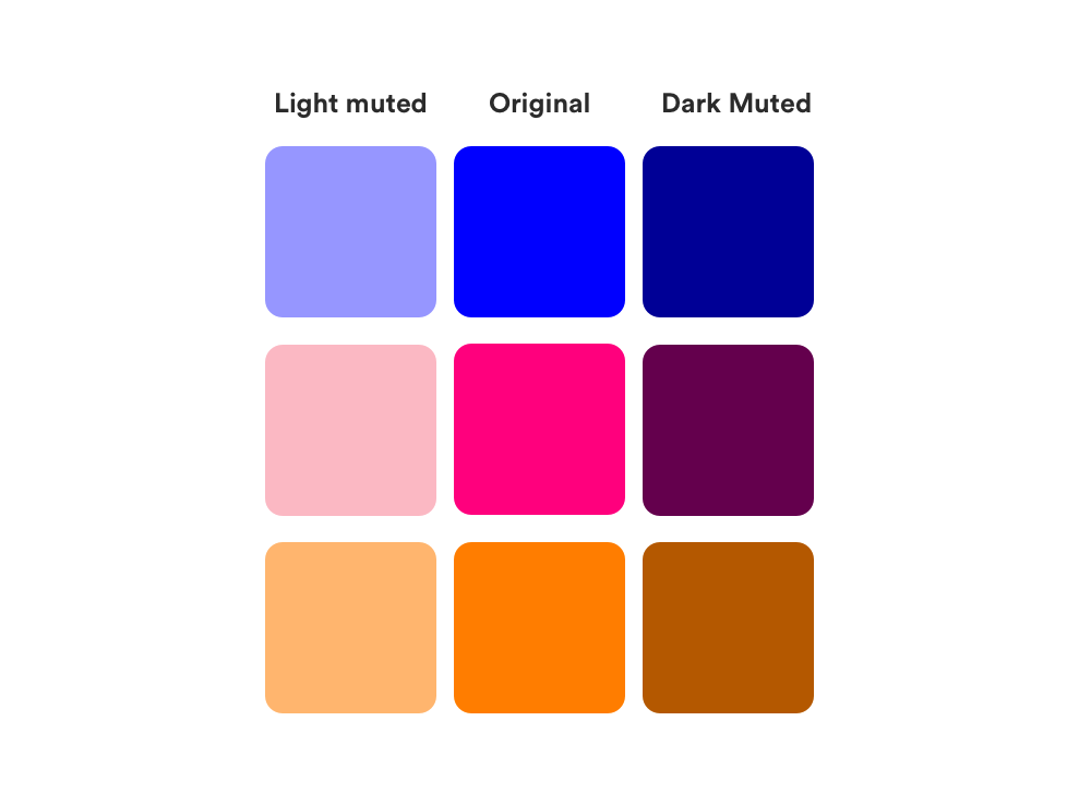
To mute a color, you can just mix it with black, white, gray, or the complement of the color (for example, you can desaturate red by mixing it with green).
Why use muted colors?
Vivid colors sure have their place. But it is usually far more effective to use vivid colors sporadically, in combination with muted colors.
If you combine two bright colors it will not the best result. For example, take the red, blue, and green below which is surrounded by a vivid yellow. The colors fight each other for attention. You may find this color combination to be jarring and uncomfortable to look at.

If you half the saturation of yellow, blue, and green the color combination is much more pleasing to look at.

The images with vivid colors are a lot more scratchy. While muted colors make designs appear more natural and easier on the eyes.
Muted colors in the painting of the past

The artist in their paintings above show us a wise use of muted colors.
While Degas and Klimt use very muted, earthy palettes with a low contrast, Veermer uses a high contrast: the bright whites of the eyes, the collar, and the pearl earring pop against the dark colors and bring focus to the feminine features of the girl. Similarly, red is used only of the lips — drawing your eyes into the rich color that contrasts with the muted and cool tones in the rest of the painting.
Muted colors in UI Design
In honor of inspirational design, let’s now take a few minutes to see some examples where the different brands use muted colors.
1. Winc
Winc is a wine club that sends wine to your doorstep. The whole structure of the company, born as one of the many wine distribution platforms, and then became a real producer in the first person, is based on the customer, and its feedback in real-time. As we can see the color palette is muted and elegant — perfect for an elegant wine club. Their site features minimalist design and simple images, well punctuated through colorful accents that keep the focus on the product.


2. Illo
Illo is a design studio with focus on motion design, illustration and set design. The site is clear, characterized by games colors. We have muted colors that combine with brighter colors.


3. Cédric Pereira
Cédric Pereira is a product design, and this is your personal website. He use a muted, pastel color scheme to create a soft and inviting look. It seems to feel a fairytale sweet sensation.


References
Draw paint academy https://drawpaintacademy.com/the-beauty-of-muted-colors/
Art Studio Life https://artstudiolife.com/muted-colors/

