Must-have font resources & trends for 2023.
A hand-picked list of top-tier websites and font families for striking designs.
Choosing the right font for the project you’re working on is not an easy task, so having a top-curated list of fonts on your computer is one of the most useful tools a designer can have.

In this post, I’m not gonna be sharing the popular fonts to have such as Helvetica, Bodoni, Garamond, etc... I’m gonna share the underrated list of A-quality websites I use for downloading fonts and getting inspiration for my projects.
Without further ado, let’s go to the first one.
This is a great website if you’re looking for fonts with a strong personality. Their selection is totally unconventional from most websites but still only the best and complete font families will be granted a space in their collection.
2. FontJoy
Picking the right font is not an easy task, and when it comes to pairing it with a secondary font we could easily spend hours trying to find the perfect match. FontJoy is a time-saver for times like that. Their insanely huge font library makes this task easy peasy.
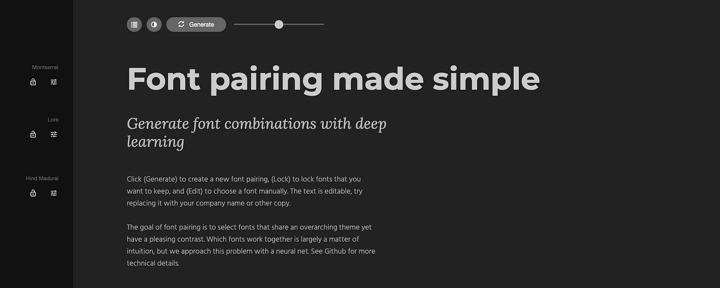
Alternative: FontPair
Pangrampangram works on a basis of a “try before you buy”. They give free access to quality fonts to everyone for personal use. The idea is to allow playing and working with the free fonts in their entirety and only when they are used in a commercial project, the client or employer (or you) purchase them.

4. Fontbrief
Fontbrief is an amazing font discovery tool that suggests different fonts based on personality traits. As you select the personality filters the tool will suggest the best fonts that match your needs.

5. Fontshare
This is another great website that offers not only quality font families to download for free but it also a font pairing tool with editable features for header and body text you can test it.

6. Velvetyne
By far the craziest font website I used. The font library here will always surprise you! Tip: Need inspiration? try clicking on the random button at the top left corner.

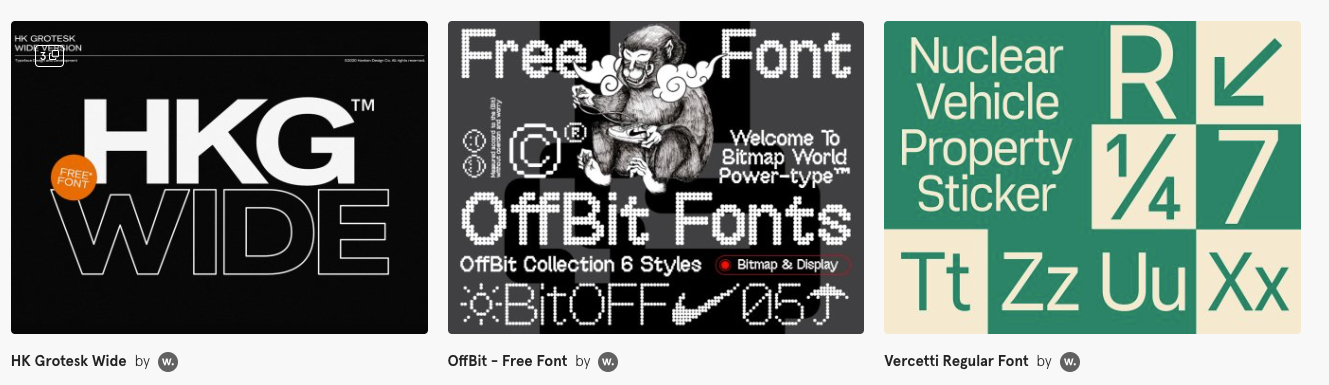
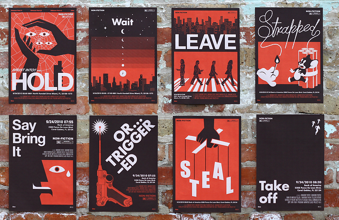
Font trend one: Big, bold, and sturdy

We’re seeing growth in big and bold sans-serif types, not just for stylish reasons, but more than ever visual legibility is key and these fonts have all-caps text, thick lines, and sturdy geometric shapes.
Give it a try:
- Greed
- Dada Grotesk
- General Grotesque
- Vercetti
- HK Grotesk Wide
- Humane
Font trend two: Psychedelic minimalist
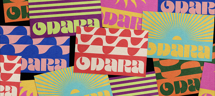
These font styles are characterised by stylistic ligatures, with gentle grooves, and rounded edges and by their warped and altered aesthetic, however, they don’t sacrifice baseline legibility or impact.
Give it a try:
- Matrona Small
- Wriggle
- Doughy
- Brice
- Blazeface
- Salvaje
Font trend three: Mid-century chic
This style is a child of the era of advertising that arose due to the evolution of printing technology and the mass production of posters and billboards in the ’60s and was highly influenced by technology and geometric styles.
Give it a try:
- Super Duper
- ES Nein
- Phantom & ghost towns
- Gopher Display
- Fugue
- Plaak
Font trend four: Flexible fonts
With brands more aware of the benefits of a good visual identity it opens a door for experimentation on flexible and illustrative fonts.
Some of the characteristics of this style include stretched/squeezed lettering, and playfulness with spacing.
Give it a try:
- OTF Glusp
- Baunk font
- Saint Regus
- Yellix