Motion design — reading between the lines
Gone are the days when motion design or animation served a superficial purpose of beautification as micro-interactions, fancy loading states, etc. Designers and users have come to appreciate the strategic use of motion to improve the usability of applications and create new interaction patterns that guide users, improve accessibility and keep the users engaged in ways that static designs cannot.
The purpose of motion
Motion can significantly improve the overall user experience when done well and utilised in the right places for the right reasons. Animations have proved to be effective ways of fostering learning. That said, subtle animations integrated within the user experience of a product help users build a mental model of the product’s functionality and serve as very helpful tools in fulfilling the users’ expectations of interface elements.
For example, a smooth scrolling animation to navigate the user (gif on left) to a section linked by an anchor link tells the user two things — that the section is placed on the same screen and the exact location of the section. Without this animation (gif on right), the user is left confused about the location of the link.


Designing motion for improved usability
A huge drawback of motion is that it attracts user attention. The excessive and unnecessary use of motion can significantly deteriorate the user’s experience and become annoying. Hence, in the creative process, UX designers must ask “How might we implement motion to support usability?”. And, like for any other UX problem, designers need to ask themselves:
Why am I including motion?
The purpose of the animation serves as a key guiding principle in framing the narrative of the animation. Animations can provide high-level delight, as feedback on a user’s action, to signify the affordance of an interface element and grab attention to important items.
In the image above, the keyboard’s affordance of being able to disappear on dragging downwards has been signified by a subtle sliding animation while the keyboard is hidden away.
How will the movement impact the UX?
While imagining the movement, we must think about its relationship with other interface objects. This refers to the movement’s spatial, temporal and hierarchical correspondence with elements in the vicinity.

In the image above, the use of motion to push and reduce the height of the input numbers “10” & “48” establishes the hierarchy between the inputs and the final answer.
What will the movement be like?
The usual process here is, to begin with, the initial and final stages and then think about the continuity of the interstitial states. Here, we must think about the connectivity and cohesiveness of the states within the animation and the coherence of the animation within the context of the overall user experience.
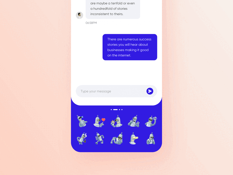
The first image below makes use of a slide-out animation that is followed by an almost continuous appearance of a success state indicating that the task has been completed along with an exit option to undo. The success message that appears in sync with the disappearance of the chat, completes the feedback loop.


However, in the second image, the lack of animation, and the connectivity between the ‘Next Up’ and ‘Done’ lists is not evident at the first glance.
When does motion need to begin and end?
The timing of the animation is two-fold. It refers to the length of the animation but more importantly, the moment the animation begins, whether it follows a previous animation or is an after effect of the user action. The latter is of utmost importance because when designers carefully choose this, the motion minimises the gap between the user’s expectation and the purpose of the animation.


For loader states, the length of the animation in addition to its pace must strike a balance that is optimal for the time the user has to actually wait. For example, if the data to be loaded is going to take a while, then an awkwardly slow loader that matches the pace of the data download may actually make the user antsy and frustrated. In comparison, a repetitive loader with a percentage indicator will keep the users focused on the animation and might take their attention away from the time.
Additionally, in the chat example above, the moment at which the success state appeared and the time for which it remained persistent, is what made the animation coherent and consistent.
Wrapping it up
Ultimately, with the right thought process and the correct set of questions to support your visualisation, designers can get as close as it gets to purposefully using motion in designs. Designers must remember to think about who their users are, what they are expecting and whether or not the animation is consistent with the overall user experience of the product. Lastly, let me leave you with an unpopular opinion: Ask yourself — “Does this really need to be animated?”
Canvs Editorial regularly brings you insightful reads on design and anything related. Check out the work we do at Canvs Club.
The Canvs Editorial team comprises of Guest Contributor - Anezka Virani, the Editor’s Desk - Aalhad Joshi and Debprotim Roy, and Content Operations - Abin Rajan

