
10 common UI elements beginner UI/UX designers don't know the name
In recent years, in many developing countries, the design industry ranks among the top paying professions. There are many areas in the design industry and UI/UX design is one of them and is currently growing very rapidly.
The job of a UI/UX designer is to implement ideas, analyze customer requirements, and then design a product with a beautiful interface — Good UI and user-friendly — Good UX. Because of the fun of the job especially, many people have wanted to switch to UI/UX. If you’re transitioning from a software developer, it’s great, IT terms you already know very well. But when you move from graphic design or other domains, many things make you surprised at first. The names and uses of elements in UI is one of those things that will confuse you even though you encounter them in applications and websites every day.
Here are the most common UI elements beginner UI/UX designers don’t know name.
1. Bottom navigation bars (Bottom bars)
Bottom navigation bars display three to five destinations at the bottom of a screen. Each destination is represented by an icon and an optional text label. When a bottom navigation icon is tapped, the user is taken to the top-level navigation destination associated with that icon.
Bottom navigation Material Design https://material.io/components/bottom-navigation


The area of the bottom bar is small, so the arrangement of content here needs to be carefully considered. The design of the icons here also need to do delicately so that users can easily recognize the function of that tab. Use a color hierarchy to let users know which tabs are active, or which are disabled. On screens that go deeper, you should turn off the bottom bar because, on these screens, it’s not really necessary anymore. In addition, you can add animation effects when switching to other tabs to increase user experience.
2. Modal
A modal is a Dialog or a Popup, which displays above all other content of the current page. The purpose of Modal is to notify the user of something in the application or wait for the user to enter information.
Modal box can be viewed as part of the content of the page but is hidden when not needed, some practical applications of the modal box can be mentioned as the registration form, full-size image, or contact information of the website owner,…
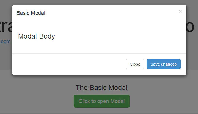
Modal is used to attract attention, need user input information, and display additional information to the content without losing the context of the original page (display larger photo, play video). A modal should not be too big or too small, the content should fit the modal, if the modal is too long and requires page scrolling then you should consider considering creating a new page instead of using the modal.
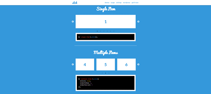
3. Slider — Carousel
A slideshow or slider is a set of fairly large images that can be slid back and forth between images, they are often placed at the top of the page to describe the features. remarkable content of the page at the time.
Carousel is a jQuery plugin that converts any HTML element into a carousel. In bootstrap, this plugin is built into the bootstrap.js file and is already CSS, so there is no need to write anything more.
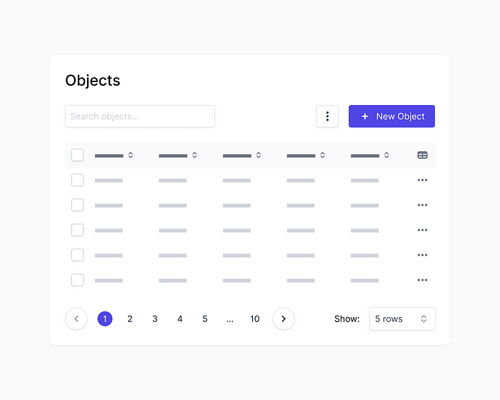
4. Pagination
Pagination is the process of dividing content across a series of pages. This is a popular and widely used technique for pagination web pages to split a list of articles or products into an easy-to-understand format. Usually, pagination is most commonly seen on website types like Blogs, Forums, News, E-Commerce,…

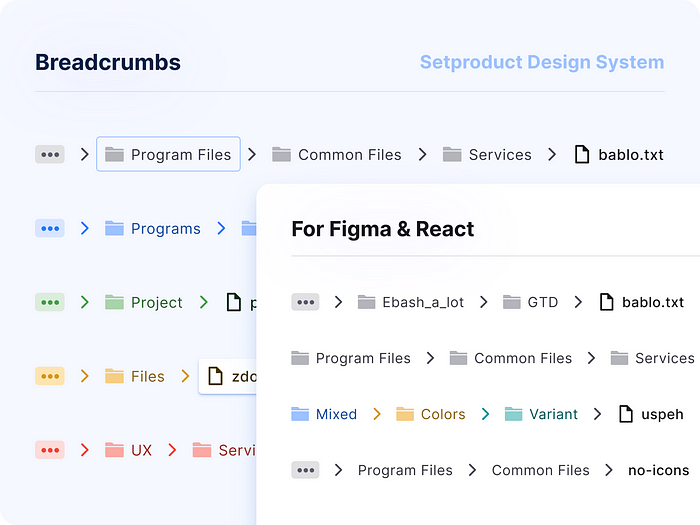
5. Breadcrumbs
Breadcrumb is a set of links that help users locate their current position on the website structure. In a website with a complex structure or a lot of content, Breadcrumb Navigation is an effective way to locate and is more convenient when users move between pages.
- Help users navigate on a website
- Shorter click paths when navigating through the website’s levels
- Draw the user’s interest to elements higher up in the site’s hierarchy
- Drive strong user interaction
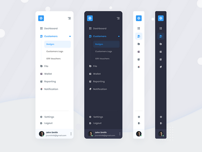
6. Sidebar
A sidebar is understood as a column that displays information next to the main content on the website. Often appearing in websites with a lot of information management functions, using the sidebar will help users quickly access the categories they use most quickly. It is not always a vertical column on the side. It can be a horizontal rectangle below or above the content area, footer, header, or anywhere in the theme that can be expanded or reduced to avoid affecting the display space of other main elements.
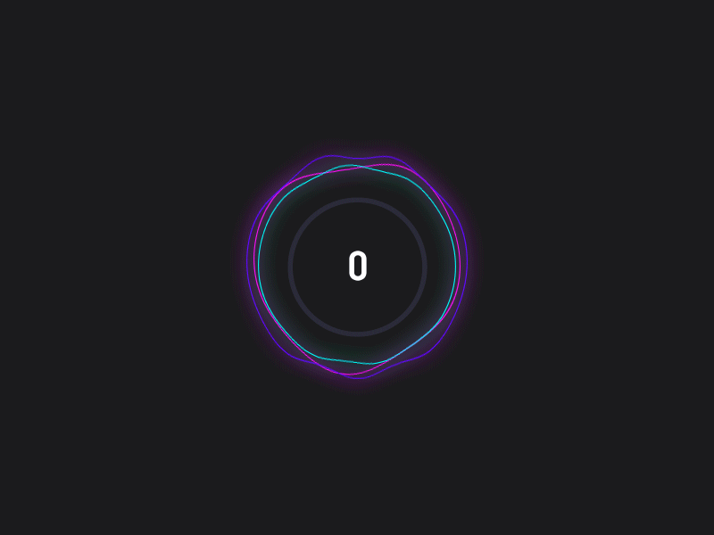
7. Loader — Spinner
Loader aka spinner is an indispensable effect in the modern web. The purpose is to bring better interaction between the web and users. It may appear when you open a new page, after logging in, uploading files, etc. With the use of a loader, to increase the user experience, you should apply a progress bar to make it easier for the user to know how the page has loaded.
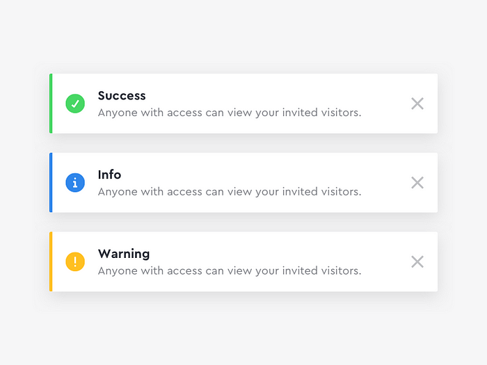
8. Toast
Toast messages let users know that the task they just performed was successful. These messages give users immediate feedback after taking some action. Users don’t need to dismiss toast messages, as they appear only for a moment before they disappear. Use toast messages when for frequent confirmations, such as successful completion of a task or transaction, or when it’s not critical for the user to read the message.
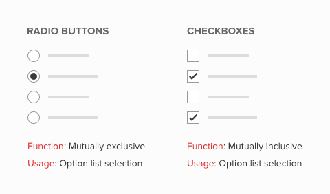
9. Radio button and Checkbox
Checkboxes and radio buttons are elements for making selections. Checkboxes allow the user to choose items from a fixed number of alternatives, while radio buttons allow the user to choose exactly one item from a list of several predefined alternatives.
Checkboxes
- Checkboxes are used to choose as many options as desired at a time from a limited number of options.
- You can select none, one, or as many options as desired in a group of checkboxes.
- There may also be only one checkbox.
- Choose a name that explicitly distinguishes two different states or contrasts.
Radio Buttons
- Radio buttons are used to choose one option at a time from a limited number of options.
- Arrange radio buttons in groups (you define graphical groups in the Screen Painter). Put at least two radio buttons in one group.
- One radio button in a group must always be selected.
- If the user should have the chance to choose no item from the offered options, create a separate radio button with a “No selection” label or similar text that turns off the other contents-related options.
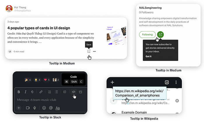
10. Tooltips
The tooltip, also known as infotip or hint, is a common Graphical User Interface (GUI) element in which, when hovering over a screen element or component, a text box displays information about that element, such as a description of a button’s function, what an abbreviation stands for, or the exact absolute timestamp over a relative time (“… ago”).
I have written very details about tooltips here, you can visit to see more https://medium.com/@NALSengineering/how-to-design-a-good-tooltip-in-ui-design-309bcf0bc4da
Summary
It’s difficult when you switch UI/UX from another non-IT industry, but with this article, I hope everyone can recognize the names of the most basic concepts of a UI. It will make it easier for you to communicate ideas to the team and write documents later.
Most common UI elements beginner UI/UX designers don’t know the name
- Bottom navigation bars (Bottom bars)
- Modal
- Slider — Carousel
- Pagination
- Breadcrumbs
- Sidebar
- Loader — Spinner
- Toast
- Radio button and Checkbox
- Tooltips
Hope this was useful for you. Thanks for reading through.


