
Mindhouse: Designing a digital mindfulness experience during a pandemic
The summer of 2020 was a tumultuous time for the world. The COVID-19 pandemic had brought about uncertainty, fear and isolation, and I had just finished the last few months of my undergrad degree in design while attending classes virtually. I was starting to look for product design positions, and when I came across an opportunity at Mindhouse, I was immediately interested in their goal of providing a way for people to practice mindfulness from their homes.
I talked to Ashish, the design lead at Mindhouse and started as a Product Design Intern during the last week of June 2020. After 6 months as an intern, I joined the startup full time for an additional 6 months, and the following is some of the work I did during that time.

About Mindhouse
Mindhouse started as a Meditation and Yoga studio in Gurgaon. Once the pandemic hit, they stopped conducting face-to-face sessions, and their plans to revamp the app (which was initially used to book and manage studio sessions) got accelerated. Today, Mindhouse is a product first organisation, building a platform to provide services across 4 verticals: Mental Health, Chronic Ailment, Everyday Wellness, and Women’s Health.
With the pandemic raging worldwide, mental health became an important part of everyone’s day to day life and getting the opportunity to design a user’s experience while they attempt to look after their mental well-being was an extraordinary journey.
Redesigning the profile page
My first task, and subsequent solve, was to redesign the profile page, helping users build a weekly meditation practice.
Since we were redesigning and not actually starting from scratch, we started by analysing the existing profile page to understand the current layout.
Following is the old profile page:

The way the information was laid out, made the page seem very cluttered, overwhelming and confusing.
Once analyzed, we decided to -
- Combine the class history instead of splitting it into two categories — classes attended (in-person studio classes) and anytime sessions (recorded sessions on the app)
- Move the “Edit Profile” and “Edit Goals” options to the settings section
- Remove the “Book Class Now” button, since in-person classes were no longer being held
- Visually enhance the profile page & fix the information hierarchy
- Add a weekly minutes KPI (Key Performance Index) on the home and profile page
The biggest challenge here was figuring out what the Weekly KPI + the graphs should be like, and whether or not they’d help nudge the users to build a meditation habit.
Mindhouse recommends you meditate at 140 minutes a week — the scientifically proven time you need to practice to achieve your desired goals, whether it’s improved sleep, increased productivity or a relaxed mind.
The next step was creating mockups on Balsamiq to better understand the new information architecture along with the flows for weekly meditation targets.

Then we moved onto taking a stab at making the high fidelity versions for these mockups.

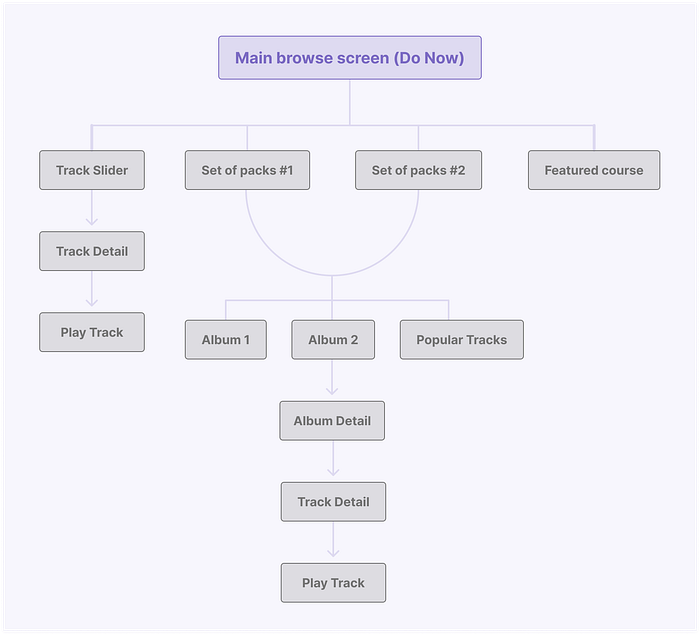
Redesigning the Do Now section
More than a UI problem — the Do Now section redesign was an information architecture problem. The tracks were haphazardly listed and not categorised, which made the entire section tough to navigate.

The old Do Now section had the following issues —
- The content was categorised, but not from a user’s perspective. This made it difficult for a user to understand what a specific album or course consisted of and how it would help them. It didn't solve for “how to choose” and “how to use”.
- Another major issue here was the copywriting — it wasn’t communicating the purpose of the content to the user.
- The visual style of the cards wasn’t consistent, which made it tough to distinguish between the tool types each album consisted of.
- The arrangement of the buttons on a track tile made the reminder and favourite options seem more important than the primary action — which was playing the track.
We started by breaking down the taxonomy for all the content within the Do Now section, to figure out a better way to classify the content.
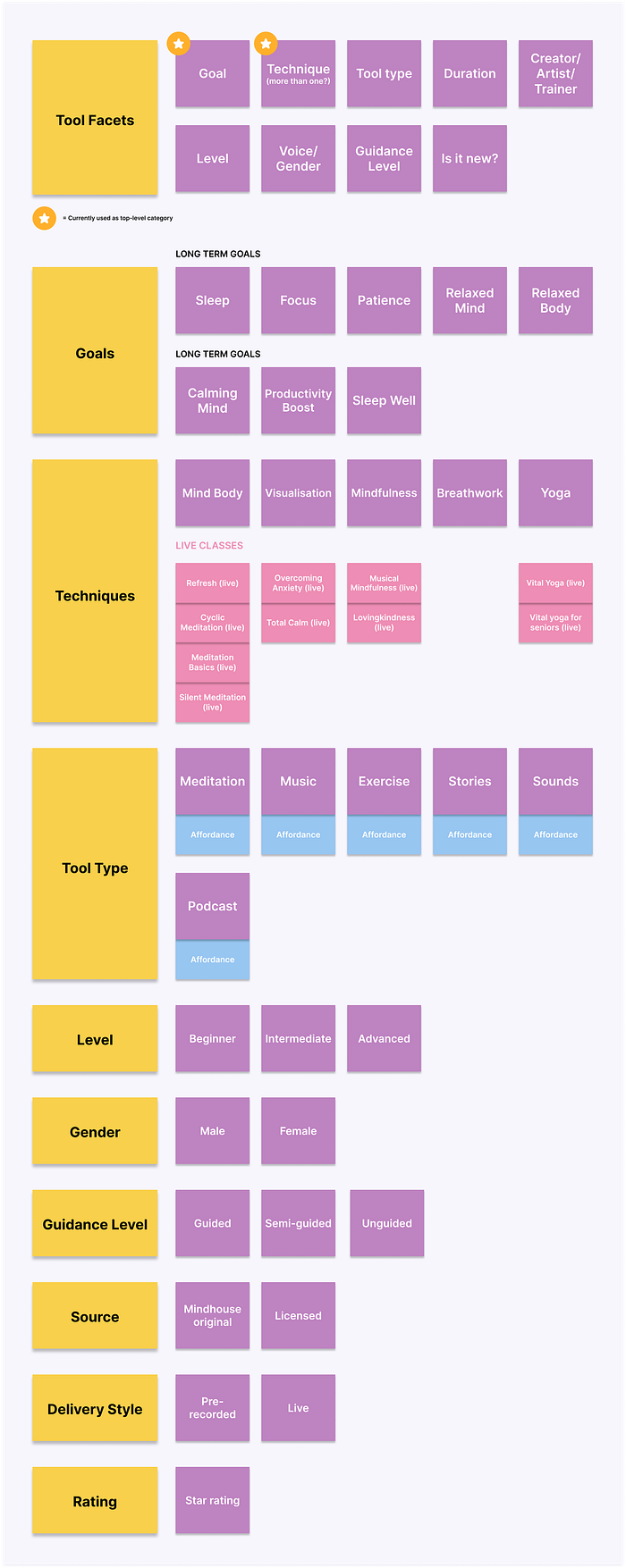
We listed down all the possible facets for classifying and grouping the content and then moved on to figuring out a better information architecture that would help to make this section of the app more delightful and consumable.
After wrapping up the problem with the information architecture, we started exploring different visual styles for the section. We started out with paper mockups and eventually created high fidelity screens. We broke down the UI into smaller pieces, such as— headers, sections, album cards, track cards, track listing, etc.

After a bunch of explorations, we decided on the final version for each element and put them all together to compose the new Do Now section.
This is what it looked like 👇

Book Tab — Slot based class selection
Due to a large number of classes (approx 70 per day), currently, it was hard for the users to know the class they were booking.
Each course has different types, which are available in two languages (Hindi and English). In total there were about 70 different classes in a single day on the app — scheduled for different times during the day.


This flow enabled the user to book classes but didn’t tell them what language the class they were booking, was in. Further, the slot listing was unnecessarily long with 70 slots in a 3x3 grid.
To solve the problem of knowing exactly what class the user was booking, we decided to give an option to pick the language before booking. Doing this would actively filter the available time slots, and only list the ones available for the chosen language.

Personal Coach
We had plans to roll out a “Personal Coach” feature, which would let the users engage with a Mindhouse coach to customize their wellness plan.
This service offers both — free and paid versions. The free version is accessible to anyone who has the Mindhouse app on their phone, from the “Coach” tab.
The differences between the two are as follows:

After getting the business requirements for the feature, and before making the screens, we planned out what the screens for both versions would consist of.
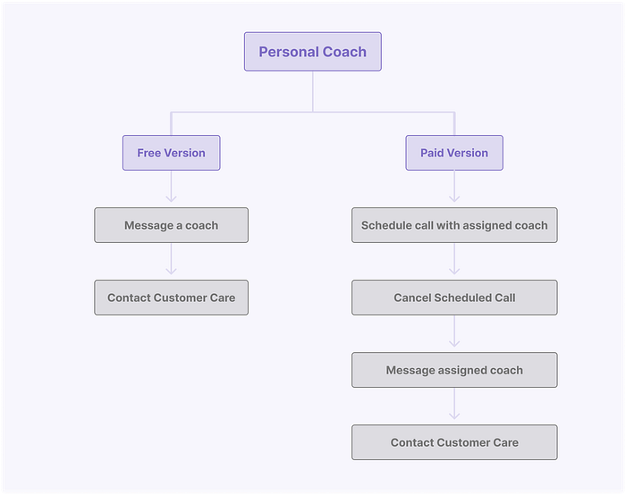
Once we had the “what” figured out, we started exploring the “how” — as in how the content needs to be presented visually.

After a bunch of explorations, we finalised the illustrations that worked best for our service and decided on the screens.
This is what the final screens looked like 👇

New Onboarding for the App
In March, we added new content to the app and divided it into 4 categories (Women’s Health, Everyday Wellness, Chronic Ailments, and Mental Health), each with several subcategories. Every user was allowed to select one major category and up to two subcategories.

This is what the final onboarding looked like 👇

Website Redesign
The Mindhouse website redesign was primarily a visual revamp of the old pages along with creating high-conversion landing pages to facilitate the launch of new services.

Social Media Collaterals
I also worked on some marketing collaterals to run as advertisements, to promote our live interactive classes.

Hi, my name is Neel and I like to solve problems with design. I am currently looking for a full-time role, you can view more of my work on my website. If you’d like to get in touch, send me an email at hello@neellakhwani.com.

