Maximizing user satisfaction with micro interactions
User experience (UX) is a crucial element of any product or service, as it determines how satisfied and engaged users are with what they are using. One key aspect of UX that can greatly impact user satisfaction is micro interactions, which are small, focused interactions that users have with a product or service. These interactions can be as simple as a hover effect on a button or as complex as a multi-step process to complete a task.

In this story, we will explore the role of micro interactions in UX and how they can be used to maximize user satisfaction. We will also learn examples and best practices for designing effective micro interactions.
Read also:
What are micro interactions?
Micro interactions are small interactions that users have with a product or service that serve a specific purpose or function. They can be as simple as clicking a button or as complex as setting up a new account. These interactions are often subtle and may go unnoticed by users, but they play a significant role in enhancing the overall user experience.
Some common examples of micro interactions include:
- Hover effects on buttons or links
- Animations that indicate progress or feedback
- Error messages and notifications
- Drop-down menus and other navigation elements
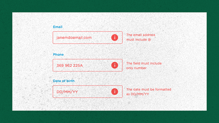
- Form validation and error messages
Micro interactions are often designed to provide feedback, assistance, or confirmation to users as they interact with a product or service. For example, a hover effect on a button may change the color or shape of the button to indicate that it can be clicked, while an error message may appear when a user enters incorrect information in a form.
The importance of micro interactions in UX
Micro interactions play a crucial role in UX because they help to guide users through the product or service and provide feedback and assistance along the way. They can make the user experience more intuitive, efficient, and enjoyable by helping users understand how to interact with the product and providing confirmation or feedback when they do.
Some of the key benefits of micro interactions in UX include:
1. Enhancing usability
Micro interactions can help to make a product or service more intuitive and easier to use by providing clear feedback and guidance to users. For example, a progress bar that shows the percentage of a task that has been completed can help users understand how much progress they have made and how much more they need to do.
2. Improving efficiency
Micro interactions can help users complete tasks more efficiently. These interactions can be as simple as a visual cue or a brief animation that confirms an action has been completed. By providing clear instructions and confirmation of actions, micro interactions can make it easier for users to understand how to use a product and navigate through its features.

3. Enhancing the overall user experience
Micro interactions can make the user experience more enjoyable by adding a touch of personality and visual appeal to a product or service. For example, an animation that appears when a user clicks a button can add a sense of playfulness and fun to the user experience.
Designing effective micro interactions
To maximize the benefit of micro interactions on user satisfaction, it is important to design them effectively. Here are some best practices to follow when designing micro interactions:
1. Keep it simple
Micro interactions should be simple and focused, with a clear purpose and function. Avoid adding unnecessary elements or complexity to micro interactions, as this can make them confusing or overwhelming for users.
2. Make it clear
Micro interactions should be easy for users to understand and use. This means providing clear instructions and visual cues to help users understand how to interact with the product or service.
3. Make it consistent
Micro interactions should be consistent with the overall design and branding of a product or service. This means using consistent colors, styles, and visual elements throughout the product or service. Consistency helps to create a cohesive and professional appearance and makes it easier for users to navigate and understand the product.
4. Most important: Test it
It is important to test micro interactions with real users to ensure that they are effective and intuitive. This can be done through usability testing, where users are asked to complete tasks and provide feedback on the experience. Testing allows designers to identify and address any issues or confusion that users may have with the micro interactions.
Examples of micro interactions in action
To better understand the role of micro interactions in UX, let’s look at some examples of how they are used in popular products and services.
1. Facebook “Like” button
One of the most well-known micro interactions is the “Like” button on Facebook. When a user clicks the button, it turns blue and displays a notification saying “Liked.” This provides visual feedback to the user that their action has been completed and confirms that their “Like” has been recorded. The button also animates slightly, adding a touch of playfulness to the interaction.

2. Google Maps navigation
Google Maps uses micro interactions to guide users through the navigation process. When a user enters a destination, the map displays a blue line to indicate the route and provides turn-by-turn instructions. The app also uses visual cues, such as a red arrow, to indicate the user’s current location and a green circle to indicate the destination. These micro interactions help users understand where they are going and how to get there, enhancing the overall usability of the app.
3. Netflix recommendations
Netflix uses micro interactions to help users discover new content to watch. When a user finishes watching a show or movie, the app displays a notification saying “More Like This” with a list of recommendations based on the user’s viewing history. This micro interaction helps users discover new content that they may be interested in and makes it easier for them to find something to watch.
Common mistakes to avoid when designing micro interactions
While micro interactions can greatly enhance user satisfaction, they can also have a negative impact if they are not designed effectively. Here are some common mistakes to avoid when designing micro interactions:
1. Overuse
It is important not to overuse micro interactions, as this can make the user experience feel cluttered and overwhelming. Avoid adding too many micro interactions to a single page or task, and be sure to consider whether each micro interaction is necessary and serves a specific purpose.
2. Lack of consistency
Inconsistency in micro interactions can be confusing and frustrating for users. Be sure to use consistent colors, styles, and visual elements throughout the product or service to create a cohesive and professional appearance.
3. Confusing instructions
Micro interactions should provide clear instructions to users on how to interact with the product or service. Avoid using jargon or technical terms that may be confusing to users, and be sure to provide clear and concise instructions for completing tasks.
Conclusion
Micro interactions play a crucial role in UX, as they help to guide users through a product or service and provide feedback and assistance along the way. By designing effective micro interactions that are simple, clear, consistent, and tested with real users, designers can greatly enhance user satisfaction and create a more enjoyable and intuitive user experience.

