Mastering the Four Cs of Designing a Product for Multiple Platforms 🖥📱

As UX designers, it is vital to consider different platforms when creating user experiences. Platforms are the mediums users access your product, such as desktops, mobile web, mobile apps, tablets, wearables, TVs, smart displays, and more.
Designing with multiple platforms in mind is crucial because users expect a consistent look and feel, regardless of the platform they use. In the past, UX designers could only focus on creating desktop-computer websites. However, users nowadays may view the same website across various platforms, such as mobile phones, smartwatches, and TVs.
Key Considerations When Designing for Different Platforms
- 📱 Screen size
One of the most critical factors when designing for various platforms is adjusting design elements and features to fit different screen sizes. For example, you have a lot of screen space when designing for desktop computers, but when designing for smaller screens, like mobile phones, you must carefully decide which parts of the design you’ll prioritize, including in the limited space. - 🤝 User Interaction
In addition to considering the screen size, designers also need to take into account the way users interact with each platform and how those interactions can impact design decisions. It’s crucial to prioritize accessibility and ensure that your design is inclusive for all users, including those who use screen readers, closed captioning, or switch devices. - 🎨 Content Layout
The layout of content refers to how information is organized on the screen. Desktop and laptop layouts can incorporate multiple columns and offer more design flexibility. Mobile phone layouts are generally in portrait (vertical) mode, ideal for scrolling. Tablets combine desktop and mobile phone experiences, allowing for the integration of both layouts. Smartwatches have compact square or rectangular screens, providing very little space to arrange content. - 🔍 Research to Craft Product Functionality
Before beginning any design work, conducting thorough Research is essential to understanding your target audience and their needs across various platforms. Functionality and the type of tasks that users want to complete are significant drivers in platform choice. Design choices will vary based on how and when users are expected to need the product.
🔢 The Four Cs of Designing for Multiple Platforms
To successfully design across platforms, it’s essential to provide users with a seamless experience, regardless of the platform they use. UX designers should ensure that their designs account for and take full advantage of the unique features of each platform. When designing for multiple platforms, consider the four Cs: consistency, continuity, context, and complimentary.
1. Consistency
Maintaining consistency in design is crucial for building brand awareness and improving the user experience. Many companies have specific design guidelines that need to be followed to ensure consistency with their brand identity, which encompasses the visual appearance and voice of the company. Adhering to these brand guidelines is essential to maintain consistency across platforms when designing a product. By staying consistent, users can expect the design to feel familiar across different products and platforms, building trust and recognition in the brand.

2. Continuity
Continuity in design means that users can maintain their progress as they move from one platform to the next. For instance, imagine writing a story or article on Medium on your laptop, but you need to leave and continue working on it from your mobile device. With continuity in design, you can easily pick up where you left off without losing your progress. To achieve continuity between platforms, UX designers need to ensure that the product’s functionality remains connected across all platforms. In the case of Medium, the platform should allow you to save your draft on your laptop and then easily access and continue writing it on your mobile device.
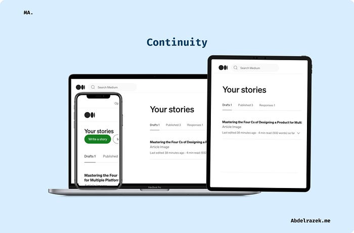
By prioritizing continuity in design, UX designers can provide users with a seamless experience as they move between platforms. This helps improve the user experience and build trust, as users expect the product to function consistently across all platforms.
3. Context
The key to creating a good design is carefully considering the context. This involves understanding how users interact with specific features on different platforms. For instance, Medium writers often need to check the statistics of their stories, such as traffic and visitor statistics, on a tablet during a break after a long meeting. Therefore, designers should consider this while creating an optimal experience. By grasping the context in which users engage with content, designers can develop a more intuitive and user-friendly experience that meets their needs and expectations.
4. Complementary
To ensure a seamless cross-platform user experience, it’s essential to consider the concept of complementarity in design. This means each platform’s design should offer something new and different to enhance the overall user experience. For example, a streaming service might provide a different browsing experience on their mobile app than their website. The mobile app provides more personalized recommendations based on a user’s viewing history.
👋🏼 Final Words
In conclusion, designing for multiple platforms is crucial in creating a consistent and seamless user experience. Designers must consider screen size, user interaction, content layout, and functionality. Additionally, the four Cs of designing for multiple platforms: consistency, continuity, context, and complementary, are crucial in creating a successful cross-platform user experience. By keeping these considerations in mind, UX designers can create designs that meet the needs and expectations of their users, no matter which platform they use.
If you want to learn more about UX and stay updated with the latest developments, follow me on LinkedIn and Medium. Thank you for taking the time to read this!

