Mastering Responsive Design: From History to Best Practices
Comprehensive Guide to Creating Optimal User Experiences on Every Device

Responsive design has become an essential component of modern web development, allowing websites to adapt to various screen sizes and devices. In this blog article, we will take a journey through the history of responsive design, from its inception to its current state, and explore the best practices for mastering it. This blog is your complete guide to responsive design, from understanding the fundamentals to learning about real-world applications.
The History and Evolution of Responsive Design

Responsive design began as a response to the issue of developing websites that looked nice on various screen sizes and devices. In the early days of the web, websites were designed with a fixed, static layout, which didn’t adjust to the screen size. With the advent of fluid grid layouts, designers became able to design a layout that would adjust to the size of the screen, making the website look excellent on different devices.

The introduction of media queries revolutionized responsive design. Designers might use media queries to apply different styles to a website based on specified parameters like screen size, orientation, or resolution. This meant that designers could construct a single website that look good on both desktop and mobile devices and adjust the layout and content accordingly.
With the proliferation of mobile devices, there was a greater demand for responsive design. As more individuals used smartphones and tablets to access the internet, it became critical that websites be optimized for these devices. With responsive design, websites may be developed once and then run flawlessly on any device, saving time and resources.
In recent years, responsive design has continued to evolve, with advancements such as flexible typography and CSS grid. Flexible typography allows for the font size and line height to be adjusted based on the screen size, making it easier to read on small screens. CSS grid allows for the creation of complex grid-based layouts, making it easier to create responsive designs that look great on any device.
Best Practices for Responsive Design
1. Prioritizing user experience: responsive design must meet user needs first:
The user experience should always be the first concern in responsive design. The design should satisfy the demands of the users and deliver a consistent experience across all devices, regardless of screen size. When designing the layout and flow of a responsive website, it’s critical to keep the user’s journey and the content they need in mind.
2. Choosing the right breakpoints: consider device capabilities, audience, and content:
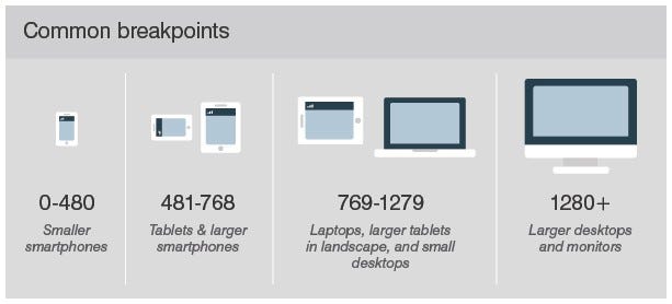
In responsive design, choosing the right breakpoints is critical. Breakpoints are the points at which a website’s layout changes based on screen size. When deciding on breakpoints, keep in mind the capabilities of various devices, the intended audience, and the content being delivered. A well-chosen breakpoint will provide the user with a smooth and ideal experience.
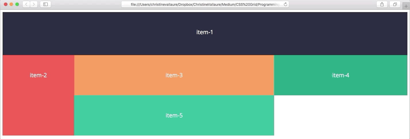
3. Implementing flexible grids and images: using CSS and HTML to create dynamic layouts:
Implementing flexible grids and images is an essential aspect of responsive design. The use of adaptable grids and pictures is an important part of responsive design. CSS and HTML may be used to build dynamic, fluid grids that adapt to various screen sizes, in addition to images that scale and fit inside the grid. This enables a responsive layout that adapts to diverse devices and screen sizes.
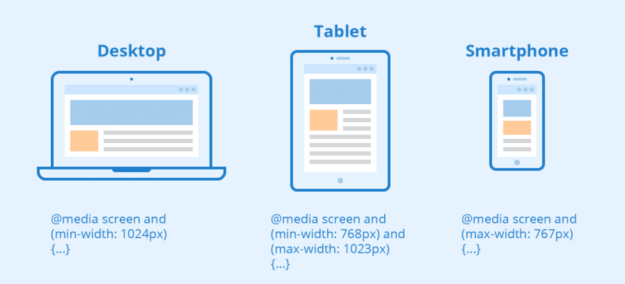
4. Using media queries effectively: target specific devices, viewport sizes, and orientations:
Media queries are a powerful tool in responsive design, and it’s important to use them effectively. By targeting specific devices, viewport sizes, and orientations, media queries allow for specific styles to be applied, resulting in a tailored experience for the user. It’s important to use media queries to enhance the user experience, rather than relying on them as a solution to poor design.
5. Tips for testing and debugging responsive design:
Testing and debugging responsive design may be challenging since it necessitates testing the design across a wide range of devices and screen sizes. To verify that the design appears and operates as intended, it is critical to test it on real devices as well as emulators and simulations. Debugging responsive design can also entail utilizing tools such as browser dev tools to identify and repair layout and functionality issues.
Finally, in today’s world, web designers and developers must master responsive design. With the growing number of devices and screen sizes, it’s critical to design websites that look nice and work effectively on any device. Designers can develop websites that deliver a seamless user experience and fulfill the demands of users on any device by knowing the history and evolution of responsive design, as well as the best practices for designing a responsive design.
Streamline Your Design Process with toools.design
If you enjoyed reading this blog and want to stay updated on the latest tips and strategies for success in the UI/UX industry, be sure to follow me, and let’s reach 100 followers together! And don’t forget to join me on Instagram and Twitter for daily doses of tips and insights to help you stand out as a UX/UI designer.

