Redesigning Acute Art — an AR app for everyone
What’s Acute Art?
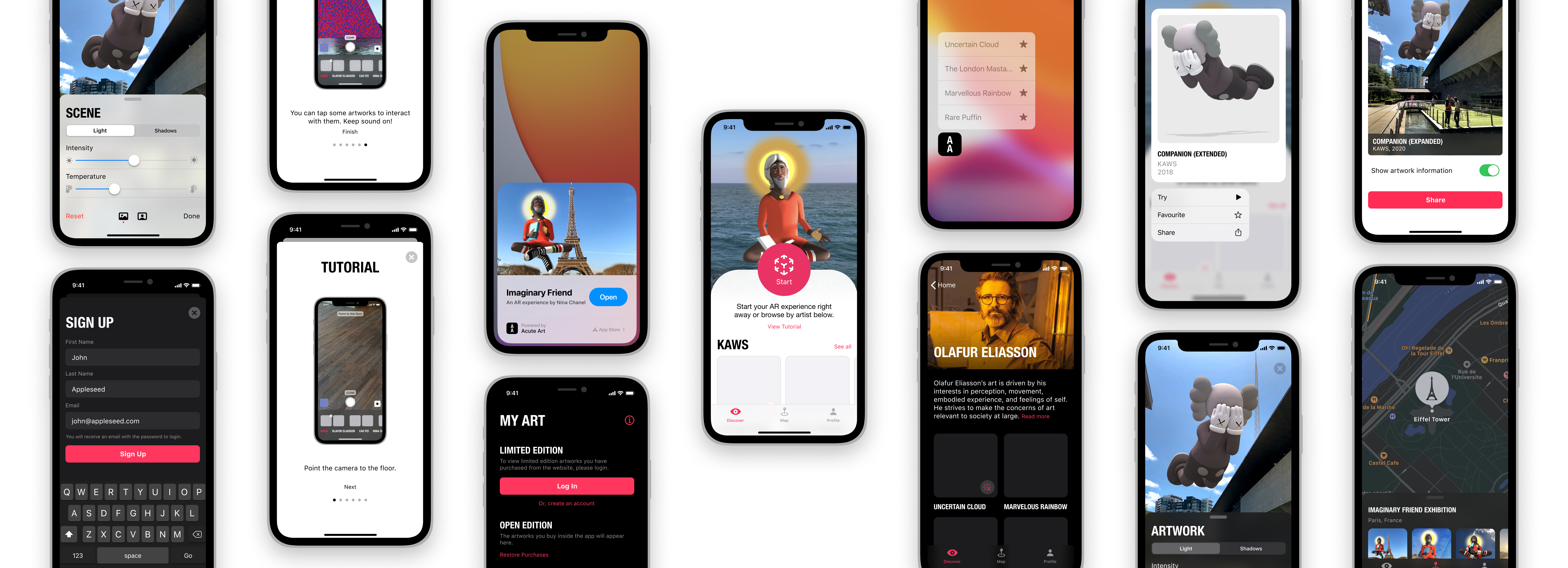
Acute Art at it’s core is an AR app to showcase artworks. It features works from revolutionary artists like Olafur Eliasson and KAWS. Like most AR apps, hero here is the camera view where users can actually see what the app is doing for them.
Who is it for?
I think the app is for all ages. All of us interpret art differently but we all can experience it, regardless of how old we are. Anybody who wants the experience can use it. From a 6 year-old to a 70 year-old, it’s going to be fun. That means, the app has to be simple and intuitive when presenting its content.
Goal
Here are a few things I wanted to change to improve the user experience and retention.
- Make it easier for people to discover new artworks and artists.
- Improving the experience when placing and adjusting the artworks to make it simpler and more intuitive for everyone.
- Create some interactions which add depth and make the process quicker for power users.
- Adding Dark Mode support 🤩
Redesign
The app has 3 tabs: Discover, Maps and Profile. I go through the redesigns as I go through the flow of the app below.
Discover
Everyone lands on the Discover tab when they open the app. They can get into the camera view right away or look into different artists.

Notice how in the original app, to discover new artworks you need to click on one of the artists to go into their page. Naturally, people are inclined to clicking on artists they know about, rather than unknown people.
Showing artworks as the hero rather than the artist amplifies discoverability in the redesign without losing any function. You can still go into the artist’s page by tapping ‘See all.’
So now there’s a bunch of places you can go into, let’s say I want to see more of Olafur Eliasson.
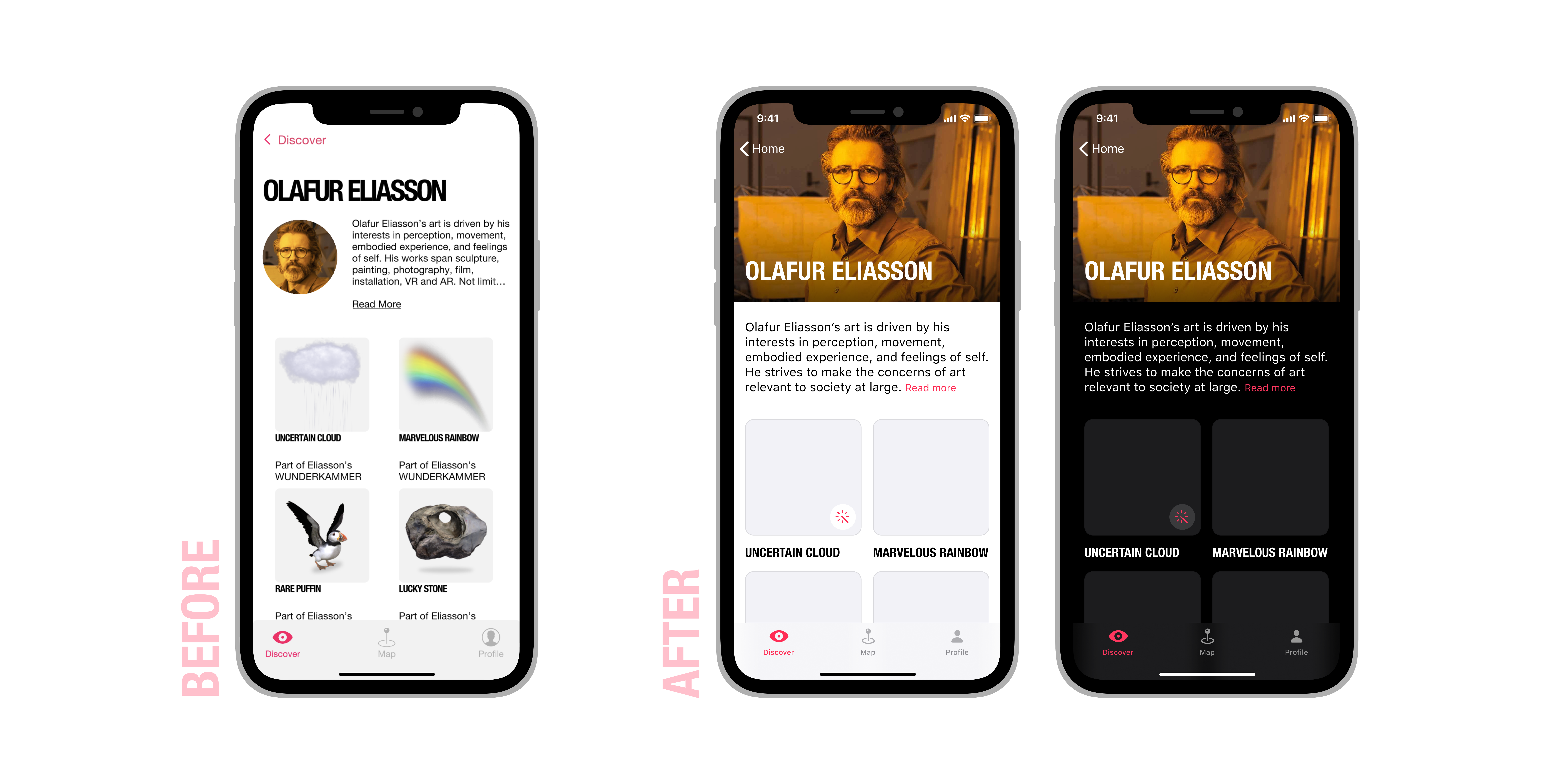
Some of the artworks in the app are interactive. To show which ones are, I’ve added a small wand icon to show that. So if I’m looking for interactive artworks, I know which one is without tapping on the artwork and going into its details. Apart from that, I’ve also changed the layout to give the page some more personality with a big clean picture at the top.
Now, if I want to try an artwork directly, I can just use Haptic Touch to trigger a contextual menu. I’m presented with a bunch of options to choose from.
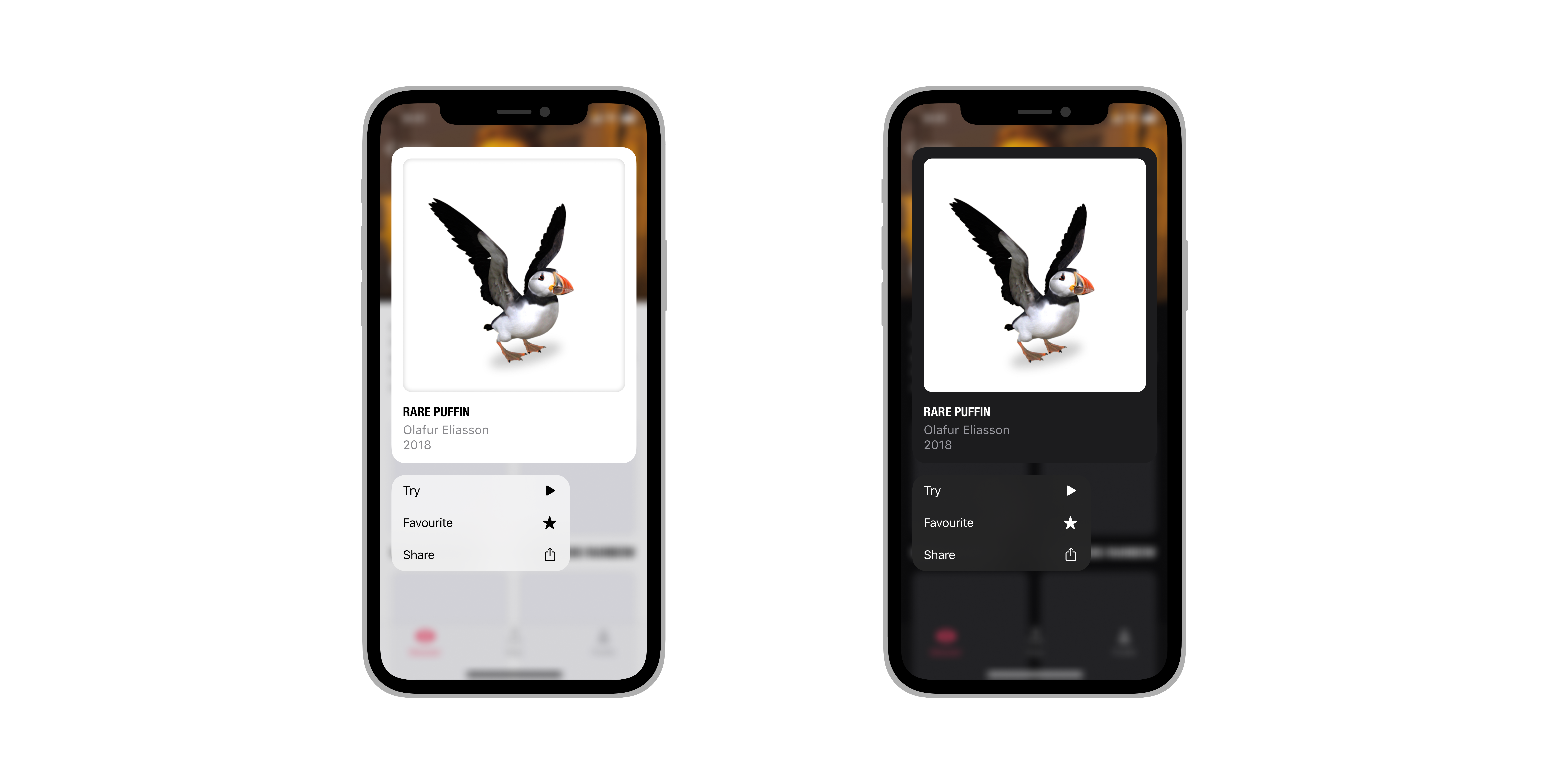
This’ll be helpful for the power users when they want to get to something quickly and easily.
Now, I decided to see more info about the artwork, so we land up on the Artwork page.

I’ve added two new features for artworks, sharing and favouriting them. Deep-linking is a technique encouraged by Apple where links open up the app in a specific location. So, say I shared the link for Uncertain Cloud to my friend. When they click that link, it’ll not only open the app, but also open it with details about Uncertain Cloud. This reduces the amount work I have to do and also reduces confusion for my friend, since he did’t know what the link was for in the first place.
Favouriting artworks let’s you access them quickly. I’ll show how as we delve further into the app.
Now let’s say I wanted to try Companion by KAWS from the Discover tab. Instead of having to click on the artwork, then be led to the artworks page, I can just use Haptic Touch.

Pretty easy, right? I can favourite the artwork, or share it with a friend as well. Let’s try out the AR experience. Since this is my first time using the app, I’m presented with a tutorial first.

Tutorials should be pretty straightforward and to the point, since this is when the user is learning how to use some complex part of the app. Instead of the tutorial covering the whole page, it’s presented as a modal.
Below are all the other tutorial screens.

Ok so, now we know how to go about everything when we are trying an artwork. Let’s try the Companion artwork by KAWS.

The current experience feels very clunky to me, especially because you can’t properly scale the artwork to your liking. It scales according to how close it is to you and if you take it too far, you run out of space to place it 😵.
I cleaned up the process a bit, with an instruction at the top. Also the buttons to adjust and remove the delete the artwork have changed.
Here’s an overview of how it looks after placing the artwork. Instead of having a toggle between picture mode and recording mode, I just changed it to an intuitive hold to record gesture.
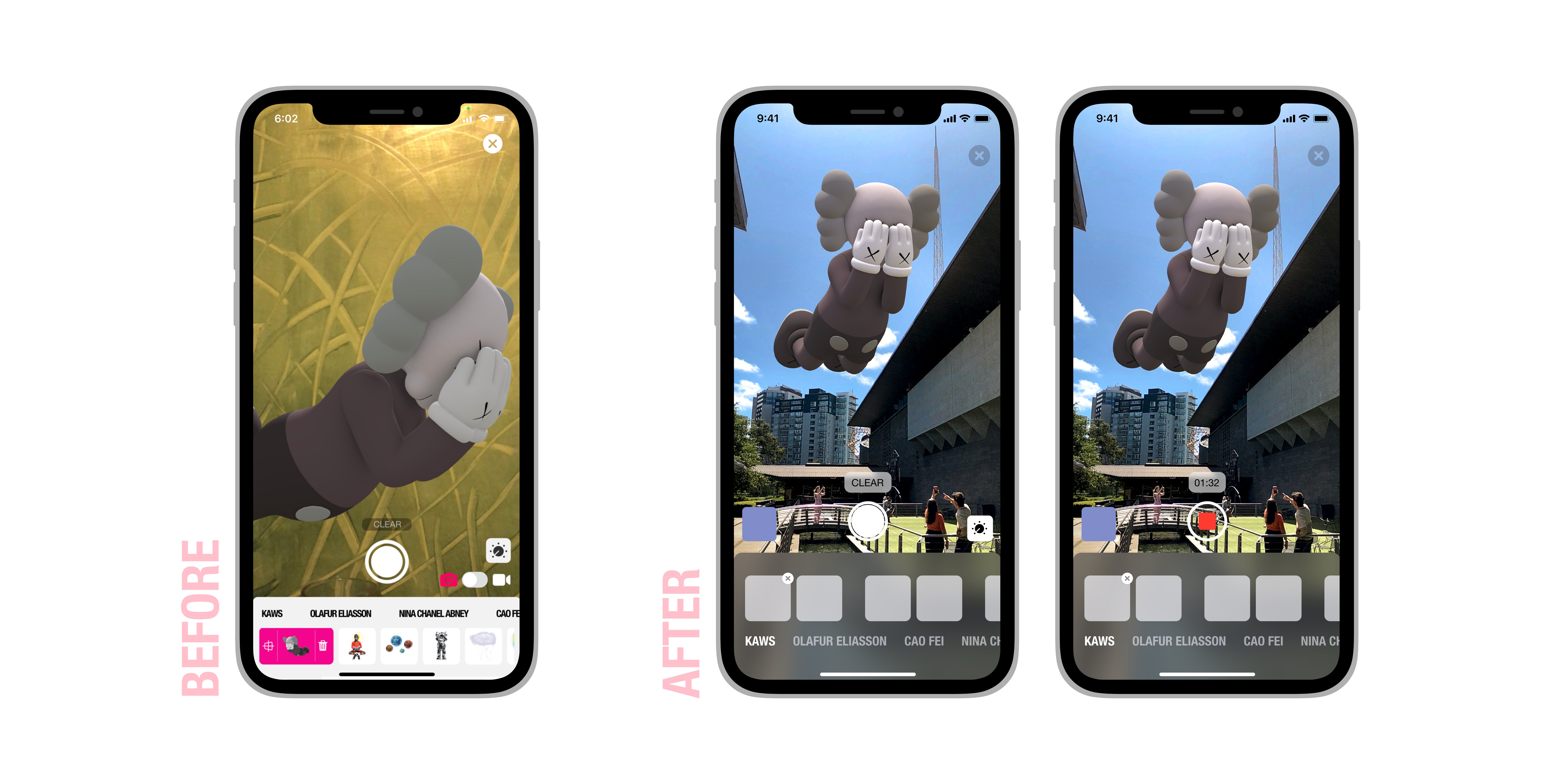
Holding the artwork in the selection menu let’s you adjust it, while the ‘x’ deletes it. These interactions are shown in the tutorial.

This screen was ridiculously difficult to simplify. There are so many controls here, it’s ridiculous. The original basically has two segmented controls–one to choose between scene and artwork, the other to choose between Light and Shadow settings.
So instead of having both at the top, I went with the global control (scene or artwork) at the bottom. The top label still clearly states in which state the user is in. The modal is expandable to show a bunch of adjustment options.
If no changes have been made, I present Reset as the destructive button, rather than cancel since there’s nothing to cancel. Done would do the same thing. But as soon as changes are made, the destructive button changes to Cancel.
Also notice the use of a relatively thinner material rather than an opaque one adds context for the user. Apple recommends using thinner materials if you have rich content underneath the view.
So after placing the artwork and making all the adjustments, I’ve clicked the perfect picture. To share it with friends, I tap the small box which shows me a preview of the picture (see first screen below) I took and the share screen appears.
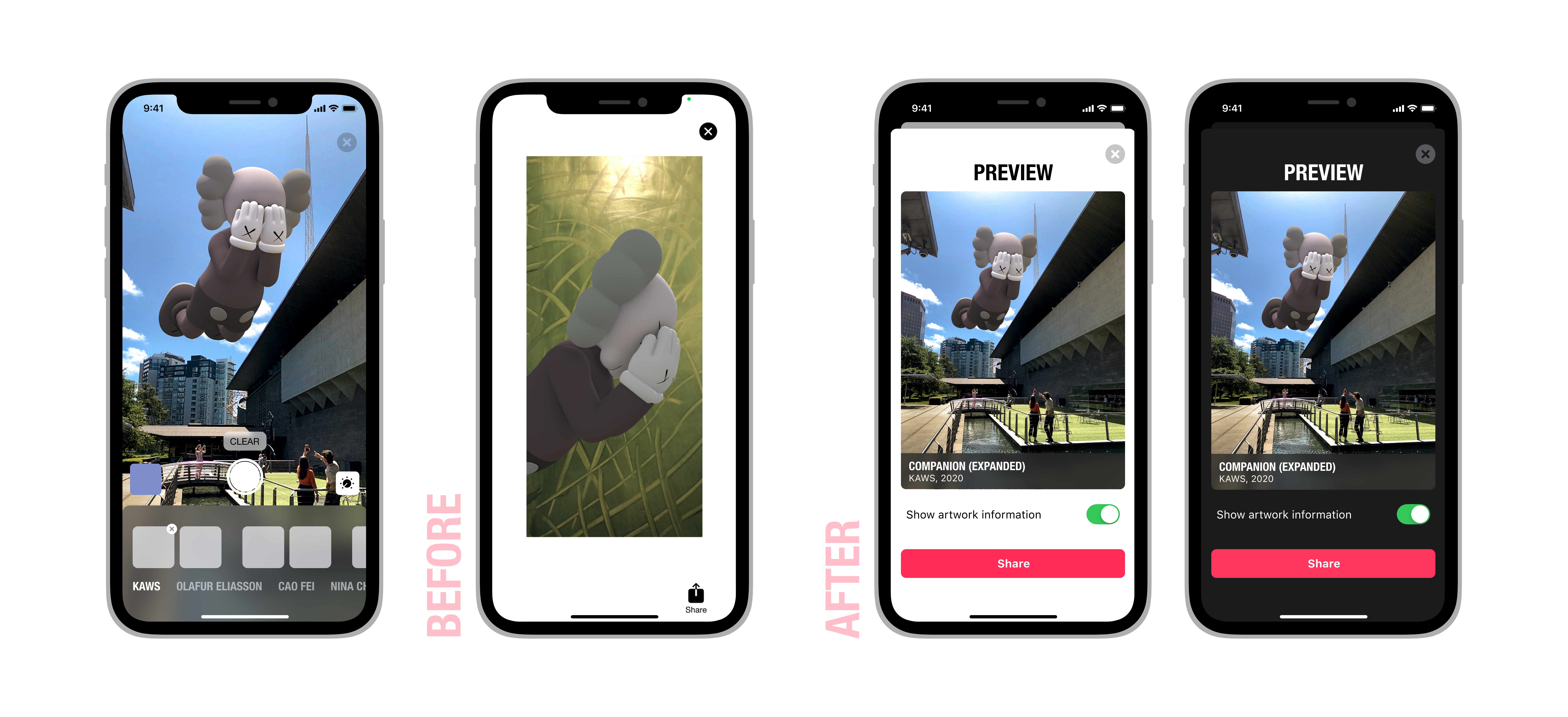
Well, needless to say, the current share screen is pretty minimal. I added a small feature which lets you share the details of the artwork you’re sharing, I think it looks pretty cool.
Maps
Acute Art allows us to look around a map with marked landmarks for various artworks. But that’s about it, you can tap to see which artwork it is but there’s little use except when you’re actually near the location. I felt they could utilise the map in a better way, so I decided to have a modal for each location which showcases some pictures clicked at that location.

Another location-based feature could be having App Clips at each location to play with the app and only the artwork featured at that location. Being light-weight, nobody would need to download much considering most of them would be on mobile data rather than Wi-Fi.
Profile
This is the last tab to explore and adds a bunch of content to interact with.
- Limited Edition: the Acute Art team allows people to buy limited edition artworks from their website and buyers can then try those artworks out in the app. But to sync the purchases, users need to login.
- Open Edition: some of the artworks in the app are paid. All these purchases can be reached in the Discover tab but also are present in the Profile app for quick access.
- Favourites (new): remember that we could mark artworks as favourites? They all are in the Profile tab too. I can just go to this tab rather than scour the Discover tab to find my favourites.

So let’s say I’m new and want to sign up. I tap the “create an account” button to get started.

The sign up process is definitely a bit weird currently. They use a very outdated keyboard which covers the submit button while also not delaying an important message regarding the email. I generally use a random spam email to sign up and don’t have it logged in in my phone’s email client. Now, Acute Art emails me the password to login. If I don’t have access to that email, I just can’t proceed 😰. It’s definitely not a good idea to withhold this information until submit is tapped and that email is registered.
Thankfully, I’ve registered and now I can log in with my new password.

The current app acts extremely weirdly when logging in. If I leave any of the fields blank, it still sends a request to the server. Also, tapping anywhere other than a textfield after you were editing a textfield will result in the app trying to login with whatever credentials you have. Anyway, after logging in, we have a richer Profile tab.
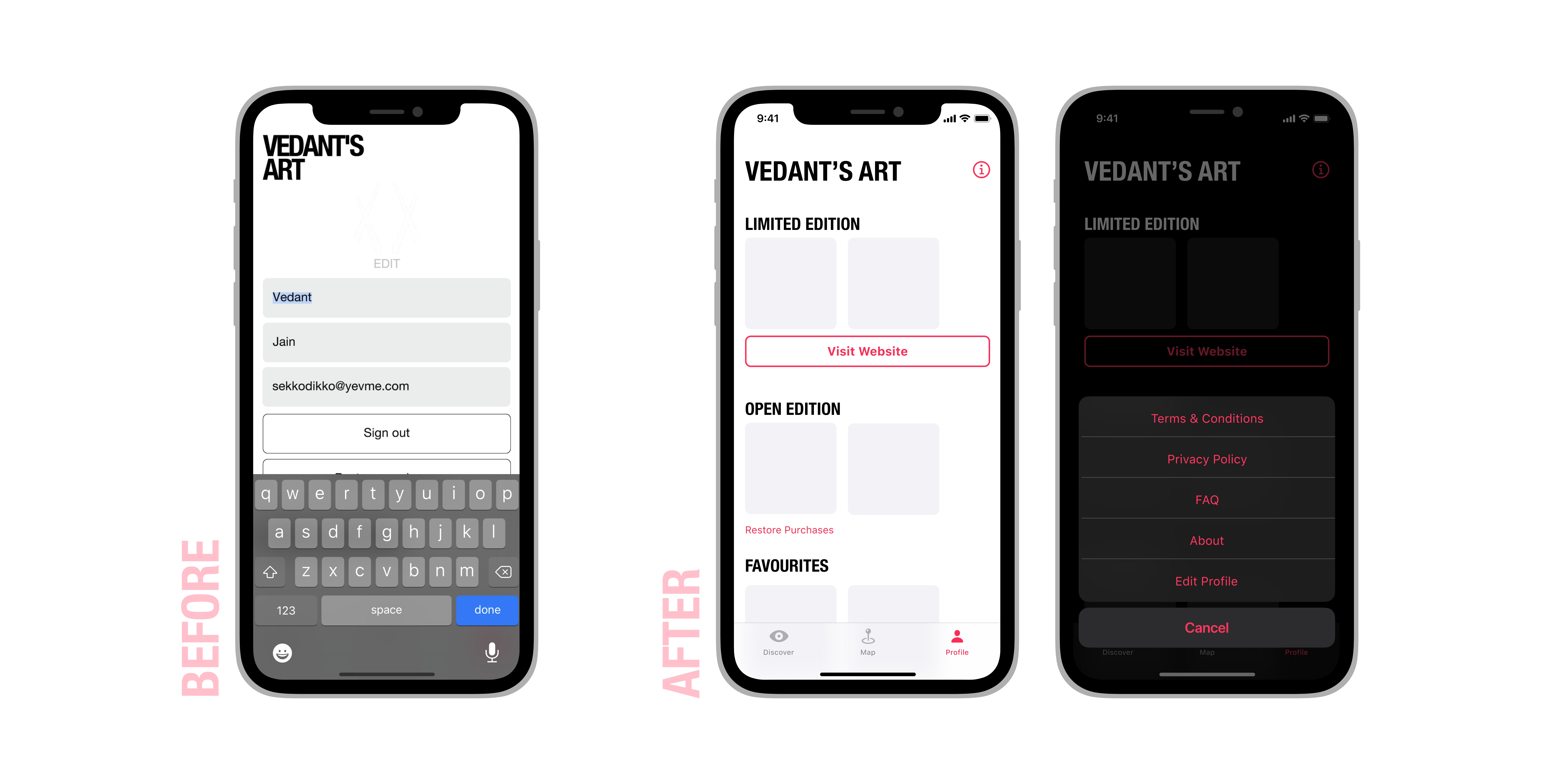
An unexpected behaviour of the app is to have editable profile information when you open the tab. I really don’t want to change my name every time I open this tab 😞. This also covers up useful space to show other, more important content.
We’ve got an option to reach the website to buy more limited edition artworks; an option to restore purchases for open edition artworks and our favourites.
I’ve also added a contextual menu to reach favourites from the home screen.

🎉
That’s about it. Feel free to dm me on Twitter if you want to discuss!
This has been a tremendous project to work on. It’s been an amazing experience and it only excites me to take up bigger projects.
Even though a widget would be unrealistic for this app, if you’re looking for a guide to make a widget for your app, I have you covered: Designing widgets for iOS, macOS and iPadOS — the ultimate guide.
Due credits to the Acute Art team for creating such a fun app.
Thank you for reading, have a nice day.

