Design sprint
Case study: Designing a local shopping-cum-travel app in 4 days
Flipkart design challenge 2021

“People ignore design that ignores people” — Frank Chimero
January 2021, Flipkart gave three design challenges to the final year students for job placements in the Indian Institute of Technology, Roorkee (IITR). I’m neither a final year student nor in IITR but I took this challenge to practice and improve my design skills.
Design challenges given by the Flipkart were:
- Bicycle Renting
- Local Shopping
- Milk Delivery App
I chose ‘Local Shopping’ design challenge.
Challenge statement
Create a solution for people visiting an unfamiliar city to visit areas of local interest and shop for gifts to take back home (souvenirs, delicacies, etc.). Come up with innovative ideas to assist in such kind of shopping.
Reason ❓
During my trip to Goa and Jaipur, Rajasthan, I myself faced the problem of not knowing what is available in the city to buy and what are the things I should try out. Although, Google is there to answer all my questions but I would like to have all the must-try / best things on my mobile screen instead of getting involved and stuck into multiple Google searches and visiting multiple sites and apps.
Because of this reason, I chose the ‘local shopping’ design challenge to design a solution to solve this problem which may also be faced by many people like me.
*I considered places and activities along with the souvenirs and delicacies.

Platform selection
I chose the mobile platform instead of the web because when it comes to portability between mobile and laptop, everybody carries their mobile with them while traveling. Website can also be accessed from the mobile but a mobile app provides more convenience to the user.
Duration & tools used
Duration: 4 days
Tools used: Figma, Whimsical, & Adobe Photoshop, Adobe Illustrator
As this was my first design sprint, I followed ‘Sprint: How To Solve Big Problems and Test New Ideas in Just Five Days’, a book by Jake Knapp.
Many assumptions were made during the design sprint with valid reasons.💡Pro tip —I used photoshop to only to create mockups where illustrator to make the logo. You can use pre-made free device mockups and logos to save your time.
🌄 Day 1: Long term goal, product failure, brainstorming, & research
Long term goal
With an optimistic approach, I began the sprint by figuring out the long term goal first, which was crucial to give the sprint a direction to go in. Whenever I got a new idea to implement or to change the previous one, the long term goal was changed and updated. So, the long term goal was to provide the user a wonderful travel experience by designing a solution where a user can find everything whatever is needed during the travel.
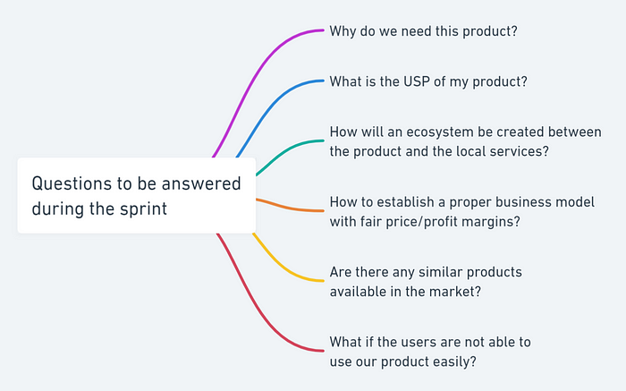
Sprint questions
A pessimistic approach was also required to know the reasons, why the product can fail? Many statements/reasons were figured out which can lead to the product fail and those reasons were then converted into the questions which were to be answered during the sprint.
*USP (Unique Selling Proposition)
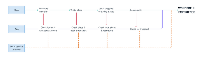
Map
A map was created based upon how we wanted our app should be benefitting the users. Customers and key players were listed on the left and end goal on the right. The initial map was a draft that was updated later in the sprint.
Research 🔎
Some research was necessary to know if I’ve missed something or we can identify a different scenario or problem which a user faces during the travel. I reached out to people to know about the problems and scenarios but I dropped this plan as it was a time-consuming process. Instead, I went to Google to search for the problems faced by the people during their travel or when shifting to a new city to see if I can get different and unique problems.
Problems identified during research
- Sometimes people feel lonely or want someone for help or want to talk to a local to know about the city.
- Not only do people face problems in finding the city’s souvenirs and delicacies, but also in finding the best places and must-do activities available in the city.
- Local shops are scared of online business collaboration because of a lack of clarity and confusion in working on an e-commerce platform.
💡Pro tip — In a design sprint, don’t go deep into the research, only do research that enough for you to drive the sprint forward.
Business model
To understand how a business model works between offline and online platforms, I referred to the business models of MakeMyTrip, taking local ‘Kirana’ shops online, & the business model of grocery delivery app. The major thing to consider was the fair price and profit margins and for this. I decided that 10% commission will be charged from the local shops and restaurants, also keeping in account their margins afters wholesale and retail distributors whereas 15% commission will be charged from the local transportation by the online service (in this case, it is our product/application).
This was an answer to one of our sprint question, How to establish a proper business model with fair price/profit margins?
Building an ecosystem
To build a healthy ecosystem, local transportation was considered to involve in the business because the revenue-generating stream for local transportation has decreased due to online taxi booking services. So local transport (auto drivers, e-rickshaws etc) owners will play an important role thus increasing their annual revenue. In addition to this, offline service providers' confusion will be removed by making them understand how e-commerce and online-offline collaboration works.
This was an answer to one of our sprint question, How will an ecosystem be created between the product and the local services?
‘How Might We’ notes 📝
‘How Might We’ notes were created displaying all the problems reframed into opportunities which can be implemented in the application. The notes were organized by moving them closer based upon their similarity.

Final map with HMW notes
The draft map was converted into a final map showing the steps a user takes and how our application will assist him/her to accomplish the target of the wonderful experience. Map was made simple with as few steps as possible to keep the flowchart simple and easy to understand.
Only those HMW notes were selected which were highly voted by me because of their need. Notes which were not too important to consider due to the time constraints were ignored.

Target customer 👤
Many customers were targeted initially but later all the customers were considered in just one category, Traveler, based upon their activities.

🌄 Day 2: User scenarios, ideas, & sketches
User scenarios
Three different user scenarios (more of a user persona) were created to know how and when people face problems when they travel with their pain points in which the scene is described. User scenarios helped me to design the app more user-centric when it comes to the usage of the app.


Ideas from existing apps
I referred to some travel apps to get ideas for the user interface design. The apps were MakeMyTrip, Booking.com, Goibibo, & Airbnb.
The user interface of the Airbnb inspired me a lot. It was so clean, proper white spacings, easy to navigate and understand what the app is doing. Also, the use of photos and illustrations were very good in the Airbnb app.

Sketches ✏
Sketching the user interfaces was a brainstorming session for me. Some of the new ideas about the layout came to my mind while sketching whereas some were already in my mind.

*More UI ideas came to my mind while I was designing the final UI, so they are not included in these sketches.
Many sketches like onboarding, signup/login, & my orders etc were not included in the list of final designs just to save time and to focus only on the important aspects of the design.
🌄 Day 3: User interface & prototype
User interface
UI designs were based upon the sketches made & UI ideas from the existing travel apps. While designing the UI, I especially focused on a constant color scheme, enough white spacing between the elements, & text under the icons so the user won’t get confused in knowing what the app is made for and what it is actually doing.
Photos and information about the places, activities, & items used in the design were taken from Google (a few from Wikipedia) because Unsplash did not have all the required photos.
*All the credit goes to the respective owners of the photos.
Home
The home screen displays the four top places to visit, activities to enjoy, souvenirs to buy, & delicacies to eat in the city. View all option is also available to see all of them in a list view.

Souvenirs
Users can find all the souvenirs available in the city in one place. They can be filtered based on the user preferences, know about the souvenir and can buy them or add it to the cart. Users can also choose to travel to the place where the particular souvenir is sold.

Delicacies
Just like souvenirs, users can find all the delicacies available in the city in one place which can be filtered based on the user preferences. Users can read about the delicacies and can buy them or add them to the cart. Also, the user can choose to travel to the place where the particular delicacy is made.

Places
Similar to some travel apps, a user can browse through all the tourist places to visit in the city which can be filtered. Users can read about the place, see the location, check reviews and prices, & talk to a tourist guide, all at one place. Option to use local transportation is also available which can be seen when tapped on the map.

Activities
Just like places, a user can browse through all the activities to do in the city which can be filtered. Users can read about the activity, its duration, reviews, and prices, & talk to an activity organizer, all in one place. Also, an option to use local transportation is available which can be seen when tapped on the map.

Social
The problem of traveler feeling lonely or they want some help or they wanted to talk to a local person to city is solved by ‘Social’, a community place to interact where a traveler can see what other people are sharing their experiences in the city and helping others.

*Primarily to interact with the city locals but can also be used to interact with other travelers and tourists.
Prototype
Being one of the most important steps in the design process, I created a prototype of the app. Prototyping is essential for resolving usability issues before launch. It can also reveal the areas that need improvements. An aspect of interaction design was focused on making the app look as real as possible to the user.
🌄 Day 4: Customer feedback
The prototype was shared with other designers and normal app users on the discord community, LinkedIn, & some of my friends. The feedbacks were positive considering the problem statement and app idea. They liked the app as a product to help travelers providing a wonderful travel experience.
💡Pro tip — Take customer feedbacks from the people who don’t know you well because they will give you better feedbacks as compare to your friends or family members (if they are not designers).
Designers
Designers focused on the UI, idea, & elements of the app. Some minor design improvements were noticed by the other designers like decreasing & increasing font-size by a little amount at some places, fixing some elements while scrolling, and placing an indicator element on photos to let the user know in which direction the scroll action is.
Normal app users
Normal app users focused on the app as a proper product to use. So asked for
- An option to personalize the app at the start (considering onboarding) according to their food preferences (veg/non-veg), health conditions affecting sports and adventure activities, as well as religious preferences for tourist spots.
- Instead of just categorizing places and activities, they’d like to have some suggestions like ‘top-rated places near you’, or ‘people who visited this also liked this’, or ‘based on your recent activity’.
- Filters or tags like spicy, sweet, veg, non-veg, Indian, continental etc (applies to other screens as well).
Sprint questions’ answers
Remember the set of questions that were to be answered during the sprint base on the long-term goal.
Why do we need this product?
We need this product to provide travelers a wonderful travel experience without struggling to find information about the city by googling different searches, visiting different sites, & trying different apps.
What is the USP of my product?
Locally (name given to the app) an app where a traveler can know everything about the city he/she is traveling to or will travel. What makes this app different from other apps in the market is that it provides all the information regarding the city of travel at one place without getting stuck in the Google search engine or any other travel app with a feature to connect to the city locals and use local transportation system which is often cheaper than online taxi services.
Are there any similar products available in the market?
Many similar apps that operate in the travel industry such as MakeMyTrip, Booking.com, Airbnb, Goibibo, & many more. However, their main focus is on providing transportation and accommodation to the customer, not providing local shopping service.
What if the users are not able to use our product easily?
The reasons due to which an app (product here) doesn’t get easily fit with the customer/user is because of bad information architecture, outdated user interface, & poor service provided by the app. In this design sprint, the major focus was on the information architecture, and friendly and easy to use user interface. Talking about service, it highly depends on the integration of business deal between the clients and the management behind the service.
Product scalability
No doubt, this product is highly scalable considering its usability. This case study revolves around local shopping and travel. However, this product can also be made for people who just shifted to a new city and struggling to find basic services like plumbing, TV connection, electrical work, local market, food shops, clothing shops, and the list goes on. Similarly, this product can be used for students who are looking for off-campus housing and basic amenities when they travel to a new city for their college.
* Some services provide the solutions to problems listed in product scalability. However, according to me, including all the services in one application is better than services on different applications.
Thank you so much for reading this case study. Suggestions are always welcomed.
Feel free to ping me on LinkedIn or Instagram.
You can email me at arshkaushik21@gmail.com

