Leveraging quantitative data to refine user experience
In this post, I am going to talk about my experience working with data for my UX Research with Quantitative Data class with Professor Raelin Musuraca this semester. In my core course — User Centered Research and Evaluation, we delved into the power of qualitative research — talking to users, understanding their pain points, and crafting solutions with empathy. We explored how seemingly low adoption rates for a Smart Loading Zone app stemmed not from a bad app experience, but from a lack of user awareness which was evident from our qualitative research, to understand the “why” behind user behavior.
However, data is a powerful tool for guiding design decisions. For example, in my Smart Loading Zones project, if we hadn’t seen the parking authority’s data revealing that few people utilize the loading zone, we wouldn’t have been able to identify its shortcomings and address the underlying cause of the problem. Hence, I took this class to learn how to use raw data to inform design decisions, how to make sense of raw data, and to learn when to use what type of data to inform design decisions.
In this class, we set our sights on improving Skeema, a Chrome extension designed to conquer tab overload and bring order to cluttered workspaces. Skeema’s initial launch addressed a well-defined problem: users drowning in a sea of open tabs. Their solution — organizing tabs into projects — offered a clever way to close them without the fear of losing them forever. However, the initial launch didn’t quite hit the mark. This is where we put our focus on. The challenge? Making sense of this data to guide future design decisions and refine Skeema for its second launch!
Here are my key takeaways from the 7-week project using quantitative data to recommend design solutions:
Learning #1: Define your users, then visualize
Understanding the impact of user segmentation on data visualization was an important step in my learning journey. I remember a lecture in class where we discussed the importance of identifying your primary users and catering to their needs. Because if everyone is your user, you keep adding more features to cater to everyone, and the company becomes bloated, and then, another company with a niche-focused offering acquires value and captures those users. Even during our conversation with Niki Kittur, the founder of Skeema, he stated that they were focusing on high-context switchers, and wanted to do so based on their research.
To get deeper insights from the data, I segmented users based on context switching behavior. Then, I analyzed the percentile distribution of window switching frequency and categorized users into three groups: low, medium, and high context switchers. This segmentation allowed me to tailor the data visualizations and understand user behavior patterns specific to Skeema’s core target users.
Learning #2: Visualization is a Journey….
Let’s be honest, data visualization takes time. Prior to the course, I had some Tableau experience, but it was instructed, but now I was staring at raw data with many possibilities. When there are no boundaries and you can do ANYTHING, it is hard. I experimented with different permutations and combinations of data following the sorting of context switching behavior, questioning if I was getting something valuable from this.
What’s the key takeaway? Don’t give up! Data holds hidden stories, and with persistence, patterns emerge.
I also used calculations to generate additional data fields. These derived variables gave useful insights into user window management behavior, as shown by my initial visualizations.

Learning #3: It’s okay to not use all the data
When I first started this project, there were plenty of data sets that became overwhelming. I mostly used the user activity and Skeema’s PMF (Product-Market Fit) response dataset. Why? Because I realized that it could help me narrow down my design even further. Of course, I can utilize the other data to validate or strengthen my hypothesis, but with such a limited project timeline, I understood I needed to pick a portion of the data to work with rather than focusing on everything.
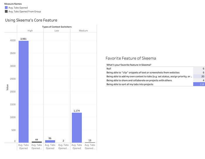
And I was able to get one important insight that helped steer my journey. I discovered that, despite the number of tabs opened, the number of tabs opened from saved groups was relatively low, which is Skeema’s core feature. In addition, when I visualized the data from the PMF responses, I discovered that grouping the tabs into various projects was the user’s favorite feature. However, these two visualizations revealed a disconnect, which led me to develop three hypotheses to help drive my design.
My Three Hypotheses
#1 Based on secondary research regarding tab management behavior and tab overload symptoms, I believe that if we implemented a gamified data visualization dashboard viewing their tab management (providing insights and rewards), then we can achieve a higher rate of tab closure.
This was focused on raising awareness of tab overload. I almost imagined a mascot whose emotional state reflects tab usage. As the number of tabs increases, the mascot might become overwhelmed (think a growing, stressed brain!), motivating users to declutter their workspace. Conversely, good tab management could lead to a happy mascot, reinforcing positive behavior.
#2 Based on high tabs opened for high-context switchers, we can say that there is potential for user uncertainty about the need for saved tabs. I believe that if we integrate AI-powered summarization, providing a concise overview of the tab’s content, then we can achieve more informed decisions about keeping or discarding tabs.
This was aimed at surfacing key information from within tabs, where AI summarization can help users quickly understand a tab’s purpose and value. This can significantly reduce tab overload by eliminating the need to revisit tabs solely to refresh memory or confirm relevance.
#3 Based on low “open tab from group”, suggesting users forget or find it difficult
to save tabs to projects. I believe that if we implement a right-click option to directly “add tab to project” within the browser interface, then we can achieve increased utilization of the “save to project” feature, leading to a better organization of saved tabs
I noticed that in the current version, they had to go the extra step to add tabs to a project, which might have been a barrier. HenceI Imagined saving tabs to projects with a simple right-click — a smooth and intuitive action that reduces friction and encourages users to organize their tabs more effectively.
Lesson #4: The Data Feedback Loop
In one of our classes, we discussed Skeema’s recent UI changes that intentionally were made to frustrate users. Professor Musuraca offered a thought-provoking perspective: perhaps Skeema was intentionally gathering data on these users to inform a larger goal, like maybe building a browser or an entirely new product. Maybe this data was useful but for not Skeema’s next launch but something bigger. This conversation highlighted the hidden potential of data — it reveals user behavior patterns that can fuel better design and targeted audience reach.
Data becomes this incredible feedback loop, informing design that gathers even more informative data.
Lesson #5: Small Changes, Big Impact
Before coming to MHCI, I saw design as grand, groundbreaking ideas and concepts. My two semesters in the program, including this class have taught me valuable lessons. The smallest, most strategic changes — such as changing the color from bright to dark or moving the CTA button from bottom to top — can have a huge influence on user engagement and, as a result, achieve UX goals. And that is the power of making small tweaks to have a greater impact. I learned that you don’t always have to introduce a new feature; if your research indicates that something isn’t working, you can make minor strategic changes, observe how people engage with it, and use that data to influence your design decisions and further build on it. This has been my biggest learning!
An Easier Way to Add Tabs to Projects, Without Changing Tabs
For my final design, I proposed a simple addition based off of the third hypothesis: a small floating widget, providing an alternative path to the existing tab saving functionality. This tiny change could potentially improve user experience without a complete overhaul and could also help us get more insights into the user behavior.

Lesson #6: Data can help you go beyond the obvious
Our final class presentation to Skeema’s founder, Niki Kittur, sparked an interesting discussion. Remember the visualization showing a user group with fewer opened tabs?
I initially interpreted this as a usability issue — perhaps the feature wasn’t visible enough. But Niki offered a thought-provoking alternative: what if this data revealed a deeper insight? Maybe these users weren’t just saving tabs; they were saving them out of fear of losing information, even if they no longer needed it. Perhaps the search itself had been a time-consuming hassle, leading them to save the tab “just in case.” This discussion highlighted the power of data visualization to uncover hidden insights beyond the reach of qualitative research alone.
As a product designer, I am looking forward to leverage quantitative data with qualitative research. This experience has shown me how seemingly simple visualizations can spark powerful ideas, paving the way for impactful solutions through small, data-driven improvements.
Working on this project over the course was filled with valuable lessons. This opened my eyes to the power of data as a design partner, working alongside empathy and user research to create truly impactful experiences!

