Member-only story
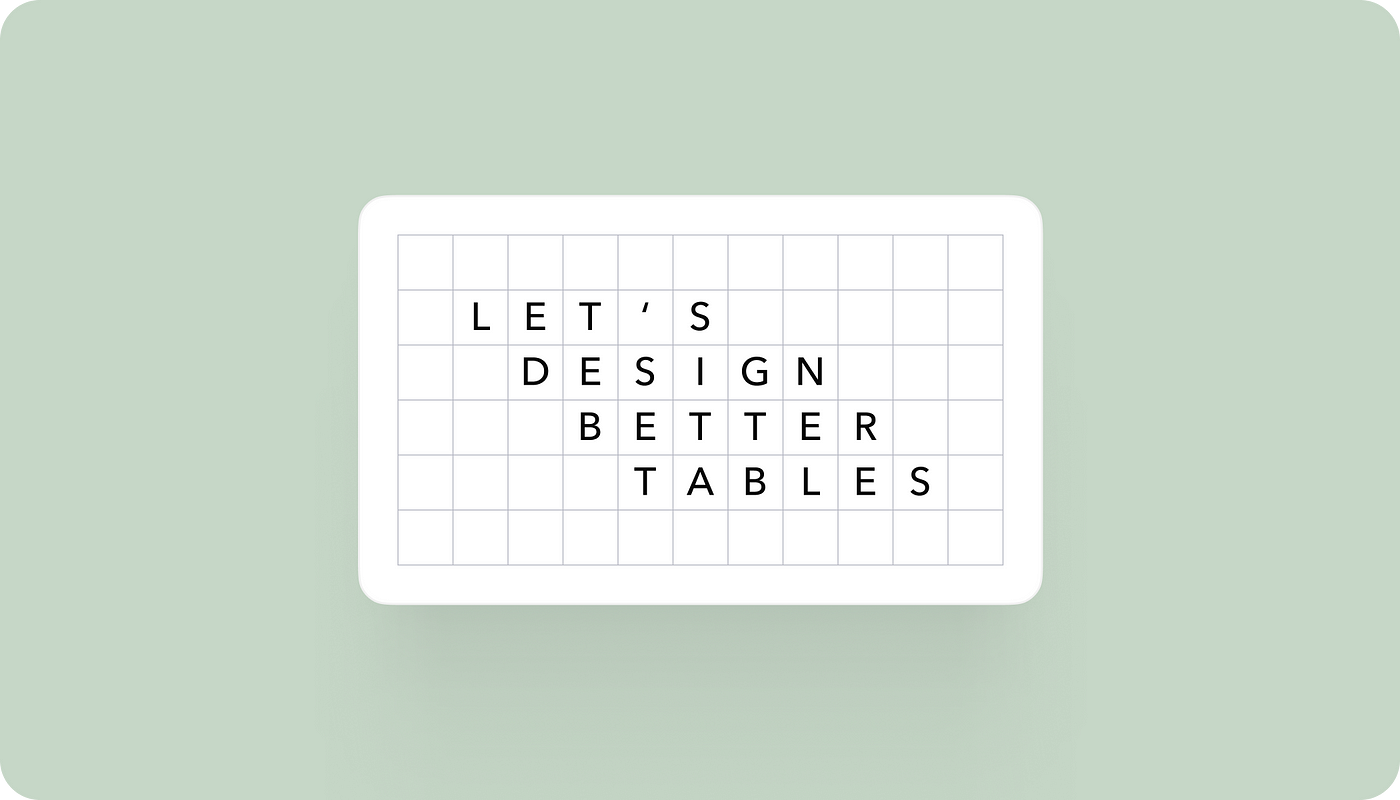
Let’s design better tables
The structure of each table in the interface can vary depending on the user’s needs and project requirements. However, a typical table structure includes features such as searching, sorting and filtering, which allow users to organise and view the data in different ways, including the table itself and pagination.
We will start from the simple table and slowly add new data here, filters and sorting options.
Columns
I can generally divide the columns into two main categories: the one that hugs content and the other with a fixed width.
For now, let’s create a simple table:

Right here, we have a predetermined width for the first column with the product name. That means that the width of the column remains the same regardless of the amount of content inside.

The product’s name could be long so that we could display just a part of it, and the full text becomes visible when you hover:

