Learning the city through its design code: Paris
Sharing my personal observations of the Paris’ design system

It’s been more than a year since I landed at Charles de Gaulle airport, a huge brutalist concrete jungle that hardly brings you an idea you’re in the city called “the city of love”.
Paris’ reputation is an absolutely extraordinary case — is there any other city in the world that has such a well-known symbol as the Eiffel Tower or such a strong myth around it filled with croissants, love, and romance? You may name New York or London but to me, Paris is what everyone has heard of first. Still, thousands of people are trying to copy the mythical Parisian fashion style and oh là là, la vie est belle spirit.
Having a degree in architecture and a strong visual perception I decided to share my vision on what are the key elements of this iconic city, the one I’ve been having a chance to learn all this time being already-not-a-tourist, not a longtime local either which means I might still have a rather fresh perception.
The design code | Color
Beige
A significant part of Parisian architecture was created by Haussmann’s renovation program back in the second half of the 19th century. The old medieval neighborhoods were mostly demolished and instead of them, Paris got some wide boulevards and avenues, parks, and squares with larger buildings.
Walking the streets of the city once you stop paying attention to shop signs, ads, and posters you notice that the color which covers the largest area is beige. It’s the most common color on the walls, especially when these buildings were built during the Haussmann renovation.


As someone who used to travel a lot, I can’t mention that this typical Parisian style of architecture played a crucial role in other geographical areas as well. The streets of Casablanca were renovated surely because of the colonial past back in time and as the result, they look really similar to Paris with the only difference — blanca, “white” — colored in white mainly. Or the notable buildings in Rio de Janeiro, Buenos Aires, and Mexico City — everywhere I noticed similarities with Paris at some point.
Emerald green
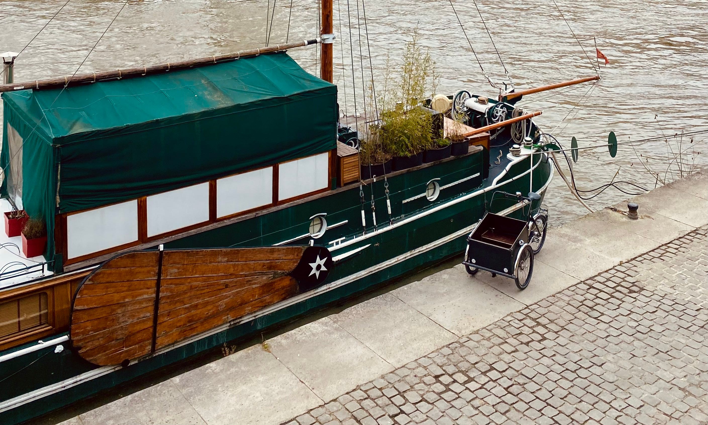
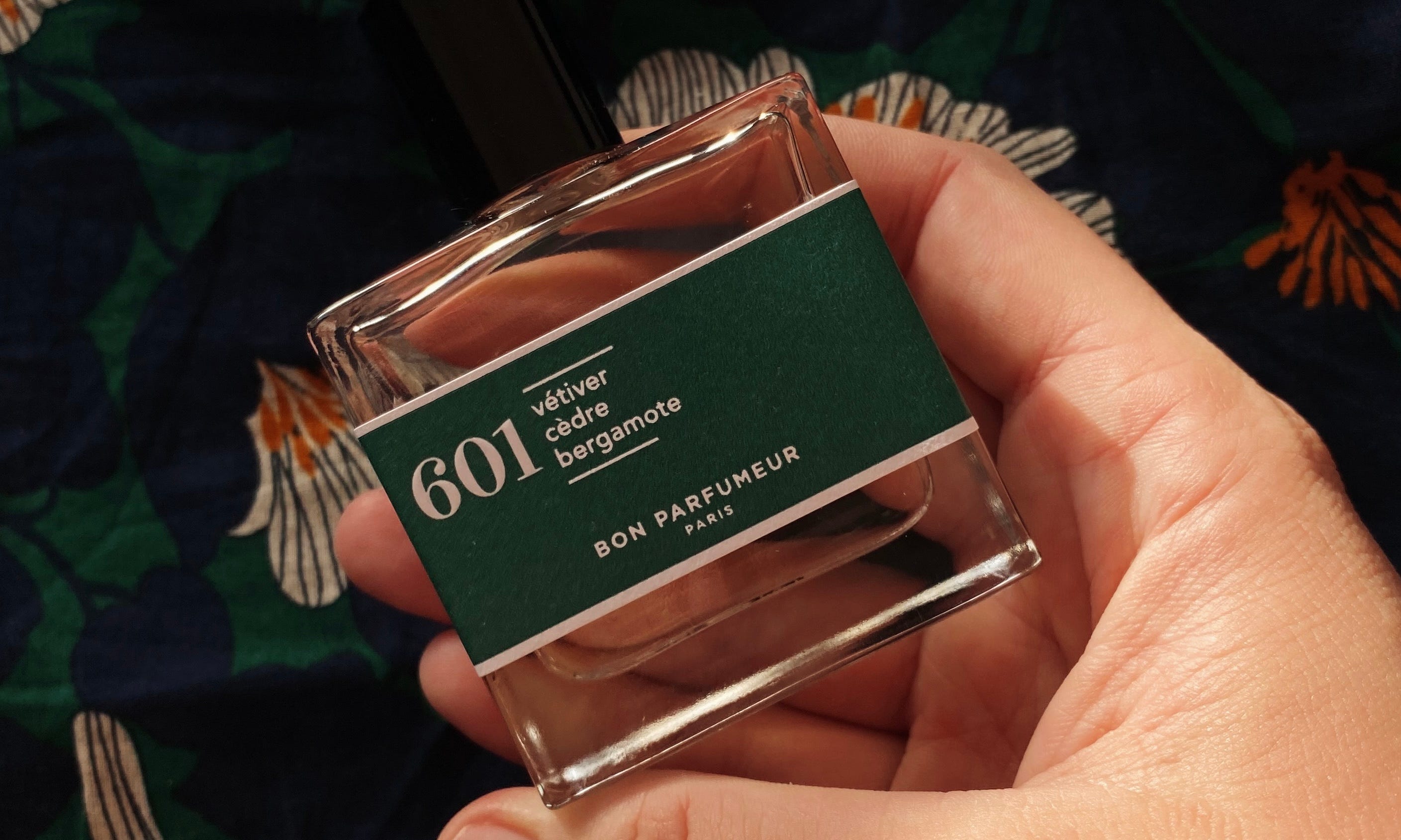
Next comes the accent color and the first one I’d name is an emerald green. It’s the color you see on the fences of the parks, benches, advertising poles, vendors’ boxes next to the Seine and so many more details.
It’s an elegant touch showing the nobility, I suppose.

Intense red
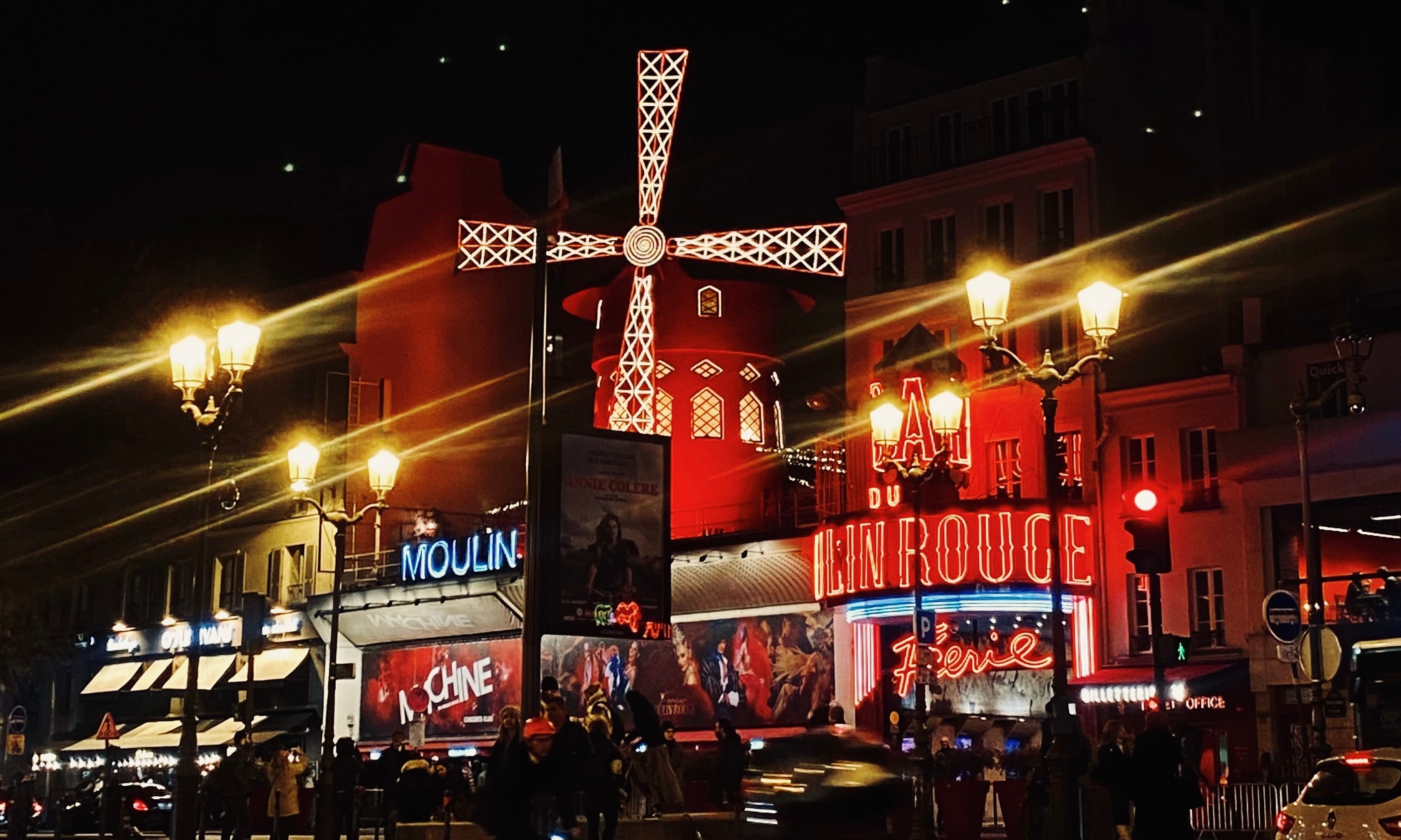
One more accent color is red. You see it mainly in cafes which often have that typical Parisian vibe — filled with rounded tables and rattan wicker chairs.


Grey
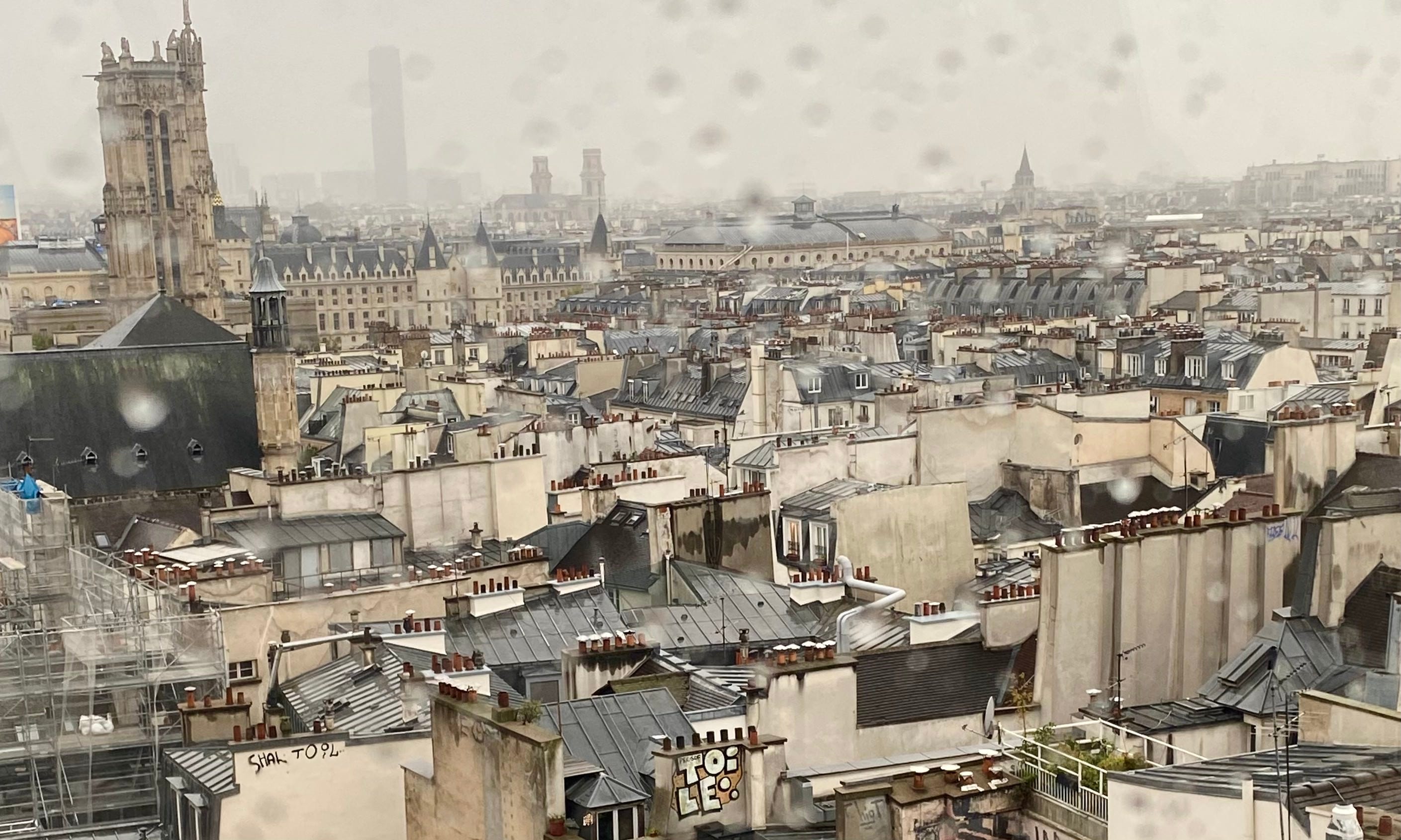
Go up to Galerie Lafayette or Pompidou museum terraces and you’ll see how the color palette changes. The dominant color is grey now, the color of the roofs.

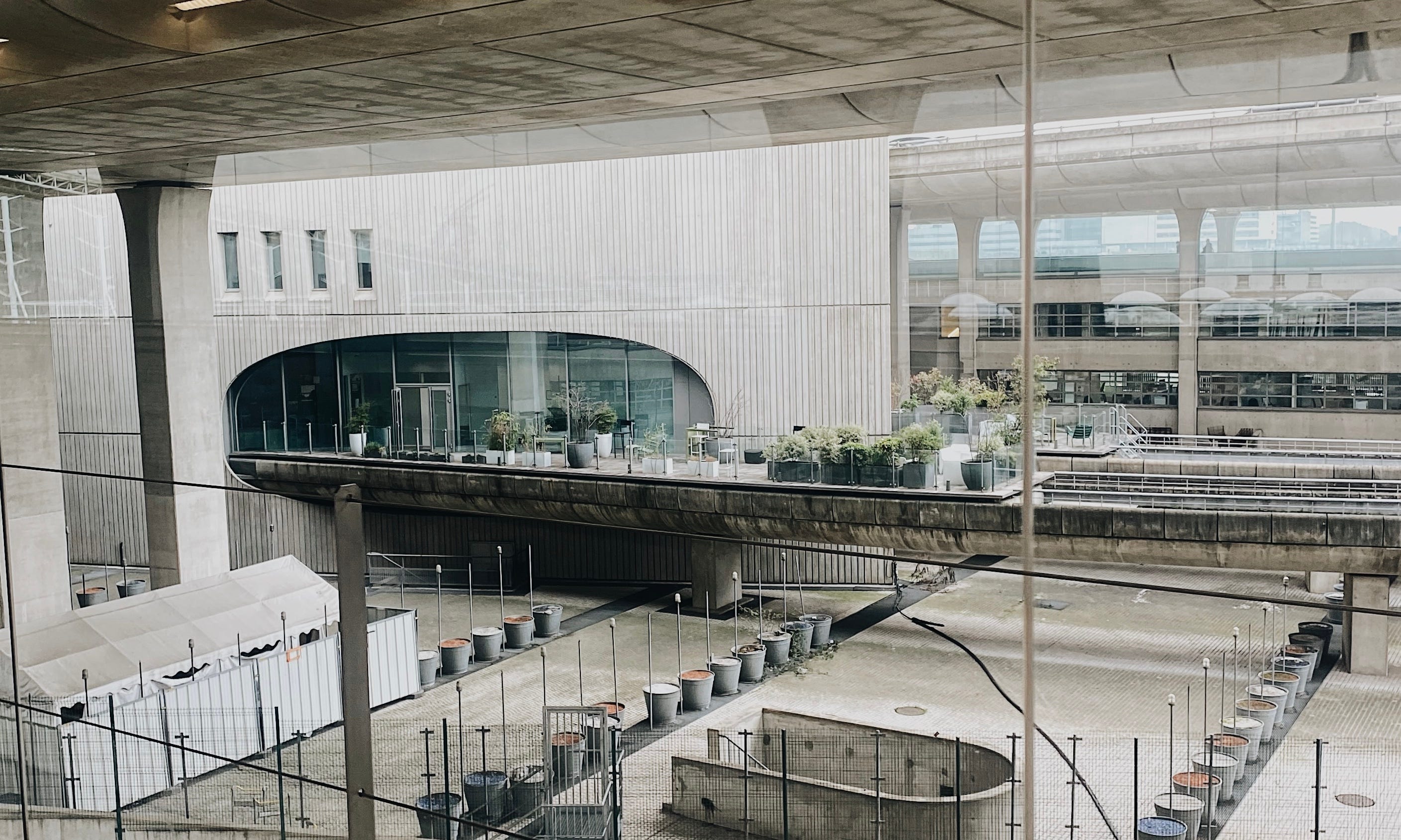
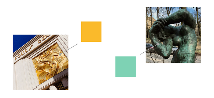
Few more additional colors
Golden and lime green are some of the colors you’ll meet in sculptures and architectural details walking the streets of the city. They can have a secondary role in the overall look.
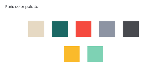
Paris color palette
There’s more to mention but I’d limit the Paris color palette to these ones.
Main colors:
- beige;
- tints of grey.
Accent colors:
- emerald green;
- red.
Secondary colors:
- golden;
- lime green.
The weather adds to the perception drastically. Personally, I really enjoy the rainy weather in this habitat (and that’s more than surprising) but once the sun comes up from the clouds the city shines brightly and c’est étonnant. That’s two very different modes and when it comes to colors here’s the comparison:

When it's sunny the buildings have a high contrast to the clear blue sky. While it’s rainy, the overall color palette loses its’ contrast and became more of the same color tone mode.
Is it all to mention regarding the visual perception of the city? Nope, there’s one more thing.
What adds more to visual perception?
Turn on the lights
Being very artistic, Paris can be compared to a scene. Each scene has lightning settings and in Paris, they are set to warm light.
This truly brings some sort of magic into the evening views. Together with the Seine or the channel, old architecture, and the sunset sky, the picture looks full and aesthetic.
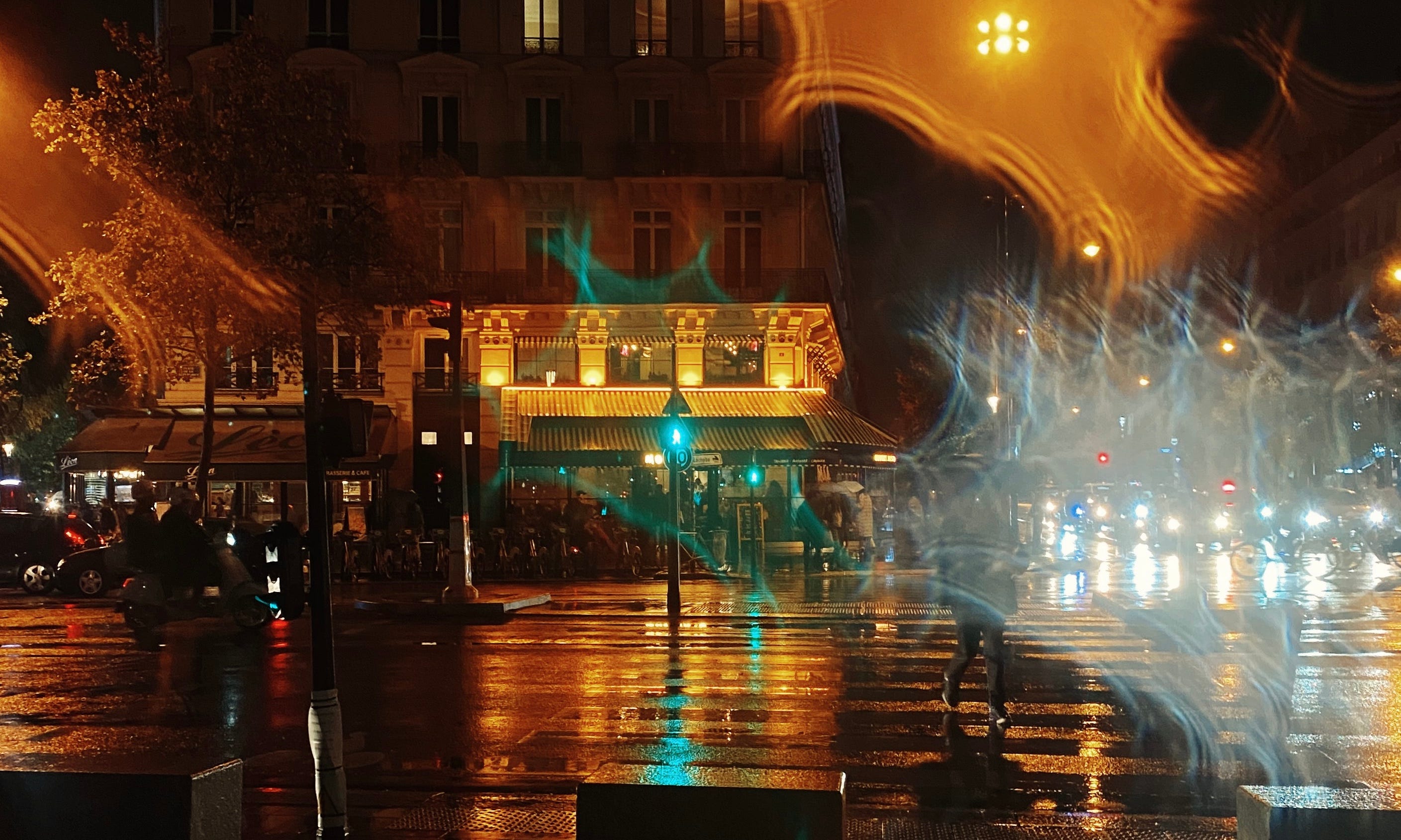

If on top of that, it rains, you’ll get even more lights thanks to reflection.
The design code | Font

Walking the streets of the city we see text all around. In Paris, it has different styles — elegant like the signs of expensive shops, modern for hip areas, or old fashioned for the places with a rich history. Text is also part of the posters both announcing some events and bringing a message from protest rallies (a very common Parisian thing).
While the font styles are as various as the multicultural side of Paris, there exist certain patterns that keep the consistency.
Metro old-style navigation
“The metropolitan railroad, in the eyes of most Parisians, will only be excused if it rejects absolutely all industrial character so as to be completely a work of art. Paris must not be made into a factory, it must stay a museum.” — Charles Garnier, architect of the Opera.
And just like that, Paris got art nouveau-styled entries and names of the metro stations both created by Hector Guimard back in the first half of the 20th century.


It adds charms indeed even though right now it’s already more of a rarity. A much more common visual style of the metro was made in more recent times.
Metro modern navigation

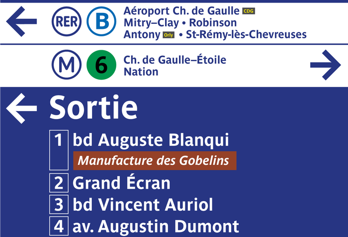
In order to unify the sign system of the whole transportation in Paris, the custom Parisine font was created in 1996. The task behind this font was to improve signage legibility and space economy. The custom typeface in Bold was first created based on the proportions of Helvetica Bold, condensed at 90%.


I’m not sure whether the Parisian metro can be named one of the biggest metro systems in the world still, it’s a huge organism and a system that has been evolving through decades. Thus, you can also meet Métro Alphabet font on some stations as all-written-in-caps signs. Also, things like metro maps and navigation on the train stations were made further. Maybe because of different organizations (Paris Transilien is part of SNCF), following the signs in the metro or train stations, you can notice other fonts too like the Achemine typeface introduced in 2008.
Few personal notes

Paris is a city I visited quite a few times in the past and being a tourist I certainly tried to stick to my list of places and experiences to do. I saw it as a place full of contrasts but the beautiful side still prevailed.
Once I started to live here I began to discover the deeper layers of the city which I already fait connaissance with. Its’ multicultural side, its’ rich art scene, its’ gourmandise (attention to food), its’ culture, and people.
It’s a place where I felt a huge range of emotions. Where I am still étrangère and where I felt like I fully match its’ lifestyle exploring multiple expositions in the museums or going to a cinema to watch movies from the Cannes festival program.

Certainly, this journey keeps going on and my relations with Paris are evolving. We keep getting to know each other better. No matter how much garbage is on the streets both figuratively and literally (the visual garbage of the shops’ signs and ads vs. garbage caused by strikes) I still see the beauty behind it and it fascinates me.
Part of my love and respect for this city I shared in this article.
All pictures (unless it’s mentioned in a caption) are taken by me
More articles to read:
UX in real life: Public navigation design — my story about navigation around the metro, airports, and public spaces.
Typography on the Subway: A Trip Around the World — contains multiple examples of font styles.
Parisine: Paris = Johnston: London — comparison of the two font styles of the two cities
And even more:
If you want to see my designs and stay connected, follow me on Linkedin, Dribbble, Twitter. À toute !

