Learning about accessibility changed how I design and build websites

A few months back, and completely on a whim, I popped into a meetup about accessibility led by Claudio Luis Vera and the team from Stark. It gave me a ton of threads to follow, and I got kind of obsessed with learning as much as I could about accessibility and thinking about how it should fit into my day-to-day design and development work.
👉👉 I want to be super clear about something before getting into the rest of this post. I’m not an expert on accessibility. It’s a deep topic and there are very smart people who know a ton about it and are worth checking out. However, I do know a lot about building products alone or with small, scrappy teams with limited resources. That’s the perspective this post is coming from.
Before I dove deep into accessibility, I abstractly understood what it was and why it was important, but I always thought of it as a secondary priority in product design. Better to get something out and working, and then refine it once the concept has been proven.
My thinking changed after I spent a few weeks reading, watching videos, listening to podcasts, and even taking a course on web accessibility.
Some of the big realizations I had:
- Prioritizing accessibility is simply the right thing to do if you want people to feel a sense of belonging in the products you create
- Basic accessibility practices don’t need to add a lot of overhead
- Even if you don’t understand all the ins and outs of accessibility, making an effort matters
- Going back and refactoring existing code to be more accessible is a pain, and rarely actually happens — the “I’ll get to it later” approach is flawed
- The constraints that accessibility imposes are actually fairly useful for both design and development
As I wrapped my head around accessibility more, I learned that with a few small tweaks to my existing design and development processes, I can help a lot more people feel like they belong when using the things I build.
This list will evolve as I learn more, but here are a few of the practical outcomes of what I learned about accessibility.
Core shifts in my thinking on accessibility
“Disability” is a fuzzy term that impacts a lot of people.
It has been unfortunately easy for me to think of “disabled people” as a group that’s distinct from “abled” people. There are a lot of reasons that’s flawed, but for my product development process, thinking about people this way makes accessibility seem like extra work for a group I don’t really understand. So I tend to not do it.
There are actually much better ways of thinking about it that are far easier for me to relate to. Rather than a binary description of a person, it’s useful to think about disability as a state of friction between a person and the environment they’re engaging with. To unpack that a little further, someone may interact with something you’ve built in a disabled state for a whole lot of reasons. Some are situational — a person is using an app in direct sunlight on a bright day. Some are temporary — I have migraines that cause half my vision to get all screwy for a couple hours at a time. Some are persistent, and some are more challenging than others. There are a lot of conditions that can result in a disabled interaction.

Microsoft Design defines disability as “mismatched human interactions”. I think that’s a smart way of framing it.
To be clear, I think shifting the focus of disability to the interaction a useful lens for product design, and broadening the way I think about who I’m designing for. I’m not commenting on how anyone chooses to talk about their own identity. Also, there’s a danger of being wrong when trying to empathize with people that have a different lived experience than you.
It’s hard to be perfect when it comes to accessibility, but it’s not hard to do it better than most
According to a WebAIM accessibility report that analyzed home pages for the top 1 million web sites, the Web Content Accessibility Guidelines (WCAG) failure rate was at least 97.8%.
Accessibility is a big topic that can get really complex. There’s a reason people have careers dedicated to it. If you have budget, you should probably hire those people. That said, if you don’t have the resources, and you’re trying to do your best, a relatively small effort will get you to “well better than average” pretty quickly. Given that 15% of the worlds population has a recognized disability, that’s some low-hanging fruit you should want to grab.
Standards are your friend
Turns out, for as long as people have been thinking about the web, they’ve been thinking about accessibility. Accessibility is built into the underlying architecture of the web, and web browsers use a set of standards to make sure pages are rendered consistently. Those same standards (or similar) are used by other assistive technologies such as screen readers, screen magnifiers, voice controls, or eye tracking software.
In most cases, you don’t need to figure out from scratch how someone with a disability will use your product. The technology already exists. You just need to know how to build for it. And if you understand basic web standards, you already know a lot of what you need to.
Doing things differently up front saves a lot of work down the road
I try to be a stickler for not overthinking things and focusing on what’s most important for a given stage of product development. Especially in early-stages, it’s key to prove the value up front and not get bogged down with edge cases. Once you zero-in on the important parts for your users, then it makes sense to move on to fleshing out the atypical use cases.
That said, I think planning for accessibility from the start of the design process — before any code is written — is 100% the right thing to do.
There are a couple of reasons for this:
- Untangling an existing design system or code base to be more accessible is a major pain. It will be hard to prioritize. It will be hard to muster support for. It will be a lot of work, and the end result won’t look meaningfully different to most of the people working on it.
- Sticking to simple guidelines from the start will build a baseline-accessible foundation that will be much easier to work with later when more complex accessibility needs arise. I wouldn’t even call this extra effort up front. I’d say it’s just doing the same amount of work a bit differently.
Designing with accessibility in mind helps everyone

In 1945, Kalamazoo, Michigan installed one of the nation’s first curb cuts so disabled veterans could more easily get around downtown. It was an action taken specifically for people in wheelchairs, but it soon became obvious that it made life easier for everyone — parents with strollers, workers delivering heavy loads, people using walkers, or someone pulling a suitcase.
Product development should take accessibility into account because it often results in a better solution for everyone.
Accessibility-oriented design process tweaks
Use proper text contrast ratios
I have a bad habit of making my color palettes too subtle. For some reason I always think it looks nice and elegant when I’m designing, only to realize later everything looks really flat and washed out. It’s a mistake I make over and over. Turns out, it’s also an accessibility problem.
Color blindness affects around 300 million people worldwide, including Howie Mandel, Neil Young, Eddie Redmayne, Mark Zuckerberg, Jack Nicklaus and Meatloaf. Additionally, many millions more have contrast sensitivity, where they cannot easily distinguish between colors that are too similar.
I don’t want to have to tell people that my design doesn’t work for Meatloaf!
And if we consider situational disabilities, it gets even worse. Contrast can be a problem for anyone looking at your design who happens to be outside on a sunny day.
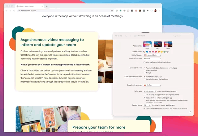
Fortunately, there are tools that can help you check color contrast. Stark is one of the best ones I’ve found for fine-tuning colors during the design phase. Others like the WAVE browser extension will show you contrast errors once the page is displayed in a browser.
Getting into a habit of checking contrast is good practice, and for me, it had the nice side effect of giving my designs an extra pop.

Respecting the viewer’s display preferences
Modern browsers (and operating systems) give people options for specifying how they would like to experience content. It’s important to pay attention to these signals. While one person may simply prefer dark color schemes, another person may be suffering from intense eye-strain and not be able to look at light-themed pages for too long. Same thing with vestibular disorders — if someone has told their browser “animations literally make me sick”, wouldn’t you want to know that before showing them a motion-heavy website?
For builders, there’s a big opportunity to show the user that you respect their preferences by designing options for:
- Dark Mode — Providing a dark color palette can be useful for people with poor vision, people with chronic eye strain, or people who tend to use their devices in low-light environments. Furthermore, some people just prefer it, aesthetically.
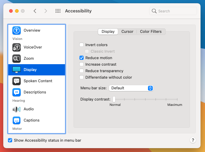
- Reduced Motion — Whenever designing animated elements, consider that many people have problems with motion sickness, vertigo, even migraines that can be triggered by motion.
The preference for color scheme and motion that can be detected by CSS and JavaScript. With a little up front planning, it doesn’t take much to include support for them.
I’ve worked this into my design process by building out a mood board before getting into the layout of a design. I’ll sort out the general colors I’m using for major elements, and then apply a light and dark treatment. After that, it’s fairly easy to stick to as the full design comes together.
Design focus states into interactive elements
Not everyone uses a mouse. In fact, there are a lot of people who can’t use a mouse.
Some people use just a keyboard, while others use more specialized input devices, like a sip and puff switch. Think about that when you’re designing elements that people will interact with. It should be clear that something can be interacted with (e.g. links are underlined or otherwise different than surrounding text), and when someone has given that element focus, it needs to be visually obvious.
A lot of times, I found I can get away with using whatever design I’ve come up with for an element’s hover state. One of the main things to think about here is not to break anything that non-mouse users rely on, like removing the outline from focusable elements without providing another visual focus treatment.
Get double-duty from your mobile designs
At this point, designing for both desktop and mobile experiences are common. You are probably already doing it.
Good news! Most of the design choices you make for a small-screen mobile experience — like bigger hit areas, simplified layouts, text-flow that avoids horizontal scrolling — work well for people using screen magnifiers. It’s worth taking a look at your mobile designs in a scaled up context by mashing ctrl/cmd + a bunch of times to get a feel for what that experience is like for people.
Accessibility-oriented development process tweaks
Give yourself a refresher on proper HTML structure
If you’re writing HTML at all, chances are you probably have a decent understanding of the semantic meaning of most elements. But it’s worth digging into how proper structure can be helpful for assistive technologies.
HTML is really straightforward, but I found a lot of nuance that I wasn’t aware of when I revisited the list of tags with accessibility in mind.
Some of the key takeaways for me:
- The root
HTMLelement should always have aLANGattribute — for example:<html lang="en-us">— easy to do, also easy to forget. This makes it easier for screen readers to process - Headings should describe the structure of your page —
H2tags should nest under anH1tag, and you shouldn’t jump from anH1directly to anH3orH4 - Only have one
H1header on the page (there seem to be different opinions on this one, but I’m going with it) - Use
HEADER,MAIN,FOOTER,ARTICLEandNAVtags appropriately
Make sure your pages have descriptive page titles
Always provide pages titles. It’s obviously good practice on search engine visible pages, but it’s also the main way screen readers can identify different pages.
This is something I often forget in web applications. Especially if I’m working in a templated system and don’t have direct access to the TITLE tag in the main layout.
Here’s a pattern I use to make a page title method that will display the contents of a variable that can be set from further down in the template system.
For example (using Ruby on Rails):
In application_helper.rb:
def page_title_text(base_text)
  [@page_title, base_text].compact.join(' - ')
end
Then in views/layouts/application.html.erb(where ‘Application Name’ is the name of my app)
<head>
  <title><%= page_title_text('Application Name') -%></title>
</head>
Then finally, I can set the class variable @page_title in any other view file (in this case, a dashboard view):
<% @page_title = "Dashboard" -%>This gives me a decent fallback when I forget to set something (just the application name), and when it is set, I get page titles like Dashboard — Application Name. Putting the most specific part first works best for screen readers.
Provide alternative text for images
It’s important to make sure images are marked up correctly so screen readers, speech input software, and other assistive technology can use them. It’s not hard — you just use the ALT attribute, but it’s unfortunately way too easy to forget to do it.
The way I worked around my own laziness is by adding a user snippet for my development environment (VS Code) that adds an empty ALT attribute by default for any image tag, so it’s actually more work for me not to include it.
Here is the user snippet, including support for the IMG HTML element, Ruby on Rails’ image_tag method, and a root HTML tag that includes a default lang attribute. Here are instructions for installing user snippets in VS Code.
The WCAG guidelines state that all images should have alternative text, even if it’s an empty string (which will be skipped over by screen readers).
Start your CSS by explicitly listing the use cases you’ll support
I have a tendency to jump into CSS without much planning. I just start with one design — usually the desktop version—and go at it until it looks right. The problem with that is I leave important things out, and I end up writing a bunch of duplicate garbage when I try to add another block for a different circumstance — like the mobile version, for example.
I find it’s easier to think through the plan for the complete design by getting all my sections set up first. Here is a boilerplate structure that I use as a starting point.
Having that structure to start with makes me stop and ask questions about what really should go where, and usually leads to a much cleaner final product.
Never remove focus styling! Just don’t!
People using a keyboard or another assistive device to access your web pages often are tabbing through elements linearly, and there isn’t a direct relationship with a pointing device to understand where the focus is. It’s not “I’m clicking on that link in the top right corner”, but rather “I’m tabbing over to the 4th link in the header section”. There needs to be some visual indication of which element is currently focused so the person knows when they’ve reached their desired link.


What the focused state looks like varies a bit from browser to browser, and it can be tempting to clear it out when it feels like it doesn’t match the design. But if you do that, you’re potentially causing massive confusion for anyone using an alternative input device.
Good rule of thumb, if you ever find yourself typing outline: none;in CSS, step back and rethink what you’re doing. I’d almost consider the outline property off limits. Changing it is sort of like restyling the browser scrollbars. You’re messing with a browser feature that the person using it may rely on.
That said, you can still be deliberate about what the :focus styling looks like. I’ve found the :hover styling usually does a decent job, so a good habit to get into is doubling up the CSS to cover both states.
Here is a VS Code snippet that makes this easy, by auto-completing :hover declarations to apply to the :focus state as well.

Image replacement — is it worth it?
Often I’ll find myself needing to display some styled text that would be impossible or idiotic to attempt to render with CSS — logos or text in hero graphics, for example. For the longest time, I thought the correct way of handling this was to use plain text in the HTML, and then replace it with a graphic via CSS. That’s the whole point of CSS, right? To separate content from presentation?
I used to use this CSS utility class that I thought was clever:
👇️ Don’t do this.
.image {
  outline: none;
  text-indent: -9000px;
  display: block;
  background-repeat: no-repeat;
  background-size: contain;
}
Which could then be used to replace the contents of a tag with an image like so:
<h1><a href="/"
  class="image"
  style="background: foo.png; height: 70px: width: 150px;"
  >My Site Title</a></h1>
☝️Again, don’t do this.
It’s clunky. It uses the outline: none; declaration which is a problem if the element can be focused (such as a back to home link that features the site’s logo).
Turns out, it’s a lot easier — and more accessible — to just do this:
<h1><a href="/"><img src="foo.png" alt="My Site Title"/></a></h1>Screen readers will pick it up just fine. You lose the weird mix of inline and external CSS rules. If you need to provide different images for different screen sizes, you can do that with the PICTURE element.
I realized I was letting the separation of concerns get in the way of what was really important — a flexible product that worked everywhere it was supposed to.
Hiding text so it’s still available to screen readers
If you must hide text from the user, WEBAIM recommends the following CSS utility class:
.screenreader-only {
  position:absolute;
  left:-10000px;
  top:auto;
  width:1px;
  height:1px;
  overflow:hidden;
}
I use this class sparingly — for example when hiding header that’s logically implied by the design, but if the visuals weren’t there it would need a “what is this group of things?” label.
Accessibility-oriented testing process tweaks
True accessibility testing should involve people. The only way you can really be confident that you’ve built something that people can easily use is by having real people test it.
That said, checking your products against baseline accessibility guidelines doesn’t take much effort and has the nice side effect of keeping those use cases near the front of your mind.
You’re probably already testing against multiple desktop and mobile browsers, so here are a few more tests you can throw into the mix.
Testing Light mode vs Dark mode
If your design respects a person’s preferred color scheme preference, you can test this by toggling the dark mode setting in your computer’s OS.
On MacOS: System Preferences > General >Appearance >Dark
On Windows: Settings > Personalization > Colors > Choose your color
On Android: Settings> Display>Dark Theme
On iOS: Settings> Display & Brightness>Dark
Testing reduced motion preferences
If a design has significant animation, it’s worth turning on your operating system’s reduced motion preference and checking to see if you need to add anything to your CSS’s @media (prefers-reduced-motion) { section.
Testing keyboard navigation
Put your mouse away and start pressing the Tab key. Go through all the links and button in your app. Does everything focus like you would expect? Pick some simple tasks and try to accomplish them with just the keyboard (no cheating with the trackpad!). Are you able to do them?
Testing screen readers
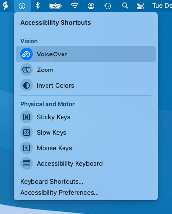
On MacOS, the screen reader feature is called VoiceOver. The easiest way to toggle it on and off is by having the accessibility menu in your toolbar. You can enable that by going to System Preferences > Accessibility and checking the box at the bottom of the window labeled “Show Accessibility status in the menu bar”.
Once you have the accessibility menu in your menu bar, you can turn VoiceOver on from there.
Then go to the window of your design, and let VoiceOver read through it. If VoiceOver doesn’t start reading, press control option A and it should start.
I find this helps in a number of ways:
- I understand the screen reader experience somewhat better — even though it still feels really foreign to me
- I get a really good sense of whether or not I’ve structured my headings and lists correctly
- Hearing someone read the content back to me is a great way to spot text errors that I’ve just glossed over
Automated Testing Tools
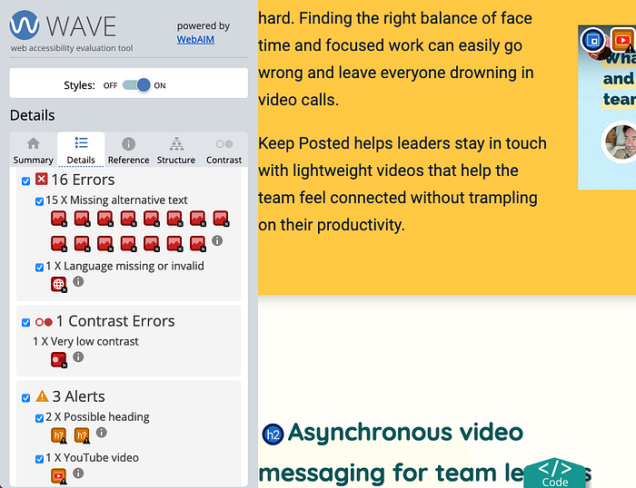
There are also a number of tools that you can use to spot potential problems. The one I’m finding the most value in is the WAVE browser extension. It will quickly show you:
- If you have images with missing alternative text
- Form elements without labels
- Missing or uninformative page titles
- Structural errors
- Text with low contrast ratios
And a whole lot more. Most of the things it catches are quick fixes, so it’s a great check to run after you think you’ve got your code ready to commit.
Final thoughts
Thanks for reading! Hopefully this makes it clear that a few small-ish tweaks can help fold accessibility into an already busy workload. There’s a lot further you could go, and I’m definitely not suggesting that you can boil top-notch accessibility down to a few process hacks. But this is an area where a little bit goes a long way. I’m really glad I understand it better now.
If you want the most people to feel like they truly belong in the products you build, you need to think about accessibility.

