Learn typography for design…in 15 minutes
If you’re a graphics or UX designer, this post is for you.
Okay, this is going to be a long one. Let’s grab our coffee and start with a healthy dose of inspiration.
“Big type, even huge type, can be beautiful and useful. But poise is usually far more important than size — and poise consists primarily of emptiness.”
— Robert Bringhurst
Take a look at the image below. Which of the two would you prefer if you want a refined, modern and minimalist look in your design?

Typography is everywhere we look — on our phones, the billboards across the street, on product packagings, books — the list is endless. Text constitutes more than 90% of the information shared on the web today. We cannot imagine a world where text is not a part of visual design. It’s one of the key ingredients of communication.
Applying typography correctly can make or break our designs. According to research, it takes users 50 milliseconds on average (subconsciously, of course) to make a first impression about your brand. Each font that you use influences the user’s psyche in a different way — it conveys a unique personality and emotion, which ultimately leads to the user making certain associations with your brand. To appreciate how important typography is in design, check out this interesting post by Google Design on how they went about reimagining Google Fonts as a more interactive, scalable, open and visually engaging resource for designers to explore and learn about different font families.
Now that we appreciate the importance of typography, let’s get into the theory. In simple words, typography in design refers to ‘the style or appearance of text’. Typography is virtually limitless in its breadth and scope, but don’t be intimated — you don’t need to study everything under the Sun to make your designs stand out. In this article, we will cover the basics which should put you in good stead for the majority of your projects.
Is it a typeface or font?
To the uninitiated, typography may seem like an exercise of choosing fonts, but it’s much more than that. First, let’s understand typefaces and fonts
- Typeface: A typeface is a collection of glyphs (i.e., letters, numbers, symbols and punctuation) that all share a single design. The first ever typeface was Blackletter, developed by Gutenberg, inventor of the movable-type printing press!
- Font: A font is a set of glyphs in a typeface. As an example, Helvetica and Futura are different typefaces. But 12-point Helvetica and 24-point Helvetica, or Helvetica Light and Helvetica Regular are different fonts of the same typeface. These differences stem from the history of physical printing presses. The terms typeface and font are often used interchangeably. The text you’re currently reading is in a Charter (Serif) font, which is one of the fonts Medium uses on its website.

Size, Weight, Style & Proportion
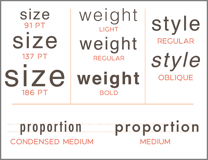
Next, let’s look at four simple attributes of fonts that you may have come across: Size, Weight, Style and Proportion.
- Size: This is self-explanatory and refers to the size of the text, usually denoted in points or ‘pt’. The larger your size, the bigger your text appears, and the stroke thickness increases proportionately.
- Weight: Weight refers to the overall thickness of a typeface’s stroke in any given font. A heavier weight is commonly used to attract attention. Some commonly used weights are thin, regular, medium and bold; but weights can have a virtually unlimited range starting from Extra Light at one end to Extra Black at the other (see illustration below).
The number of weights and the actual naming of individual weights in a type family depends on the designer who created it, and may be arbitrary. With variable fonts, end users like you and me get a much better control on the weight by tweaking the weight axis. - Style: Style is usually one of three types — normal (upright), italic and oblique. Italics were originally introduced to effectively emphasise small pieces of text within a larger block of text, and still serve this purpose beautifully. An oblique style is slightly different from italic in the sense that it doesn’t employ cursive transformations, and may appear as regular text, but with a slant. Oblique styles are commonly seen in Sans Serif type families, while Italic styles are common in Serif type families (more on serifs later).
- Proportion / Width: Proportion refers to the width of a character relative to its height. Note that we are talking about the width of the characters here, not the stroke. A smaller proportion will render a more ‘condensed’ or ‘compressed’ look, while a larger proportion will give an ‘expanded’ look. Width names can range from Extra Condensed to Extended. Note that unlike weights and styles, most type families do not come with variety in width options, often having only one width.
A type family would include multiple weights and styles, usually in a TrueTypeFont (TTF) or OpenTypeFont (OTF) format file which we can download and install in our computers. Large type families would usually contain a large number of variations of font styles and weights, giving designers a greater range of options to pick and choose from.
Leading, Tracking, Kerning and Hierarchy
Size, weight and style are higher-level characteristics that we usually select when deciding the font. But there are other, more nuanced characteristics of fonts, that are often used by designers to give final touches to their text elements and optimise them for visual appeal. Let’s go!
Leading / Line Spacing: Leading (pronounced led-ding) refers to the vertical space between two lines of text. The word derives its origins from the strips of lead (a metal) which were used to separate lines in the days of mechanical typesetting. Designers play around with leading whenever required to improve the readability of text — too much or too little can be an eye-sore (see below).
Tracking / Character Spacing: Tracking refers to the horizontal space between characters in a text sequence. This can be condensed or expanded depending upon the aesthetic requirements. It is common practice to prefer a wider tracking on small-sized fonts and narrower tracking on larger ones.

Kerning: Kerning refers to the horizontal space between a pair of individual characters. Although the space between the centre of two characters may be similar across the whole text, the space between individual characters often appears to be unequal due to their different shapes. Since any two characters fit together differently when placed next to each other, the Kerning between different sets of characters varies, e.g. the Kerning between ‘a’ and ‘b’ might be different from that between ‘b’ and ‘c’.
Adjusting kerning involves looking at each letter individually, to assess how different shapes or styles influence the way it connects with another letter. The goal of adjusting Kerning is to ensure that all letters look evenly spaced and visually pleasing; and no two letters should blend into each other or appear so far apart from each other as to affect the readability.
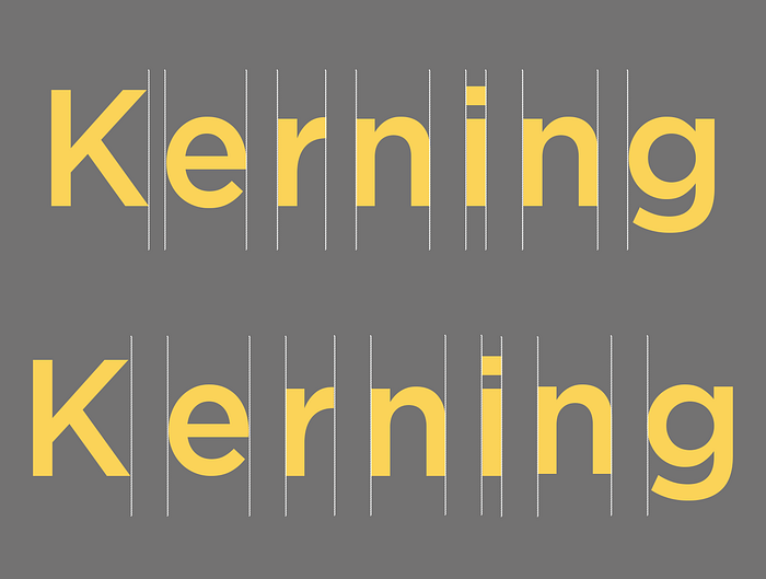
As beginners, we may often confuse Kerning with Tracking, however the key difference is that Tracking deals with the spacing between larger groups of text, like words or lines, whereas Kerning deals with the adjustment of spaces between a pair of letters. In practice, Tracking is generally applied across large segments of text, while Kerning is applied to specific small pieces of text such as headers and logos.
Some character pairs may have a naturally wide or narrow Kerning, such as the letters A and V, which naturally look farther apart in a standard piece of text, and may often require tweaking the kerning to move them closer together.
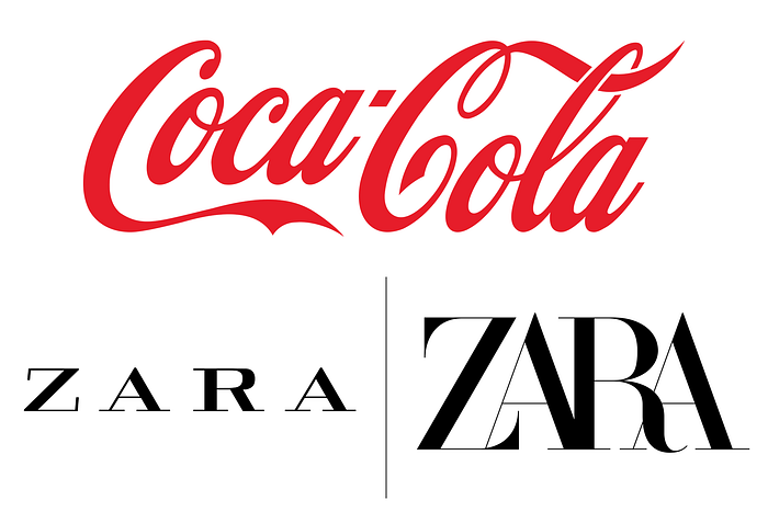
Take a look at the Coca-Cola brand logo below — look at the spacing between the first set of C and O and the second set of C and O. Can you notice the difference? This is Kerning at play. Because the design of the second C is markedly different from the first and the vertical alignment of both the Os differ, the Kerning was readjusted to make the characters look more evenly distributed.
The second example below illustrates the redesigning of Zara’a logo. While the older logo (left) used a wide kerning, the new rendition (2019) accentuates the serifs and reduces the kernings almost to the extent that the characters start superimposing on each other (not a good makeover if you ask me!)
Hierarchy: Hierarchy leads the eye sequentially from one element on to the next one by using different levels of emphasis, and is used by designers to guide the viewer’s eye to the most important elements in the text, e.g. a header or a CTA. To do this, designers decide where they want the maximum emphasis to be, and then make those elements stand out by changing their appearance vis-a-vis the regular text — usually by making them larger or bolder.
Having understood these terms, let’s take a closer look at fonts now.
Font Classifications
When it comes to fonts, there are 6 major classifications or types that we need to know, and each of these has certain associations and personality.

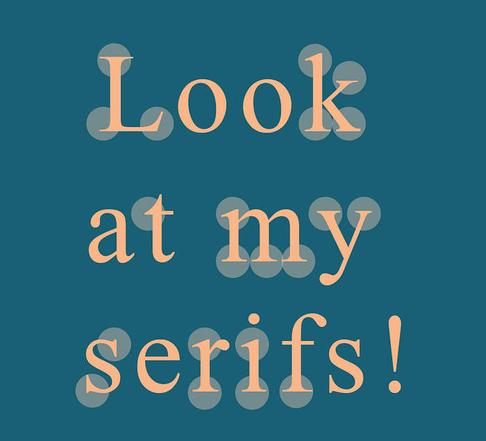
Serif: Have you ever noticed the little strokes, lines and designs at the end of individual letters? As an example, look carefully at the top and right bottom of this ‘d’. These strokes are called serifs, and fonts that use serifs are called serif fonts (see the illustration below). In physical printing, serifs served to improve the legibility of text.
Serif fonts have a very traditional/formal look; and evoke seriousness, practicality, trustworthiness and respect. They are frequently used in official documents, luxury branding and print publications such as magazines, newspapers & books (this explains why Medium uses a serif font for the body text). Times New Roman is a popular serif typeface.
Slab Serif fonts are a sub-group of serif fonts that incorporate a bigger weight and size and uniform stroke, giving them a more punchier and bold look. The serifs are often heavier and square-shaped. This comes handy when used to characterise strength or heaviness, or to easily grab attention — making these fonts apt for headers. Roboto slab is a popular example.
Sans Serif: ‘Sans’ in French means ‘without’, so Sans Serif refers to fonts that do not use serifs, rendering a minimalist, clean and contemporary look. They represent modernity and progress, appear less formal and more straightforward, and tend to have better readability on computer and mobile screens. As a reason, Sans serif fonts find extensive usage in most modern brand designs and web content.
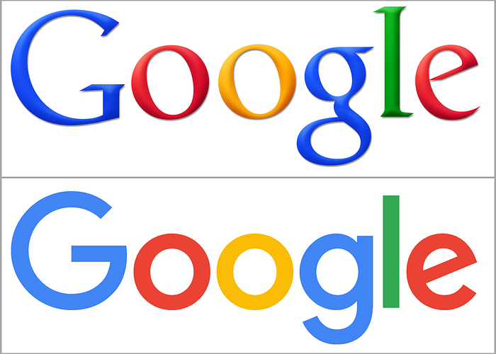
Montserrat and Helvetica are popular and versatile sans serif typefaces. Remember Google’s older brand logo? It was in a serif typeface, which was redesigned with a custom sans serif font in 2015 to give a new, more modern look.
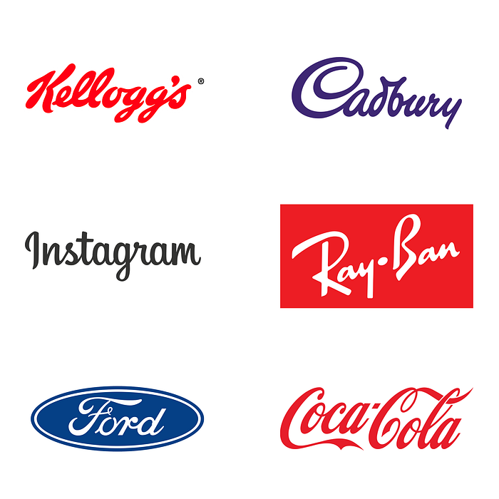
Script: Script fonts emulate the look and feel of handwritten script, with each character typically having a connecting end-tail for fluidity. They have a very informal, fun, casual and creative feel associated with them. Think of the logos of Instagram, Cadbury, Coca-Cola and Ray-Ban. Because of their nature and limited readability, script fonts cater to a specific set of uses (e.g. headlines, titles or short copy) and cannot be used as the primary font (body copy) for most use cases. This explains their lack of prevalence on most long-form web content. Imagine having to read all Medium stories in a script font, that would be a nightmare!
Apart from Serif, Sans Serif and Script, we have few more font types (probably not as heavily used as the above three, but still relevant).
Calligraphic: Close to script fonts in their overall look, calligraphic fonts try to mimic brush strokes in appearance, but the letter forms have a modern, contemporary artistic look that can be chosen for rendering small pieces of text.
Blackletter / Gothic: These are probably the oldest of all fonts, dating back to medieval times. The first book ever printed, the Bible, used a Blackletter font. Characterised by a high contrast between the thin and thick strokes, these evoke a very traditional and classical vibe. Keep in mind that legibility may be an issue while using Blackletter fonts.
Display / Decorative: These are modern fonts that do not belong to any of the above categories and can be extremely diverse in style, making it hard for us to define them based on simple characteristics. Display fonts can incorporate script, blackletter, all-caps and much more, and their forms may be very specific to a time period or genre. As they are decorative in style and intended for usage in large-size text, they are typically applied to small amounts of text, such as in headers, or in graffitis.
If you want to know the top 20 best fonts for web design and need some ideas for your next app or website, check out the below article.
NOTE: Sometimes, you may encounter the term ‘Web Font’. Web Fonts are fonts specifically created for websites and can be used/viewed only on a screen (which means they cannot be downloaded and used in desktop-based softwares such as Illustrator and Photoshop or for printing applications, thus making them moot for most graphic designers). Unlike regular fonts that are downloaded and installed on a desktop, web fonts are downloaded by the browser(s) during the rendering of the webpage, and then directly applied to the text on the webpage. In this post, we are limiting our discussion to regular fonts. For more details on how to apply web fonts, you can check out this article by Envato.
Great! We have understood the various font types. Next, let’s look at 4 characteristics of text that are crucial to ensure the right user experience— Legibility, Readability, Colour and Contrast — and the factors that affect them.
Legibility is a typeface characteristic and refers to the ease of recognising or differentiating one character from the next in a text segment, and represents how easy it is to read a block of text. Legibility of any typeface depends on a variety of factors such as
- X-height (height of lowercase letters relative to uppercase): More the x-height, better the legibility.
- Width of characters: Characters with average width are more legible compared to condensed or extended ones.
- Weight: Avoid using very light or very heavy weights. The default/regular option often works the best, especially for body text.
- Nature of character design (neutral vs exotic/quirky): Neutral designs tend to have better legibility.
- Stroke Contrast (ratio of width of thin and thick strokes): This can be an issue for typefaces with very thin strokes, which might affect legibility.
- Serifs vs no serifs: Though serifs improve legibility, sans serifs have become more popular for body text in recent years due to their simplistic look and feel.
For most practical use-cases, ‘sticking to the middle’ or the default option serves well.
Readability deals with the arrangement of fonts and words to ensure that the content flows in a clear, simple and easy to read manner. Readability looks at the design from a higher level, and depends on multiple factors such as
- Type Size: A smaller text size is usually more difficult to read. There is no right type size, and it would also depend on the selected font, but a good rule of thumb is to keep it between 9 and 11 for body text.
- Type Case: TEXT IN ALL CAPS IS DIFFICULT TO READ AS THERE IS LIMITED DISTINCTION BETWEEN THE HEIGHTS AND SHAPES OF DIFFERENT CHARACTERS. GET IT? Stick to Sentence Case for body text.
- Leading: A good rule of thumb is to have the leading value between 1.25–1.5 times the font size.
- Tracking: Text using heavier weights would typically require a higher tracking value.
- Kerning: Most fonts require some kerning readjustment to improve readability, as there will always be some sets of characters that seem too close or too far apart when placed next to each other.
- Column Width: Too narrow or too wide columns of text can distract the readers. Try to maintain the number of characters between 45 and 70 on each line.
Colour and Contrast: The colour of the text and how well it contrasts with the background colour is key to good typography. A good contrast between the text and its background is essential. You also need to ensure that the colours don’t ‘vibrate’ — which happens if we choose a colour combination involving high-saturation complementary colours. For more detailed study on colour and colour combinations, check out my article on colour basics below.
When choosing the colour and contrast (especially when they’re used with text) it’s important to keep accessibility principles in mind, so that you can reach a wider audience. To learn more on accessibility, you can check my recent post on accessibility tips for writers.
Having covered the basic principles of typography, let’s understand how to apply these principles to choose fonts and font combinations for your design projects.
Choosing the Right Font for your Design
Fonts are like humans — each one has a different use, personality and character. Choosing fonts can be an intimidating process where you may need to experiment a lot before hitting the right one. While deciding which font to pick for your next design, keep these pointers in mind:
- If you are working with a brand as your client, you should check their brand guidelines. Usually, the guidelines would clearly mention various design details, e.g. fonts, brand colours, etc. which are in accordance with their brand identity and ensure consistency in communication.
- Choose the font keeping in mind the medium of communication, the audience and the content. Make sure that the personality of the font resonates with the nature of the content. For example, a quirky script font wouldn’t make much sense on a health insurance pamphlet.
- Serif fonts are well suited for long form copy such as books, magazine and blogposts due to their high legibility. Slab Serifs should be used only for display text such as headlines due to their limited readability.
- Sans Serif fonts are very versatile and can be used in both body copy and as display text.
- Script fonts should be used sparingly and should be limited to short form copy. Anything longer than 2 lines is usually not advisable. These are an excellent choice when a personal touch and informal look is required, for example in birthday cards, wedding invitations, etc.
- Display fonts should be limited to usage in display text.
Font Pairings
Just like colours, fonts work well in tandem. Not every font works well with every other. Since most design pieces would use a maximum of 2 fonts to keep it simple and consistent, it is important to spend sufficient time and ensure that we pick the right combination.
Finding the right font combinations is NOT an easy task. Here are some pointers to help you on the journey.
- Use a Single Font: This may seem contradictory, but hold on. Font pairs should not contradict or conflict each other in appearance. If you’re unsure about a font combination, using different variations from a single font family is often the safest route. This ensures that the fonts gel well with each other and renders a minimalist look with adequate contrast. To get ample variety, you can choose superfamilies such as Roboto or Source which have a lot of weights and styles to pick from.
- Opposites Attract. We can get interesting results by combining fonts that have different natures, such as serif with sans serif, display with serif, short with tall, all caps with lowercase, regular with italics, etc.
- Less is More when it comes to choosing fonts. This might come across as cliched advice, but it is relevant because it’s so incredibly powerful. Most designs would benefit from having a maximum of 2 fonts, one for the headers/titles and one for the body. The pair should work well together, of course. Remember, when in confusion, use a single font!
- Play around with the size, colour and weight of fonts to make the design visually engaging, ensure contrast and establish hierarchy.
- Avoid using two typefaces which have a very similar appearance. Contrast is key for differentiability, even within a font combination.
- Use font duos: Font duos consist of two fonts that are designed to coordinate and perfectly pair with each other. This saves you the hassle of having to look through thousands of fonts, looking for the right match. Check out this article on font duos to learn more.
There are many online sources that you can use to explore the best font pairs and also take inspiration from what other designers are using in their work. Some examples include
Check out these articles on best font combinations for web content.
Some Quick Tips
- For long copy or body-text usage such as in blogposts, stick to Serif and Sans Serif fonts. For shorter textual elements like titles or artistic illustrations, where you need to draw attention or set hierarchy, the display font types can be more effective.
- Some typefaces have a reputation for being overused and outdated (examples include Comic Sans and Brush Script), and you should be careful in applying those in your designs. Often, it might be better to look at other fonts with a similar look and feel.
- Some fonts may have an inherently bad kerning — which means the spacing between certain pairs of characters might appear unusually large or small compared to other pairs. In such instances, it is advisable to choose a different font (unless you want to play around with Kernings a lot).
- Avoid ‘rags’, or uneven vertical margin of a block of text. To solve this, hyphenate words wherever necessary or put in proper line breaks. Avoid ‘orphans and widows’, which refer to a word or short line at the beginning or end of a column of text that seems separated or ‘orphaned’ from the main block. For more details, check out this page.
Enjoyed this post? If yes, please show some appreciation by clicking on the “clap” button. Fun trivia — you can hit it up to 50 times! It helps the content reach out to more like-minded people.
Please share your thoughts and feedback in the comments below. This will help me improve and also inspire me to create more.
I try to publish regularly on Medium. Follow this account to receive similar content in future, and click here to get each post directly in your email. You can find me on Linkedin and Twitter as well.
See you soon!
Further readings and resources:
- https://fonts.google.com/
- https://design.google/library/reimagining-google-fonts/
- https://www.fontpair.co/fonts
- https://femmebot.github.io/google-type/
- https://typ.io/
- http://typeconnection.com/
- https://design.tutsplus.com/tutorials/web-fonts-in-60-seconds--cms-29695
- https://typographyprinciples.obys.agency/fonts/
- https://marketingyourbrand.com.au/blogs/marketing/logo-design-fonts#
- https://fonts.google.com/knowledge/glossary/weight
- The Ultimate Guide to Typography by Envato Elements
- https://elementor.com/blog/font-pairing/

