Laws of UX that Uber Follows
Get ready to unravel the captivating world of UX strategies and laws employed by the Uber app, elevating it to the realm of super usefulness and unrivaled effectiveness.
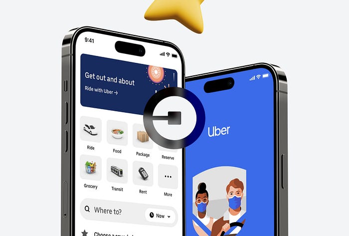
In this article, we dive deep into the ingenious design techniques that drive the Uber app’s success. Brace yourself for an enlightening exploration that unveils the secrets behind its seamless user experience.
Without wasting another moment, let’s embark on this thrilling journey of discovery!
1. Aesthetic Usability Effect
Designing a beautiful UI is a necessity nowadays, which according to the law of aesthetic usability makes the design more useful in users' eyes.
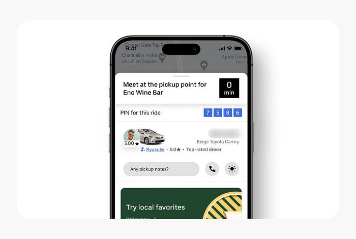
Users often perceive aesthetically pleasing design as design that’s more usable.
2. Doherty Threshold
Uber provides the perfect feedback, when searching for a ride they show the progress bars. Uber shows circular loading indicators to make the user feel they have listened.
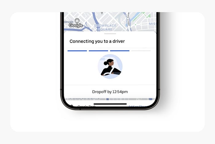
Productivity soars when a computer and its users interact at a pace (<400ms) that ensures that neither has to wait on the other.
3. Fitt’s Law
They have put every key button like confirm ride near your thumb. It makes the design more convenient and useful for the users.
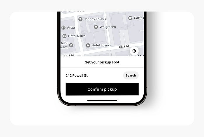
The time to acquire a target is a function of the distance to and size of the target.
4. Hick’s Law
Uber offers you the 3 best rides with their pricing and some indicators like cheaper highlighter and nearest time count which makes your decision quick.

The time it takes to make a decision increases with the number and complexity of choices.
5. Law of Proximity
Uber cleverly places the categories of their ride accordingly by spacing them from other categories, on the other hand, you can see the different groups of pickups and drop-offs as well.
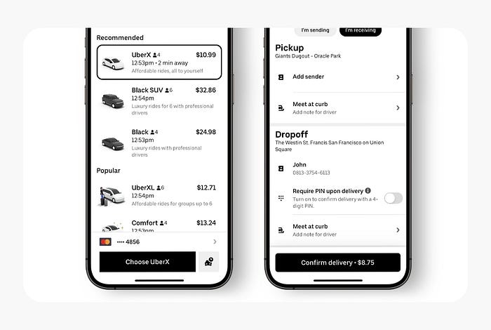
Objects that are near, or proximate to each other, tend to be grouped together.
6. Law of Similarity
If you will see Uber UI, you will be noticed everything is designed on the same pitch. They design their elements with the same black color to make their design more consistent and relatable.
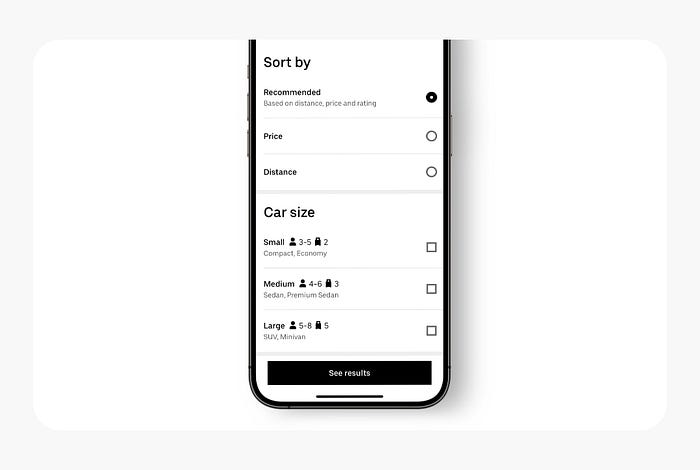
The human eye tends to perceive similar elements in a design as a complete picture, shape, or group, even if those elements are separated.
7. Miller’s Law
Uber knows this law very well and perfectly placed the limited option on the very first screen for the users to remind what they have on the mainland, As human beings we can save a few things in our mind at first glance.
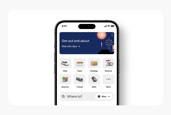
The average person can only keep 7 (plus or minus 2) items in their working memory.
Bottom Line
In a world of UX design, the Uber app reigns as a shining example of excellence, skillfully employing UX laws to craft a flawless user experience. With the strategic implementation of principles like the law of proximity, the law of similarity, and more, Uber has curated an interface that seamlessly guides users with ease and precision. By harnessing visual cues, intuitive icons, and straightforward instructions, Uber has transformed the intricate process of navigation into a simplified masterpiece.
The user-friendly nature and personalized touch of the Uber app have set a new gold standard for UX design, inspiring other applications to strive for greatness. As Uber continues to push boundaries, innovation will remain at the forefront.
Further elevating the user experience to unprecedented heights. Embrace the revolution, for the evolution of Uber is destined to shape the future of UX design as we know it.
Cheers!
If you like it, then share it with your friends ❤️

