Laws of UX that Netflix follows
Discover the captivating world of Netflix’s design principles as we delve into the Laws of UX that shape their web and application interfaces. This insightful article unveils key insights on how these design principles come to life in a real-world application, offering valuable knowledge for aspiring designers and enthusiasts alike.
Get ready to embark on a journey where theory meets practice, as we explore the impactful ways in which Netflix embraces these laws. So, without further ado, let’s dive into the fascinating realm of design and uncover the secrets behind Netflix’s user-centric approach.
1. Hick’s Law
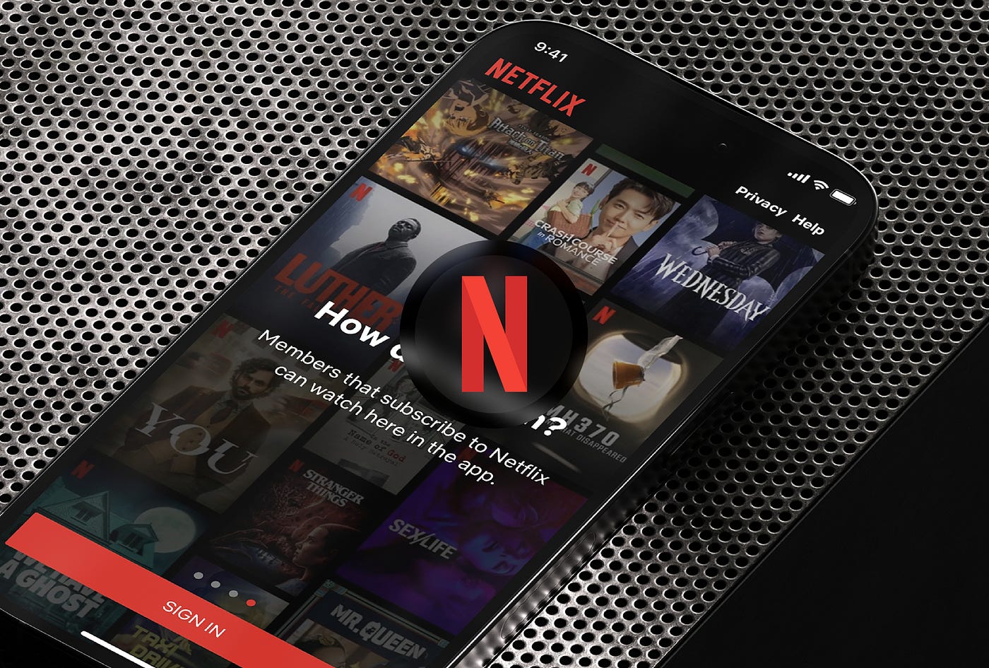
Netflix strategically leverages its vast library of movies and series, employing a masterful application of Hick’s Law to simplify your decision-making process. Recognizing that choice overload can be overwhelming, Netflix curates a dynamic trending page that presents the top 10 movies or series in your country. These handpicked selections, often representing the crème de la crème of content, alleviate the burden of sifting through a thousand options. By reducing the choices to a highly curated list, Netflix empowers you to effortlessly discover captivating content, saving you time and decision fatigue. With the artful implementation of Hick’s Law, Netflix transforms the daunting task of selection into an enjoyable and streamlined experience.

The time it takes to make a decision increases with the number and complexity of choices.
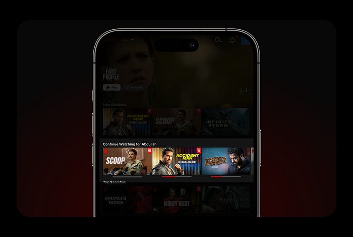
2. Fitt’s Law
Netflix embraces the principles of Fitt’s Law, crafting an app interface that ensures effortless navigation and intuitive user engagement. The strategic placement of a captivating movie poster at the forefront, followed by conveniently positioned play buttons and a curated selection of movies, puts the user experience at the forefront. With a design that aligns with human ergonomics, every element is within easy reach of your thumb, empowering seamless interaction. By reducing the distance between the user’s intent and action, Netflix ensures that clicking a button becomes second nature, granting an unrivaled sense of ease and satisfaction with every tap.

The time to acquire a target is a function of the distance to and size of the target.
3. Doherty Threshold
Netflix values your time and prioritizes an uninterrupted streaming experience. To minimize waiting times, Netflix employs clever design techniques that optimize image compression and size, ensuring swift loading without compromising quality. However, in the rare instances where delays occur, Netflix has your back. With the strategic implementation of loading indicators, progress bars, and design skeletons, you are kept informed and engaged during any temporary disruptions. These thoughtful design elements not only alleviate frustration but also instill confidence that your viewing pleasure is a top priority. By seamlessly managing potential hiccups, Netflix ensures a seamless and enjoyable streaming journey, letting you dive into your favorite content without unnecessary delays.
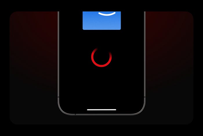
Productivity soars when a computer and its users interact at a pace (<400ms) that ensures that neither has to wait on the other.
4. Jakob’s Law
Netflix understands that users crave simplicity and familiarity when using new applications. Following Jacob’s Law, Netflix seamlessly integrates a user-friendly experience by designing its video player to be instantly recognizable and intuitive. Drawing inspiration from popular video apps like YouTube, Prime, and Disney Plus, Netflix ensures a seamless transition for users, eliminating the need to learn new controls or interface elements. By adhering to Jacob’s Law, Netflix empowers users to effortlessly navigate and enjoy their favorite content, fostering a sense of comfort and ease that enhances the overall streaming experience.
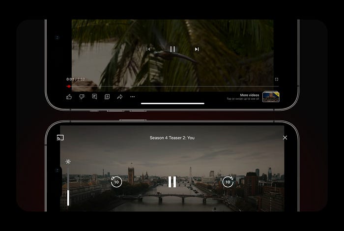
Users spend most of their time on other sites. This means that users prefer your site to work the same way as all the other sites they already know.
5. Law of Proximity
Netflix showcases its mastery of the Law of Proximity through a visually captivating screen. With precision and finesse, Netflix strategically groups related objects in close proximity, ensuring a seamless and intuitive user experience. The play button and download button harmoniously coexist, streamlining key actions for effortless accessibility. By intelligently categorizing sub-actions such as My List, Rated, and Recommendations, Netflix creates an interface that prioritizes user needs and preferences. This meticulous attention to detail exemplifies Netflix’s commitment to user-centered design, where every element is thoughtfully arranged to enhance usability and visual harmony.
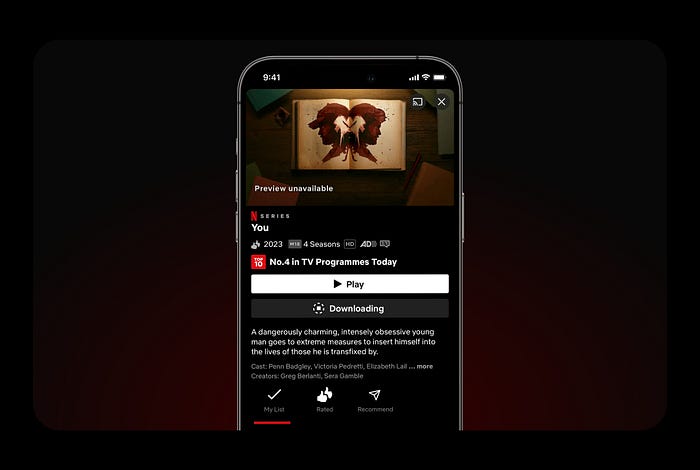
Objects that are near, or proximate to each other, tend to be grouped together.
6. Zeigarnik Effect
Netflix’s ingenious utilization of the Zeigarnik Effect keeps you hooked from start to finish, ensuring you immerse yourself in the full cinematic experience. By captivating your attention and subtly hinting at the time invested, Netflix entices you to stay engaged until the very end. Leveraging the power of human psychology, unfinished series or movies become etched in your memory, creating an innate curiosity and desire to see the story through. Netflix recognizes that our minds fixate on unfinished narratives, making each viewing session a captivating journey that lingers in your thoughts long after the credits roll. With the Zeigarnik Effect as its secret weapon, Netflix keeps you coming back for more, leaving an indelible mark on your entertainment repertoire.
People remember uncompleted or interrupted tasks better than completed tasks.
7. Goal-Gradient Effect
Netflix’s clever implementation of the Goal Gradient Effect shines through in its cancellation screen. With a strategic choice of button color, Netflix ingeniously discourages users from canceling their subscriptions easily. By featuring a prominently highlighted blue button with the text “FINISH CANCELLATION,” Netflix subtly communicates the finality of the action and nudges users to reconsider their decision. This masterstroke by Netflix showcases its commitment to retaining users and ensuring a delightful streaming experience. With this thoughtful design choice, Netflix demonstrates its dedication to keeping you engaged and satisfied, proving once again why they are the industry leader in captivating their audience.

The tendency to approach a goal increases with proximity to the goal.
8. Aesthetic Usability Effect
Experience seamless entertainment with Netflix’s meticulously crafted app design, where beauty meets functionality. The law of the Aesthetic Usability Effect comes to life as every pixel and interaction is thoughtfully designed, effortlessly blending form and function. Immerse yourself in a visually stunning interface that not only delights the eye but also ensures intuitive navigation, making your streaming journey a truly captivating and user-friendly experience. By seamlessly blending beauty with functionality, Netflix has established itself as a go-to platform for millions, where the art of design meets the science of user satisfaction.
Users often perceive aesthetically pleasing design as design that’s more usable.
CHEERS ✌️
Like it? Don’t forget to share your thoughts share it with your friends ❤️

