Landing page Design 101 — Psychology Version

Designing landing pages can be fun yet overwhelming, especially if you’re designing your landing page with high business expectations.
Sometimes, Your company could suffer from a low conversion rate or think its landing page isn’t good enough for the business size.
And no doubt, As designers once we hear the word “landing page”, we remember all the great designs we saw on Dribbble, X, or LinkedIn with all the great animation and transitions here and there.
But we need to understand what makes the landing page “Psychologically” good and enough for the users to convert.
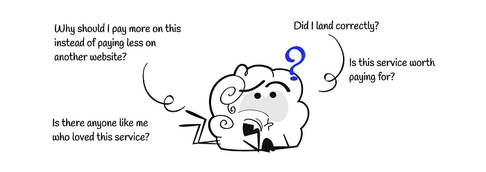
First things first, There are different ways that your potential users can land on your page. That means they have different Psych levels.

Some visitors will land on your landing page unmotivated and not psyched enough. For example, they’re confused between you and other competitors and can’t make a decision. Or even worse, they don’t know what you’re doing as a business (Low Psych).
Some others will be psyched to join or sign up for your service. For example, they may be referrals or motivated to do a specific action by your service, or they’re just joining a service their team uses 🤷🏻♀️ (High Psych).
Rule №1 (Reassure your visitors)

Whether they have low or high psych, you need to reassure the confused or even the psyched ones that they landed the CORRECT landing page.
To do so, it’s not only about making your logo obvious or the main services included on your landing page. You have a very important center of attention that you need to take care of which is your main headline.
That takes us to the importance of UX writing because in this headline you need to invest in understanding your targeted personas to achieve two things:
1. Speak the user’s language in the headline.
2. Highlight the main motivation why the converted users are converted and why they chose you over other competitors.
By doing so, you may make your unmotivated users read this headline and start getting motivated to even scroll your landing page (Which is a good win BTW).
But, there is more you can take care of in your main banner and landing page.
Rule №2 (Social Proof)

Social proof is a powerful psychological motivation because I will say it again and again, aren’t we always searching for people like us who took this road earlier to know how it went?
Isn’t this the main reason why a company like “Glassdoor” exists?
Same here, by understanding your personas, you can highlight certain social proof here and there on your landing page.
The first thing that may jump into your mind now is “Including testimonials”. Well, it’s a good idea but can turn out to be useless and something the visitors skip.
Do you ever remember yourself paying attention to read every testimonial on a landing page?
I believe the answer will be “No” and this is logical, who lands on your page intending to read? They’re just searching for answers to the questions on their mind and have a very short time to make a decision.
That’s why you shouldn’t just copy and paste some testimonials quotes and run away. Look at them one more time, Is there a pattern you can highlight? Are there certain keywords your visitors usually search for? How can you highlight the common needs between the quotes and the visitors’ needs?
More social proof examples:
If you’re a company that has ratings/reviews, you can highlight this number on your hero banner.

So, what if you’re a business that relies more on the services it offers after signing up? You can still do some social proof methods like:
1. Showing how many and which companies trusted your services for example
2. Including a slider of short testimonials with images (preferable to have a similar look, gender, and age of your targeted personas).
3. Playing around with testimonials as mentioned above.
Rule №3 (Avoid boring content for better conversion)
Do you know that you need your users to convert within 8s? This is called the 8-Second Rule. You want them to understand your business and be motivated enough to convert within this period. Most of us started to have a less attention span than before (Thanks to YouTube Shorts) so consider this while designing. That’s why you need to avoid boring landing pages.
Explaining your features can be a good “business” idea, but who reads, right? The over-explanation on this page can make it look overwhelming and risk the conversion.
Do you want to highlight something important? Visualize it.
Do you want to show a flow or inner process? Add an animation or a short video (Not a YouTube external link, please :D).
Does this mean that you don’t need text? NEVER! You always need SHORT and TO-THE-POINT paragraphs with a good text hierarchy.
Rule №4 (Layout)
Choose your layout concisely. You need to balance between text, icons, images, and background colors.
There are no rules in the sections ordering but there’s a trick that I learned in doing case studies that works well with landing pages as well which is adding illustrations/stock images for people between the text-heavy sections that adds a good hierarchy between them
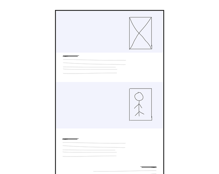
This layout can motivate more users to complete scrolling.
Rule №5 (Fear of loss)

This can be tricky but you can ask yourself, Will the user miss anything crucial if they didn’t convert today? this month? Is there a special offer you need to highlight to motivate them?
💭 Loss Aversion
People prefer to avoid losses more than earn equivalent gains.
That means that we always prefer not to lose something rather than gain it and this is a common practice on e-commerce sites.
Were you ever exploring a product and still not sure if you needed it but then you saw that “Hurry up, only 1 left” that made you think OMG what if I didn’t manage to get the last piece 😱.
You can do the same within your call to action as well like for example “Join today with 50% off” and mentioning that this offer lasts for only 1 day or maybe hours. Or win a certain badge on joining today and many more other ideas you can get based on your business.
Rule №6 (Call to action)
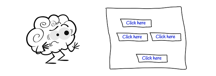
During this article, we mentioned several times that we’re doing all these to make the potential user converts. For this to happen, you need to keep your call-to-actions visible enough within your landing page. But don’t use too many call-to-actions because the user will end up overwhelmed and confused about where to click exactly.
Quick Tip:
Do a Squint Test, which means that you can blur your landing page and check if your main call-to-action stands out or if more call-to-actions are overly visible as well.
Also, Avoid boring wordings like “Sign up” or “Download” and use more related wordings instead like “I want to reserve this”, “Subscribe for free”, or “Show me how it works”. But always keep it short.
Rule №7 (Good Visuals)
You should keep your landing page visually appealing but don’t go extreme. Your landing page still needs to be familiar enough for your users.
💭 Jakob’s law
Users spend most of their time on other sites, and they prefer your site to work the same way as all the other sites they already know.
This doesn’t limit your creativity but always keep your designs clear enough for someone who never dealt with many sites before, unless you’re targeting different personas who can deal with any new creative sites so that’s another story.
Good visuals aren’t limited to illustrations or colors, you should pay attention to the text hierarchy what represents a heading, and what can be just a paragraph or caption to avoid cognitive load
Last but not least, I want to mention that users hate to be forced on something. They hate the fact that you’re taking away their choices and that leads them to do the opposite of what you want them to do (Reactance law).
Use your psychological methods accurately to build your landing page and always iterate! I can reflect on myself on this that I usually feel satisfied with my landing page design after iterating for the second time at least. So, don’t hesitate to iterate till you’re satisfied and that never means that you’re not smart or professional enough to achieve this satisfaction from the first trial. It takes time, take it easy :).
Thanks for reaching this far, I hope you enjoyed this article,
Please 👏 if you find it useful so it can reach other designers as well❤️

