Job Spark: Here’s how I designed a job app for a human-centric approach for your next career move.

This project is part of my third assignment at 10kdesigners. The goal was to create a mobile app that felt as authentic as possible and to put everything we’d learned into practice.
Coming up with the idea:
We were provided with a list of ideas from a cohort-based accelerator program for founders called Nights & Weekends. The problem statement was chosen from the 120+ ideas mentioned there. I chose to build a job app that works like Tinder.
For this project, I am making an app for job seekers.
❗️Problem Statement:
Traditional job platforms lack engagement and interaction which is required to effectively connect job seekers and recruiters. The app aims to provide a more efficient, and human-centred approach to job hunting.
🔍 Research:
In the first phase, I began my primary research by identifying the pain points. This enabled me to continue with the competitive analysis in order to identify competitors. I later conducted a brief interview with a few of the participants.
Interview Questions:
- What are the first basic things you look at while applying for a job?
- What challenges do you face during the job search process?
- Can you describe a frustrating experience you’ve had while applying for jobs online?
- What information do you find lacking or confusing when browsing job listings?
Pain Points Identified through Interview:
- No human-to-human interaction
- Slow communication
- Apps appear to be mundane.
🕵️ Competitive Analysis:
I carried out a competitive analysis on both direct and indirect competitors. I explored popular job-search platforms such as FoundIt (monster), Naukri.com, LinkedIn, and Indeed. The main aim while conducting the analysis was to determine what drives users to these platforms and where they may fall short.
- Filters: So many filter options are available for job seekers, one can narrow it down to what kind of job he/she wants. Though not all apps are well-versed in it, it’s getting better.
- Courses: Few apps offer courses which help job seekers learn and improve their skills. Having such an in-app feature is useful.
- No proper flow: They occasionally send application’s confirmation emails and then redirect to LinkedIn to apply again.
🖼️ Moodboard:


ℹ️ Information Architecture:

✍️ Wireframes:

‼️Important Features:
Swipe: Candidates can swipe right if they want to apply for jobs and leave when they don’t want to, or they can just ignore that particular job card.
Reminder: Once you match with the recruiter, you can send a reminder to him/her after 72 hours if they forget to text you regarding the job.
Easy process: Swiping right sends your résumé, portfolio, projects, and more, along with a short message explaining ‘you’ to the recruiter, making the process easier for them.
Quick Response: Communication becomes easier, making it more human-to-human.
Premium Plan: Minimal paid plan for users who want to apply for more than 10 jobs per day. They even get the boost where recruiters can see their resumé on top.
🗺️ Blueprint (user flow):

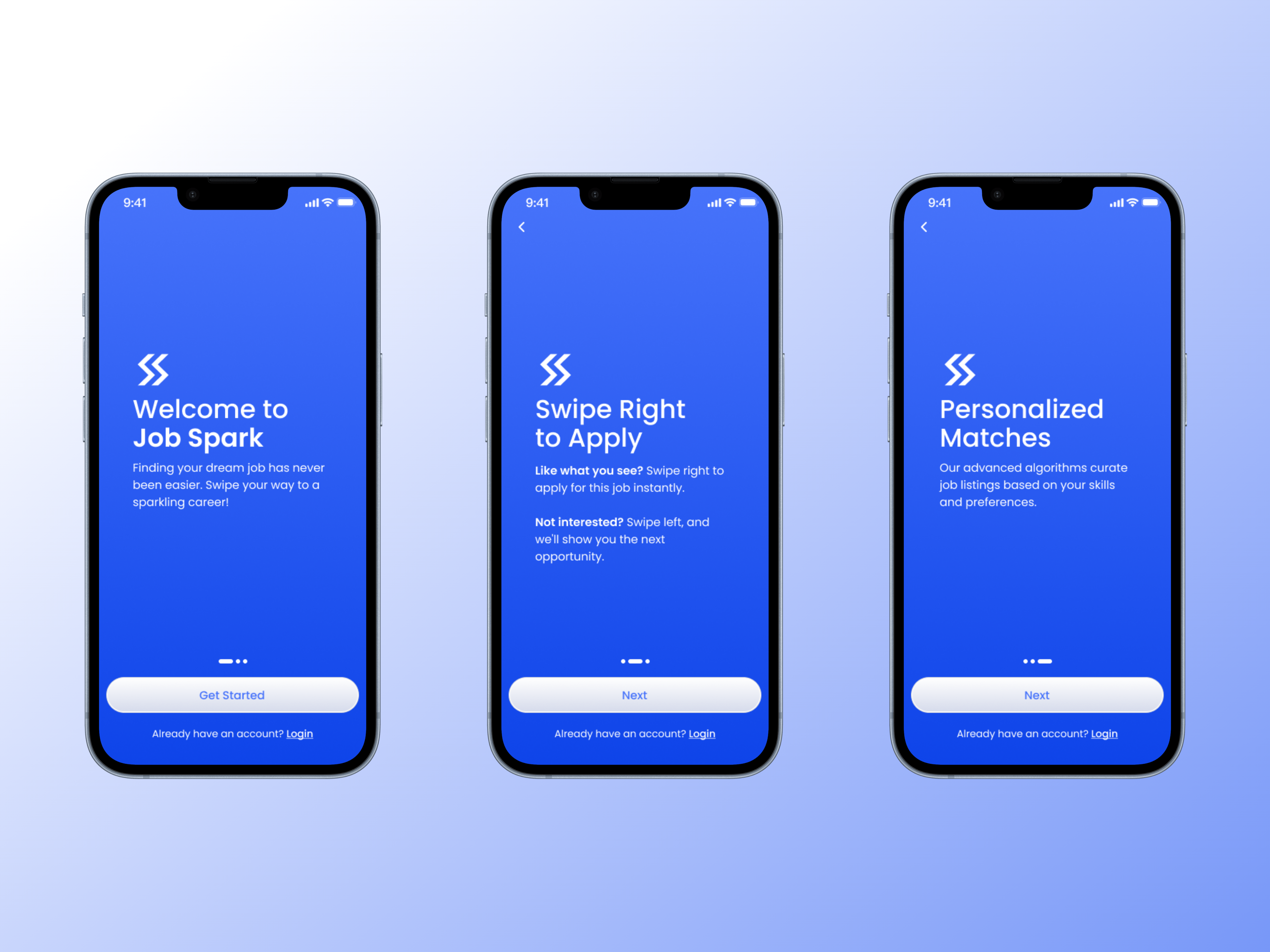
➡️ Onboarding:
While designing the onboarding screens, I aimed to explain to the users how the app would work.
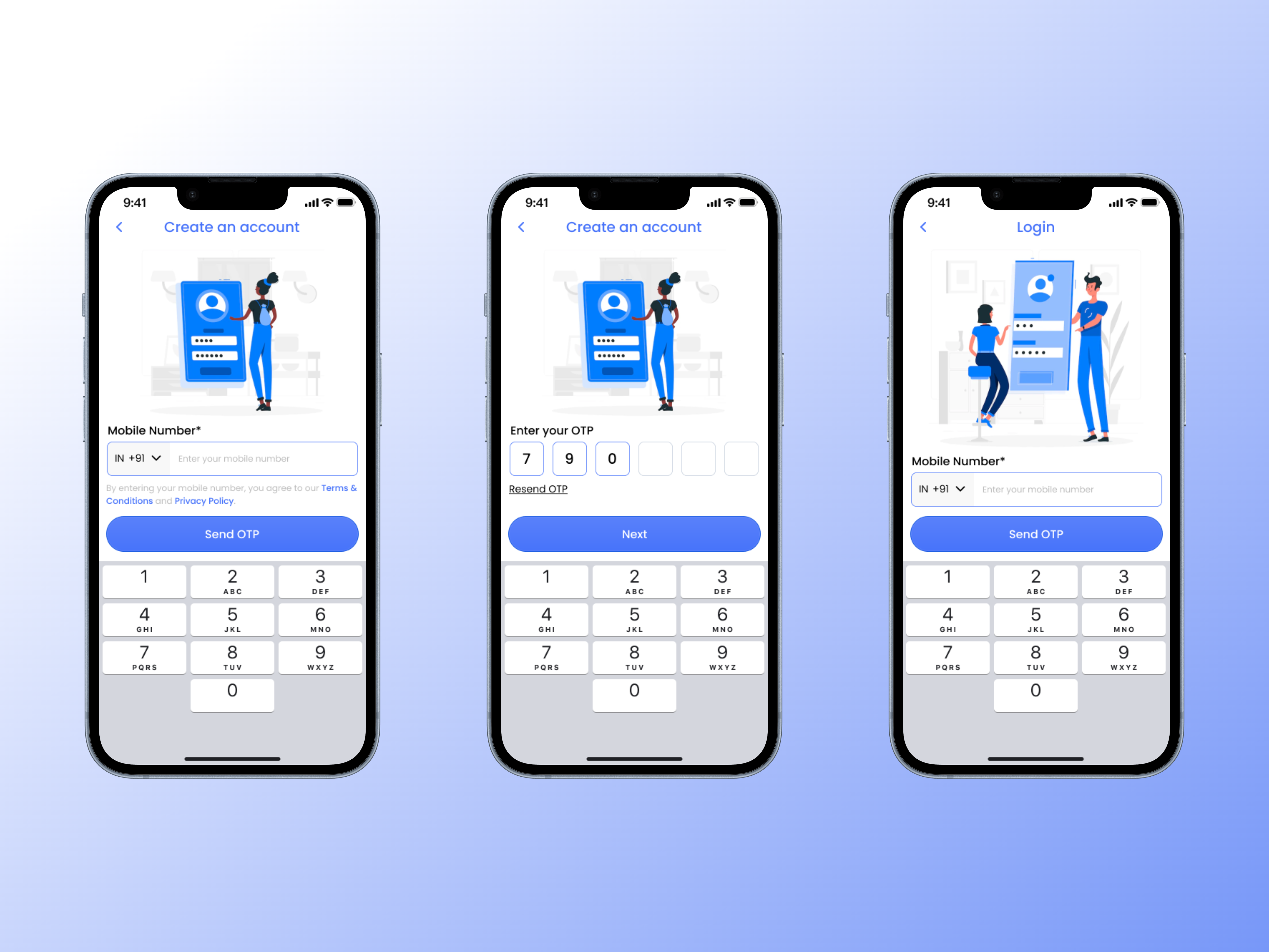
🔑 Sign Up/Login:
The thought process behind designing these screens was to keep them as short as possible so that the user could start as soon as possible. So, the same process for both — sign up and log in. A mobile number followed by OTP.
📄 Setup:
This focuses mainly on the user’s professional career. A basic question on their experience.
The next step for them will be to upload their resume, a short message, links and lastly their projects, courses, awards, etc. which are a bonus while applying for jobs. Out of all uploading resume is mandatory so that they can start with their job-hunting process.
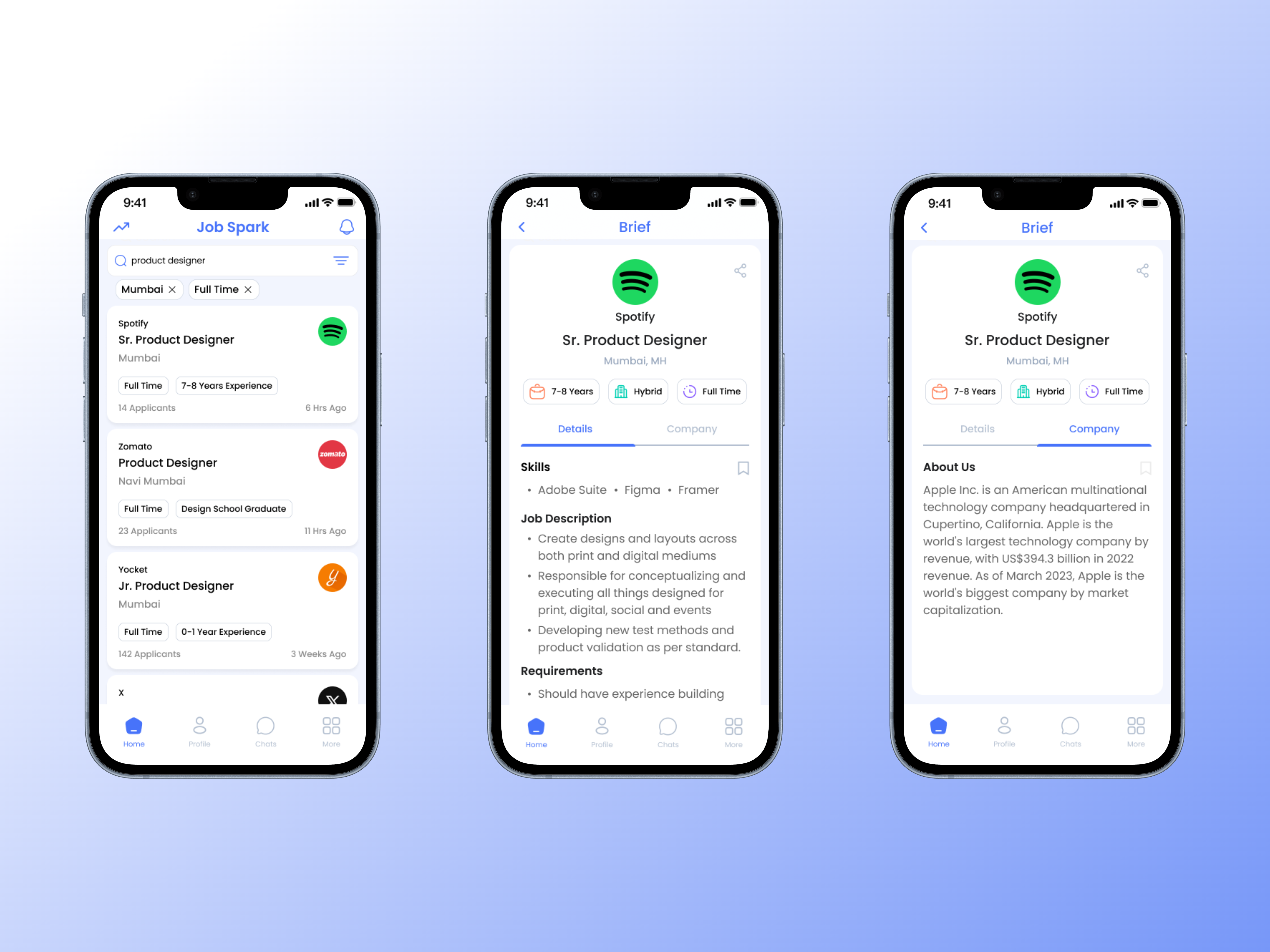
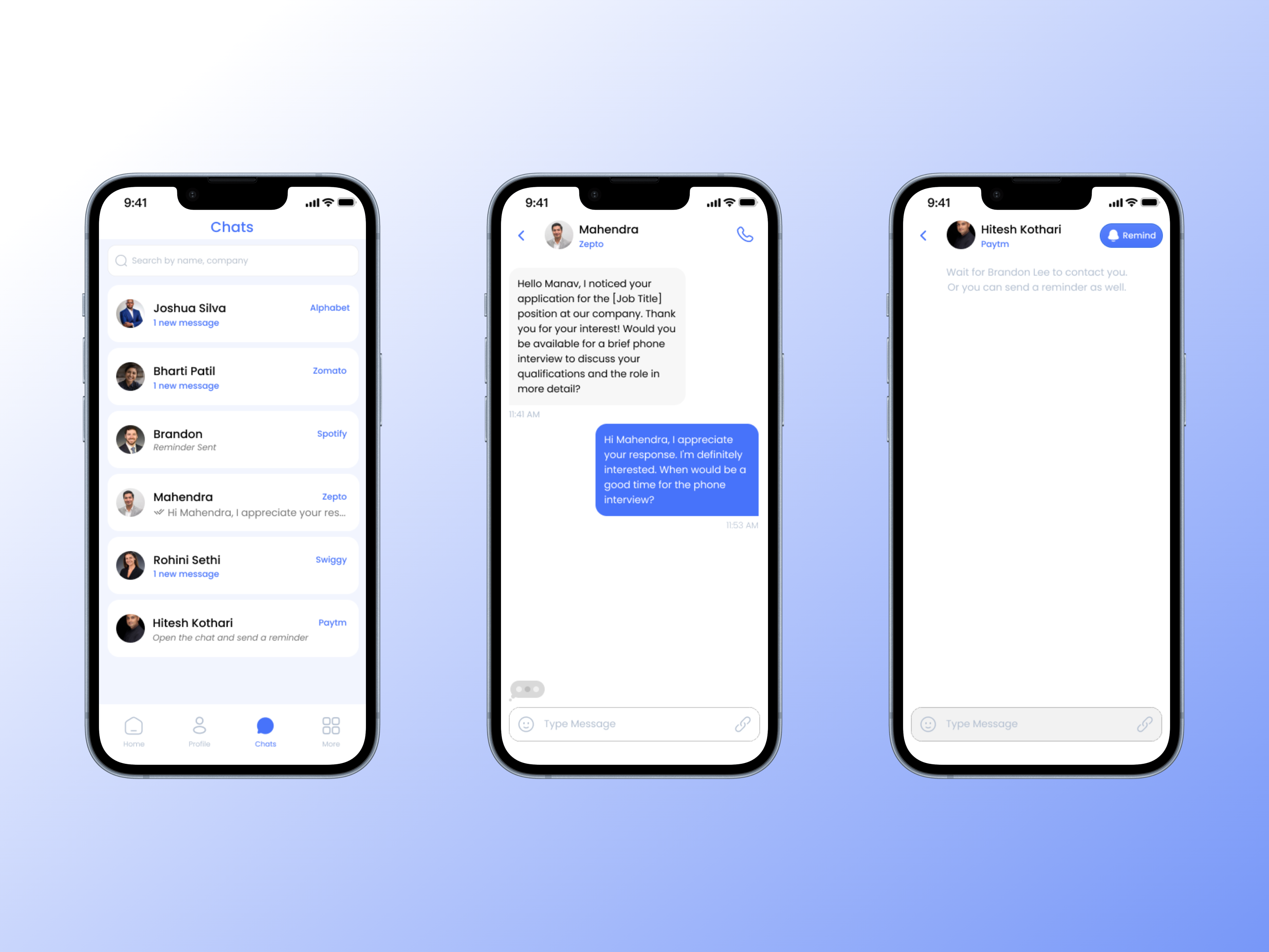
📋 Job Feed:
While designing the feed page, earlier users would see the second screen (few changes made after adding the first screen) and then they could swipe right if interested. But a couple of points which led to the addition of another screen:
Job List: Users like to go scroll through a bunch of jobs and after that, they like to apply to some of the jobs. Here the user would feel stuck with just one job posting on the whole screen.
Gist: Users can see the basic details of the job posting which gives them a basic idea of what the job is related to. If interested, they can tap on it for more details which makes the process much faster.
When the recruiter right-swipes your profile, a chat section is created where the recruiter will text/call you.
💬 Chats
An important feature which makes the communication faster. Instead of sending an email, the recruiter and the job seeker can directly get on a call/text through JobSpark.
On the 3rd screen, there’s a “Remind’ button where the job seeker can send a reminder to the recruiter if they haven’t contacted them in 72 hours (working days). This helps recruiters to NOT miss out on an amazing candidate for their company. Eventually, it is a win-win for both.
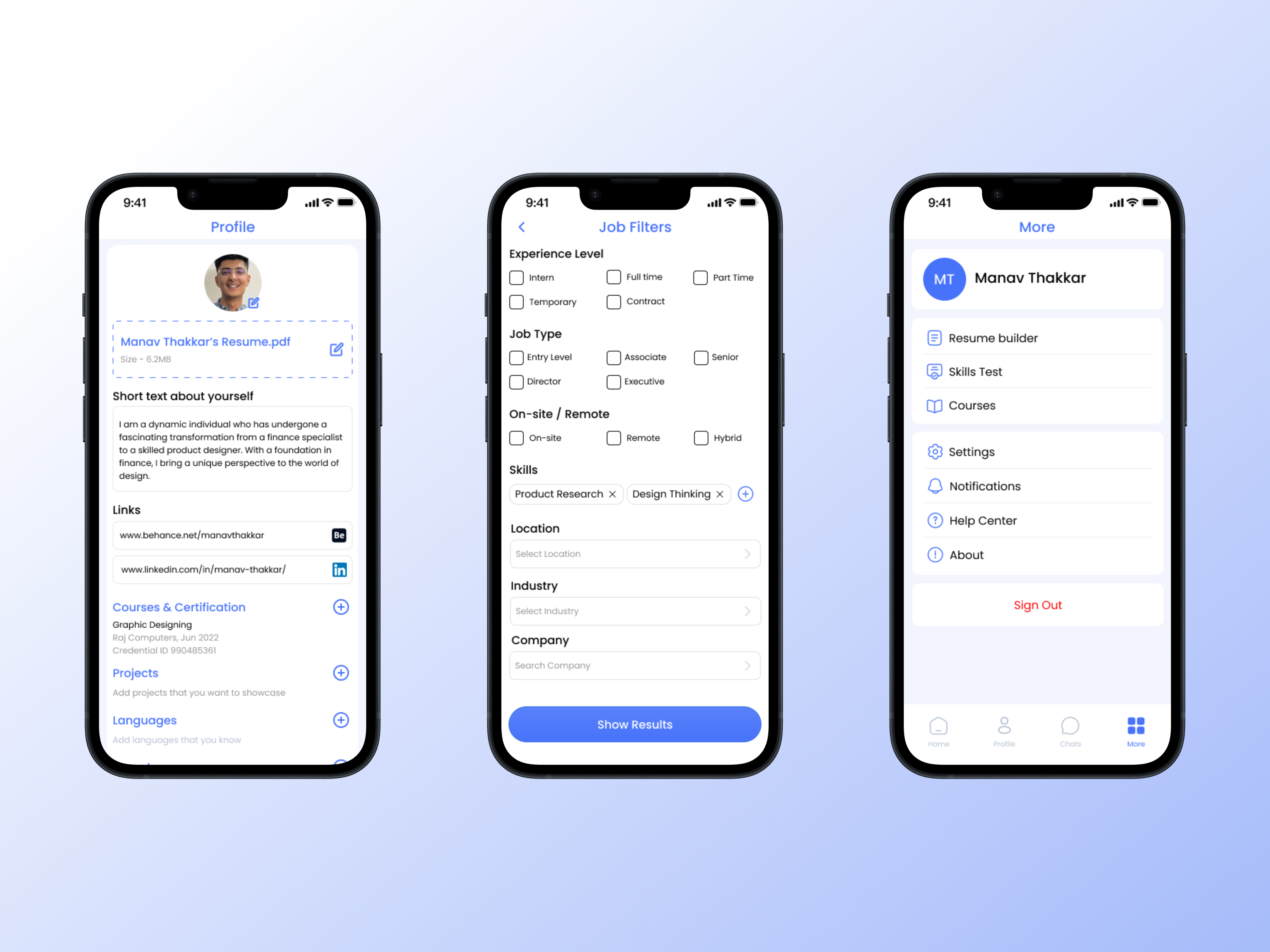
👤 Profile, Filters & More
In the profile section, I have added an option for profile pictures which makes it more human-human interaction as this is lacking in the other apps which I found out during the research process.
As many as filters have been added to make it more precise for the users to find their dream job.
Alongside job search, the app also provides a few more things such as a Resume builder, skills test, and courses. This will benefit the job seekers before applying.
👇🏻 Here’s the link for you to check out the prototype:
🤔 What’s next?
After designing the app from the jobseeker side, it’s time to work on the recruiter side, which will present some interesting challenges.
Designing a dark mode theme would be exciting as well, giving an option more for the user experience.
And that concludes my case study:
Thank you for reading till the end; it means a lot to me! This was my first design project. It was jam-packed with plenty of lessons. The things I learned were — how to think from the user’s point of view, iterations being the key to the outcome and creating something beautiful.
I am up for the opportunities out there and I believe I would be a good fit. Let’s connect on LinkedIn or Twitter. 🤝
I am open to all the feedback, do comment and let me know your thoughts.
See you around👋🏻
If you long hold the clap button, you can give up to 50 claps on Medium.

