Is it a myth? Here’s why we still use above the fold in landing pages
Deconstructing the trend to use “above the fold” concepts when creating landing pages and other insights
I don’t normally do this, but…
This article will assume you know what “above the fold”, why we say it isn’t relevant anymore and why it’s been called a myth since 2014-ish.
If you’d like to learn what “above the fold” means and why it’s “dead”:
- What is “above the fold” and is it still relevant in website design? (Impactfulplus.com)
- Is Above the fold Really Dead? (vwo.com)
- Blasting the Myth of the Fold — Boxes and Arrows
- Why “Above The Fold” is a Myth | Wiltwyck Web Design
- Debunked: The “Above the Fold” Web Design Myth | authentic. (beauthentic.digital)
Or if you’d like to read more about the “everybody scrolls” movement that caused “above the fold” to be “dead” (apologies for all the “double quotes”):
Caught up? Cool.
We’re going to tackle three topics today:
- Why landing pages are different from most other types of pages on the internet (and their relationship with the “above the fold” concept)
- Figure out if “above the fold” is important for landing pages (By also analyzing how message match gets tied up when it’s not at the top of the page).
- Why “above the fold” is still talked about in the landing page space today if we’ve decided it’s a myth.
A lot of this will try to explore user scrolling and the above the fold concept (together) when applied specifically to landing pages and what that means for the marketers and designers behind them.
Let’s start then.
Landing pages are different from most other types of pages on the internet.
This is usually because they:
- Are part of a campaign or funnel (PPC campaigns for example) that try to guide users (what we call “leads”) to take some sort or action (buy something, click on a button, try a free trial, fill out a form, etc.)
- Prioritize user intent more than other types of pages (So they try to match the reason why somebody clicked on a link with what the page is about. If that intent isn’t “matched” with what your page is about, it won’t convert well. Check out Unbounce’s message match page to learn more)
- Are the only types of pages where “above the fold” is still pushed as being relevant and highly important.
This last one is true, especially when you realize that searching up “landing page above the fold” gives you articles and results that talk in favor of above the fold, while also sometimes never even mentioning why the concept isn’t as relevant today.
In fact, it’s really hard to find any info that relates to above the fold being a myth unless your intent is to search for it directly.
Heck, new articles still pop up every now centered around this idea.
So this “myth” is still being passed around and, in a lot of places, is actually thriving despite the evidence given against it.
Which is a problem if, say, you are a new copywriter or marketer who wanted to learn about how to write for landing pages (and didn’t know anything about web design because, why would you?).
You’d have a high chance of reading one of these articles and believing this “above the fold” thing to be important for pages.
And that begs the question…
Isn’t “above the fold” important for landing pages? Won’t we break message match if don’t put things at the top of the page?
The idea behind this fear of letting “above the fold” die is this:
You only have a few seconds to capture your lead’s attention.
If you don’t show your offers messaging immediately to your lead and make it the first thing they see, they’ll click off because they won’t see anything relevant to their search.
Which makes a whole lot of sense…
Until you realize the devil is in the details.
Message match isn’t about showing your message immediately.
It’s about making sure the first message on your page matches with the reason/intent why your lead is on the page.
To see what I mean, let’s create an example that shows this off.
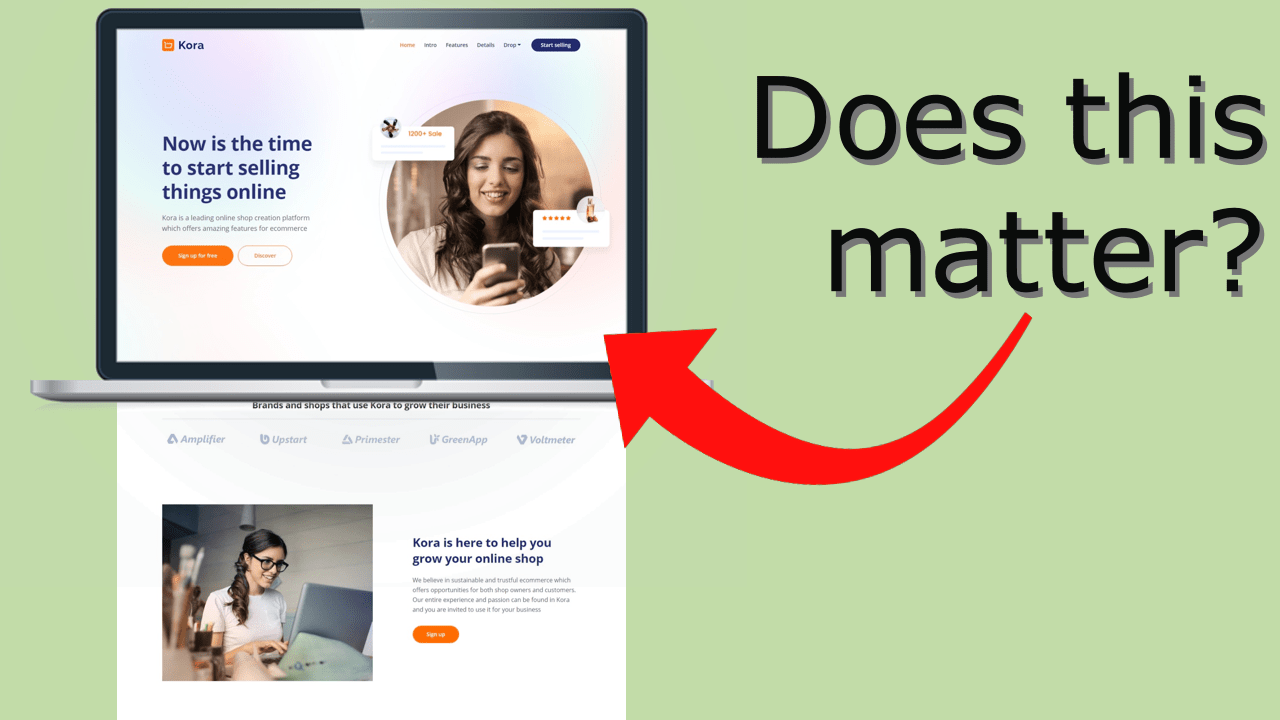
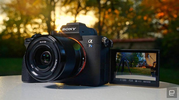
Imagine a landing page with an “above the fold” that has a relevant image of the page (It needs to be somewhat relevant enough as to avoid them leaving immediately).
For example, if they clicked on a link to buy cameras, they’d arrive on a page where they only see a banner showing off a camera (They’d have to scroll down to see more)
And let’s say that the headline (so the page’s first “direct message” that you can buy) is below that image.

Now comes the question:
Do you think most people would immediately leave (because they didn’t see direct messaging that you can buy cameras “above the fold”) or would they scroll down?
The answer is…
They’d scroll.
We know this from one of the most cited studies titled “everybody scrolls” on the internet. (which, weirdly enough, doesn’t exist anymore. Although it can be read thanks to the way back machine or through this copy that’s hosted on renydigital.com).
It was an unmoderated remote testing study done in 2014 that tested what percentage of users scrolled below the fold when the only thing shown was a full cover image. (Different variations of “you can scroll” indicators like arrows or animated images were compared to a control with no indicators).
And although it was only a small sampling (about 48 participants), there is a stat I’d like to share that I found interesting.
These were the findings:
91% of users immediately scrolled.
Which is pretty insane.
But wait there’s more!
If you tie it in with this study which analyzed 25M sessions on a page (The images missing on that page can be found here. Yes, these are old pages) where they observed “many visitors scroll down the page before it finishes loading”
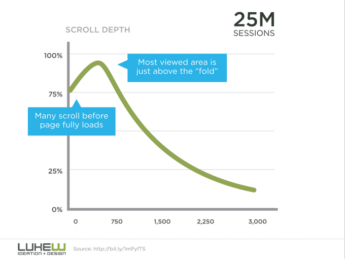
Then this kind of shows that users are mouse-wheel trigger-happy in general, even on landing pages.
Now to be fair, both of these studies don’t really explain their test methods too well and they don’t directly say what kind of pages they were testing (Even though the first one seemed to hint at testing the current homepage and the second one an article page).
But that’s why from these two studies, what I want us to extract is this:
- When not presented with immediate and direct info to what they’re looking for, users seem to always scroll down to look for it. (Keep in mine they probably won’t scroll to the bottom though. Like, if after 7 seconds of scrolling I don’t see anything related, I’m leaving)
- Users are very scroll happy — going as far as scrolling before everything loads.
Now taking this back to the topic of landing pages, this means a few things:
- What causes leads to bounce is being shown irrelevant information (bad message match).
But in the absence of that info, (or out of pure curiosity), leads will scroll to find the main message. Use scroll indicators to avoid creating what looks like a fake end on your page. - Users don’t need to be shown everything on the first page screen. You can space things out.
- More emphasis should be given to the structure of your page and the order in which you present info (rather than worrying about what’s above the fold). Meet your lead where they currently are and guide them where they need to go to reach your page’s main action.
- Pretty much everybody scrolls… except, maaybe if you’re targeting people who aren’t as used to technology, those numbers could change. (They won’t be so used to scrolling automatically)
Which is a pretty little list of insights.
Now normally, I’d finish up this article here and close the chapter on above the fold in landing pages forever…
But I can’t until we tackle this one last issue…
Why is above the fold still talked about in the landing page space today if we’ve decided it’s a myth?
This is tricky to pinpoint. Because seriously, why are articles like 17 Stunning Examples of Above the Fold Content to Hook Your Visitors still being made?
Why won’t above the fold just die.
I believe there’s a few reasons for this:
There’s an overlap between the “above the fold” concept with the “show relevant and useful info first” concept. And this happens exclusively with landing pages.
Most landing pages as we know them tend to show their primary messaging included above the fold (So think headline and supporting images).

This makes sense because you want your primary messaging to be read first.
This is different from other types of pages where, for example, you might have a navigation area, a search bar and maybe an ad or two at the top of the page. And then your main content continues lower down (And even below the fold).
Now here’s the thing — Landing pages don’t tend to have additional components that “inflate” the top of the page like other pages do.
And since you want to include things like your headline and supporting images and messages at the top of the page, it just so happens that you’re pretty close to just saying “keep things above the fold”. Because for most landing pages, the former is always included in the latter.
There is overlap between these two ideas.
Although remember they don’t necessarily have to. (Because of what we talked about before)
It doesn’t matter if your direct messaging is shown immediately on your lead’s screen, as long as you take care of the structure and order of the info presented (so showing the most relevant info that your lead was looking for first).
But because the most relevant info is always at the top on landing pages (and is structured in such a way as to increase conversions), there seems to be a habit of just calling this highly relevant and structured info “above the fold”.
Even though it doesn’t matter how much ends up visible on your lead’s screen!
They’ll scroll down either way. (Especially if it’s mobile, where the “above the fold” portion is pretty small.

But that’s not the only reason why I think above the fold is still alive…
It’s hard to come across info that says “above the fold is a myth” unless you actively go looking for it
Landing page tutorials, articles and videos that explain concepts like “above the fold” might explain what it is, but a lot of them never mention why it isn’t relevant anymore.
Or if it does mention the idea, it tends to be in favor of above the fold, not against it.
And there’s a few reasons why this happens.
This could be because of the overlap we talked about, where a lot of writers and marketers end up referring to “above the fold”, when really what they’re talking about is the “show relevant and useful info first” structured concept from before. And they just don’t realize it.
It may have to do with landing page articles recycling, copying and repeating the same content ad nauseum, but with different words (which, totally happens). And because they get views anyway, there’s no incentive to go more into depth with the content or say something different (because saying something new is hard).
Or maybe knowing whether above the fold is relevant or not doesn’t really affect your ability to get high conversions on said pages. (Because high conversions aren’t dependent on above the fold… so who cares, right?)
Whatever it is, it’s a huge part of what’s keeping the above the fold myth alive.
And if we keep this thing from dying, we’re not increasing our knowledge and we won’t be able to improve and innovate into the future.
In conclusion…
- Everybody and their aunt seems to know that “above the fold” doesn’t matter anymore — but only if you’re aware and actively searching for it can you find that info.
- Above the fold is still alive when talking about landing pages because that’s what we call the initial structure we give most of our pages. They just so happen to be above the fold. We’ve married the concepts.
- If we don’t talk about this more, we’ll keep making pages for users that don’t reflect reality. Your lead’s behaviors change over time. Plus, it sucks to be a designer who makes pages that look like they were done in 2013.
So talk about this more when you can. We’re not in the early 2010’s anymore.
Want more landing page insights like this article (plus a free landing page swipe file)?
In One Snap is a weekly newsletter for marketers, designers and devs who want to increase conversions on their landing pages.
Every Wednesday, you’ll get sent some insight on landing page marketing, design or building.
You also get my landing page swipe file as a bonus if you do.

