Introduction to graphic design: color theory #part 3
I wrote about color theory about the topics of what is a color and it’s properties and models in previous articles you can find them here, what I want to talk about today in this 3rd part is about what does color means, and what do we mean by color harmonies.
Have you ever wondered why color have meanings and they symbolize to some feelings, how they can convey a message, reflect a message, why we feel so worry if we saw a yellow mark and feel so afraid when we see a red mark?
Color holds power.
Colors can influence our decision-making, thinking, and impact our moods. Depending on our interpretations, they can be used for good or evil.
To truly grasp the meaning of the colors, we must learn that although some hues are similar, they don’t awaken the same emotions on us.
All in all, colors can be a powerful tool if you know how to use them.
The meaning of the colors
Colors convey meanings in two different ways — psychological association and cultural symbolism.
Color psychology studies the hues as a determinant of human behavior.
That is, colors convey feelings, evoke emotions, and impact people’s behavior.
Color symbolism is an ambiguous term as the underlying meaning of each color is not universal and changes in every culture — it refers to how colors are tied up to symbolic elements unique to each individual.

Why colors have a meaning?
Our brain treats a color based on an associative network, this network is accumulated based on our daily life experiences.
Through association, we attribute characteristics to elements, including their colors, and that influences how we perceive and behave in this colorful world.
Why do colors have different meanings?
As said above, the meaning of the colors might be different for every person.
Although blue is often depicted as a calming color, some individuals might perceive it as an intimidating hue, which confirms color psychology isn’t an exact science.
People attribute different meanings to the same color based on:
- Personal experiences — Each color will trigger a distinct sense depending on your own experiences. For instance, yellow might be a happy color, but if your child got hit by a yellow car in the past, you might associate it with bad moments.
- Cultural connotations — It’s not a secret that each color has contradictory meanings in other cultures. While blue is a boy’s color in Western cultures, it is considered a feminine color in China.
- Gender — From a young age, we’re conditioned to specific colors depending on our gender. That directly influences our color preferences.
- Context — The context is essential to understand the meaning of a color. For instance, red can act as an appetitive signal in a restaurant, or as a warning signal in the road
List of color meanings
this can take a book to explain every color alone in order to cover all of the positive and negative meaning of each color, However i will put some references bellow:
- Blue is the color of trust, responsibility, and relaxation
- Red is the color of action, passion, and aggression
- Yellow is the color of the mind, intellect, and optimism
- Green is the color of growth, balance, and renewal
- Orange is the color of enthusiasm, adventure, and creativity
- Purple is the color of spiritualism, supernatural, and imagination
- Black is the color of mystery, elegance, and power
- White is the color of purity, peace, and cleanliness
- Pink is the color of romance, feminine, and nurture
What is color harmony?
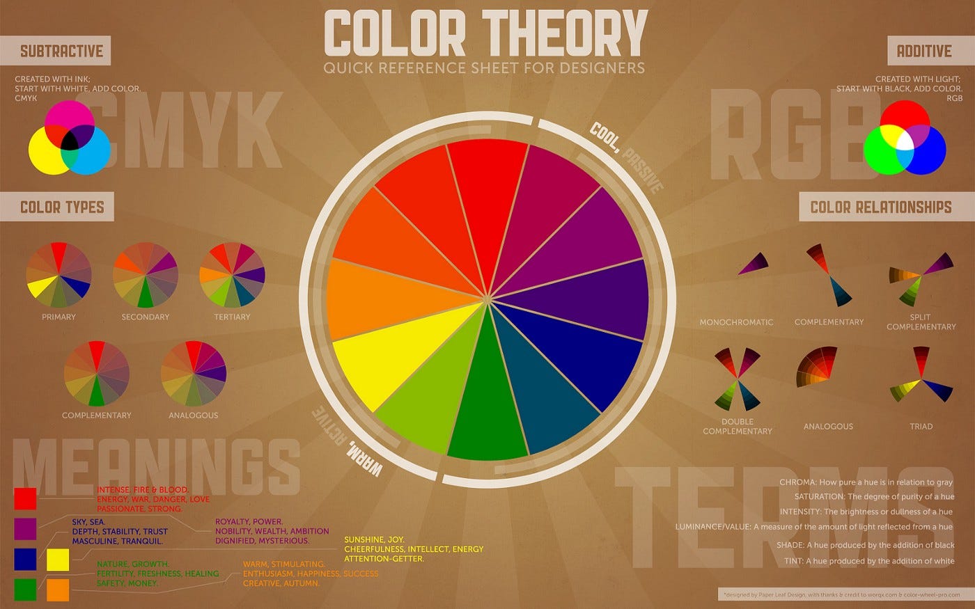
In color theory, color harmony refers to aesthetically pleasing and harmonious color combinations based on geometric relationships on the color wheel.
These colors in harmony produce consonant and eye-pleasing contrasts that are used in various projects, from websites to logos to interior design.
You can create harmonious color schemes by placing these geometric shapes on top of the color wheel and adjusting saturation and brightness as needed.
Back in the late 17th century, Sir Isaac Newton created a circular diagram of colors or color wheel that would be the base of color theory and a revolution in understanding the relationships between colors.
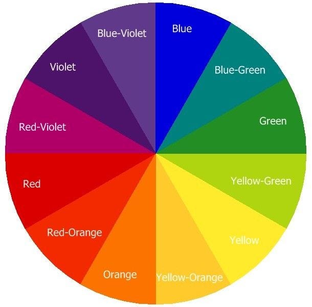
That color wheel, which was made of the seven , was later improved to 12 different hues.
Most Common Color Harmonies
Once you have the key color on paper, it will be easier to identify harmonious colors using the color wheel.
For that, you can use any or a combination of the color harmonies below. Still, regardless of which harmony you choose, it’s essential to pay attention to your use of warm and cool colors because you don’t want your design to look garish.
Last but not least. Consider shade, tint, and tone when working on your color scheme, as they allow you to create rich, layered color combinations.
You can always use an online color wheel or a color picker. Still, we described how to create your own color harmony palette for each of the seven color scheme articles below.
Here are some color harmony examples:
Complementary
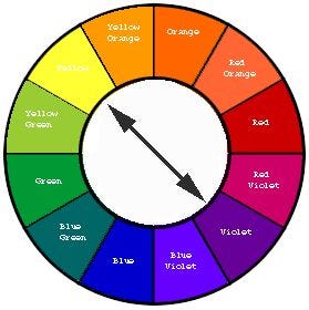
Complementary color schemes are the most basic of all harmonies. They’re often used in the world of design because of their simplicity.
Put simply, complementary pairs are colors positioned on opposite ends of the color wheel (or color circle), and they can be either primary, secondary, or tertiary colors.
These harmonious color combinations create vibrant color palettes with high contrast. While that’s desirable in a number of designs, it can be jarring if not appropriately managed.
For instance, text and background in complementary colors are tough to read, so steer away from that.
Further out, these color schemes are ideal for making something stand out and create eye-catching elements. Some great examples of complementary color schemes are:
Split-Complementary
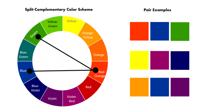
Split complementary combinations are slightly more complex than complementary colors because they have three hues.
The simplest split complementary color schemes have one key color and two colors adjacent to that key color’s complement. Because of that, this color harmony has a vibrant contrast that is generally easy to use.
Beginner artists and graphic designers often gravitate toward these types of combinations as they start to branch out into more complex color schemes since they’re approachable and intuitive.
Beyond that, split complements work exceptionally well with artwork since it gives you enough colors to work with.

Analogous
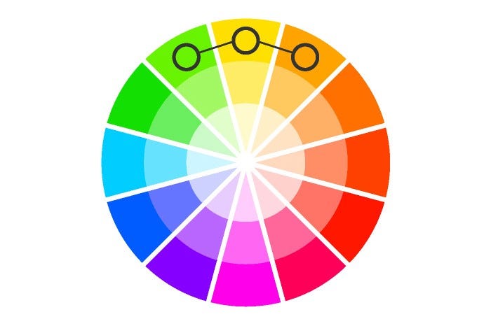
Unlike complementary color schemes that pick complementary pairs, the analogous color schemes consist of three hues, all positioned next to each other on the color wheel.
They usually consist of one dominant color, then a supporting color. The third color can be the first two colors blended together or an accent color that pops.
Analogous color schemes are widespread in decorating and interior design. These color harmonies tend to be eye-soothing and have a sense of visual cohesion without being too flat, overwhelming, or monochromatic.
Still, make sure you have enough contrast when choosing your analogous color scheme.
When employing an analogous color scheme, stick to the 60–30–10 rule to maintain a visually appealing balance.
Triadic
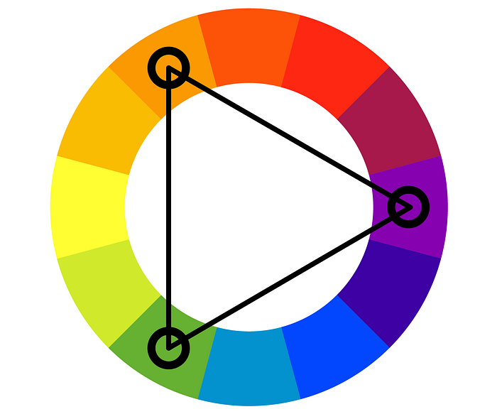
Triadic color combinations consist of three colors evenly spaced on the color wheel. They are very versatile, and more often than not, they create a vibrant, bold color palette.
Similar to complementary color schemes, triadic color schemes offer strong contrast.
Still, they tend to be easier on the eye than a simple complementary pair, making them a pretty safe bet if you want more than one hue to play with, but don’t want to make quite as much of a splash as a complementary pair would.
Tetradic
Tetradic color schemes have four individual colors: a key color and three more colors, all equidistant from the key color on the color wheel.
This color harmony can also be referred to as a “double-complementary color scheme” because it consists of two complementary color pairs.
Like any complementary scheme with a wide range of colors, the result is a vibrant palette rich with contrast.
In fact, tetradic colors are some of the boldest, most vibrant color schemes in the designers’ toolkit. While that’s a great thing, it also means they should be used judiciously and with caution.
If applied with an unpracticed hand, this color harmony can look aggressive and even a little nervous.
Conclusion
this is the final part I hope that was not to heavy for you guys, and i will sum up with some resources to learn about colors:
book:https://www.amazon.com/Color-Psychology-Therapy-Factual-Influence/dp/1614275130
article:https://www.colormatters.com/color-and-design/basic-color-theory

