Introduction to Figma’s interactive components

While it’s always been possible to animate controls using Figma prototypes, it required some crazy workarounds and a ton of views to be created. With the new functionality, it’s super easy, and it allows you to create some pretty nifty interactive and animating prototypes. The key thing to understand is that you can animate elements within a frame without changing the state of the parent frame. You can make them react to user input or simply loop them.
There’s a certain limitation that needs to be kept in mind when dealing with the new feature. It only works within a single component. So for example, you wouldn’t be able to string together two variants that belong to separate components, and you can’t connect two separate components that exist by themselves (without any variants) for that matter. So in order to use this new functionality, you should be quite comfortable with using variants.
Now the first thing that comes to mind when thinking interactive elements in any given project are buttons, so let’s start there.
Simple buttons
Create a new component and turn it into a variant. Now add a new variant by clicking the + button inside the component group or just copy/paste the existing one and modify it, so that it looks like a hover state, and then do another one that’s going to be used when the button’s clicked.
It’s completely up to you how to style/design each state, the important thing here is to now connect the three states in a way that’s going to make the button interactive. In order to do that switch to the prototype tab and connect the default and the hover state. The default event for new connections is ‘On click’, so we need to go into settings and change it to ‘While hovering’. You should also change the animation type from ‘Instant’ to ‘Smart animate’ and voila. Now when you put the button (in its default state) in a frame and hover over it, it should animate. The next step is to connect the second state with the third one. For this connection between the second and the third state, we’re going to be using the ‘While pressing’ event type.


Naturally, you don’t need to limit yourself to animating shadow and color changes. You can animate pretty much anything you can think of. For our next example let’s use the underscored link that turns into a button on hover. The prototype settings look the same. The only difference is I’m animating the background (a rectangle) that changes its vertical size to fill out the frame on hover. I’m also using blend modes to have the text change its color based on what’s in the background.

Not so simple buttons
Simple, right? Let’s turn it up a notch. How about one of them submit/upload type buttons that change states and animate? We can use the previous button as the base for our next creation, only this time we’re going to need a few more variants inside of the component group. I’d like to have an icon that animates and informs me that the process of uploading is underway.
There are two ways of doing this. You could animate the whole thing by using many variants inside the button group and stringing them together through After Delay even types (that’s hardly English, but I hope you know what I mean). Or you could do it properly and embed a prototype inside a prototype to make it loop, or in other words, use an animated icon. This is what we’re going to do since this method allows for much more flexibility and reuse of the icon.
Perpetual loops
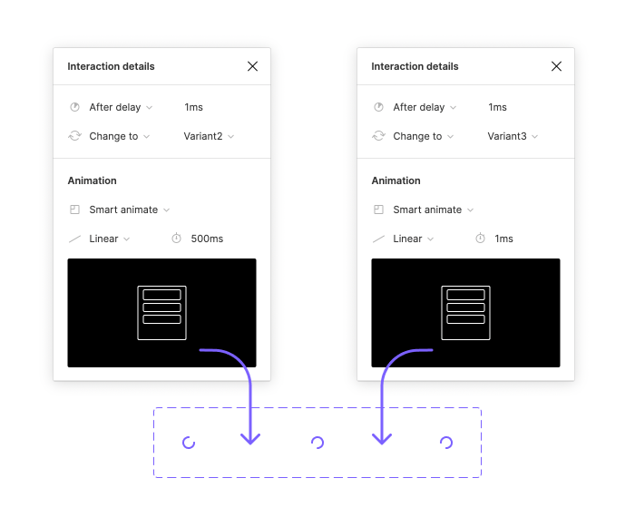
First, you’re going to need another component that animates and loops. As long as you put it anywhere inside a frame and run the whole thing as a prototype, it’ll keep going through its motions until the end of time or at least the end of your laptop’s battery. Let’s do a basic spinning circle (or a 270-degree circular arc to be exact).
Animating circles in Figma requires some gymnastics. You can’t just tell them to rotate. You need two additional states: the first one at -179 degrees, the second one at 180. Another tricky part is making this thing loop. We’re going to set the default state to switch to the second state after a delay of 1ms with the transition taking 500ms in a linear fashion. Since the difference in rotation between the second and the third state is so tiny, the transition needs to be pretty much instantaneous. Lastly, in order to close the loop, we need to connect the third state with the first one and use the same settings as we did between the first and second states.
So this is how you put animations in a perpetual loop. You can do the same thing with any kind of animation that you’d like to use inside your Figma prototypes.
Now let’s go back and finish the button. We can use one of our previous buttons as a base for this one. For this, we need five states: default, hover, clicked, busy, finished.
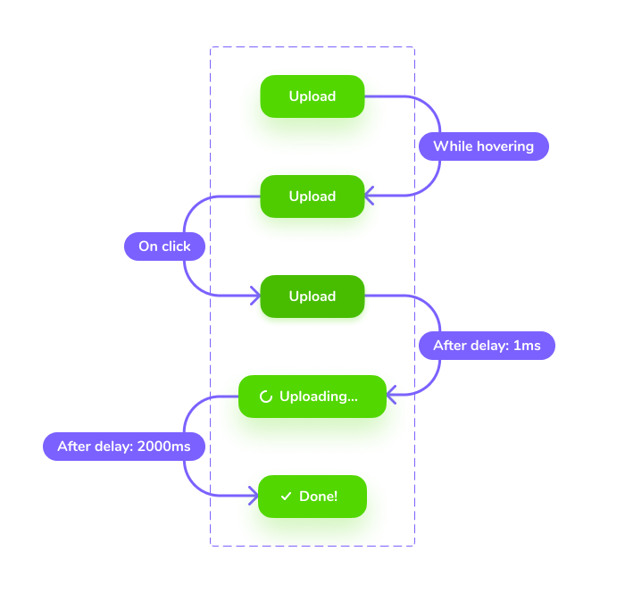
Now the first event happens while you’re hovering over the object. The second one needs to be an On click event. The reason for that is that previously we just wanted to show how the button reacts to clicks. Now we want the button to move to the next state once the button is pressed, independently of what the user does next. That’s why the third state automatically moves to the fourth state after the smallest possible delay and that is when we get to see the looped animation in all its glory. The fourth state is when the aforementioned flexibility comes into play. The animated circle will loop for as long as we like. I’ve decided to loop it for 2 seconds, that is why the After delay is set to 2000ms. The fifth state is invoked automatically after said delay and that’s where our button’s animated journey ends.

Practical uses
Aside from making your prototypes just a tad more fab, this new functionality allows you to set up what you might call an interaction library for yourself and your developers. With all the interactive elements that your app uses grouped, it could serve as part of your documentation. Its usage is not limited to buttons of course. You can animate all sorts of controls and the things you can do are only limited by your imagination and the amount of time you have for these sorts of shenanigans. Good luck.

