Member-only story
A Sass Mixin to Build Your Own CSS Framework à la Tailwind

In a recent project I built from scratch, I was intrigued by the idea of experimenting with chunking my app to optimize its performance when deployed on the blockchain. One of my primary goals was to minimize the number of CSS files included in the project. As I explored this further, I had the idea of using components with a class-based approach similar to Tailwind CSS. However, I steered clear of relying on any external frameworks, as I’ve always been cautious about adding unnecessary dependencies if they aren’t required. I also believed that this experiment could provide greater flexibility in the long run.
In a nutshell, I ended up creating a Sass mixin for building my own class-based framework. In this blog post, I’m excited to share it with you.
The project we built together with my colleagues is called Oisy. It’s an open-source Ethereum wallet hosted on the Internet Computer.
Overview
The idea behind the mixin is to eliminate code duplication while enabling the generation of classes that can be used to create responsive components. For instance, consider the following code snippet:
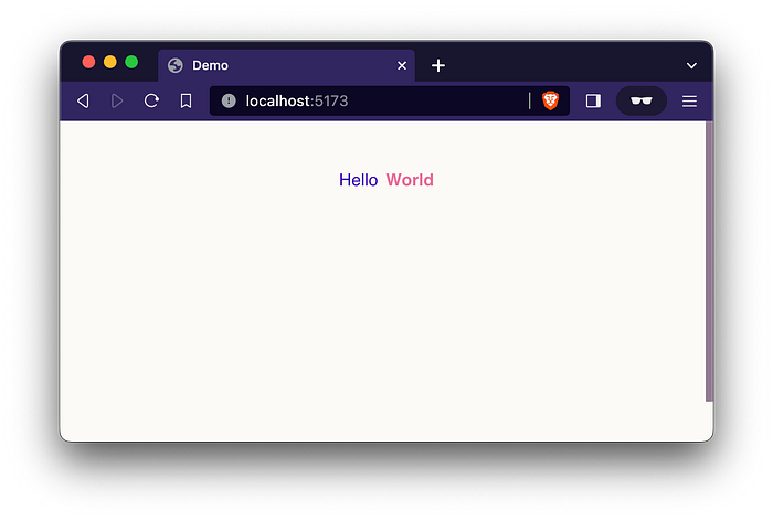
<div class="flex justify-center gap-1 mt-4">
    <span class="text-blue">Hello</span>
    <span class="text-cyclamen font-bold">World</span>
</div>
This code would render a web page featuring a div container with a centered flex layout and a top margin. Inside this container, there are two inline span elements, each assigned specific colors, with one of them set to bold text.
While I could have simply declared these classes globally, my objective was to generate them using a Sass utility for all my styling needs.
Gotcha
This solution exceeded my expectation when I first began to code it but, it’s essential to note that it’s not as advanced as dedicated CSS frameworks like Tailwind. Before we proceed further, it’s important to be aware of the following two limitations:
- Responsivity in this solution is limited to the usage one breakpoint…

