Increasing user sign ups through a better onboarding for ContactOut
Finding out the possible gaps in the flow and providing solutions to overcome them.
Disclaimer
I was in no way associated with ContactOut while making this case study. I am an existing user of ContactOut and this is a personal project to enhance the UX.
What is ContactOut ?
- ContactOut is basically an email scraper tool which allows you to get someone’s email from their LinkedIn and GitHub profiles.
- Added to this functionality, they allow you to organize your own database of contacts which can be integrated with Salesforce and other tools.
- ContactOut provides a free basic plan service and premium features with pricing options.

Why the onboarding flow redesign ?
- Overwhelming and confusing : The current onboarding flow in some ways can confuse or overwhelm users.
- This is an attempt to solve those issues and provide a solution which is user-centric but also increases sign ups.
Lets Start
Now before I delve into designs and everything, I would like you to go through this video. This video shows the current onboarding flow of ContactOut so that you can familiarize yourself with it.
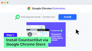
ContactOut has 3 main touchpoints in the user onboarding journey :
- ContactOut Website,
- Chrome WebStore and adding the extension,
- LinkedIn.

Lets see each of them in detail.
1st user touchpoint - The website
Goal of the website - To make the user add the chrome extension.

Lets go through the website in detail-
1. The Value Proposition
‘Find anyone’s email & phone’
This is directly related to the user’s goal (finding out someone’s email ).
The problem with the current value proposition -
- Ambiguous and not fully descriptive : there could be one question in the user’s mind — ‘How does this work ?’ and ‘Will this work on LinkedIn ?’
Now the website addresses these questions down the fold with an easy to understand video(see below).
A better value proposition -
- I believe it would be better if we could address that in the headline itself. Something like - ‘Get anyone’s email on LinkedIn and the web’.
This will be beneficial in two ways -
(i) It addresses the user question of ‘if it works on LinkedIn’.
(ii) This will rank up the website on search results when someone searches- ‘How to get someone’s emails on LinkedIn’.
2. The top navigation bar
After the headline and the video, the top navigation bar is the next thing that the user will see (according to visual hierarchy).
The problem with the navigation bar -
- Confusing and not relevant to context - Now the different attributes in the navigation bar may easily confuse the user.
- Leak by Links - He/she could have questions like - ‘Features ? Is it complex to use ? The video down the fold seems easy to use, Pricing ? Is it free ? Or do I need to pay ? etc.’
This might be enough for the user to leave and look for a free and easy alternative.
How can we make this better -
We can test if removing the top navigation bar altogether increases the conversions. This is a ballsy way to improve the onboarding without overwhelming the user.
Reason behind this -
- No leak by links - We need to make sure that during their first interaction the user can reach their goals as easily as possible without distracting or overwhelming them.
- Progressive Disclosure - The free plan should work as an acquisition strategy and later on when we have provided enough value, we can roll out more features which may help the user and introduce pricing at the correct time when the user will need it ( More on this later).
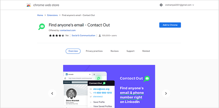
2nd user touchpoint — Chrome webstore and adding the extension to Chrome
After clicking on the CTA, the user is directed to the chrome webstore page to add the extension. The experience is pretty standard here.
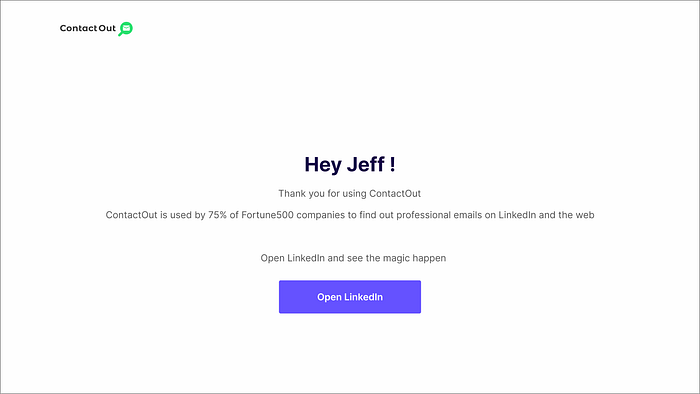
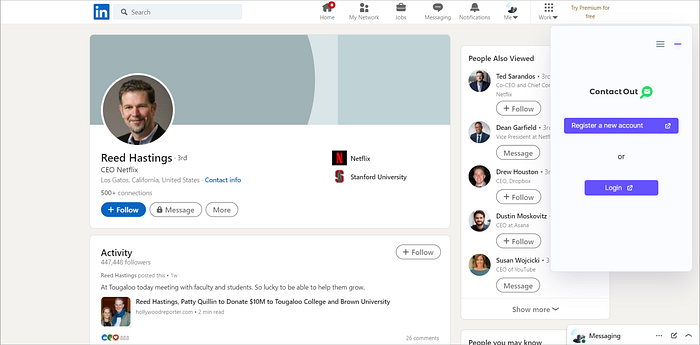
After adding the extension to chrome, ContactOut opens up a new tab with LinkedIn with the extension on the sidebar :

A lot of things happen here —
- The user’s LinkedIn opens up all of a sudden,
- a prompt saying that ContactOut will run as a background process always,
- a youtube video has started in a small screen.
The user right now might have questions like — ‘Why should ContactOut be always running in the background ? What kind of processes are they running in the background ? Do all other extensions do this ? What is the video about?’
There are a few problems here -
- (i) Overwhelming - The number of processes here could easily overwhelm the user and increase the cognitive load.
- (ii) Lost Control - Running background processes without asking for permission and without specifying why it is needed, the whole thing may feel creepy and suspicious. These lot of things could easily make the user feel not in control of the process.
How can we make this better -
1. Adding an intermediate thank you page after adding the extension : After the user adds the extension from the webstore, an intermediate page is shown.
Why this -
- (i) Empathetic to the user : Rather than abruptly opening the user’s LinkedIn, this slows the process down a little bit and thanks the user for choosing ContactOut.
- (ii) User feels more in control : Since the prompt to open LinkedIn is user-prompted, the user feels more in control of the onboarding.
2. Removing the Youtube video : We can test if removing the Youtube video reduces cogntive load.
Why this -
- A lot of things are happening and this may easily increase cognitive load and user might not know where to focus.
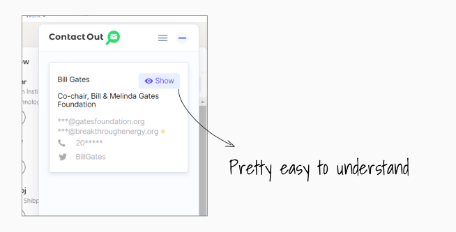
- Easy to understand : The design of the extension is pretty intuitive and I don’t think it needs a Youtube video to explain how it works.
Once the user gets more familiar with the interface, we may then introduce other complex features which will help the user (progressive disclosure).
3. Asking for permission and giving context :
- If we need access to something crucial like running a background process, we need to ask for permission at the right time (when its needed) and give context on why we need it.
- Otherwise, it may seem creepy to the user and he/she can easily churn away.
3rd user touchpoint — Using ContactOut the 2nd time
The second time the user tries to use ContactOut, a sign up/login prompt appears.
The problem here :
- Not the best way for asking to sign up: At this moment the user might think — ‘ I just used it to find Bill Gates’ email but now I have to sign up ? Doesn’t seem right’
- No USP shown( The user has no reason to sign up ) : The user might feel that ContactOut is like any other extension out there and haven’t even seen its USP ( list builder, Salesforce integrations etc ). So he/she might not feel motivated enough to sign up.
How may we make this better -
- Let the user reach their ‘aha’ moment first : Before, asking to sign up, we can let the user use ContactOut a few times to let them reach their ‘aha moment’.
- Make the user to invest in the product : During their exploration and finding of emails, we may ask the user to save the emails and build their own list in a temporary profile. Later on, we can ask them to ‘sign up to save your list’.
Why this -
- Endowment Effect : This will increase sign ups because the user has already invested in the product (by creating their own list ), giving it a feeling of owning it (Endowment Effect ).
- Sunk Cost effect due to their own list : Now, to save their list, they are more likely to sign up ( due to Sunk Cost Effect).
Thank You
👋Hey there! Thank you for reading till here. You’re awesome.
Feel free to reach out on my LinkedIn or Twitter for any kind of feedback. Would love to chat!
