Inclusive fonts and type readability
5 keys to accessible web typography
We might not realize it, but as designers and developers, we build inaccessible websites all the time. It’s not for the lack of care or talent though — it’s a matter of doing things the wrong way. In this article, you will find 5 basic rules for building an accessible web typography.
Text might be the most important thing on a webpage.
Web Design is 95% Typography. 95% of the information on the web is written language. So it needs to be readable and accessible to all. Your typeface and design choices can aid understanding, readability, and comprehension.
Remember there are no hard and fast rules when it comes to typography. It’s not all black and white. It’s more like a spectrum from less accessible to more accessible.

5 keys to accessible web typography
Use a large enough font size for body text so that people can comfortably read.
As digital producers, it is our responsibility to ensure that the content and web pages experiences we create are universally inclusive. This means considering how legible copy and headlines are for users with visual impairments or reading disorders. Use at least an effective size of 16px, but this can vary depending on the design of the font.
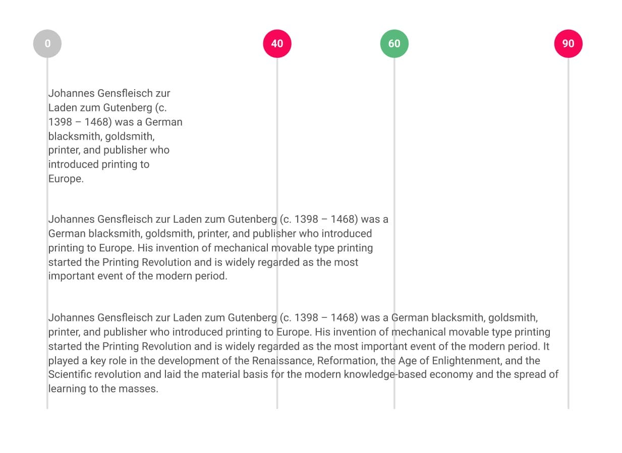
Maintain a line length that promotes comfortable reading.
Don’t make lines too long or too short: 45–75 characters per line is acceptable and approximately 66 characters per line is comfortable.
Choose a typeface that emphasizes clarity and legibility.
In particular remember that it is a good accessible font if it performs well when it’s small or large, the metrics (such as x-height) are consistent between letterforms, individual letterforms are distinct in shape and can’t they be confused with others (for example: I, l, and 1 are distinct. 0 and O are distinct), the typeface supports all of the characters and font styles that are needed.

Use headings to communicate hierarchy.
Ensure heading styles differ from paragraph text by some combination of size, weight, face, or color. This ensures they’re distinct from paragraph text but are related to each other with some consistency, which helps with scanning.

Use your type size and line width to determine a line height that people can comfortably read.
The larger the type size and line width, the larger the line height should be. For running/body text, that’s usually around 1.4–1.65, headings at around 1–1.3, and captions or short lines at around 1.3. Lines that are leaded too tightly or loosely can diminish readability by making it harder for the eye to know where to return to when the line breaks.

Resources:
Here are a few resources to learn more about fonts and their impact on readability in the cognitive space:

