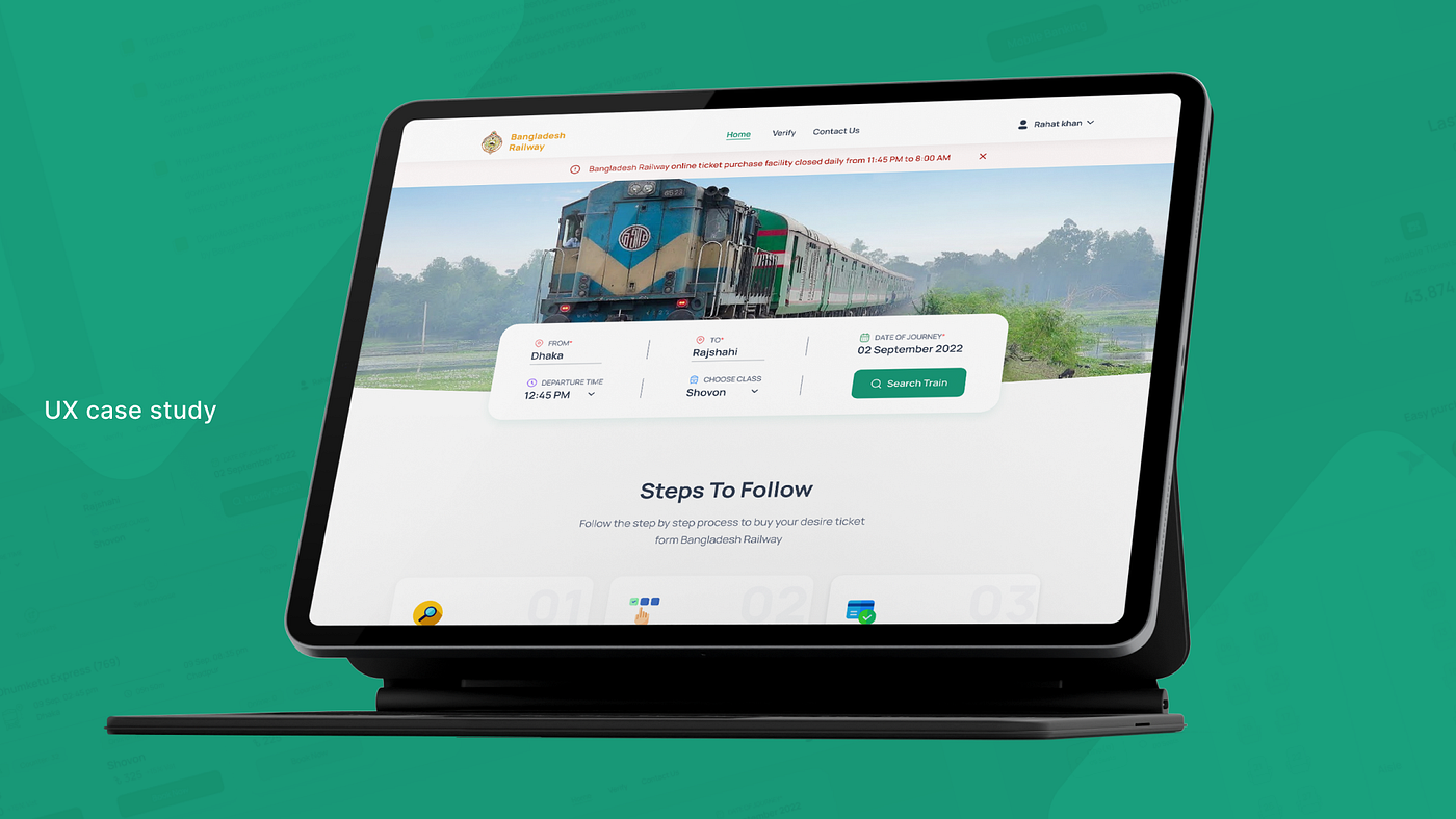
UX case study
Improving the user experience of the Online Ticket Booking System in Bangladesh Railway.
Bangladesh Railway is the state-owned rail transport agency of Bangladesh. It operates and maintains all railways in the country. Currently, BR is supposed to sell 50% of tickets at the counters and the rest online.
It’s reported that it’s not easy for users to locate available seats on “Bangladesh Railway” because there’s a lot of confusion about how tickets are booked.
There is frustration among users as a result of this situation. This problem can be solved to improve the experience of the users of “Bangladesh Railway” Source
Disclaimer:
This work is intended only for educational purposes and is not for commercial purposes. It is not intended to belittle any organization or harm its business. Our research and data can only be used by us. If unauthorized use is discovered, we will take legal action.
Also, we disclaim any responsibility for the consequences of this educational work if it harms a person or an organization.
Background Story:
One day one of our teammates tried to book a ticket on the Bangladesh railway website for his parents. As his mother was sick, he tried to find a comfortable seat for them. As he is not a regular user of trains, that’s why he has no idea about train seats. He faces some struggles to find a proper seat for his parents. On the other hand, he also faces some struggles to complete the overall seat booking process on the Bangladesh railway. So, After listening to him, we (the rest three team members) go through the whole website to feel the experience. Unfortunately, we also face some problems. That’s why we decided to work on this website as it is a very useful website in Bangladesh.
My Role:
UX Research & Visual Design
Project Goal:
To identify the problems of the existing Ticket booking system on “Bangladesh Railway” and improve the user experience of that flow.
Project Timeline:
4 weeks.
Problem Statement:
There is a lot of confusion surrounding the system of booking tickets on “Bangladesh Railway” since it is difficult for users to find available seats. There is frustration among users as a result of this situation. By solving this problem, “Bangladesh Railway” will be able to improve user experience and user satisfaction.


Design Process:
We followed the Double Diamond process to ensure that our decisions were supported through user research and feedback.

Initial Thoughts:
- Who are the target audiences?
- What do people think about booking train tickets online?
- How is the ticket booking experience for new users?
- Do they actually remember the train name and time of the departure? What do new users think about it?
- What do users think about choosing a class?
- Can they track their ticket booking steps?
- What happens, if they don’t have sufficient balance to buy?
- What do people think when they try to book a train ticket from Bangladesh Railway?
- How is the ticket booking experience for the existing users?
- Can we select desired train?
- Why do they use websites to book tickets?
- What is the percentage of new users and existing users?
- Percentage of the user using app and website for booking tickets.
Hypothesis:
Initially to solve the problem we made some hypothetical solutions.
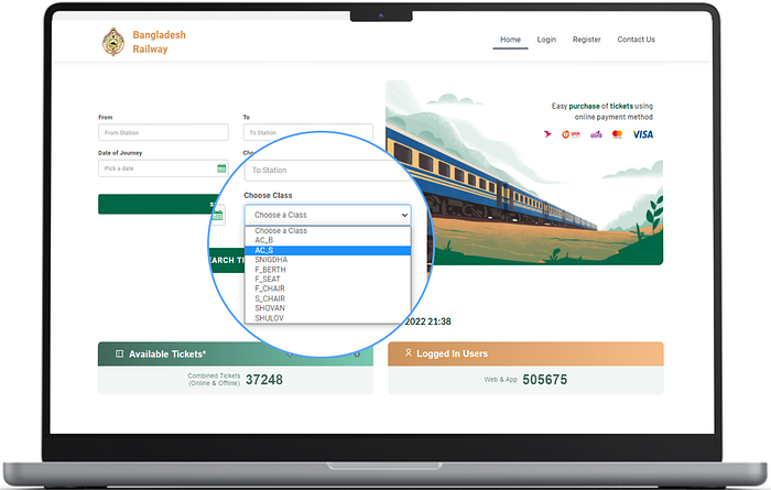
Hypothesis 01: As the class names are not described properly, we don’t get any idea about the seat quality.
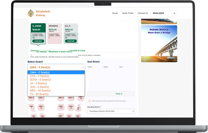
Hypothesis 02: The system shows 12 seats available online, but we can see 0 seats in the coach.
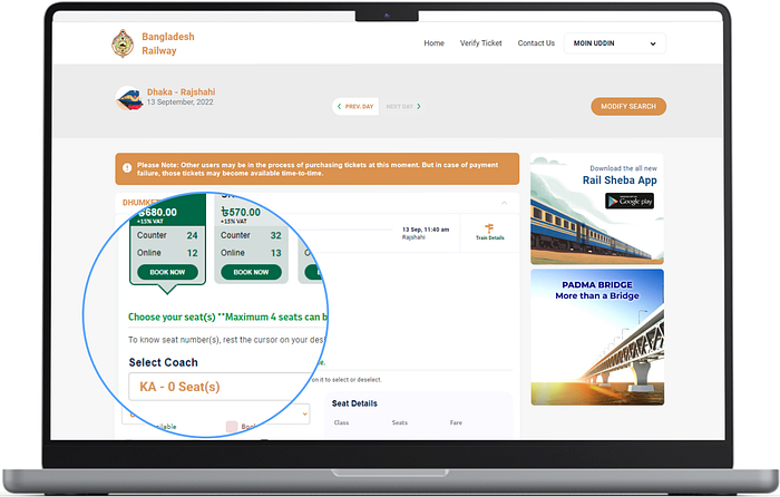
Hypothesis 03: Clicking on the “Select Coach” dropdown shows us which seats are available. This is annoying to us.
Inspirational Analysis:
As there’s no direct competitor for Bangladesh Railway, we took inspiration from some train ticket booking system websites. Here are some comparisons.


Research Goals:
- Understand how people book train tickets online.
- Identify the pain points in the Bangladesh Railway website user experience.
- Uncover their expectations using the Bangladesh Railway website.
Research Question:
Basic Questions:
- Do you have experience buying train tickets online from Bangladesh Railway?
- Would you tell us about the last time you book online tickets from Bangladesh Railway?
The task for users: Please book a ticket on the Bangladesh Railway website
- How was your experience when you book the ticket?
- What are the biggest pain points when using the Bangladesh Railway website? (follow up)
- What are the expectations you have from the Bangladesh Railway website?
- How much would you like to rate Bangladesh Railway on a scale of 10?
User Interview:
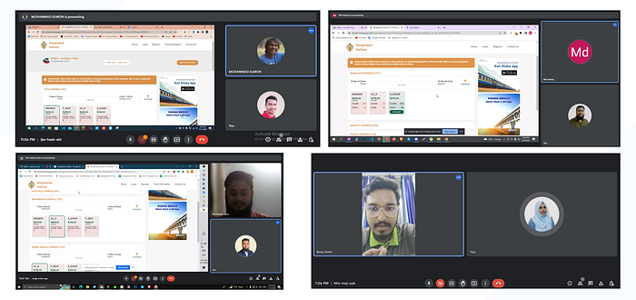
A total of 8 user interviews were conducted using Google Meet and Zoom. Among the 8 users, 5 were first-timers, while the rest had experience with the Bangladesh Railway website.
User Sayings, Observations & Insights:
After talking with some users and observing them we have found some insights.
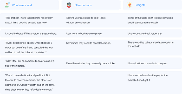

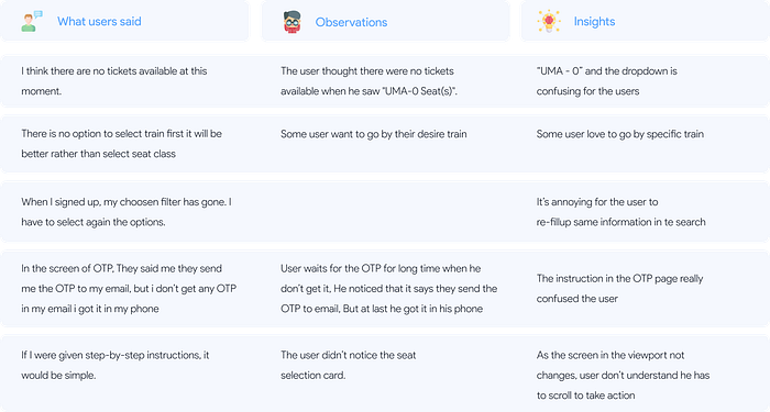
Problem Identify:
- Users are unable to understand the seat quality.
- Users are confused about the selection process of available seats as he has to select them manually.
- As the Bengali letter is written in English, the user cannot understand the names of the coaches.
- Users are not sure about the departure time.
- Choosing a train is not available to users.
- The booking steps are not clear to them.
- The OTP process takes longer to reach the phone.
- On the OTP screen it says, OTP will be sent to email but in real OTP code reach the phone.
- After completing the booking process, they show a popup that said, “Bangladesh Railway online ticket purchase facility remains closed daily from 11:45 PM to 8:00 AM”
Dot Voting on problem finalization:
After analyzing our user interviews, we identified nine problems. In order to finalize the problems, our team members arrange a meeting to vote on the problems. We proceed with the voting in FIGJAM.
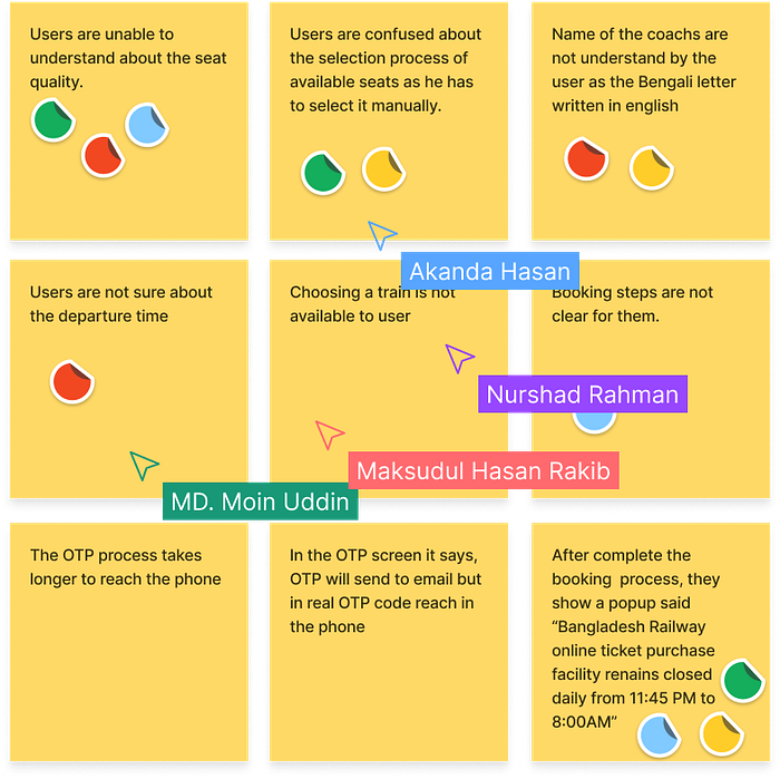
Then we finalize four problems as the main and get three problems as our sub-problems. Initially, we work on the main problems and then move on to the sub-problems.
Main Problem:
- Users are unable to understand the seat quality.
- Users are confused about the selection process of available seats as he has to select them manually.
- The name of the coaches is not understood by the user as the Bengali letter is written in English.
- After completing the booking process, they show a popup saying, “Bangladesh Railway online ticket purchase facility remains closed daily from 11:45 PM to 8:00 AM”.
Sub-problem:
- Users are not sure about the departure time.
- Choosing a train is not available to users.
- The booking steps are not clear to them.
Solutions:
User Flow: Our team created user flows as a way to provide the user with a clear direction to solutions.

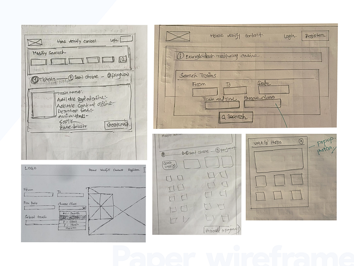
Paper Wireframe:
Wireframe gives designers an opportunity to walk through the structure of the website without getting sidetracked by design elements such as colors and images. So, to visualize our problems, we created paper wireframes first so that we could easily reach our goals.
Problems & Solutions:
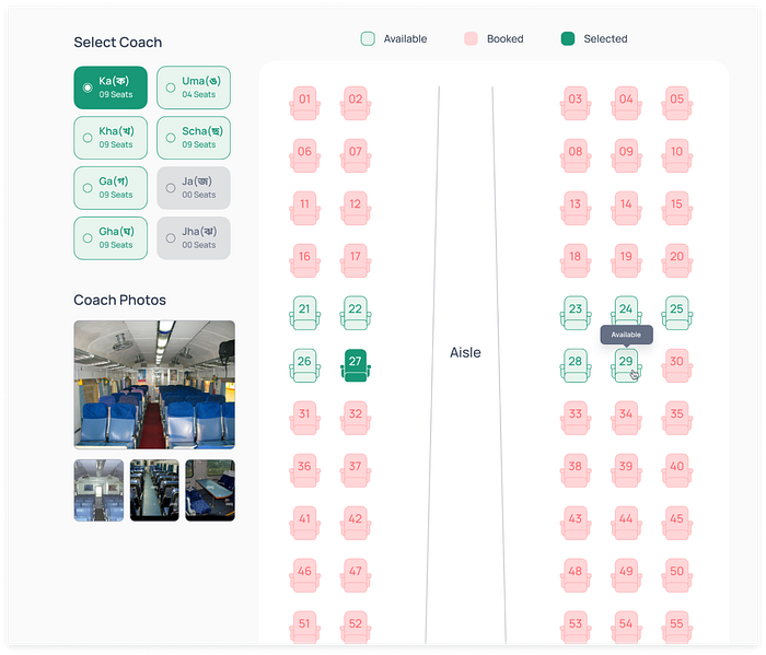
Problem 1: Users are unable to understand seat quality.
Solution 1: Seat quality and pattern are unknown to the new users. We decided to keep two options for users to know more about the seats. Hovering over a seat will show the seat’s picture, and the user will be able to see its quality.
Solution 2: At the left side of the seat choose page, we show some coach photos so the user can gain a better understanding of the quality of the seats.
Tooltip: To inform users about which seats are Available, Booked, & Selected we put a tooltip to help users understand the seat as per Usability Heuristics “Help & Documentation”
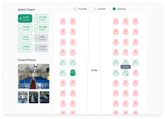
Problem 2: Users are confused about the selection process of available seats as he has to select it manually.
Solution: As a solution to this problem, we kept the coach name options open, as well as the number of available seats on the card.
We kept the card disabled if no seats were available, in the solution of “Error prevention”.
Problem 3: The name of the coaches are not understood by the user as the Bengali letter is written in English.
Solution: To understand the name of the coach, we designed the coach name both in English and Bengali so that users can easily understand.

Problem 4: After completing the booking process, they show a popup said, “Bangladesh Railway online ticket purchase facility remains closed daily from 11:45 PM to 8:00 AM”.
Solution: In order to keep users informed about the time of the ticket purchase, we keep the alert message at the bottom of the menu bar in red color.
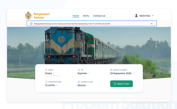
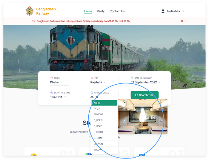
Why we kept the default value in search:
The goal of UX designers is to make people’s lives easier and more efficient. Therefore, we use default options to save our users time and effort. The date of journey and departure time fields were designed with default values based on the next train availability so that users may not be confused and can easily search for trains. In addition, we left all other fields default, so a new user can easily navigate the site if he comes just to explore.

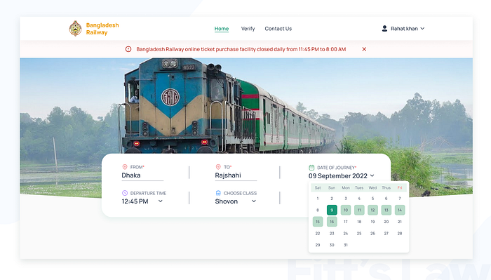
Fitts’s Law:
Using Fitt’s law, we apply the term Infinite Targets Along Screen Edges to the date of the journey input field. Users can close the calendar by clicking the mouse outside of the panel.
The solution to Sub-problems:
Problem 1: Users are not sure about the departure time
Problem 2: Choosing a train is not available to users
Solution: The user was confused about the time and they wanted to select their desired time to travel. And Bangladesh railway has specific time trains for departure. So we decided to put a “Departure time” here.
Problem 3: The booking steps are not clear to them.
Solution: To address this problem, here we use the Visibility of system status heuristics. It says: “The design should always keep users informed about what is going on, through appropriate feedback within a reasonable amount of time”
Based on the heuristics we designed a progress bar. From this users will get to know at which stage they are.

Before Usability Test: See the video to get a better idea
Usability Test & Iterate:
Usability Testing: To start validating our design decisions we conducted 4 usability tests with the High fidelity prototype.
Here is some important feedback:
- 1 of 4 users said he choose a class, but in the train details card, I see all of the classes, so why do they take my input?
- 1 of 4 users told that the unavailable book now button was seems good to him but, if it were more specified then, he would not have to discover the button.
- 2 of 4 users were very happy to see the seat photos hover over the seats but also want to see them In the train details card when the user take a decision to select the seat class.
- 2 of 4 users are confused about the scrolling process in the seat choose the page.
- As all three of the Book now buttons are primary buttons, 1/5 of users were confused by them.
Solution 1: As we get users' feedback from usability testing the users wanted to see only their selected class when searching so we put a header “Selected class” to avoid user confusion and add “Other class” for the suggested search.
Toast Message: If there’s no available ticket, according to a user search, we will show them a toast message as per Usability Heuristics “Help & Documentation”.
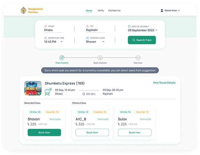
Solution 2: Users liked the disable button when a ticket isn’t available online to be more specific we typed “Booked” instead of Book now.
Solution 3: To find the solution we add the View Seat option to this card. A pop-up is displayed when they click on that link, so they don’t have to leave the page to see seat quality.


Solution 4: Users are confused about the scrolling process in the seat choose section so we decided to remove the scroll bar from the seat Selection section.

After Usability Test: See the video to get a better idea
Final Design:


Learning:
In this case study, we learned how to come up with an appropriate solution for a specific problem. As well as how to interview the user and identify the problems. After solving a problem, we learned how to conduct usability tests. We learn teamwork, time management, and presentation skills as we work together. Since we worked online from different locations, we learned how to efficiently and effectively manage our time.
Limitations:
This project had a short deadline. Due to time constraints, we weren’t able to address all the problems of our project. There are some problems that were out of our hands, such as the train class name, which was decided by Bangladesh Railway. On the other hand, due to the fact that any of us are not members of the Bangladesh Railway Authority, and we have not had any contact with them, we have limited information. There were not enough resources available for user interviews and usability testing.
The Team & Mentor:
Mentor: Shoaib Mahmud-Product designer Toptal
We are proud of the results that we achieved as a team. Specifically, Md. Moin Uddin, Nurshad Rahman, and Maksudul Hasan Rakib played vital roles as Visual and UX Designers. They made this possible with their outstanding effort.

