Improving Compose horizontal pager indicator.
Let’s improve user experience with horizontal pager and its indicator from the documentation to a better result.
So from the documentation, a basic pager implementation could look like this:
@Composable
fun PagerFromDocumentation(){
Column(
modifier = Modifier.fillMaxSize()
) {
val pageCount = 10
val pagerState = rememberPagerState(
pageCount = { pageCount },
)
HorizontalPager(
state = pagerState,
modifier = Modifier
.fillMaxSize()
.weight(1f)
) {
Box(
modifier = Modifier
.fillMaxSize(),
contentAlignment = Alignment.Center
) {
Text(text = "Page $it")
}
}
Row(
Modifier
.height(50.dp)
.fillMaxWidth(),
horizontalArrangement = Arrangement.Center
) {
repeat(pageCount) { iteration ->
val color = if (pagerState.currentPage == iteration) Color.DarkGray else Color.LightGray
Box(
modifier = Modifier
.padding(8.dp)
.background(color, CircleShape)
.size(10.dp)
)
}
}
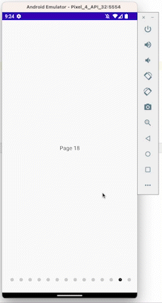
}
}and it would give this output:

Ok this works well and is very simple but when we have lots of pages it’s hard to feel it with this implementation of the indicator. Let’s improve it together.
Step one make the indicator scrollable:
So from now, I’ll be using 100 pages and items.
First, let’s move to a lazy row as we don’t know how many items we will display and later we will need some features from LazyListState.
LazyRow(
            modifier = Modifier
                .height(50.dp)
                .fillMaxWidth(),
            horizontalArrangement = Arrangement.Center
        ){
            repeat(pageCount) { iteration ->
                val color = if (pagerState.currentPage == iteration) Color.DarkGray else Color.LightGray
                item(key = "item$iteration"){
                    Box(
                        modifier = Modifier
                            .padding(8.dp)
                            .background(color, CircleShape)
                            .size(10.dp)
                    )
                }
            }
        }
So replacing our previous Row with this will allow us to display enough dots but it won’t make them follow while we scroll our pager.
Step 2: Make it follow the current page
We now need:
 val pagerState = rememberPagerState(
            pageCount = { pageCount },
        )
        val indicatorScrollState = rememberLazyListState()

        LaunchedEffect(key1 = pagerState.currentPage, block = {
            val currentPage = pagerState.currentPage
            val size = indicatorScrollState.layoutInfo.visibleItemsInfo.size
            val lastVisibleIndex =
                indicatorScrollState.layoutInfo.visibleItemsInfo.last().index
            val firstVisibleItemIndex = indicatorScrollState.firstVisibleItemIndex

            if (currentPage > lastVisibleIndex - 1) {
                indicatorScrollState.animateScrollToItem(currentPage - size + 2)
            } else if (currentPage <= firstVisibleItemIndex + 1) {
                indicatorScrollState.animateScrollToItem(Math.max(currentPage - 1, 0))
            }
        })
So in this code, every time the current page of our pager changes we are going to check if the current page index is before the last visible indicator, and if so we are going to scroll the indicator items enough so that we can know if there are more item coming next. As the scroll parameter refers to the first item that is going to be visible we need to do the calculation with the number of visible items. It’s simpler when scrolling back to the start.
So we end up with this:
@Composable
fun PagerStepTwo(){
    Column(
        modifier = Modifier.fillMaxSize()
    ) {
        val pageCount = 100
        val pagerState = rememberPagerState(
            pageCount = { pageCount },
        )
        val indicatorScrollState = rememberLazyListState()

        LaunchedEffect(key1 = pagerState.currentPage, block = {
            val currentPage = pagerState.currentPage
            val size = indicatorScrollState.layoutInfo.visibleItemsInfo.size
            val lastVisibleIndex =
                indicatorScrollState.layoutInfo.visibleItemsInfo.last().index
            val firstVisibleItemIndex = indicatorScrollState.firstVisibleItemIndex

            if (currentPage > lastVisibleIndex - 1) {
                indicatorScrollState.animateScrollToItem(currentPage - size + 2)
            } else if (currentPage <= firstVisibleItemIndex + 1) {
                indicatorScrollState.animateScrollToItem(Math.max(currentPage - 1, 0))
            }
        })
        HorizontalPager(
            state = pagerState,
            modifier = Modifier
                .fillMaxSize()
                .weight(1f)
        ) {
            Box(
                modifier = Modifier
                    .fillMaxSize(),
                contentAlignment = Alignment.Center
            ) {
                Text(text = "Page $it")
            }
        }
        LazyRow(
            state = indicatorScrollState,
            modifier = Modifier
                .height(50.dp)
                .fillMaxWidth(),
            horizontalArrangement = Arrangement.Center
        ){
            repeat(pageCount) { iteration ->
                val color = if (pagerState.currentPage == iteration) Color.DarkGray else Color.LightGray
                item(key = "item$iteration"){
                    Box(
                        modifier = Modifier
                            .padding(8.dp)
                            .background(color, CircleShape)
                            .size(10.dp)
                    )
                }
            }
        }
    }
}
Which is actually ok but could we do better?
Step 3 Final Improvement:
Let’s be honest, this long list of dots is not really beautiful.
Let’s make it shorter and provide a size effect on it.
To make it shorter I’m just going to fix the width of the LazyRow:
LazyRow(
            state = indicatorScrollState,
            modifier = Modifier
                .height(50.dp)
                .width((26*5).dp), // Only change is here I want to display 5 items here so 5 x (padding + size)
            horizontalArrangement = Arrangement.Center
        ){
            repeat(pageCount) { iteration ->
                val color = if (pagerState.currentPage == iteration) Color.DarkGray else Color.LightGray
                item(key = "item$iteration"){
                    Box(
                        modifier = Modifier
                            .padding(8.dp)
                            .background(color, CircleShape)
                            .size(10.dp)
                    )
                }
            }
        }
The list scrolls the same as before but it takes less space in the screen this way.

At this point, users still know there are more item but they are not overflowed with the fullscreen list of dots.
Let’s apply some visual effect on it to make it prettier by reducing the size of the first and last dots if they are not targeted. To do so we are going to use an animateDpAsState value
val currentPage = pagerState.currentPage
val firstVisibleIndex by remember { derivedStateOf { indicatorScrollState.firstVisibleItemIndex } }
val lastVisibleIndex = indicatorScrollState.layoutInfo.visibleItemsInfo.lastOrNull()?.index ?: 0
val size by animateDpAsState(
    targetValue = if (iteration == currentPage) {
        10.dp
    } else if (iteration in firstVisibleIndex + 1..lastVisibleIndex - 1) {
        10.dp
    } else {
        6.dp
    }
)
So if the item is targeted or is not the first or last visible item it will have a “big” size and otherwise will be smaller.
Note that we are using a derivedStateOf for the first visible item index here as it’s a value that can change a lot (warning triggered by android studio).
Full implementation is now:
@Composable
fun PagerStepThree() {
    Column(
        modifier = Modifier.fillMaxSize(),
        horizontalAlignment = Alignment.CenterHorizontally
    ) {
        val pageCount = 100
        val pagerState = rememberPagerState(
            pageCount = { pageCount },
        )
        val indicatorScrollState = rememberLazyListState()

        LaunchedEffect(key1 = pagerState.currentPage, block = {
            val currentPage = pagerState.currentPage
            val size = indicatorScrollState.layoutInfo.visibleItemsInfo.size
            val lastVisibleIndex =
                indicatorScrollState.layoutInfo.visibleItemsInfo.last().index
            val firstVisibleItemIndex = indicatorScrollState.firstVisibleItemIndex

            if (currentPage > lastVisibleIndex - 1) {
                indicatorScrollState.animateScrollToItem(currentPage - size + 2)
            } else if (currentPage <= firstVisibleItemIndex + 1) {
                indicatorScrollState.animateScrollToItem(Math.max(currentPage - 1, 0))
            }
        })
        HorizontalPager(
            state = pagerState,
            modifier = Modifier
                .fillMaxSize()
                .weight(1f)
        ) {
            Box(
                modifier = Modifier
                    .fillMaxSize(),
                contentAlignment = Alignment.Center
            ) {
                Text(text = "Page $it")
            }
        }
        LazyRow(
            state = indicatorScrollState,
            modifier = Modifier
                .height(50.dp)
                .width(((6 + 16) * 2 + 3 * (10 + 16)).dp), // I'm hard computing it to simplify
            horizontalArrangement = Arrangement.Center,
            verticalAlignment = Alignment.CenterVertically
        ) {
            repeat(pageCount) { iteration ->
                val color = if (pagerState.currentPage == iteration) Color.DarkGray else Color.LightGray
                item(key = "item$iteration") {
                    val currentPage = pagerState.currentPage
                    val firstVisibleIndex by remember { derivedStateOf { indicatorScrollState.firstVisibleItemIndex } }
                    val lastVisibleIndex = indicatorScrollState.layoutInfo.visibleItemsInfo.lastOrNull()?.index ?: 0
                    val size by animateDpAsState(
                        targetValue = if (iteration == currentPage) {
                            10.dp
                        } else if (iteration in firstVisibleIndex + 1..lastVisibleIndex - 1) {
                            10.dp
                        } else {
                            6.dp
                        }
                    )
                    Box(
                        modifier = Modifier
                            .padding(8.dp)
                            .background(color, CircleShape)
                            .size(
                                size
                            )
                    )
                }
            }
        }
    }
}
Which is giving this result:
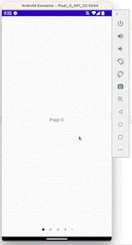
Conclusion:
The sample from the documentation is pretty simple but by leveraging compose tools (state, animate value mostly) we can really easily push it further.
Let me know if you have questions or feedback about this.

