Improve Form UX by Reducing Input Fields
Increasing Conversion Rate by Reducing Friction
I was working on transforming a full-page form into a multi-step form the other day. My team’s goal was to improve the conversion rate of a lead-generation form.
While building out the designs, I came across a handful of ways that we could improve our form, which would ideally result in a higher conversion rate. The first opportunity for improvement was to reduce the number of form fields (e.g. inputs).
How can we reduce fields?
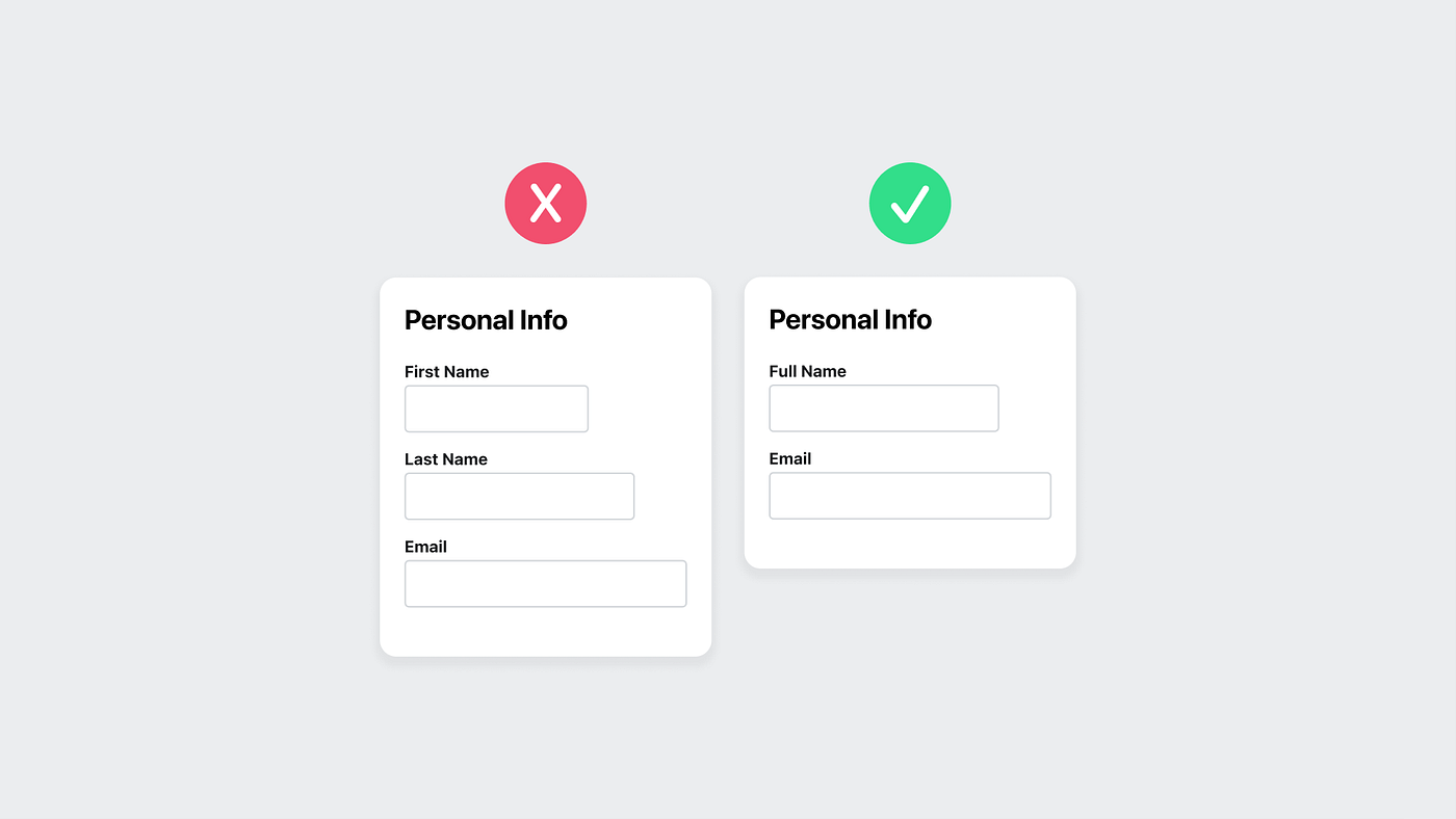
The original form had 6 inputs but 2 stood out to me. There was one for a first name and another for a last name. We can combine those two fields into a single input for the full name.
This is a pretty simple idea, but does require some extra work on the dev team. The devs had some pushback on this change.
The feasibility of this change was quite high — meaning that it’s a pretty simple change to make. In the end, this is an improvement to the user’s experience with a low amount of effort, so it’s worth taking the time to make the change.
Our form only had 6 inputs to start with, so reducing the first and last name down to 1 single input left us with 5 inputs. That’s not that much of a difference, but it’s still an improvement and takes less time for our user’s to fill out.
What if the user enters something weird?
There were some questions that popped up like, “what if they enter their middle name?” or “does our system support this type of data?”.
These are legitimate questions and I’m sure that you’ll get stuff like this when you push to make changes to your UI. Sometimes, it’s easier just to leave things the way they are. That’s fine if we need to move quick, but that’s not the mindset we want if our goal is to make improvements.
We had research that supported our idea of combining the fields, now we had to give others the confidence that it was the right call to make.
In this scenario, we weren’t concerned about users entering middle names. The likelihood that someone would do that is very low. We decided to split the first and last names at the first space that the user enters. So the input would be valid as long as they had the minimum of something like “M M” and invalid if they had no space like “MM”.
So, if the user types “Martin McFly”, then “Martin” is the first name and “McFly” is the last name. If the user types “MartinMcFly” (notice the lack of a space here), then the field is invalid and they need to enter a space with at least one letter after the space. If the user types “Martin Seamus McFly”, we would save “Martin” as the first name and “Seamus McFly” as the last name.

Saving the middle name as part of the last name wasn’t a concern of ours because we’d never show a user just their last name. We would either just use just the first name or full name. We’d also never show a user their last name then first name separated by a comma (e.g. “McFly, Martin”).
Saving the data like this would allow our users to have more control over their own name — which is more accessible by the way — and matches the existing support for our data.
Why would we want to reduce fields?
Reducing the number of steps reduces the interaction cost. This means that there is less friction between your user and what you have to offer. When you reduce this friction, users can flow through your form easier which increases conversion rates.
Let’s think of it another way.
Your form is a doorway that your user needs to go through to get the prize. Every input you add, is like an additional lock that they need to go through to open that door.
If the motivation is high, then they’ll have a higher tolerance to go through more locks — inputs. But at some point they’ll reach the point when the prize isn’t worth it.
Help yourself and help your user by reducing the locks that they need to get through to get the prize that you have to offer.

