Implement UI Design Using Grapedrop Vol 1 : Getting Started with Grapedrop

Hello friends. I am Agung Prabowo from Singaperbangsa Karawang University. This time I will continue discuss about UI Design. we will discuss about User Interface Design and Implementation of User Interface Design. this article continuation of the previous article. Let’s just start the first discussion.
Implement UI Design with Grapedrop
Grapedrop, a powerful platform that allows you to design and publish landing pages by online. After creating an account and logging in to Grapedrop, you will be directed to your main dashboard page.

This is where you will manage all your projects. As you can see, initially the page is blank and will ask you to create your first project, so let’s get started by clicking “Start your new project!”
On the next page, you will specify the name of the project and its initial template. In our case, let’s call it “My first website” and since we want to create it from scratch, let’s select the Blank Page template and click “Create Project”

Using Grapedrop Editor
Once you have defined your project, you will be directed to the main of the platform, the Editor.

Editor, the main section is divided into 4 sections:
- Canvas — the biggest and most important part. This is where you will see your project created, by creating a layout with blocks and arranging them using the Drag & Drop technique.
- Left Sidebar — in this section, you will be able to see the hierarchical structure of your project. On the top side, you will manage the entire page down, for each of your pages you will see all the inner layers.
- Right Sidebar — this section is responsible for handling the behavior and style (color, background, etc.) of each element placed on the Canvas.
- Topbar — this section contains other commands for editing and managing your project.
Now let’s move on to real creation.
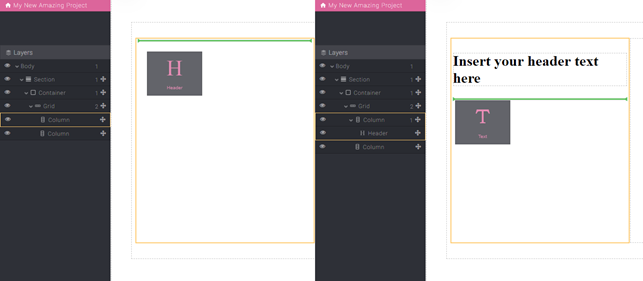
Block
You should know that all the elements placed on the Canvas are called Blocks. Blocks can be very simple elements such as images and text or complex compositions of other blocks. For this reason, we have divided them into different categories but the most important one is definitely the Basic Blocks, knowing well how they work will help you in creating and managing all the other categories.
To access all available blocks, simply click on the big “+” (Plus) button near the Grapedrop logo (the link that takes you back to your project list) and you will see it appear on the left

As you can see, the Basic Blocks category is selected by default and below that there are other sub-categories as well, but for now we will use the Basic category.
Click on the Basic sub-category to show all the available blocks in it and let’s focus on 2 very basic blocks: Sections and Grids
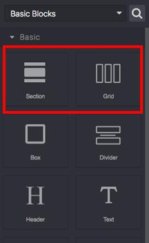
Section Block
Sections are sections that are quite easy to use and understand, you can put them only in the root layer (Body) of the page, Sections cannot be stacked, so you cannot place one Section on another Section. The goal of this block is quite simple, keep your content centered and responsive. All you have to do is insert it into the Canvas and you will see the outline.
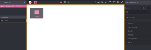
You can start going into any Body section you want, the editor doesn’t limit you, but to keep your content looking good across multiple devices, we highly recommend starting with this Block.
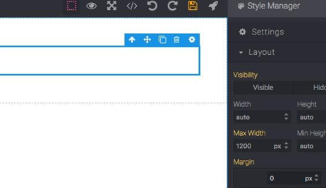
You will notice that Section has an inner element called Container, this is where we will place our content and is responsible for keeping our content centered. It also has a maximum width of 1200px applied by default, but you can change that if you want your content to be placed in a larger container on a bigger screen.
Now that we’ve placed the Section so we can start exploring the next suggested one, the Grid block.
Grid Block
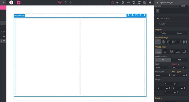
Grid Block has the main function of organizing your content that you may need the most to use. Indeed, we recommend taking your time and feeling very confident with this block because once you understand the basics you will be able to build any kind of layout. Let’s start by placing a Grid block on the section.
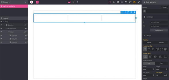
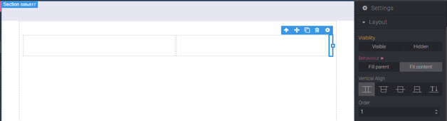
As you can see, the block consists of a row element (the Grid itself) and 3 inner columns. With Grid selected, on the right Sidebar, in the Layout section, there are new properties related to the grid: Horizontal Align, Vertical Align, and Allow multiline. Those properties are self-explanatory and they change the behavior of all its columns. You’ll see the same thing when you select a column.
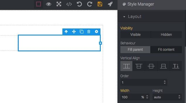
The column will show other properties, there are:
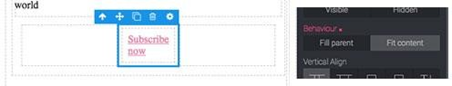
- Behavior — Fill Parent is the default value, in this case, the column tries to fill all available space. Since we have 3 identical columns and multiline (allow multiline on the grid) is disabled, all columns have the same size to fill the entire space. However, if you select Fit Content, then the column will adjust its width according to the contents of the content in that column, for example you select Fit Content now, you will see the column size will narrow to almost 0.
- Vertical Align — This changes the vertical of a single column
- Order — This property can change the order of the columns. You can change the order of the columns by simply dragging them, so the real utility of this property is to use it only when you want to change the appearance of the device because changing the structure by dragging will affect the order on all devices.
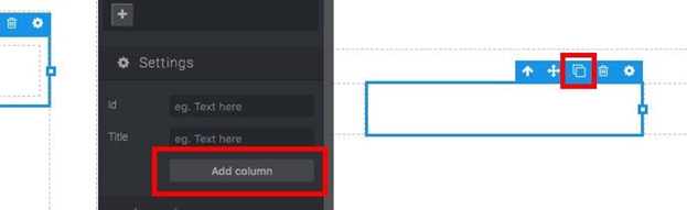
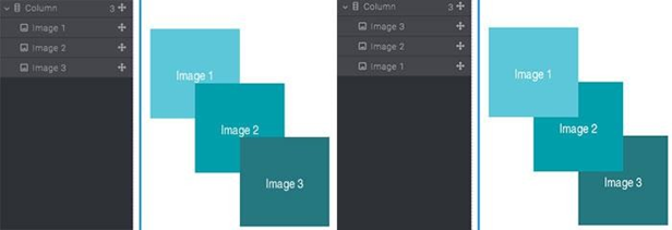
You can add as many columns as you want, by selecting Grid and clicking the Add Column button in Settings, or by simply cloning the selected column (via the clone action on the block elements toolbar or simply using CTRL + C / CTRL + V as a shortcut).
To delete a column, simply select the column you want to delete and press the (Delete) button or via the delete action (trash icon) on the block toolbar. If you make a mistake, remember you can use these sortcuts: CTRL + Z — Undo and CTRL + + Z — Redo.
Text Block
Now let’s continue with our header composition. Before adding the text content, make the grid fill the height with a value of 100% and delete one of the columns, so the result will be like this.
Now let’s drag the Header and Text Block to the left column and update it with some content. To update a Text Block, simply double click on the content to enter edit mode and once you are done just click anywhere else outside the block.
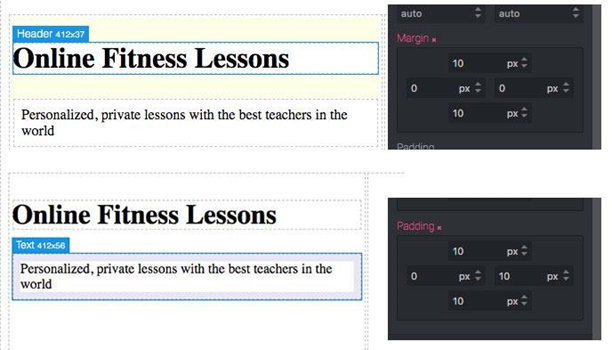
Great, now you may notice that the text has some sort of white space between them. The Block Header has a default top and bottom margin (outer gap, highlighted in yellow on hover), but text has paddings (inner gap, highlighted blue on hover) around its content. When needed, you can actually customize it very quickly via the Style Manager in Layout.
And how to vertically center the text on a column? You can actually try playing with margins and padding to find out, but the results won’t be as accurate and scalable (think about updating your content or just visualizing your page on a different screen size). In Grapedrop, when you face layout doubts, think about how to solve it using Grids. Indeed, in this case, all we have to do is simply use the Vertical Align property on the column block and all of our content will be automatically centered.
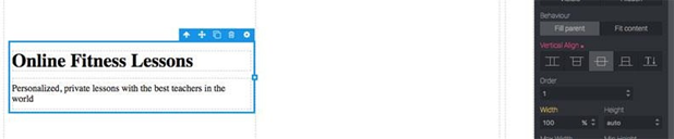
Image Block
Now let’s drag the image block to the right column of our header.
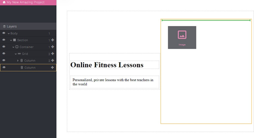
Once the block is dropped, the Image Manager modal will appear.
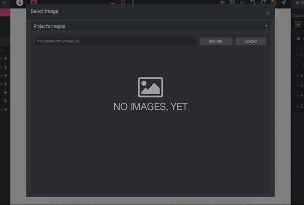
We don’t currently have any uploaded assets but you can start doing so by clicking the Upload button. For our example, we will use a free image from https://unsplash.com/. So, change Project’s Image to Free Image by Unsplash and look for some images that relate to context.
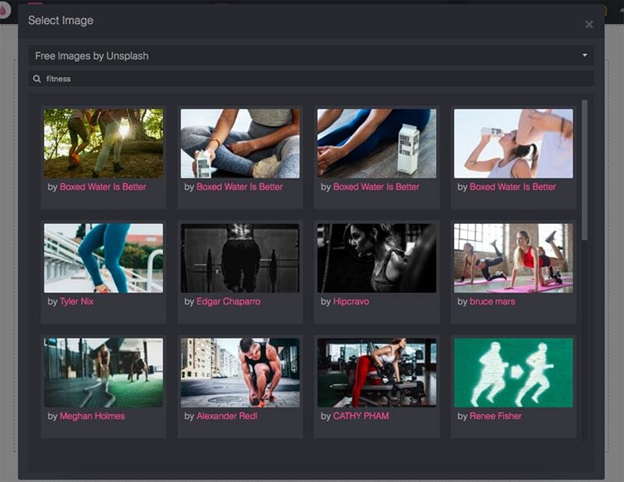
Now just double click on the image you like, to select it and close the modal, then you will see it on Canvas. If you need to change an image, you can always double-click on that block to reopen Image Manager.
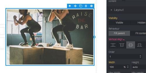
The image will automatically fill in width to the size of the selected image, but you can always resize it by using the sizing handler.
Note :
By default, when you resize an image, the editor saves its aspect ratio to avoid the stretching effect, but if you need to ignore it, you can press while resizing.
As we did earlier with the text section, to center the image vertically, select the right column and change the Vertical Align property to Center.
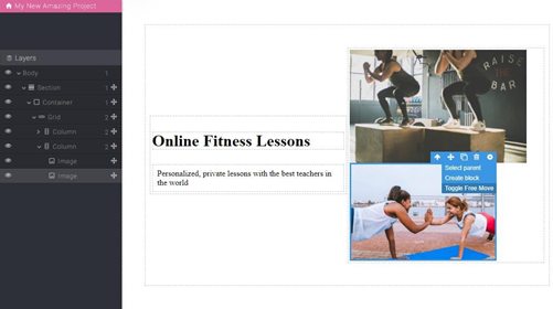
Now, to make things a little more interesting, let’s resize our image a few pixels smaller than the column, drag another image right after the first and resize it to make it a bit smaller than the first image. So, the result should be like this.
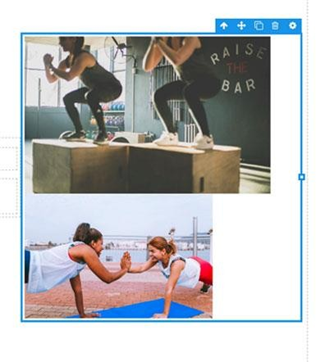
The Grid column tries to fit the layout to the newly added image but what we want to do is return the first image to the center and make the second image float around it.
All we need to do is enable Free Move from the Settings action in the toolbar block (gear icon). This will release the element from the standard block flow (where elements are dropped from top to bottom and left-to-right) and will allow you to move it freely on the Canvas.
Note:
When the block is entered in Free Move mode, the image is outside the standard block flow but the movement is still related to its original position. This means that if you add a new block near the move in Free Move mode, it may change the position of the existing block because you are shifting the original position of the existing block by placing a new element near it. If you want to see an example of this effect, try resizing the first image from the example above.This may seem like a major flaw but it actually brings a lot of benefits as it's easier to maintain in a responsive editing context. If you try to move the column containing the image (eg changing the Vertical Align down) you will notice that the floating image stays in position and the same will happen when, for example, on a smaller device the column is shifted down in the document. .
We can also add another image to make it look more symmetrical
When you see the Free Move blocks overlap and you need to change their order, it’s easier to rearrange them in Layers (using the move icon)
Link Block
To complete the left side of the header, we can drop the Link Block block below the Text Block that has been created, which will later become the CTA. When you select Link, on the right side you can see all the available options under Settings.
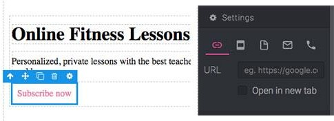
This block lets you choose from 5 types of links:
- URL — Here you can insert any external URL
- Element — Select any available element on the page by entering its ID (useful for pointing to different sections)
- Page — Go to another page of this project
- Email — Use this to allow users to send emails in a fast way (will open their default email app)
- Phone — Go to multiple phone numbers, useful for dialing numbers faster on any device that can make phone calls
Note :
Link Block doesn't accept any other elements in it, but if you need to apply a link to something else (e.g. an image) you can use the Link Box which allows you to have the same options of a Link but with the possibility to drop anything in it
What if we want to center the link on a column? As you know, we can solve it by using Grid. Just drop the Grid below the link, move the link to the middle (second column), change the Behavior of the column to Fit Content and you’ll get something like this.
The only problem now is that the column breaks word lines, to avoid that, select the link and under Typography select No for the Line Breaking property.

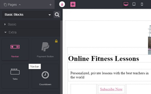
Navbar Block
The final part of our header structure is the top navbar, which will contain our product logo and links to various parts of this project page. So, drag the Navbar Block located in the Extra sub-category at the top of the section.
Then you will see a display like this
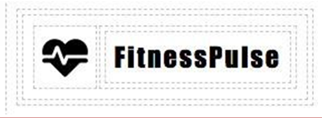
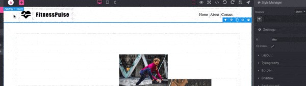
For now, we haven’t worked on navigation links, but will change the brand logo first. Generally, a logo is a single image of a brand/product but for our case, for more practice, we will choose a composition of icons and text. As usual, we’ll be using the Grid to create this composition, so let’s start with a new Grid drop block below the text on the left side of our navbar. Since we may need our logo linked, make sure to include it in the Link box.

Note :
Usually, it might not be easy to move things into small blocks, so remember, in this case, it's easier to move things in the Layers panel (left sidebar)
In the left column, we will drop the Icon block (Basic sub-category) and from the icon manager, we will select something that relates to our context. In the middle column, we will drop a simple block of text for the product name. We simply delete the right column and the text above the grid. If you want, you can change the icon size and change the text style a bit. This is my final result.
Note :
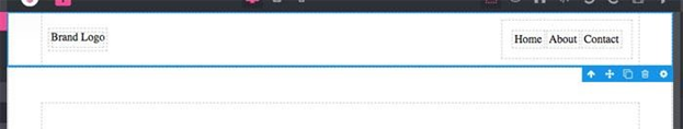
Multiple nested grids might create too much white space around the content, so remember you can adjust it by changing its relative margins/pads under Layout propertiesLastly, you might notice how the navbar pushes our header section below by making our content out of alignment. To adjust this, select the navbar and, under the Settings property, change the Position to Detached
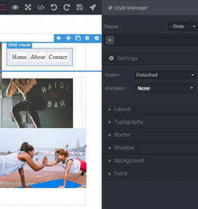
Then, the navbar and header will be separated as shown below.
Great, now that we have a good header section structure in place, we can start making it tidier by using the Style Manager.
Styling
As you can see, we’ve already started using the Style Manager during header composition, but in this section, we’re going to give a better look at some of the common styling aspects.
Using multiple blocks you may have noticed how the Style Manager changes its properties based on the currently selected block (eg Grid-related properties under the Layout category). So, each block can have its own set of properties to set to avoid the user letting the layout spoil with multiple mismatches.
Almost all blocks have this set of arrangement categories
But there are certain cases where this set may differ (eg Body Block only has Typography and Background).
Note :
The Settings category you see above Layout is a slightly different category and its main purpose is to change some block behavior. The big difference between the other categories is that the changes apply equally on all possible devices where the others can be defined differently on each device
Now, let’s start with the setup…
First, select the main section and change its color (in the Background) to #303a52 and the Font color (in Typography) to white. Since our Navbar isn’t in the same section, the font color doesn’t change, so update the Font color to the same value.
In general, we recommend changing the main Typography properties such as Font, Font size and Color directly on the Body Block as it will apply to all children (content within). So, select Body and change the Font to Helvetica (good for a start but, will see how to load other fonts later), Font Size to 16px and Color to #333 (currently invisible because the section and navbar are separate).
As an extra point, let’s give more visibility to our heading text (Font size up to 64px), text under heading (Font size up to 20px) and navigation links (Font size up to 18px).
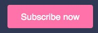
Great, now it’s starting to take shape. Let’s focus now on the CTA button and adjust the Grid in the middle to fit the new style content.
At first, let’s move the CTA button from the middle column to the left to make it more aligned with the rest of the text (change it to 0px on the left padding of the block grid as well) and now apply the following changes to the CTA link:
Layout
- Padding top / Padding bottom — 15px
- Padding left / Padding right — 30px
Typography
- Font size — 20px
- Font color — white
- Text decoration — no
Border
- Border radius (all) — 5px
Background
- Fill color — #fc85ae
This configuration should lead to the following results
Now let’s adjust the main grid containing our image and text. The image in the right column is slightly misaligned with the right edge, to align it properly let’s align the right column (image column) properly using Fit content (Behaviour property).
Note:
Columns might shrink the image, in that case, try to remove the height property from the Style Manager and only update the width of the image if needed.
Result of Header
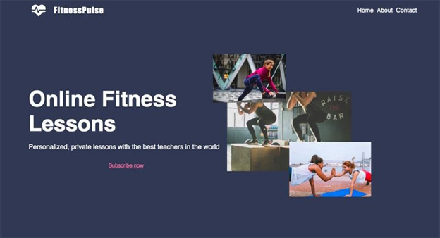
And this is what the header looks like now

Conclusion
We have finished creating a header on the appearance of a website using Grapedrop. in the next article we will discuss responsive design using Grapedrop.

