Iconography rules to follow in UI design
Iconography is a visual language used to represent features, functionality, or content. Icons are meant to be simple, visual elements that are recognized and understood immediately.
Icons are frequently used in app and website designs to express a certain meaning to our users. As designers, we know that each element we include in our designs should have a function, and all elements should follow the UX Design guidelines.
Here are some guidelines to follow while using icons to ensure that you’re doing it correctly.
1. Icons should make sense
The most important purpose of using an icon is to visually transmit a message to your users. It therefore makes sense if the icon communicates the intended message. This also implies that it should be a globally understood symbol or one that resembles the physical object being represented. According to NNGRoup: Use the 5-second rule: if it takes you more than 5 seconds to think of an appropriate icon for something, it is unlikely that an icon can effectively communicate that meaning.

2. Consistency all the way
Icons come in a variety of shapes and sizes, including filled, line, and outline icons. Stick to a specific icon style when selecting icons for your project. Your icon’s style, rounded corners, and stroke width must all be consistent across all of your projects.

3. The simpler the better
Icons must convey a message but do not necessitate a great deal of detail, such as illustration. Make sure your icon is simple and contains only the information needed to perform its purpose. Icons are typically used in small sizes, thus an icon with a lot of details will just appear cluttered and may be difficult for the user to interpret.

4. Vectors only, please!
If you're going to use icons in a project, make sure they're vector icons. This way, you can scale them without losing clarity or sharpness, and you can alter them more simply, such as changing the color or removing certain elements. When saving them for use in digital products, the SVG file type is the best choice as it preserves the scalability of the icon as well as transparency.

Read more here on the differences between the image formats.
5. Add text labels
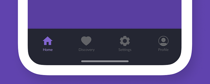
Text labels are used to clarify the meaning of the icon. Even when we know we are using universal icons, we can not assume that all users are familiar with them. We also want our users to understand how the icons were utilized in this context because some icons can be used for a variety of different meanings in other apps.

6. Be careful with color
As a general rule of thumb, icons should be a single color. Furthermore, don’t use different colors for each of your icons unless it directly contributes to making them more usable. In most cases, you might use a different color to indicate an active icon, while the rest are another color.
Where to get these icons
Here is a list of sites where you can get icons to get icons.
Final step!
To make always be sure, test the usability of your icons by showing them to users and try to see if they can identify the meaning behind that icon and what they expect to happen after interacting with that icon. This will give you a clear picture of what your users associate that icon with.

