I put design guides to the test. Did they help or hurt? You decide

I’ve spent a lot of time deconstructing design guides posted across social media. The main issue with design guides is less often about the advice itself, but rather the lack of context surrounding the advice. Some minor tweaks to these design guides can take them from ambiguous to specific and contextual.
Taking guides to task
In this post instead of challenging the “right way” design guides or offering contextual insights, I instead applied the guides’ advice directly to popular websites without questioning them. Did the changes help or hurt the customer experience? That’s for you to decide!
1. Modal UX — Instagram Post


Which modal do you prefer and why? Does one produce clearer understanding of what will be lost by proceeding with the destructive action?
2. Text alignment — Instagram post


Which Google page do you prefer and why? Is one easier to read or another create better visual balance?

Which Apple iPhone page do you prefer and why? Does the choice of iPhone image impact the text alignment you prefer? How might different device sizes impact the image and text alignment choice?
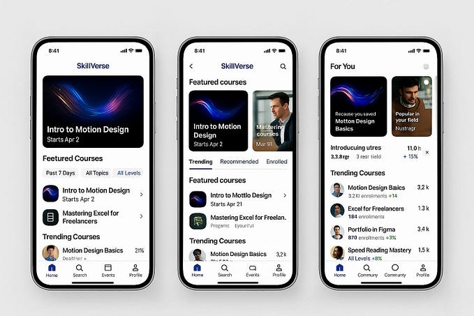
3. Mobile Navigation — Medium post


Which Apple mobile page navigation do you prefer and why? Is one nav clearer or easier to access? What about the number of nav items, the cart icon or other elements left off of the wire frame above? Should the Apple logo be moved to the left? Did the wire frame account for an endless variety of business goals exceeding one singular solution?


Which navigation pattern do you prefer and why? Are mega-menus universally better even when fewer nav items are present on the drop-down? Does context matter here?
4. Headings Sizes — Instagram Post


Is the Instagram post correct? Should headings be within a fixed range? Should Medium reduce their headings and paragraph text to a much smaller size? Or are headings more contextual to format, device, accessibility, brand, etc? Points vs pixels, would context help? Should design stay within a rigid typography size box?
5. Button Design — Instagram Post


Thank you for taking some time to read this post! It’s not my goal to disparage design posts across social platforms. It is my goal, however, to continually push designers to provide context to their posts. To afford caveats and exceptions even when discussing tested and proven design patterns. Let’s all grow in this space together!