Case study: How UX design supports ‘new’ tourism?
Part 4
I hope that this four-part article can provide beginners in UX design with some useful insights, and tips. In this special case study, I present my first mobile app design on my own; ‘Budapest Murals’ is an extended MVP for tourism. The main focus of the project was to practice prototyping with the software I had not used before. The polished UI was not among my targets. The operation framework that I set to myself as a limitation for the whole project including the full documentation (= YouTube video, Highlights on Behance, Case Study on Medium) was one month. I made all these for the first time, only the case study was an exception in a sense.

I present the mistakes I made through the evolution of all functional building blocks of the prototype.
On the screens, I numbered which wireframe/prototype iteration they belonged to. In the last, the fourth full iteration you will see that I iterated some screens more than once. But that is my only cheat. Of course, I still think the end result is ‘far from ideal’ to be polite.
Beyond the remarks below the screens, the content is structured simple: Concept, Feedbacks, Tips at each block. Concept: my preliminary idea; Users Feedback: results of test rounds; My Tips: takeaway that can be interesting for beginners. I indicated with a green tick the screens included in the final proto.
There were three test rounds, with UX vein testers, with my former teammates on xLabs UX design training course.
Now let’s see the blocks of the proto as follows:
TRANSPORT SELECTION

The app’s concept puts environmentally friendly transport options at the forefront. I wanted to make the selection screen ‘spectacularly’, showing the eco-friendliness as well as the time required for the tour.


I should solve it on one screen, not with scrolling. Photos are not good at all. ‘Everyone knows what a bike looks like.’ It is an unnecessary visual load, and even the user has to scroll.

Icons sizes should be proportionate to context. Icons should be of the same style, possibly from the same creator. Either all outlined or solid, but not mixed. It seems better if the icons do not have a background. If you have UI vein and experience, make your own UI elements or ‘design system’ for your design taking into account the time. I put a vertical scroll to manifest my skills. Failure on the test. I found icons dull, thus, I was enlighted to use photos, even of Budapest from free stock photos. Failure on the test. Though I tried to remain on one screen, I find the final screen to be logic, but dense, and ugly.
TOUR ASSISTANT

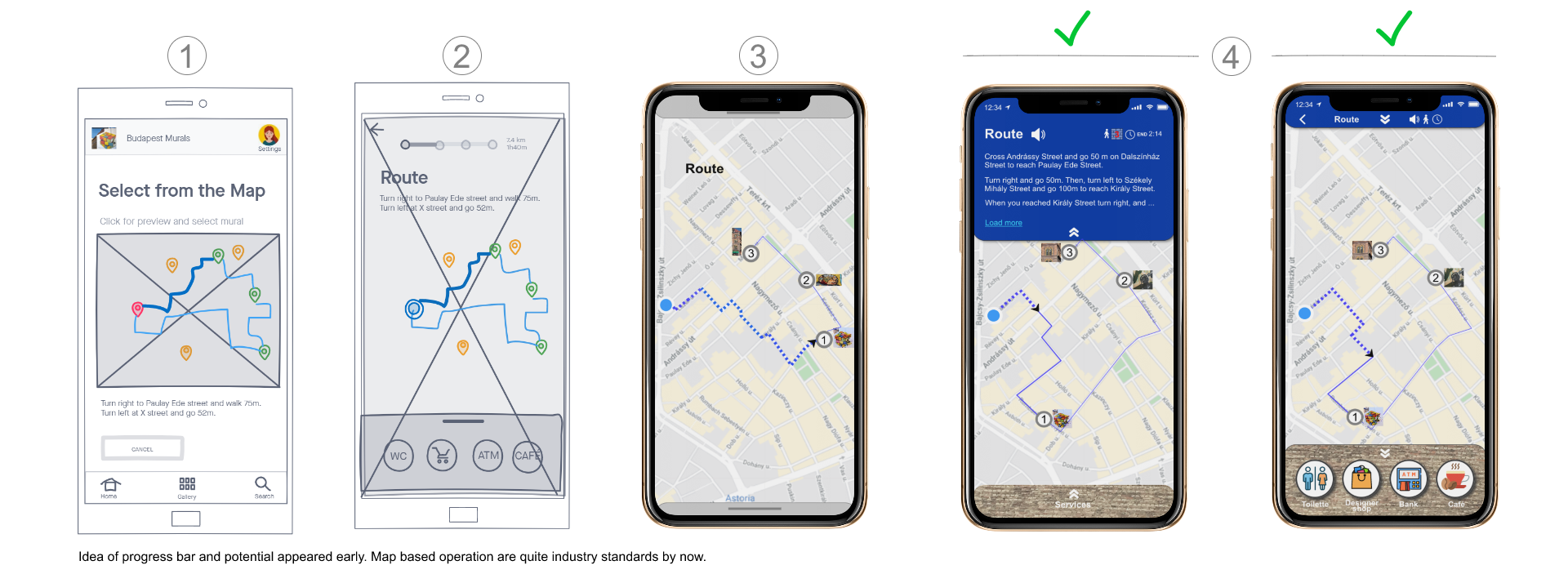
Following industry conventions, from early on, I imagined two types of tour guide information swipeable down/up. Top: route direction guide, bottom: services in line with the business model of the app. So, not grocery stores or malls in general, but local design shops etc.


I should use a more visible solution to recognize that the users can swipe down/up the tour assistant. Text, icons should be of larger sizes (that previous version is not shown here).

I was surprised since in some apps there is only a thin element to indicate the vertically swipeable parts. Testers want it to be more emphasized here. In the UI, I followed the overall design of the app. The blue sky of Budapest is for the top, the firewall of Kálvin tér is for the bottom background colour. The visibility of the services icons text is a question with this background. In general, there is a minimum visible font size that you should fix in advance when prototyping. Cut your wording, instead of cheating with decreasing font size. Writing less is an art itself. For me, at least.
MURAL MAIN & RELATED ACTIONS

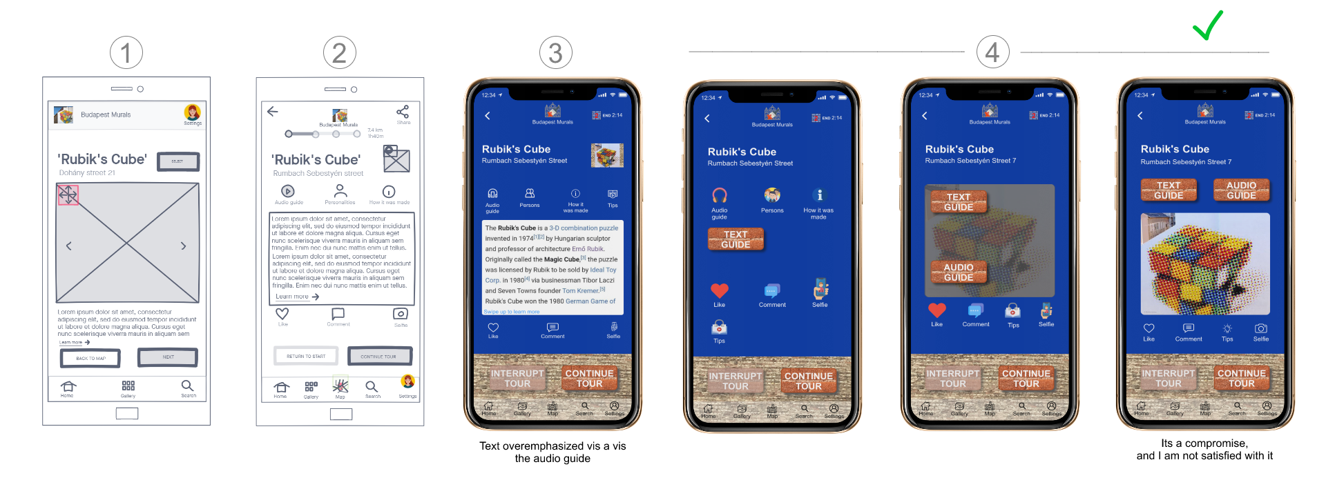
While the structure of this extended MVP is linear based on a typical user journey, that of this specific building block is not. I thought that all actions related to a mural should be available from the mural’s central screen and after the action is performed, the user should return always until continues its journey to the next mural. This structure is visible well in part#1 of this case study. Why this architecture here? Otherwise, the user would ‘accidentally’ go on and not use all of the features which are part of the business model.
The guide structure consists of 3 elements written and audible: the topic of the mural, the persons that can be connected to the mural, and the curiosities related to its creation.


Confusing written guide: mural theme shown, but the other two appeared as icons. Why written and audio guide are different? There is 3 written, but only one audio. The top part is too dense with the icons, miniature, logo, progress bar. Coloured icons are loud, do not harmonize with each other at all. The red heart captures the attention of everything else.

Many designs apply the solution of icons, and fonts with the same colour, having no own background. If you want these coloured, use the same, well selected, very few colours only. Maybe A/B test it. Obviously, we do not need a picture here, since the users are physically in front of that specific mural. I was running out of time and was not able to fill the space normally. You should not fill all space at any price.
MURAL — PERSONALITIES, COMMENTS

For the sake of simplicity, I used Wikipedia for the written guide. Initially, I thought it will appear as the mobile view of the webpage. Comments are everywhere, those are industry standards, I just wanted to implement something that the users are familiar with.


Testers were happy with the final screens.

For the text guide, I used the iOS solution instead of my lower part and tap bar design to show as many texts as I can on one screen. Obviously, the source of the guide can not be Wikipedia for various reasons, it is for illustration purposes only. I tried to polish the comment field UI by using the firewall background with opacity as if someone was writing on it. It may be strained though.
SOUVENIRS#1

Initially, I just wanted visitors to walk from mural to mural exploring the city meanwhile. Then came the idea of what kind of additional services could be built on the MVP, how these can be monetised? One opportunity is to make tailor-made souvenirs manufactured by third-party service providers.


When I put souvenirs selection on the same screen with photo sharing: ‘what are these icons? are these buttons?’ (were not). ‘Do not put these on the same screen. The primary function is photo sharing here. Use same colour solid icons without background.’

I was so enthusiastic about the idea of auxiliary services that I even did not make sketches on those or a mid-fidelity screen. Mistake. Based on users feedback, I used a standard iOS photo gallery screen, and photo sharing screen. I even initiated the Souvenirs function from that screen since users select from their photos, selfies. The final selection screen is a time-stretched compromise of course.
SOUVENIRS#2

The momentum took me, thus, I wanted to show a concrete example of additional services. The case was for the tourist to order a poster of its selfie with the mural.


‘Limit the choice to the most used options only. They do not understand the rest and won't use those.’ They were happy with the final order screen.

User first. Never sacrifice usability on the altar of demonstrating your scrolling skills, anyone can scroll. The main CTA should be in the focus always, which is buy. Do not use save the result, if users accommodated to add to the shopping cart as a standard. Do not spare the final UI check, the colours of BUY seems different from NEXT here, which is a mistake I just realized. Wording: you see from the screen titles how those evolved to the simple ‘Get a Poster’.
LOGOUT

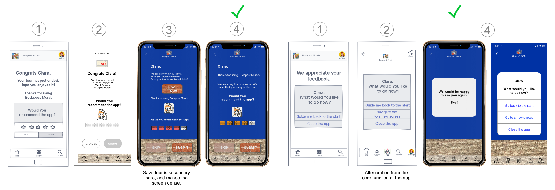
Logout like onboarding is quite a standard element that users are familiar with. I just wanted to add a tiny bit of ‘unique flavour’ in line with the overall visual concept of the design. It manifested in a painter girl who paints walls to express the level of the users' recommendation.


‘It would be a good idea to save a started tour, interrupted for whatever reason.’ Make it separate from the recommendation to get less dense screens. Just say goodbye, cut the rest, too many pop-ups, and it is not a general map app.’

Try to avoid enlarging the scope, stick to the core function when prototyping. You can not rate an app after the unfinished first use, which was my case if you watch the video. But maybe you can have a feeling and can or not recommend it to try. I think it is an acceptable approach. Though testers were ‘electrified’ by the idea of the painter girl (‘I would put her on every screen somehow’) I did not find or create her without the white background, thus, it is unfinished in a final UI sense.
Takeaways.: I intended to highlight most of my failures, feedback received, and conclusion by building blocks. You found a lot of technical type of conclusion or tips. But just looking at the screens, you immediately recognise what is wrong.
There is some general conclusion. Enthusiasm is important since it generates a lot of ideas. However, it seems hardly avoidable to make a mid-fidelity black and white proto version in order to test your ideas, leave out what is not working in order to spare resources before the turn into the final UI. I missed it intentionally, but I think of it as a mistake in a ‘real-life’ design context. Making all of the main selection, comparison screens remains a failure for me, since I wanted to make something spectacular and reached a mediocre compromise. I did not dig (deeply or at all) into current mobile app UI trends before prototyping, that is one reason why it is different from all you see on relevant websites. On the other hand, I find most of those, since being very similar to each other, dull very quickly. This raises the question of how one can be unique (if it is relevant at all) in its design while ensuring a seamless user experience? Yet to be answered.
Thank you for reading this article. You can find the video of the clickable prototype here, and the highlights of the project here.
If you like this article, follow me and read other stories.

