Case study: How UX design supports ‘new’ tourism? #1
I hope that this four-part article can provide beginners in UX design with some useful insights, and tips. As an xLabs alumni, in this special case study, I present my first mobile app design on my own; ‘Budapest Murals’ is an extended MVP for tourism. The main focus of the project was to practice prototyping with the software I had not used before. The polished UI was not among my targets. The operation framework that I set to myself as a limitation for the whole project including the full documentation (= YouTube video, Highlights on Behance, Case Study on Medium) was one month. I made all these for the first time, only the case study was an exception in a sense.
In every project, I intend to try out new things, software, processes. Among others, the novelty this time is that I highlighted the mistakes I made, the lessons learned, the key takeaways through the evolution of all functional building blocks of the prototype in part#3 and part#4 of this case study.

The Problem
For practice, I decided to design an MVP for one of my old, lifelike ideas. With this tourism app design I target a niche of tourists that are more deeply interested in a specific topic or already ticked off their bucket list of primary attractions, and open to a different kind of city experience. Today’s widespread solutions targeting mass-market typically don’t serve this niche at all or not with the quality of what this app design targets.
The Context
The globally re-intensified climate, environmental, and sustainability aspects due to Covid19 may transform people’s relationship with tourism in a more lasting way. Sustainability, technological development, changing customer habits bring alternative approaches to the fore in tourism. Inland, local character and values, environmentally friendly accessibility will be more on the tourism agenda. How can all this be reflected in a tourism app? I was looking for an answer to that as well.

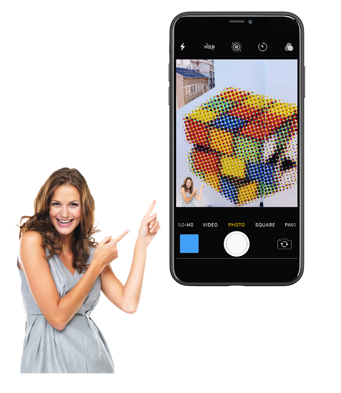
My tourism app design: what is it all about?
The app is aimed at globetrotter street art fans, in this case, murals specifically, found typically, but not exclusively in large cities. Furthermore, those who are returning city visitors, and open to a different kind of city experience beyond mandatory sights. The app wants to serve this special niche to a high standard.
Credit to all creators of murals in Budapest
In the last approx. 25 years, Hungary has also become a member of the elite group of cities on the mural world map. The murals are mostly in public areas, but they can also be found in the real-estates of companies and residentials. Festivals are quite regular. This spectacular progress is the merit of many, private companies, creators, NGOs, and local municipalities alike. Just to name two well-known: Neopaint Works, Vertigo Murals, but there are a lot more, of course.
My project is an unsolicited love project, I have no relationship with the above persons or entities.

The Project
The project served two other purposes in addition to creating the app.
Firstly, I tried already Miro and Figma. At every project, I intend to try new tools for myself. In this case, these were the InVision Studio for prototyping; Invisionapp for freehand wireframe sketching, and for testing; Movavi for record tests; Flaticon predominantly for icons, placeit.net for mockups, Screencastify extension to Chrome to record and cut video, Windows 10's built-in video editor to add background sound, and for photos I was using pexels.com, and klipartz.com. I was in the paid plan only at placeit.net.
The key takeaway here is: there are tons of stuff, even free, for everything. The ‘Top X Tool’ type articles help (to find those), but it is you who should try all those things with practising. It is highly unlikely that you can spare this. Which fits one, not necessarily fit the other.
Secondly, I measured my speed of delivery from scratch to a high fidelity prototype, and a case study using the above new tools. I was filling a timesheet. A simple, well-known tool, I thought it was a good idea to download a template from one of the largest IT companies. It was useless for my purpose. The ’perfect timesheet’ is a problem yet to be solved. Oldschool, I used Window10 stopper and Excel spreadsheet.
Contrary to my earlier UX work done so far and the typical approach in general, I intended to implement another speciality in this design project. I continuously documented and published the case study in the process on my website, so that the evolution of the project and the case study can be well followed transparently. I made two versions as I was progressing, and this is the final. It implied that there will be mistakes, not nice or unfinished parts, but that UX Design is all about. Continuous iteration.
Technically, I designed for iPhone XR, a relatively smaller size phone sold in relatively large quantity. However, for practical reasons, I drew some of the solutions from an old iPhone SE I have that still uses the 12.4.1 iOS operating system. I also used a free iOS UI Kit for InVision Studio, but I did not find it useful enough. I had the impression that there are a lot of useful things in that, except what I was needed, actually. For technical reasons, most of the mockups here are of iPhone11, but it does not affect the essence of this writing.
The Design Process
Because of the special roots and objectives of my project, the double diamond design methodology approach was set aside. I didn’t start with primary customer research, but with my own brainstorming, and very limited desk research. After that, I elaborated on the first wireframe sketch relatively quickly in InVisionapp freehand. I tested this with really few, but UX-minded users. I then iterated the second sketch version, which I test with the same users. After 2nd round of testing, I started to elaborate on the prototype in InVisionStudio. In parallel, to make the work more varied I started to wrote the case study.

The key takeaway here is that I was so enthusiastic that I made my first prototype on my own, that I didn't elaborate on mid-fidelity. Even if one is a pro in UI (which was not the case by far), I think it is a step not to be missed since testing mid-fidelity proto helps to leave out dead ends, may bring in new ideas, and spare resources at the final UI.
Brainstorming
It was clear what the app should know anyway: a geolocation-based route planner, well-structured tutorials on murals, and must promote eco-friendly transport, like walking. Additional features have already resulted from imagining me being in front of a mural as a tourist what would I do, what would I need?
Desk Research
The number of tourism apps is “endless”; the global ones are available in many languages, in local markets. The most well-known apps or responsive websites provide complex services: accommodation, transport, program, car rental, restaurants, insurance, etc. Those have the advantage of a one-stop-shop. These apps basically meet the needs of a large number of users, first-time travellers to destinations, those who stay safe and posts bucket list pictures on Instagram.
There are good ones and even better ones. However, it is usually true that very difficult to make complex solutions intended to resolve everything at a high level, consistently for every aspect. What happens is that some functionality is compromised, the information is not deep enough, there is no consistency between features, and so on. These are the takeaways to keep in mind when designing.
User journey
My preliminary assumption was one persona. I imagined a pre-Covid19 medium complexity user journey for this one persona. Why? Though the app planned as a niche product but can be used by anyone. Anyone interested in murals, the interest is regardless of gender, age, origin, marital status, religion, etc., etc. However, for this persona, I tried to incorporate various, realistic client needs.
The specific user journey is as follows: Clara is a young, dynamic, eco-sensitive manager from Manchester. She loves murals. Clara is in Budapest for the second time, came for a weekend. She stayed in a downtown hotel and wants to throw herself into the city, to ventilate her head in order to relieve stress. She heard that there are many murals in Budapest.
Clara doesn’t know how to start. Even the hotel receptionist knows only two. There are articles but in Hungarian, and without the location marked. Fortunately, she made a search in the app store, and previously downloaded Budapest Murals.
She registers to the app after convinced about its value proposition. Following the onboarding, from the organizer options, Clara selects the murals from the map that she likes at first sight. Clara wants to visit those walking, thus selects this transport option. At the first mural, she reads the theme, listens to the audio guide with earphones, and then scrolls through the information about the personalities associated with the mural. Clara then indicates that she liked the mural and writes a hint in a comment. Clara makes a selfie, which she intended to send later to a girlfriend through a messaging app with stronger privacy. As a souvenir, she wants to have her selfie as a poster, so she orders it. Before continuing the tour, she got a phone call from her local Colleague Éva. Éva wants to meet her, so she interrupts and saves her tour. Clara recommends the app to try. In the end, as a registered user, she receives a push notification on a new mural that can be viewed later in that year.
For potential future development, at least two features can be raised here. 1) Clara wants to have the related info, or stories of all interesting building, place, etc. among the murals while walking. 2) Clara varies transport facilities during the same tour.
Wireframe sketching and testing
The first sketch came together relatively quickly. I tested the completed wireframe with two former teammates as users, both with a UX background one skilled in graphics, while the other in online marketing. The relevant literature typically considers 5–6 testers to be sufficient. Surprisingly, the above two have already given many useful insights to me. It could be a little distortion only that they couldn’t completely remove their UX goggles.

One important takeaway here is that the initial 23 screens sketched here could be doubled-tripled very easily when it comes to prototyping as it happened in my case.
They commented on the wireframe screen by screen. I used post-it for their comments per screen in the InVisionapp. I could group their comments into 4 major topics, onboarding, core function-tour planner, UI, and interaction design-related ones, and summarized in the table below.
I received a lot of UI-type comments which results from the fact that I am on my learning path to see the apps, and websites not just content-wise, like the normal user, but much more with a UI eye. Thus, I expect quick improvement in this with projects and conscious attention.
The other type of comments pushed me toward more seamless flows, more intuitive use, and simplicity. I am very grateful for the feedback of Anna Árpás, and Gábor Kiss.

Then I accomplished the first iteration on the wireframe still in freehand mode. I had some solutions, dilemmas, ’how might we’-s be validated in the 2nd test of the wireframe, thus, asked them to have a look again.

This time I made notes separately. The reason for this I am wrong in making notes, and listen to testers/making interviews parallel. Therefore, I always make a video recording. In my view, there is no UX design without recording. You can always go back to the original source of information, see, and feel the nonverbal reaction.
I grouped the topics and their feedbacks.


