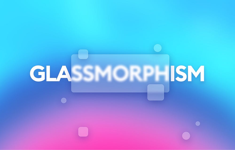
For my new project, I decided to expand my CSS skills and create a landing page on a web app using HTML and CSS. The catch? I wanted to incorporate glassmorphism. I first became aware of glassmorphism on LinkedIn and YouTube. A quick Google search has designated glassmorphism as the 2021 UI/UX trend. Glassmorphism has its appeal: it’s sleek and minimalist. In fact, UX Collective first published about it in late November 2020.
This week though, I wanted to focus on whether or not glassmorphism is accessible. Marty Seinamats defines accessibility pretty clearly in his blog: “Accessibility…means that devices, services, and products are accessible to people with disabilities. a11y says that “one in four people in the United States have a disability”.
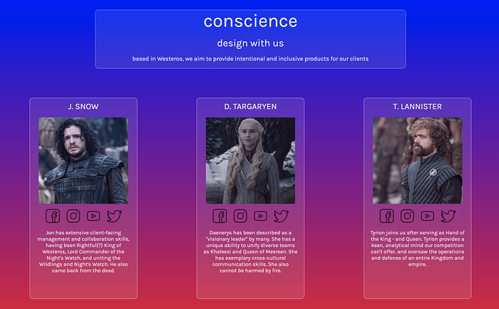
The appeal of glassmorphism is, as I mentioned earlier, how sleek and minimalist it looks. Albert Walicki’s blog highlights the basics of glassmorphism:
- “Frosted glass”
- “Vivid or pastel colors”
- “Light borders”
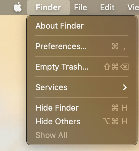
We’ve already seen glassmorphism incorporated in our daily lives, most notably if you’ve upgraded to MacOS Big Sur:
As developers and engineers, we need to keep our designs as inclusive as possible. Here are some issues with glassmorphism, as well as ideas on how we can make it more accessible:
Sharper border contrast
One of the key features of glassmorphism are thin, light borders and fairly pastel colors. One possible solution is to have a sharper contrast through an inner border, a thicker and more distinguishable border, or perhaps choosing a darker background that allows for a better contrast to text, icons, or images.
Clear sense of hierarchy
We need to be intentional with how users interact through design and developing the client-side. Arun Karunanithi makes an excellent point about making it clear which elements are a parent or child of one another on the client-side. Any changes to the client-side comes with a little bit of a learning curve.
Larger fonts
Another consideration would be to make fonts distinguishable. This might mean a larger font. It could also mean choosing a font color that contrasts from the glass background and the web app’s background.
I’m not an expert on UX/UI, but I’m curious to see how the industry will be able to take this trend and transform it so everyone is able to have a great web and mobile experience. At the same time, it’ll be interesting whether these solutions can also allow for it to retain the unique features that make it glassmorphism.
For more information on determining whether your app is accessible, please check out a11y’s official checklist.
Resources:


