How to make a great shadow in UI design
This is going to be a short hands-on practical on how to create and achieve different drop-shadow for your UI designs.

Drop shadows have become a very integral part of our UI design these days as drop-shadows can affect the look and feel of a visual design beyond the imaginations of the designer. Shadow can be applied to various UI elements ranging from regular shapes to buttons, to cards, to table elements, among other things.
When it comes to shadows, I like equating the feelings I want a shadow to exude to that of a physical object or feeling. I want my drop shadows to feel like milk, I want to look at these drop shadows and feel calm other days I want to look at my shadows and feel strong.
Haha, enough talk, let’s get started.
Using Layer Blur
This is coming first because its my favourite method of creating drop-shadows. This method is the most flexible, as it gives you total control over the subtleness and strength of the shadow.
How To Create This
Create a shape same size as that of the element you want to apply this shadow to, place it beneath the element, and add the effects to the shape. An example is illustrated below.
Also, you can experiment around the colour of the shape, the opacity level and the layer blur (Which ranges from 0–100 in figma).

Dividing The Value Of The Blur.
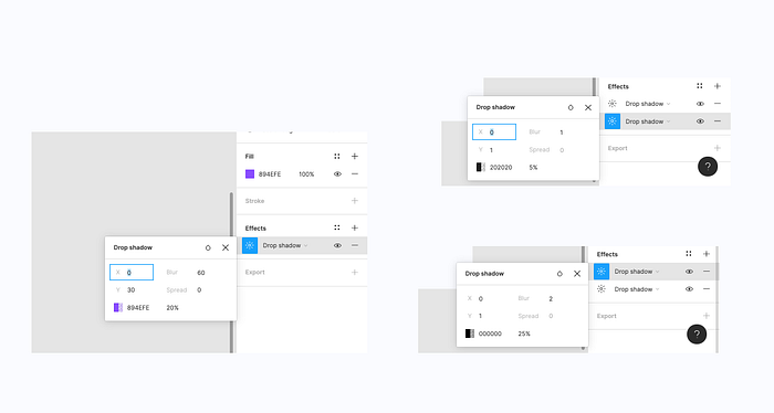
This is also one of my favourites methods and quick hacks. With this method, I always never miss the shadow effect I want to create. In this method, I always divide the value of the Blur into two, to get the value I use for the Y-Axis, while also making sure the value of the X-Axis is still at zero.
View an example of the application below.

Using Double Shadow Effects
This is another shadow style I use, when I want to create s subtle but firm shadow effect.
An example is added below.

These are the top three styles I make use of when implementing shadow effects across my UI designs.
Some Other Key Takeaways For Creating Great Shadows.
- Use same colours of elements for shadow colour: To achieve this you should use the same colour as the UI elements you are applying the shadow to, while experimenting with different opacity values.

2. Always reduce opacity: To achieve a really nice drop-shadow, always ensure to reduce the opacity of the shadow colour to achieve a subtle effect.

In conclusion, drop-shadows are great as they improve the aesthetics of your UI Designs. Never forget that the best drop-shadows are usually subtle and easy on the eye.
If you found this helpful, help share with friends and colleagues . Also, drop other suggestions in the comment section of how you achieve great shadows in your UI Designs.

