How to Develop UI while You Develop Software
I love software development. Even more, I love designing UI during the development process. My problem? I’ve always been a perfectionist. As an optimizer, I’ve had to learn how to combine my design skills, development principles, and ideals for consistency and minimalism. I have picked up multiple habits my 3 years as a game designer, and 3 more years as an app developer, so here are my tips.
What makes a view look good? Consistency, everywhere. I’m talking colors, spacing, fonts, even animations. It’s 2022, and design standards are evolving and changing. Things are getting simpler, and I believe that it’s for the better.
Extract, Extract, Extract
I’m a big Apple fan. With their brand new unveiling of their device lineup with the September 7 Apple Event, it’s fitting that we use their latest UI in my examples.
Check out this screenshot on Apple’s website, demonstrating the capabilities of the new Dynamic Island on the iPhone 14 Pro and Pro Max:

It looks fantastic, right? You can really pick out some of the details, even from UI as simple as this. The entire Dynamic Island blurs the content behind it ever-so-slightly. There is a consistent color theme, the icons are all very similar, the fonts are aligned perfectly. And when watching the full animation on their website, everything animates fluidly.
When starting to optimize your designs, it’s key to always compartmentalize your information. Extract any type of design consistency into a separate encapsulation in your development process.
I’ll show you what I mean. Let’s say you’re Apple, and your considering the SwiftUI implementation of the above display.
VStack {
  HStack {
    Text("FL234").font(.caption)
    Spacer()
    Image("airplane.fill").background(Color.gray).cornerRadius(4.0)
    Text("FLIGHTY").font(.caption)
  }
  HStack {
    Text("SFO").font(.title2).bold()
    airplayDisplayView
    Text("JFK").font(.title2).bold()
  }
  HStack {
    VStack(alignment: .leading) {
      Text("On Time")
      Text("Lading in 55m")
    }
    Spacer()
    HStack {
      Image("bag.fill").foregroundColor(Theme.black)
      Text(4)
    }
    .foregroundColor(.black)
    .padding(4.0)
    .background(Color.orange)
    .cornerRadius(8.0)
  }
}
.padding(16.0)
Even if you’ve never written or read SwiftUI code, developer instinct may give you a few warnings. For instance, we’re using hardcoded values for our corner radii, padding, and text labels. We can instead write .xs, .s, .m, .l, and so on, to define preset spacing values.
Preset spacing values are great, because they make your UI look organized and well-placed. Check out this screenshot of iOS 16’s Maps multi-stop routing feature, and notice how even the spacing is across different elements on the screen:

Colors Should Be Just as Simple
You should also have a set color pallete for your design. Of course, the pallete you choose will vary depending on your project or company’s existing designs. However, when developing UI, it’s important to retain the basic color elements, and to simplify your colors as much as possible.
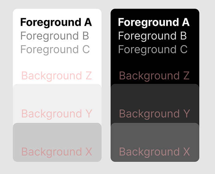
I use a simple color system for most of my apps.
- Foreground A color: The primary foreground color. Used for pretty much any body text.
- Foreground B color: The secondary foreground color. Used to display less relevant text.
- Foreground C color: The tertiary foreground color. Only needed for small, discrete text.
- Background Z color: The primary background color.
- Background Y color: The secondary background color. Used for cards, UI elements, etc.
- Background X color: The tertiary background color. Used for elements atop other UI elements. I like using the X color for borders as well.
- Accent color: An accent color to use in the app. This can be a single color, multiple colors (depending on your branding), or even a gradient style. Used to make elements pop.
Even though Apple uses a much more complicated coloring system, you can still notice the ABCXYZ color principle throughout much of their UI. Check out a screenshot for Apple Pay Later functionality in iOS 16:
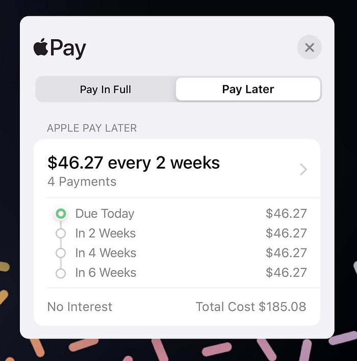
Do you see the hierarchy of colors? A is used for the Apple Pay logo, and the important information… “$46.27 every 2 weeks”. All the other text is B; secondary information that the user may look at next. C is used in the right chevron “>” icon. The background colors are also present, and the accent color is the green indicator next to “Due Today”.
Including a range of these colors is a smart move, as it allows the user to get a read of your theme and coloring in a single glance. Good UI developers will ensure that these exact colors are used throughout their platform’s ecosystem. Extracting your colors is great, as you can easily fine-tune your app’s colors all at once as well.
Fonts are More Detailed Than You Think
Ok, your team has picked out the perfect font to use for your application… but now what? How do you individually style each label in your application? Which pieces of text are small, or large? Bold, italic, or regular?
Picking out the right font styles is important for your app. Designers have many options when it comes to choosing fonts for an application.
When deliberating over which font styles to use, I try to simplify it to a few rules.
- Use preset font sizes for your project. Avoid any more than 4–5 sizes. For instance, I stick with header 1, header 2, body, caption.
- For every piece of text you include in your application, think twice about what size the text should be. Header 1 text is usually a short piece of vital information, displaying the content on the page. Header 2 text usually demarks sections. Body text is what I use primarily, and I only use caption text if I’m displaying a large amount of sub-related text.
- If you want to draw attention to specific words, use a bold modifier. I rarely see italicized or underlined text in applications.
- If you want to get fancy, use heavy or light font styles. You could use a light or heavy font style in all caps, for instance, to demark important sub-header-esque information.
Applying these principals, let’s see how Apple styles their fonts in the new iOS 16 Notes Activity:
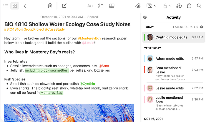
You’ll notice the small “TODAY” and “YESTERDAY” headers are bold font, all caps, and “caption” text size. These make great headers, especially when comparing the font style to the lighter “LATEST UPDATES” label with a matching clock SF Symbol on the trailing edge of the view.
Notice how, in the above Activity panel, the user’s names are bolded, and the activity timeline is displayed to the right with caption-sized, secondary text. Underneath the change notes are small, secondary preview text labels displaying the relevant changes made to the note. And it all looks gorgeous. Neat!
If you’re a developer, think about ways to extract this information into reusuable modifiers or variables. SwiftUI makes it easy; to make small fonts it’s a simple as .font(.caption), to make bold fonts it’s just .bold().
Wrap-Up
To review, here are my general tips when developing and designing your To review, here are my top tips for designing UI:
- Use a consistent color scheme throughout your app.
- Use consistent spacing between elements.
- Use consistent fonts throughout your app.
- Use animations sparingly and only when they improve the user experience. (will cover this in a future article!)
If you’re curious, you may notice this is my first article. Thanks for reading! I am a full-time student working to improve and share my learnings to whoever is interested in reading. I hope you’ll check out my future articles; I hope to release a new article daily.
Cheers! 🥂

