How to Choose Right Fonts for your Project
The all-in-one solution for choosing the right fonts
Overview
As a designer, choosing the perfect font for your project can be a time-consuming and daunting task. While color psychology has been extensively discussed in design literature, the psychology of fonts is often overlooked. However, typography plays a crucial role in our designs, as different fonts possess distinct personalities that convey unique messages. Understanding and aligning a font’s personality with your brand’s identity is essential to creating cohesive and effective designs.
In this article, we will delve into the nuances of font selection and explore how to choose the right font for your project. It’s not just about aesthetics; there are various requirements that must be met. Here are a few key considerations to keep in mind:
- The font should reflect your brand’s identity and personality.
- Ensure that the fonts are scalable and will not distort at any level in your project.
- The font must be legible and easy to read, particularly for body text.
- Proper font pairing is essential; we will cover this in more detail in upcoming articles.
- Keep in mind that fonts take time to load, especially when designing for screens. Choose fonts that won’t slow down your project’s loading time.
By understanding the psychology of fonts and the various requirements that must be met, you can make informed and profitable font choices for your projects. The right font can elevate your designs, enhance your brand’s message, and ultimately lead to more successful projects.
Classification of fonts:
We generally Classified fonts into the Following three Categories:
1- Serif Fonts: In typography, a serif is the little extra stroke found at the end of the main vertical and horizontal strokes of some letterforms. A font that has serifs is called a serif font. These are Sophisticated, Reliable, Formal, Practical, and Traditional. Some of the popular and best Serif Fonts are:
Times New Roman, Lora, Badoni, Silk Serif, Didot, Butler, Playfair Display, Saol Display, Roslindale, Timpos fine, Orpheus Pro, Windsor, Ogg, Canela, Mermaid, Abril Fatface, Larish Neue, Beirut, St. Marie, Frieght Text, Georgia, Courier New, Adobe Garamond Pro, Argesta, American Typewriter, Cambria, Beirut, Giveny, Maiah, Quincy, Merriweather, PT Serif, Noto Serif, Bitter, Crimson Text, Libre Baskerville, Arvo, Cormorant, Cinzel, Alegreya .
2- Script Fonts: Script typefaces are based upon the varied and often fluid strokes created by handwriting. They are elegant, Classic, Sophisticated, Formal, and stylish. Some of the popular and best Script fonts are:
Segoe script, Rage, Script MT, Snell Roundhand, Lucida Handwriting, Dancing Script, Allura, Tangerine, Cookie, Precious, Agatha, Self Deception, Lovely Coffee, Attraction, Boyshore, Shalma, Pacifico, Kaushan Script, Wind Song, Sofia, Arizonia, Euphoria Script, Miama, Scriptina pro, Promocyja, Condiment, Italianno, Kingthings Wrote, Milkshake .
3- Sans Serif Fonts: A font that does not have serifs is called a serif font. They also have a more modern feel to them, with their clean lines. These are Modern, Clean, Humanist, Geometric, and Universal. While designing for Screens we will mainly be using Sans Serif fonts. So we will talk about them in brief.
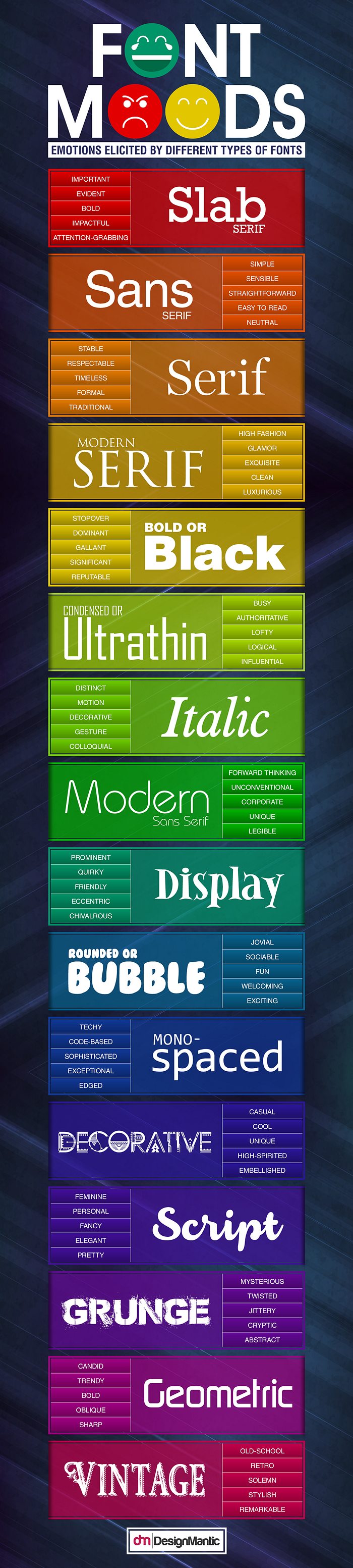
Font Moods
The emotions associated with different types of fonts can have a significant impact on the overall tone and message of a design. Emotions associated with different type of fonts:
1- Rounded Fonts: Roundness conveys Softness, fun, comfort, femininity, and sweetness.
2- Angular Fonts: Fonts with sharp edges evoke the feeling of danger and strength.
3- Condensed Fonts: Condensed fonts evoke the feeling of being restrictive, crowded, or precise.
4- Extended Fonts: Extended fonts refer to relaxation and spaciousness.
5- Long Fonts: Long fonts convey the feeling of lightness, aspirations, ambitions, growth, success, and luxury.
6- Short Fonts: Short fonts convey the feeling of heaviness and Stability.
7- Light Fonts: Light fonts are often associated with femininity and beauty.
8- Bold Fonts: They are associated with dominance or significance.
Some More Categories to understand font moods are shown below: 👇
Understanding The Fonts
Let’s deep dive to study some of the fonts and try to discover the message they convey:
- Poppins: This clean, geometrical, and highly scalable typeface is well-suited for both headings and body text. Its minimal look has made it a popular choice among designers for their portfolios. Poppins conveys a playful, modern, natural, or professional message depending on the context of its use.
- Open Sans: This humanist sans-serif typeface is elegant and sophisticated, yet modern. Its legibility and excellent reading experience make it a popular choice for small screens. Open Sans is ideal for designs that aim to convey a clean, simple, or modern message.
- Montserrat: This versatile typeface can be used in a wide range of domains, such as websites, the publishing world, branding, editorial, logos, print, posters, etc. Its geometric and elegant simplicity, along with a large x-height, makes it suitable for various projects.
- Roboto: As the default typeface in Android and other Google services, Roboto offers better readability, elegant contrast, and a wide range of font-families. It’s widely accepted globally and can be used in a wide range of projects.
- Helvetica: This classic typeface is widely used for interface designs. Its popularity and long-standing use make it a favorite for corporate designs. Helvetica conveys a message of sincerity, classic and simplicity.
- Arial: Arial is the most used body typeface after Times New Roman. It’s simple and classic look makes it perfect for body texts. However, it should be avoided for print design work.
Understanding With Projects
When selecting a font for a project, it is crucial to consider the target audience and purpose of the project. Let’s discuss different Categories of projects and how one should think while choosing fonts for these projects.
1- Education: For educational projects targeted at students, it’s essential to choose fonts that are easy to read and understand. For applications aimed at younger children, playful, comic-style fonts such as Comic Sans can be used in combination with clean, recognizable fonts like Helvetica, Arial, and News Gothic, which are popular choices in children’s books. For e-learning, it’s important to choose fonts that are readable, welcoming, and encourage students to learn new things. Some good choices include Raleway, Montserrat, Proxima Nova, Graphik, Open Sans, Century Gothic, Averta, Avenir, and GT Walsheim Pro. Some popular e-learning brands have used the following fonts:
Unacademy: Averta Std
SkillShare: GT Walsheim Pro
Byju’s: Roboto
Duolingo: Feather Bold and Din Round
Brainly: Proxima Nova
2- Food: For food projects, a font such as Open Sans is a great choice. Its clean, elegant lines convey a sense of warmth and welcoming, and also communicates to diners that the restaurant offers high-quality dishes. Helvetica is also a great option, its minimal and neutral form creates a no-nonsense attitude that immediately catches the reader’s attention. Other good choices include Gotham, Cabin, Circular, GT America, Metropolis, Raleway, and Montserrat. Some popular food brands have used the following fonts:
Zomato: Metropolis and Open Sans
Swiggy: Proxima Nova and Arial
Domino’s: Proxima Nova
Pizza Hut: Open Sans
Starbucks: SodoSans
3- E-commerce: For e-commerce projects, fonts such as Lato, Roboto, Montserrat, Inter, Cabin, and Segoe UI are popular choices as they are commonly used by customers on a daily basis. These fonts evoke a sense of warmth, stability, and professionalism that aligns with the overall aesthetic and tone of the project. Some popular e-commerce brands have used the following fonts:
Amazon: Amazon Ember
Flipkart: Roboto
Myntra: Whitney
Bewakoof: Montserrat
Nykaa: Inter
4- Health: When designing for a health application, the target audience includes patients seeking services and doctors providing consultations. In this context, it’s essential to choose a font that is legible, easy to read, and conveys a sense of professionalism and trustworthiness. For health projects, legible and easy-to-read fonts such as Source Sans Pro, Open Sans, Futura, Helvetica Neue, Avenir, and Lato are good choices. Other options include Brandon Grotesque, Apercu, Camphor, Clear Sans, and Gotham. Some popular health brands have used the following fonts:
Pharmeasy: Open Sans
Netmeds: lato
1mg: Clear Sans and Helvetica Neue
Apollo Pharmacy: IBM Plex SansSerif
Practo: Camphor
5- Entertainment: When designing for entertainment projects, it’s essential to choose a font that is widely accepted and can be used across different audiences and locations. By selecting the appropriate font, designers can create a more engaging and effective experience for the users. Helvetica, Montserrat, and Roboto are all good options, as they are familiar to a wide range of users. Other suitable choices include Noto Sans, Source Sans Pro, Poppins, Futura, and Work Sans. Additionally, using typographic techniques can help to convey a specific message or style. Some popular entertainment brands have used the following fonts:
Netflix: Netflix sans
IMDb: Helvetica
JIO TV: JIO type
ZEE 5: Noto sans
Hotstar: Roboto
6-Sports: Designing for sports websites requires a strong and attention-grabbing font that can effectively convey the energy and enthusiasm associated with sports. To maintain a sense of enthusiasm on sports websites, it’s a good idea to use bold and strong fonts for headings and titles. Decorative fonts can also be used to grab attention. For the body and overall design, fonts such as DIN, Futura, Open Sans, Helvetica Neue, Kanit, League Spartan, Proxima Nova, and Founders Grotesk are suitable choices. Some popular sports brands have used the following fonts:
ESPN: Arial
Reebok: Neue Plak
Adidas: AdihausDIN
Cricbuzz: Helvetica
Fifa: Open sans
Dream11: Roboto
7- News: When designing for a news application, it’s important to choose a font that is both traditional and legible. This will help to convey a sense of authority and credibility to the audience. traditional fonts such as Arial, Helvetica, Oswald, and Times New Roman are suitable choices for body text. These fonts have been used in newspapers for a long period and are easily legible. For headlines, fonts such as Neue Haas Grotesk, Open Sans, Proxima Nova, Montserrat, Roboto, and Franklin Gothic are good options. For body text or descriptions, Arial or other serif fonts can be paired well with the main font. Some popular news portals have used the following fonts:
NDTV: Roboto
India Today: Open sans
BBC: Arial
The Times of India: Montserrat
8- Music: When designing for music applications, it’s important to choose a font that creates a sense of relaxation and calmness. This helps to create an inviting and enjoyable experience for users. fonts such as Futura PT and Circular are highly recommended as they create a sense of warmth and cleanliness. Other suitable options include Proxima Nova, Raleway, Roboto, Lato, and GT Walsheim. Some popular music brands have used the following fonts:
Spotify: Spotify Circular (Alt. Circular)
Gaana: Proxima Nova
Wynk Music: Roboto
Jio Saavn: Lato
Youtube Music: Youtube Sans and Roboto
9- Development: For technology or development projects, it’s important to choose a font that is unique and legible for coding. Good choices include Open Sans, Consolas, Ubuntu, Montserrat, Helvetica Neue, Proxima Nova, and Graphik. Other suitable options include Roboto, Sofia Pro, and DIN Round. Some popular brands have used the following fonts:
VS Code: Consolas
HackerRank: Open Sans
Github: Segoe UI
Linux: Ubuntu
GeeksforGeeks: Sofia Pro and urw-din
10- Payment/ Billing: For payment or billing applications, the font should convey a sense of seriousness and fascination. Good choices include Calibre, Camphor, Sofia Pro, Open Sans, Mulish, and Gilroy. Other suitable options include Circular, Roboto, Helvetica, Inter, and Neue Haas Grotesk. Some popular brands have used the following fonts:
Paytm: Inter
Phonepe: UniNeue
GooglePay: Roboto
Jio Money: Helvetica
Razorpay: Mulish
Conclusion
Ultimately, there are many factors to consider when selecting a font for a project. However, there are no hard and fast rules. It’s important to keep in mind that the fonts discussed in this article may not always be the best fit for your brand or project. The key to choosing a font is understanding your brand identity and ensuring that it aligns with the preferences and needs of your target audience.
Additionally, it’s important to note that font pairing is another important aspect of typography and design. It will be covered in further detail in upcoming articles. In the meantime, best of luck with your design efforts and continue to experiment with different font options to find the best fit for your brand and project. Till then best of luck and keep designing!

