Member-only story
Design
How to choose a color for your fintech brand
I studied the top 250 brands in finance of 2020 and summarized a list of the safest and most powerful colour choices and combinations
Every designer knows the importance of choosing the right colours for their brand. There's a plethora of information available on the psychology of colour and which colour combinations are more visually pleasing, making it an overwhelming task to choose the right ones.
The history of colour preference studies is long, confusing and contradictory. (1). One of the studies looked into sex differences in colour preference. They found a consistent sex difference which may be linked to the evolution and further found that hue preference curves for males and females differ significantly. (2)
Other studies looked strictly at the emotion-colour relationship (3), which has been challenged by another study that speculates colour preferences are largely affected by a personal experience with objects of the same colour. (4)
In finance, you want your brand to express trust, security and respect. Whether you are a bank, a payment system, personal finance tool or advisory firm, the common theme is money. You want to show status and wealth, but empathy and loyalty at the same time. When it comes to money, people want to be sure they can trust whoever is handling them.
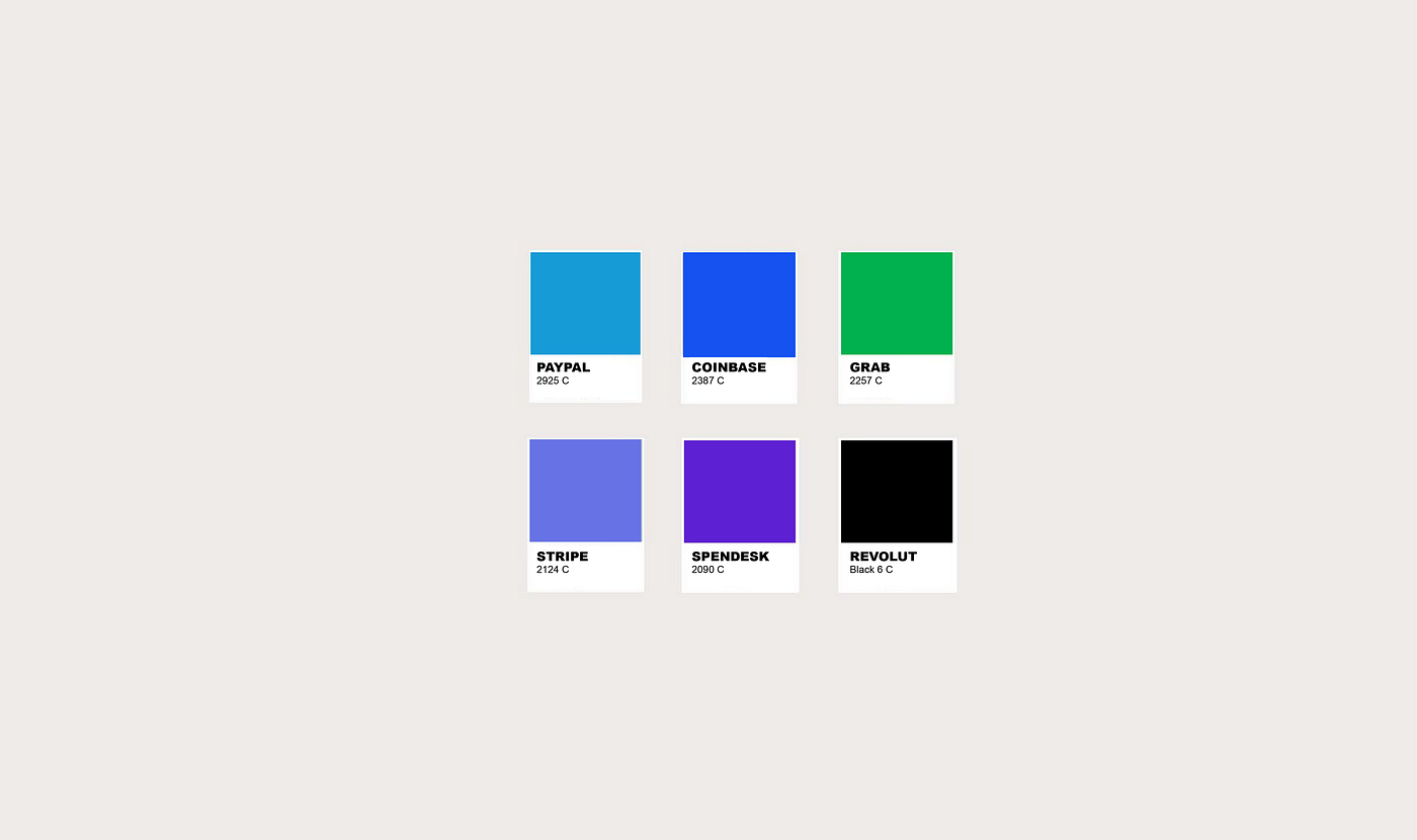
I studied the top 250 companies in finance for 2020 to see how they have employed colour in their design and how it relates to the studies of colour preference. Then I summarized a list of the safest colour choices, those that should be avoided or used with caution and secondary colours that could further alleviate the power of colour in your brand.
The Best Bets
The Color of Trust (Blue)

Blue is by far the most popular colour choice for brands — both for a primary and a secondary colour. Besides that blue is associated with trust, confidence and security, it is a universal…

